
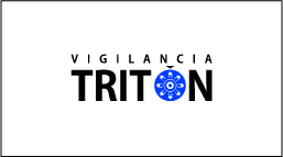
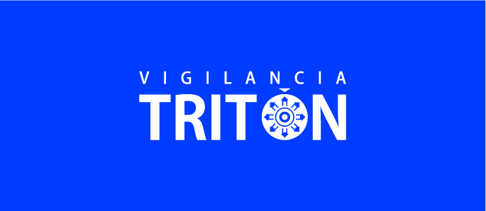
Tritón
Security Company
Security Company
During the branding process for this item, I use several concrete creativity techniques and started with this very important word for the whole project, "vigilance", that is the main feature of the company, because watching is the way businesses and houses stay secure.
I study several meanings for vigilance, the obvious one, the state of paying close and continuous attention, being watchful and prompt to meet danger or emergency, spying involves obtaining information that is considered secret or confidential, in other words, losing privacy. There are different kinds of spies, moles or the fav ones, ninjas, trained with murderer skills used at war, says Sun Tsu.
I focus my interests in a philosopher called Jeremy Bentham, a well respected jurist who life ambition was to create "Pannomion" a complete utilitarian code of law. His proposal also includes The Panopticon, a type of prison designed to allow an observer to observe prisoners without incarcerated being abole to tell whether they are being watched and creating a feeling of an invisible omniscience.
I also get inspired by Netherlands painter Vincent Van Gogh's piece "The prison courtyard", because vigilance must be constant like prisoners exercising, and the color blue, cause it's a color that brings safe, security and confidence, and this are values that clients put in the company's hands.
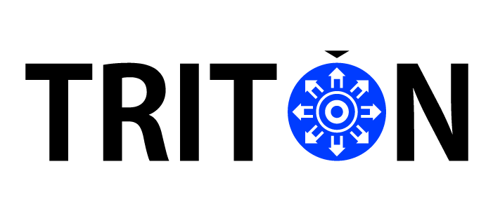
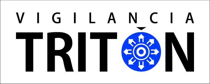
Kozuka is the main typography I choose, because the company must give clients safeness, confidence and security when they contract their services. It reflects strength with the wide body, but yet not an imposing look, because it also looks friendly, two things to create a great relationship.

The basic construction for the logo, behind all the basics presented before, I focus and simplify info, so I decide to named the company Tritón cause they were gods of the depths, ocean messengers and sons and guards of Poseidón's sea golden palaces.
The symbol proceeds from Panopticon, in wich pan means "all" and opticon "watch", Jeremy Bentham propose to build prisons in a cylindrical way, in the perimeter will be all the prisoners in different floors, and in the center of the perimeter, a tower with one single vigilant that will guard all the cells from one point.
I created an ideogram that represents this, an eye in the center and around it houses and/or companies, that look like arrows and resemble all the directions the eye watch.
The word Tritón, color blue, the shape of a flat sea star represents oceans, security and confidence that Tritón will bring to their clients.

The Panopticon diagram

The flat star, the relation with blue, oceans and the name of the company
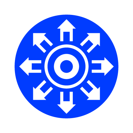
The ideogram
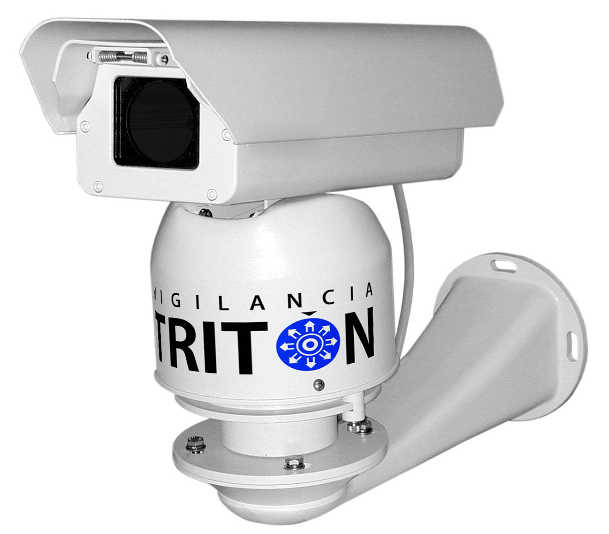
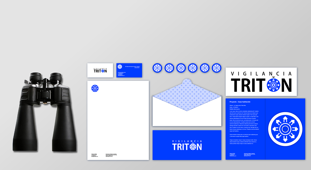
The apps made for the project so far...
Business cards
Business cards

Letterheads

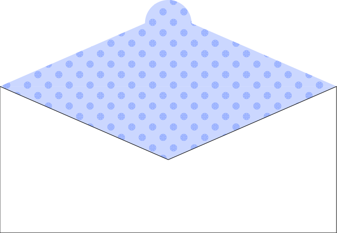
Envelopes
Project brochure and CD

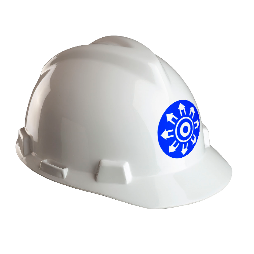
Company items

The stationary
As always, comments are welcomed, thanks


