Tower Supermarket Branding
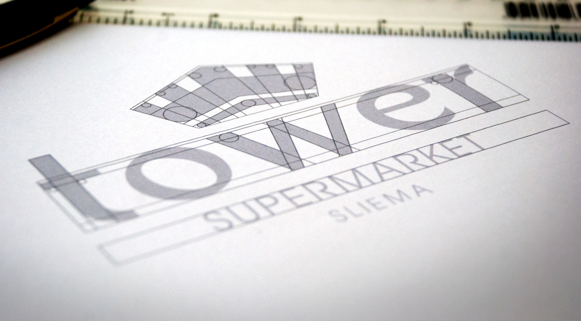
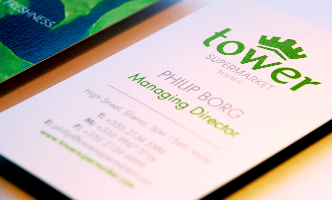
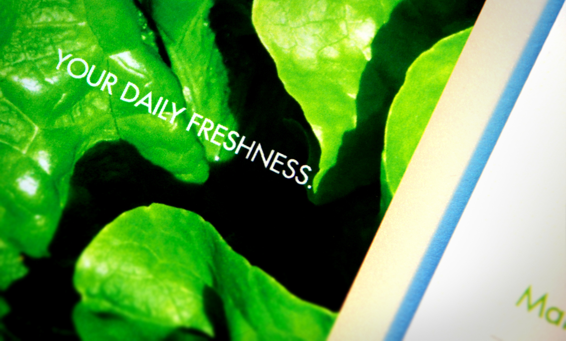
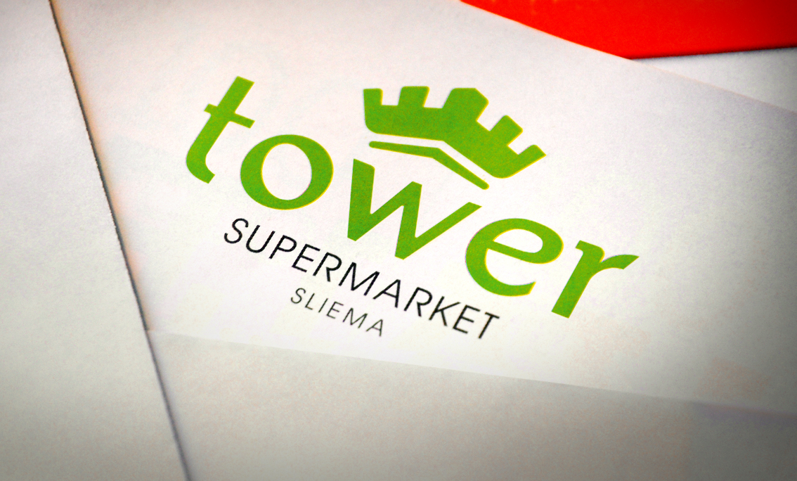
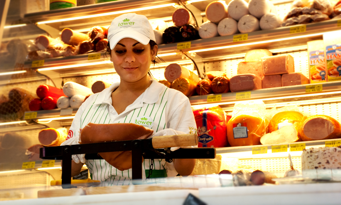
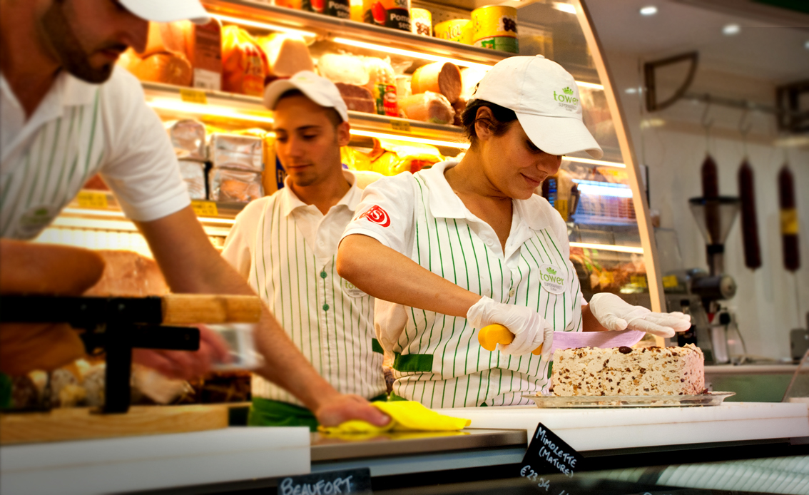
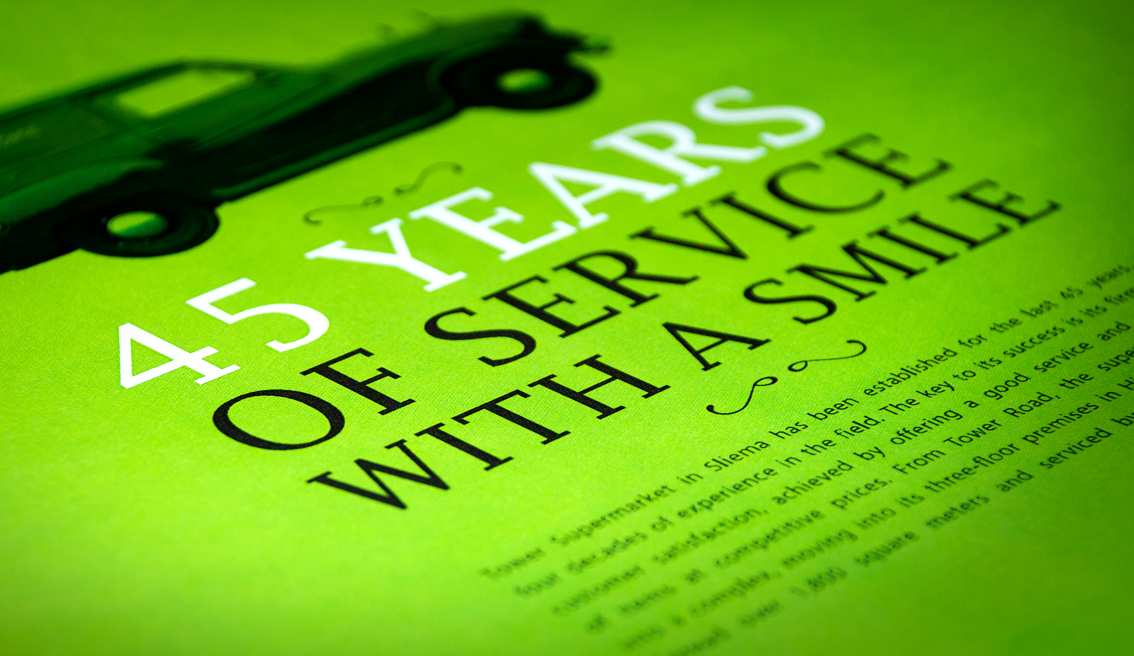
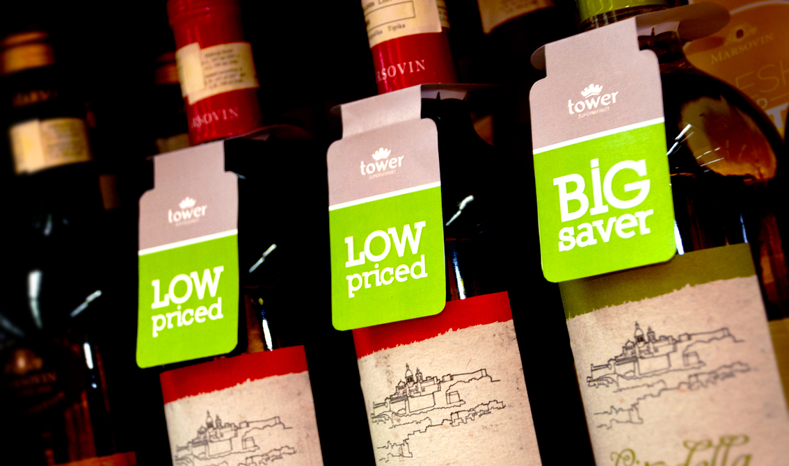
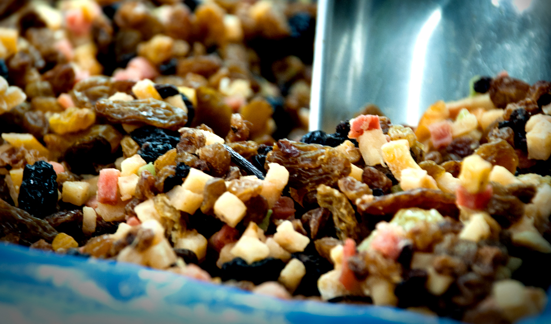
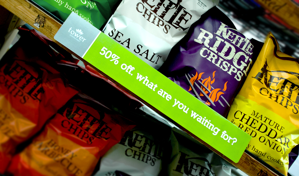
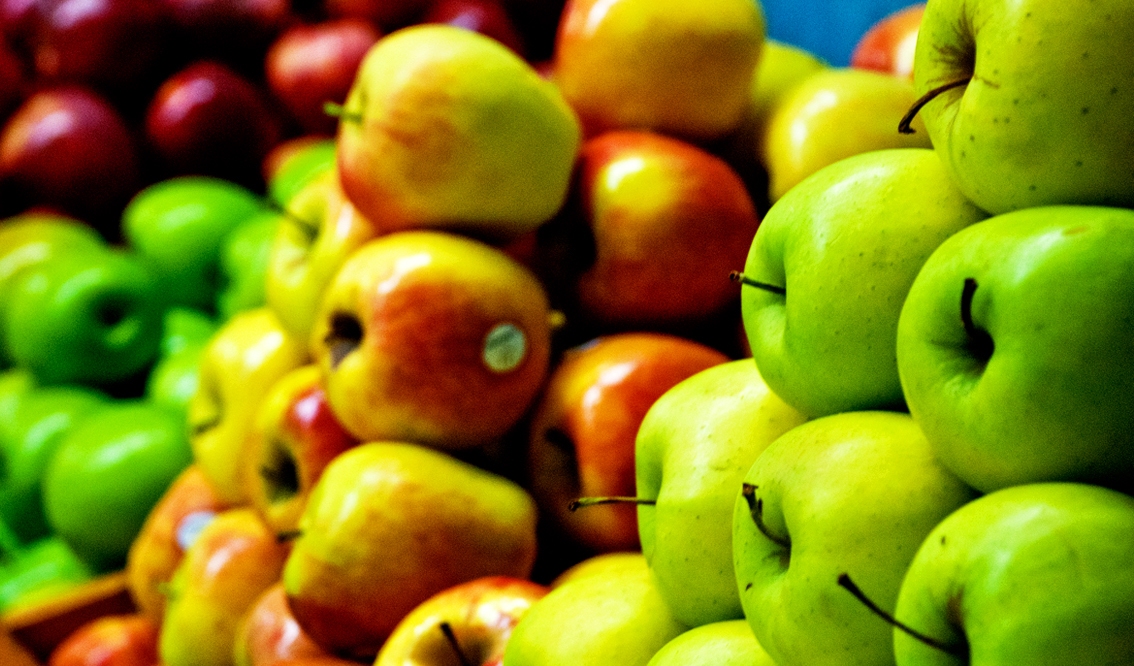
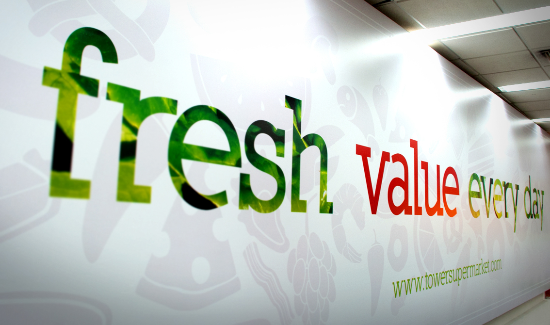
When the Borg family opened a small corner store in the late 60s little did they imagine that over 40 years they would have turned this little hole in the wall into a multi-level supermarket that services thousands of satisfied customers on a daily basis. Re-branding this household brand was no easy feat for BRND WGN but inspired by the brand's promise to offer clients good value, fresh quality produce and most of all great service with a smile, the agency set to work on a complete overhaul of the brand. The main elements of the logo are based around a contemporary impression of a fort or tower, similar to the ones that guard the Maltese coastline whilst the lime green colour was used to represent the fresh products sold in the supermarket daily. The use of lower case typography was extended to show the more humble and friendly service offered at the supermarket. The slogan 'fresh value every day' was also coined by BRND WGN as a promise to customers. The application of the brand was extended throughout the store, uniforms, delivery vans and of course rolled out online.