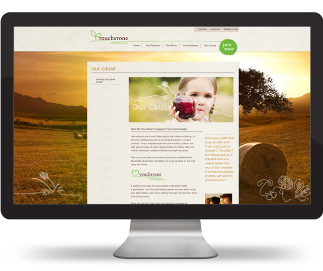
We’ve all heard it before, someone with a secret ingredient and experience in multilevel marketing venturing out on their own to build a new company. We were a little skeptical at first, but once we got to know the client and the product, this seemed truly something different.

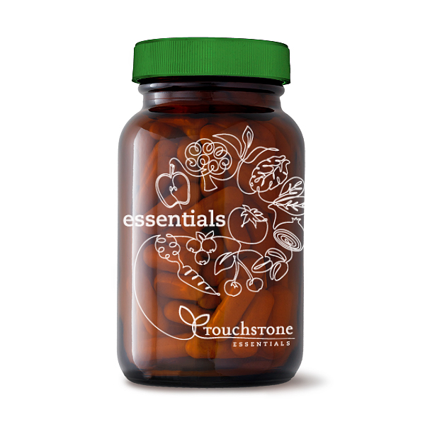
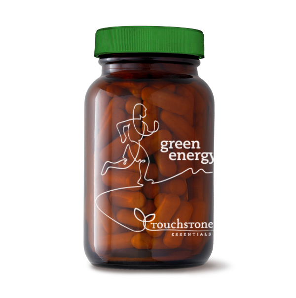
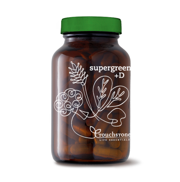
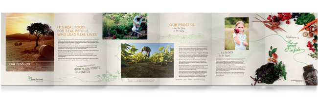
The Touchstone Essentials product labels and packaging continue a theme initiated with the design of the logo. The “tail” of the logo often turns into illustrative elements that amplify the qualities identified in the brand strategy. The amber colored glass bottles and label are transparent, emphasizing the tagline, “The Good Inside.” Hand lettering conveys visually and verbally the same messages on the protective packaging.

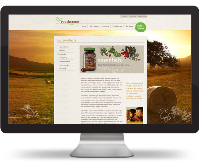
The products, which are the driving force in the success of Touchstone Essentials, are truly whole food nutrition, harvested right from the earth. To emphasize that, we shot photos of the raw fruits and vegetables that comprise the supplements. Connecting with interest in sustainable, local farming, we combined photos with hand lettering and illustrations to capture a distinctive difference from others in the MLM industry.


Print Materials


Video Illustration by Cameron Gardner


