
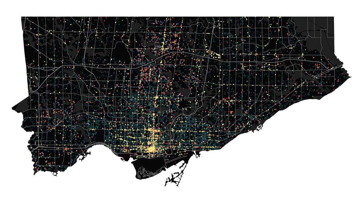
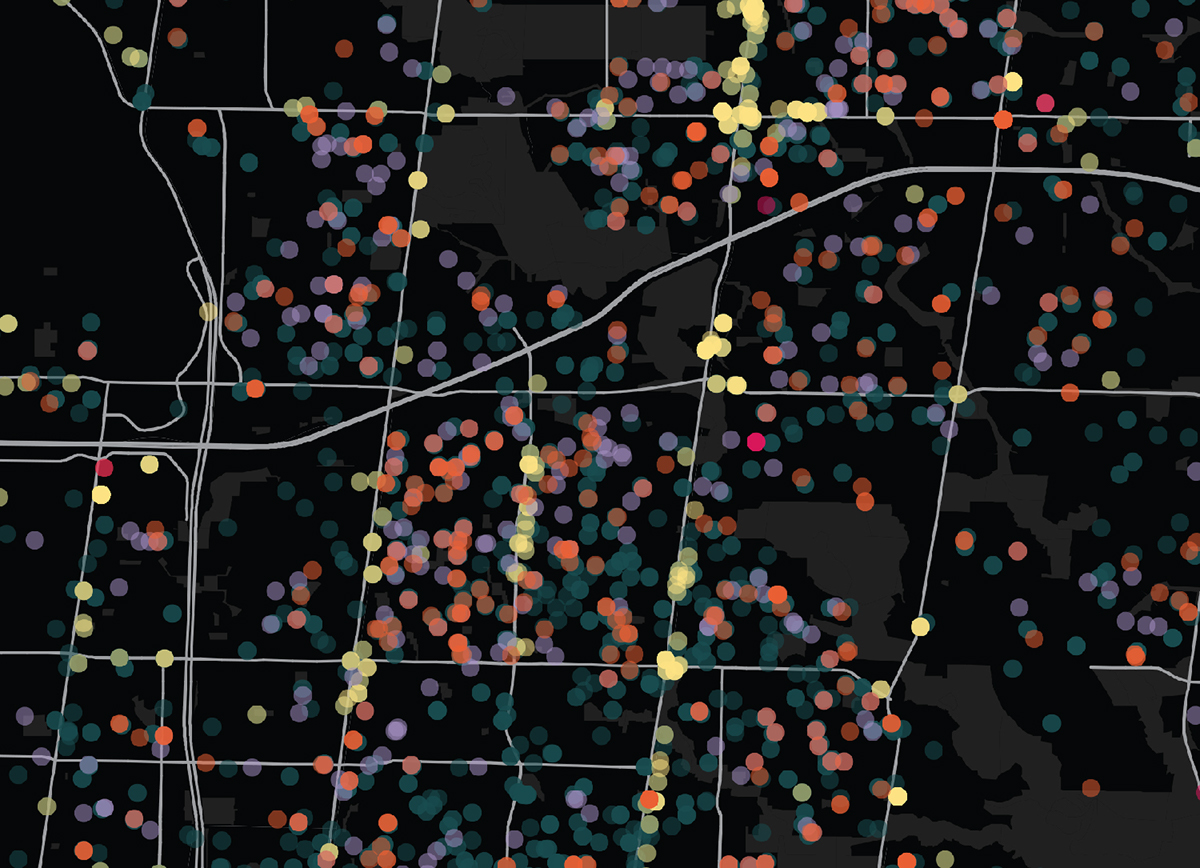

This visualization shows all the building permits completed in the year 2012, plotted on a map of Toronto under permit type. The permit types consisted of: temporary, new buildings, demolitions, additions, and alterations. Each type is represented by a different colour dot, plotted in its location on a map of the different city zoning areas for context. I chose a black map and tones of colour for the dots because it provides a contrast of colour to differentiate each dot type. I made alterations a darker blue to blend in with the background because it has the most dots and would be to distracting as a bright colour, from there the colours get brighter as the amount of dots decrease to even out hierarchy. Below the dots I incorporated streets and green areas as a dark grey to give some context as to why the dots are where they are. Besides the map I just put on a legend and title to keep it simple. This visualization is a broad overview of the data and I allow the viewer to make their own conclusion from the given variables. I printed it at a large size so all the data is at a reasonable scale to be seen. Giving an overview is ideal in this situation because I don’t want to show anything specific; I want to make the viewer in aw of the 30000 points on the page. It is a statement on the vastness of the amount of permits Toronto goes through in a year. This was what amazed me most about the dataset; how many entries there were and that they were mostly for alterations, not new buildings like one would think.
