Tom&co
Branding
After establishing itself with Big Fish, Tom&Co has now debuted as an independent digital agency.
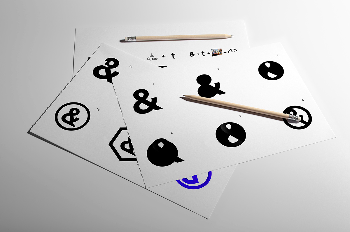
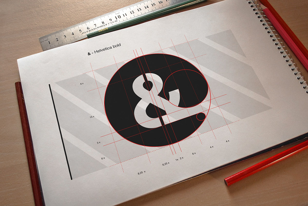
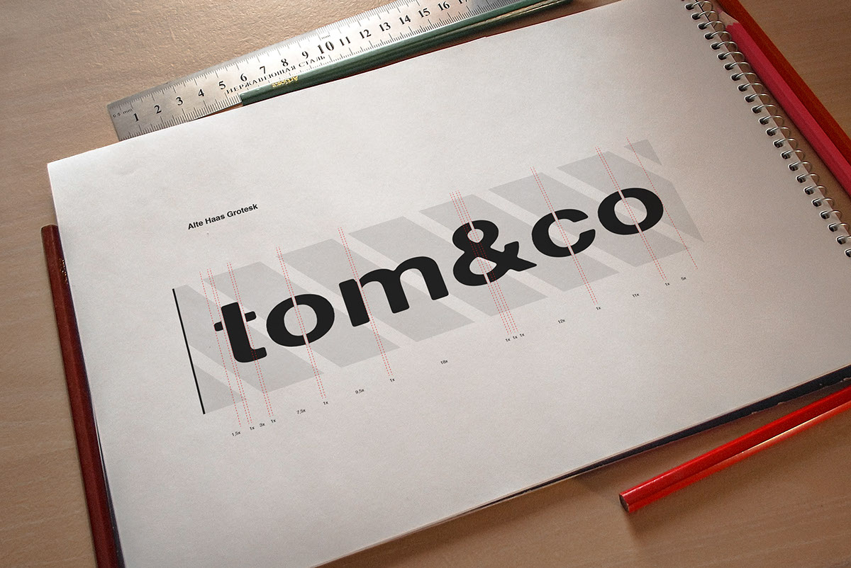
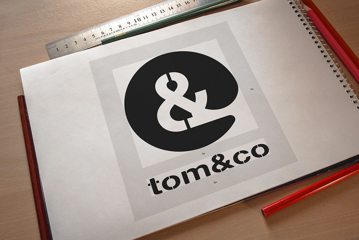
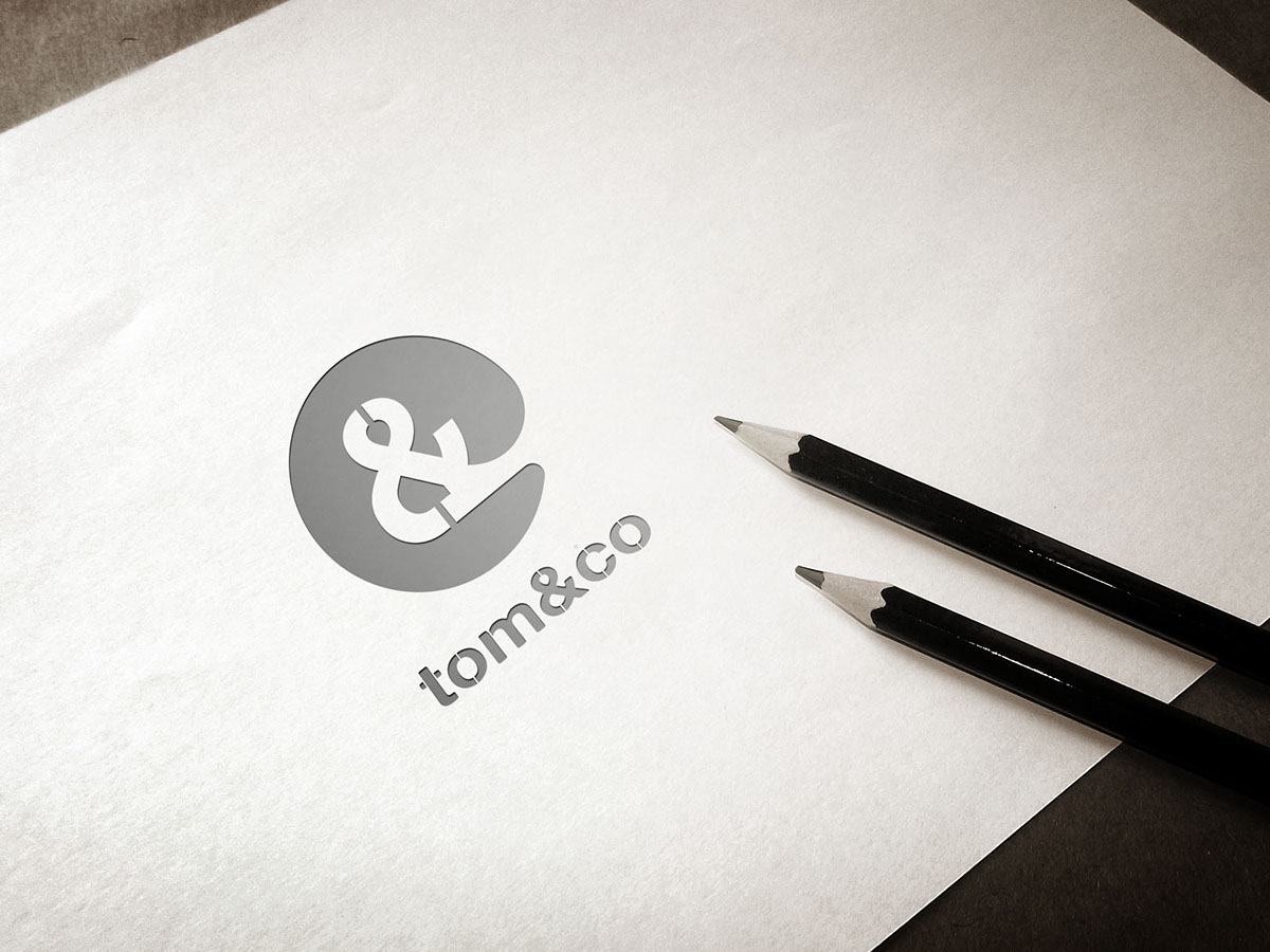
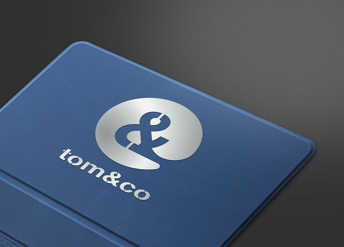
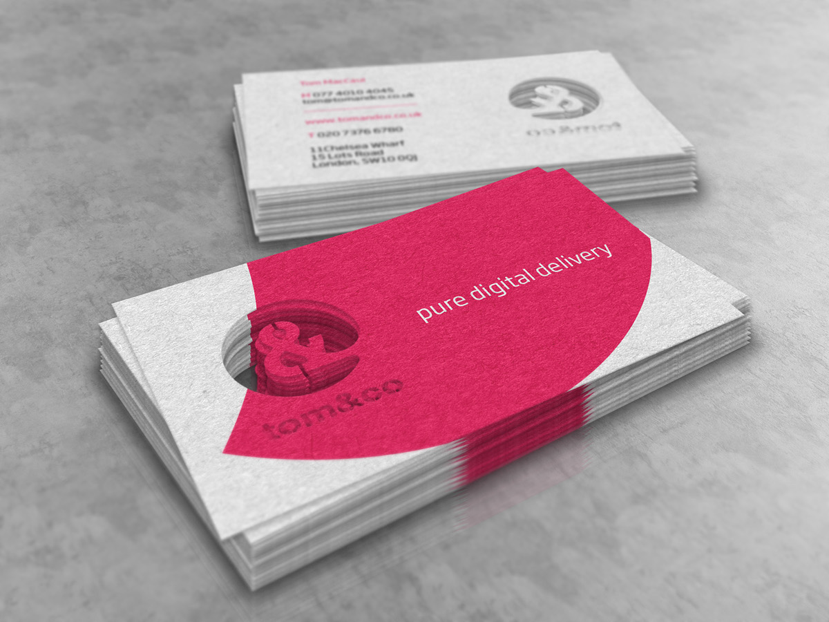
My role at Tom&Co was to create business cards, a new logo and a stencil for the latter. It was agreed that the logo had to revolve around the ampersand symbol and the color had to be magenta. Therefore, I engaged in a fun creative process and having in mind the relaxed team-spirit, various concepts were brainstormed.
In the first phase of the creative process, a distinct ampersand symbol was selected along with other emblems that represent the key qualities of Tom&Co. I then created a stencil that best captures the company’s friendly personality; to me this final task was fulfilling.