The Brief
Target group is classified as a young population with the dynamic lifestyle that appreciates good food, frequently goes out and has contemporary habits. In terms of ages the target group is mainly consisted from 21 years till 40 years old, males and females equally, who like to drink high-quality wines.
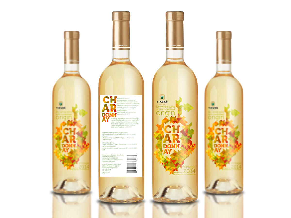
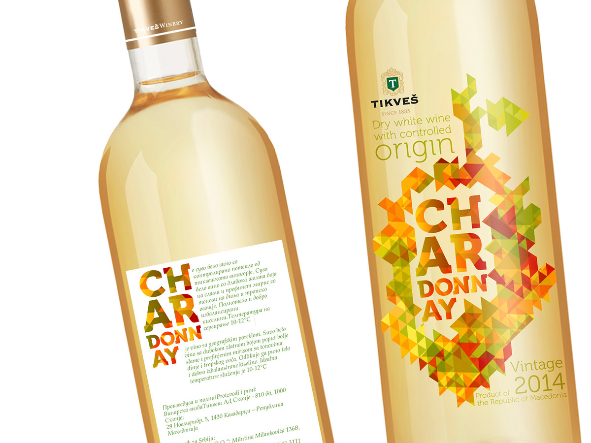
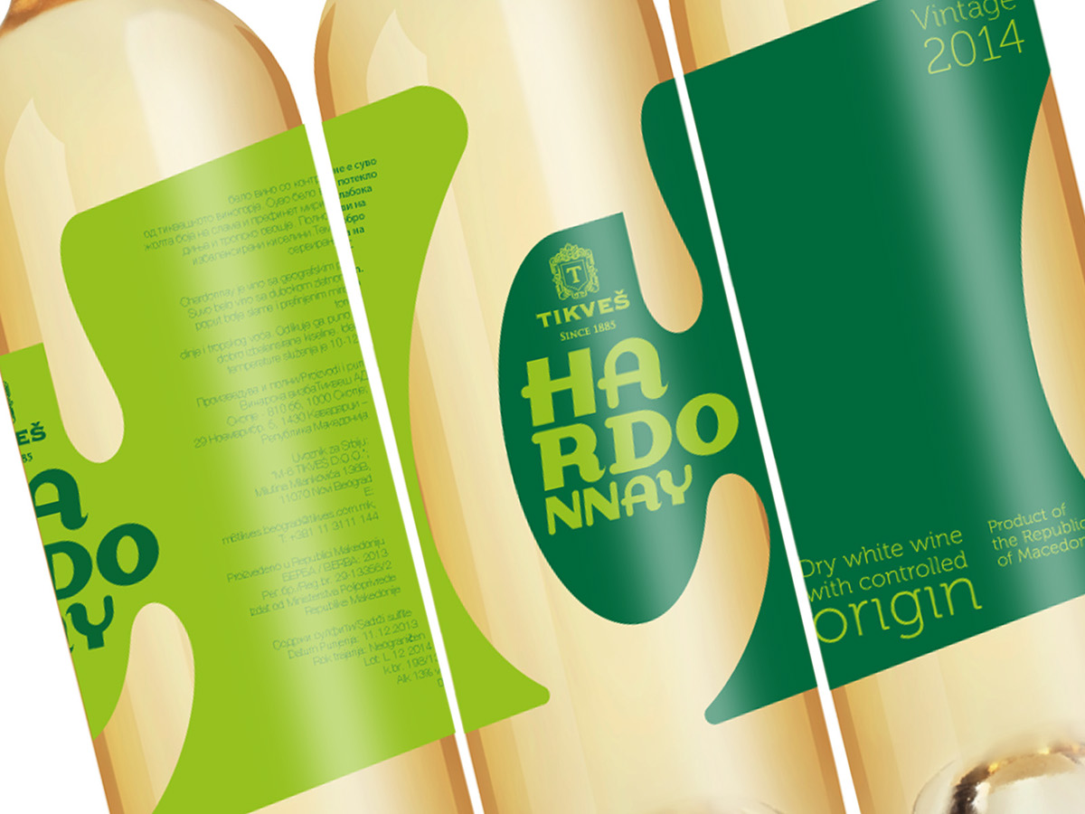
The wine is dry with rich golden colour and refined scents of melon and tropical fruit.
Concept and Idea
Mainly based on typography solution to target young population.
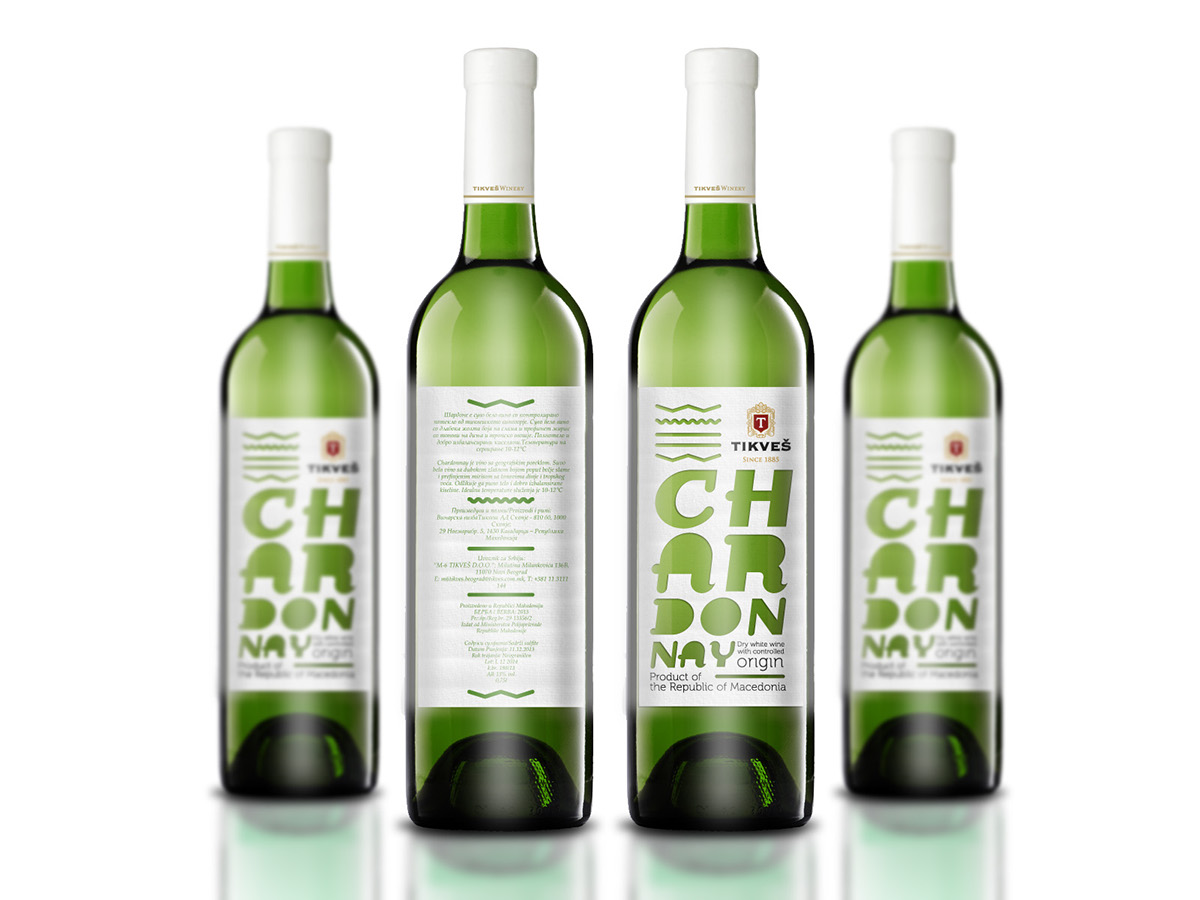
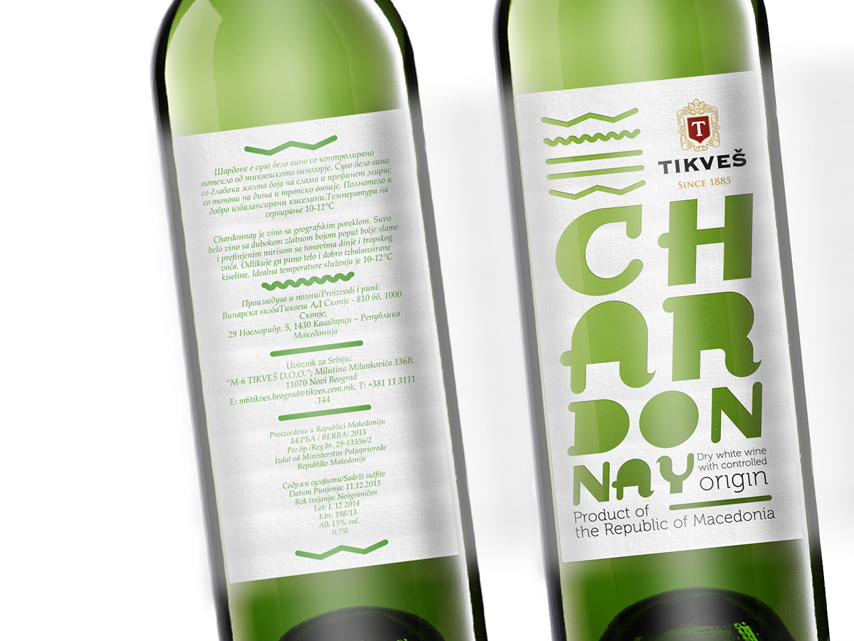
Label is inspired by Vardar valley, mountains, wind and river. Type and embellishments are die cutted.
Label is inspired by grapes, Vardar valley, Sun, rain, melon and tropical fruit.
White colour is printed on transparent film.


Label is inspired by bunch of grapes, illustrated in contemporary manner by using pattern style.
Colours are printed on transparent film.
Colours are printed on transparent film.
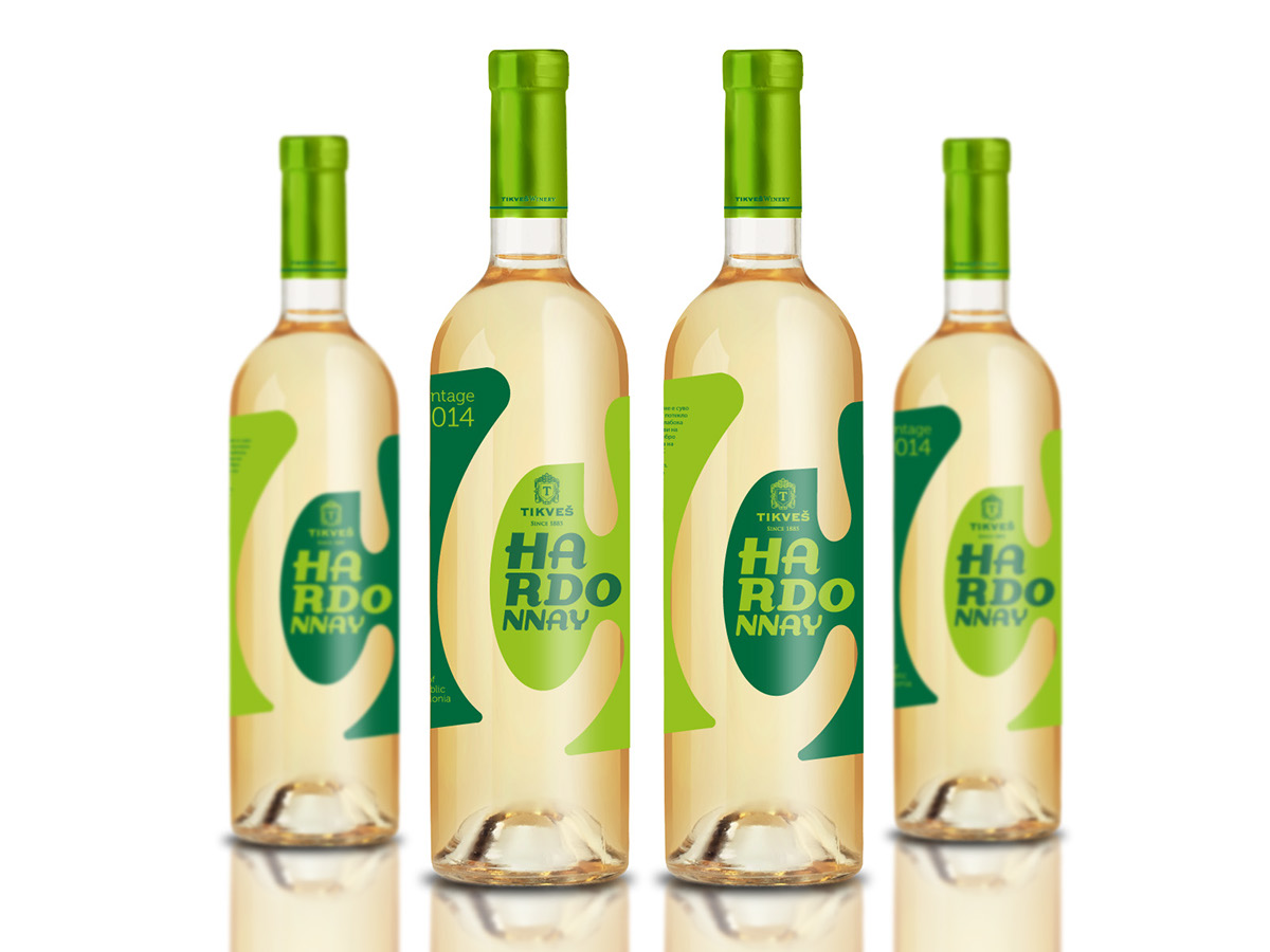
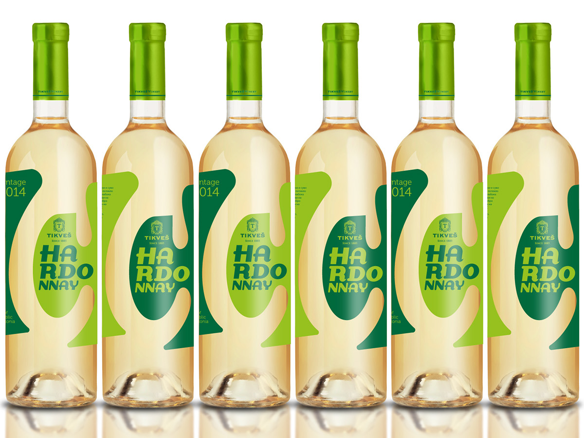
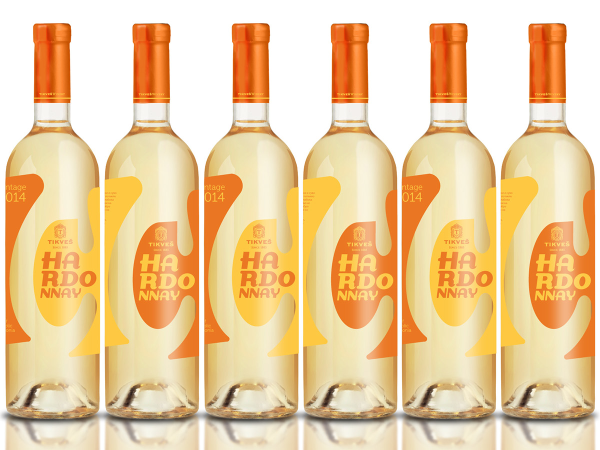
Label inspired by the insight that the wine is for daytime and also for night outs
presented in two colours. Continuous label is divided with die cutted letter C. Colour combinations could be numerous.
presented in two colours. Continuous label is divided with die cutted letter C. Colour combinations could be numerous.
Lime green and dark green represent freshness and citrus.
Light orange and dark orange represents melon and tropical fruit.
Black and gold combination is for special occasions such as New Year.

Colors inspired by summer, fruit, fun, night out.


