
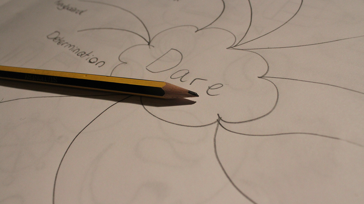
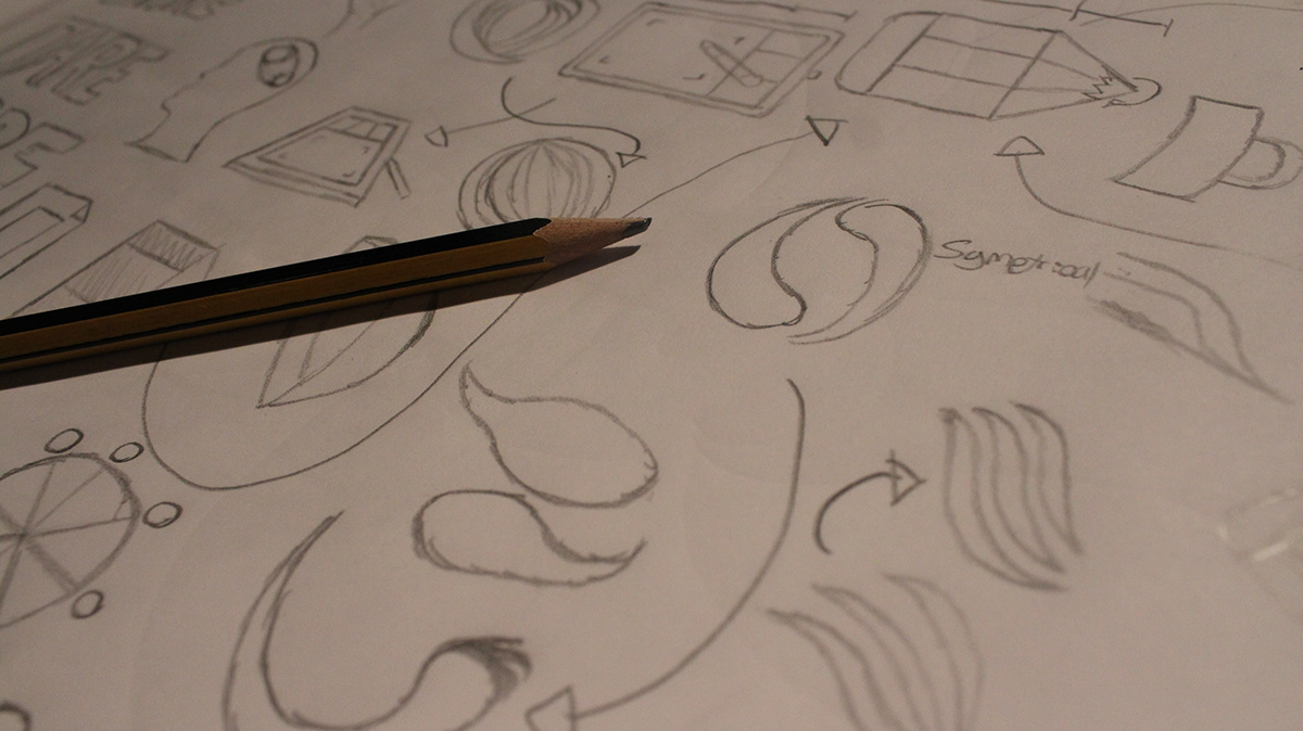
The Dare Arts Identity
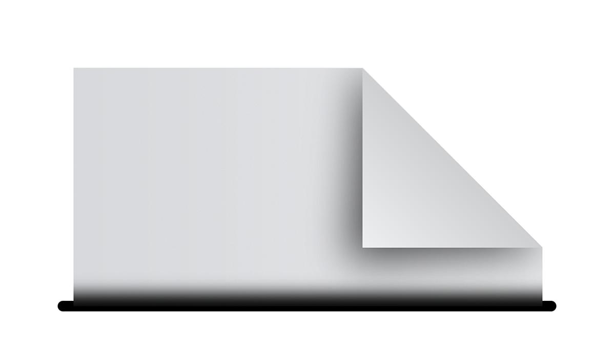
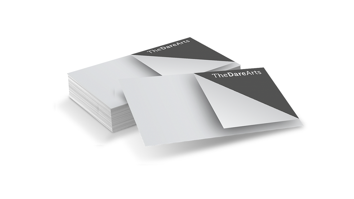
A lot of times designers overlook a very vital tool that we use all the time. Paper is used on a day to day basis by designers. This is a very simple design but it can be used in such a different array of ways.


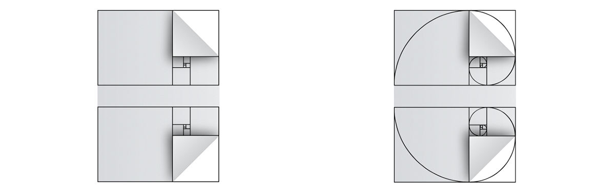
The Golden Ratio
The golden ratio is found often in nature and that's what makes it aesthetically pleasing. Here's how it was used in the Dare logo.
A ÷ 1.61 = B


Typeface
The typeface you chose to go alongside the business you're designing for is vital, personally I prefer to use webfonts but there are many creative fonts that go well with the companies design. I used Museo for this design because I felt it looks very clean and is also good for body text.

Shading
As I was using paper as a basis for this design It was important for me to avoid colour. As the theme of this design is based on drawing and sketching I chose a shade of grey similar to that of a HB pencil (the most common)


Thanks for viewing!
Please be sure to Appreciate the project to show me some support!


