The making of FF Quixo
–
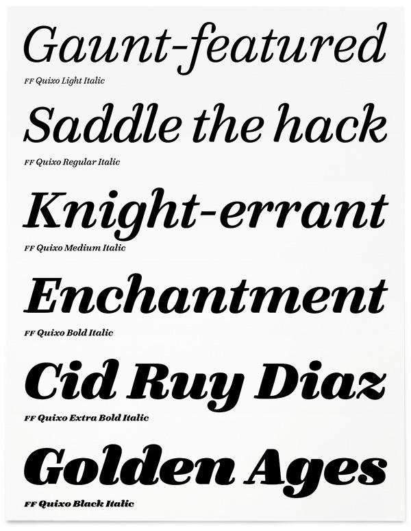
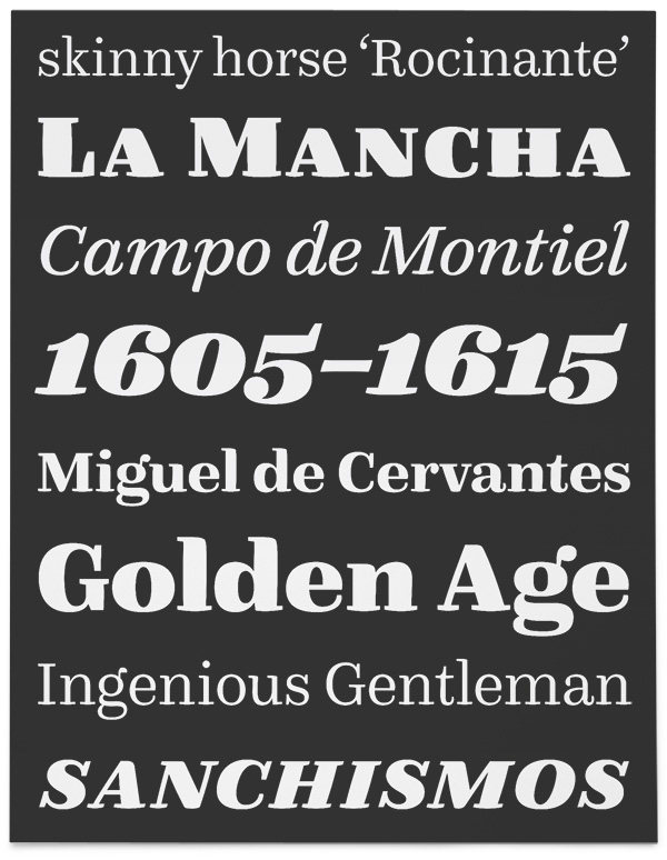
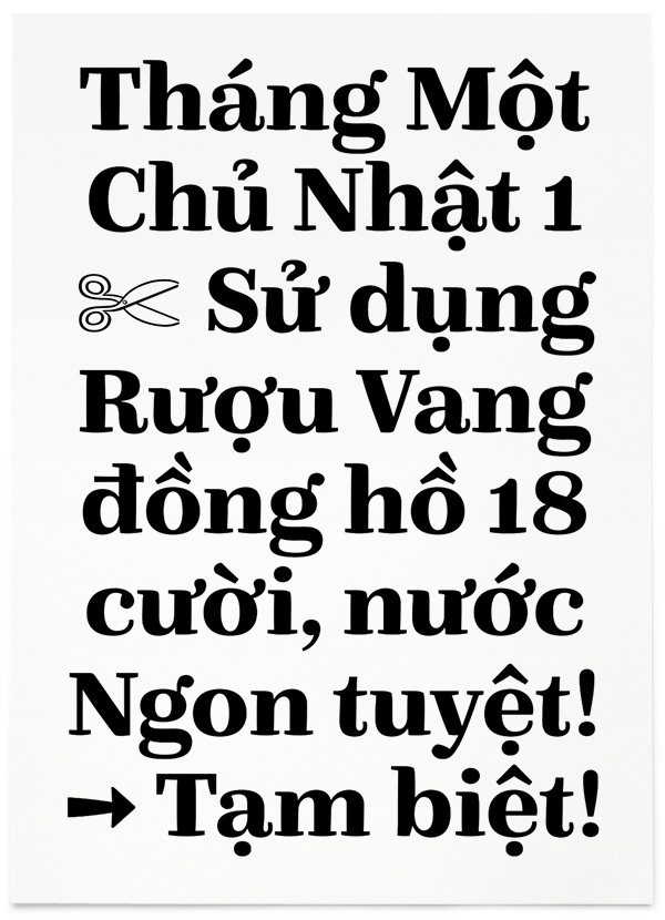
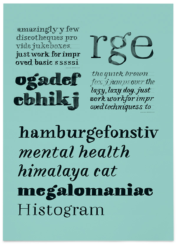
FF Quixo is a tool-based typeface family, rooted in handwriting and exploring the concept of increasing tool size in relation to weight. Frank Grießhammer’s diverse spectrum of 12 styles (6 weights with Roman and Italic in each) is suitable for compact and concise passages of text. It is a typeface that can show a playful side without looking goofy and is equipped with all the features and considerations needed to produce complex typography. With just the right amount of personality, symbols and whim, it also works to provide the necessary precision and finesse for more functional applications.
–
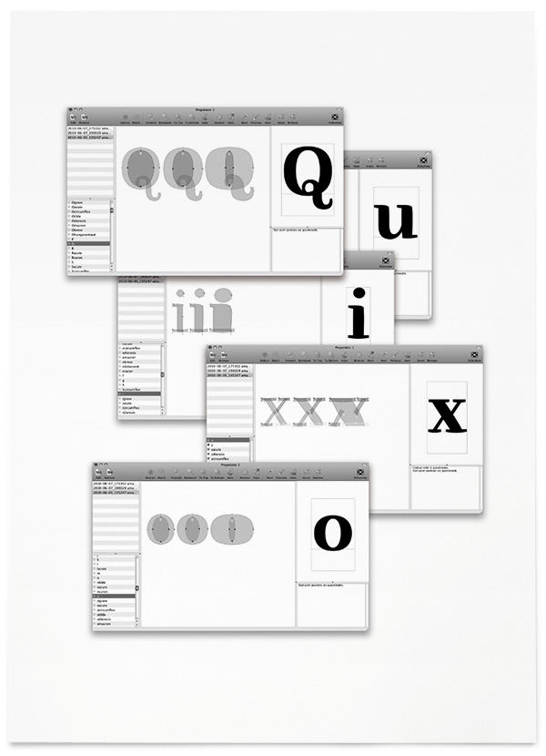
Images and captions extracted from Frank Grießhammer's Quixo process book which was also part of his FontFont TypeBoard submission.
–
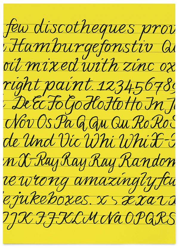
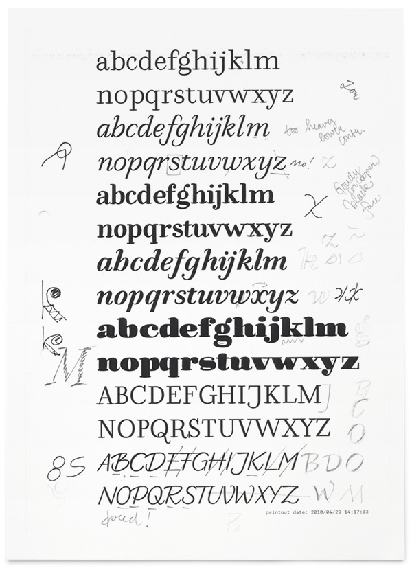
Regular/Regular Italic:
Pentel MLJ20 fountain pen

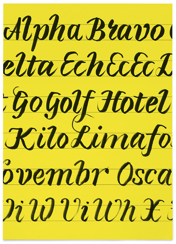
Bold/Bold Italic:
Faber-Castell PITT Artist Pen B

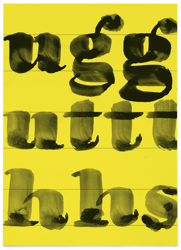
Black:
Very old Chinese pointed brush

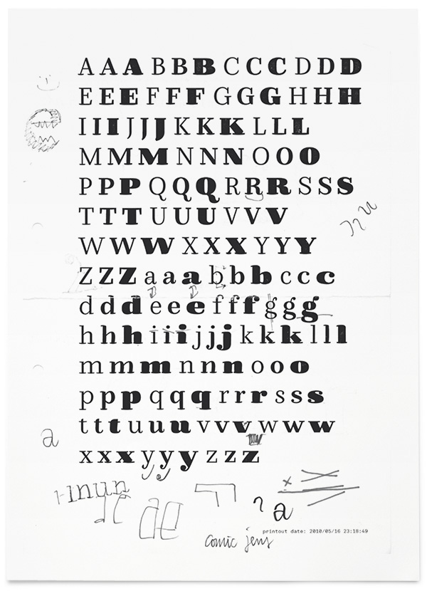
“I experienced that the different brushes I had used offered similarities, but also differences in detail. This fact was appealing to me in the context of type design, and worthwhile exploring.”
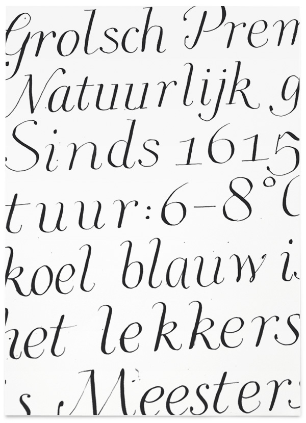
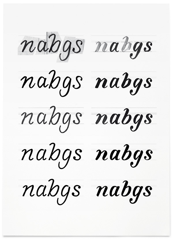
“As I very much had enjoyed pointed pen calligraphy in the first semester, the decision to focus on this style was taken quite early. I preferred the contrast and the freedom of shapes to the broad nib.”
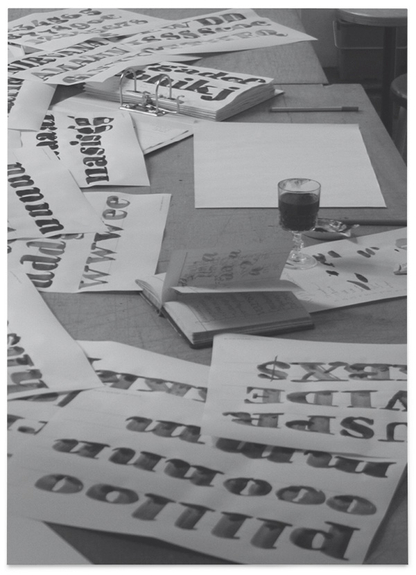
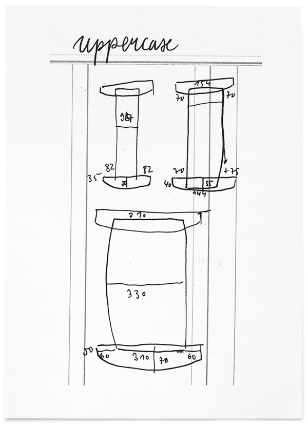
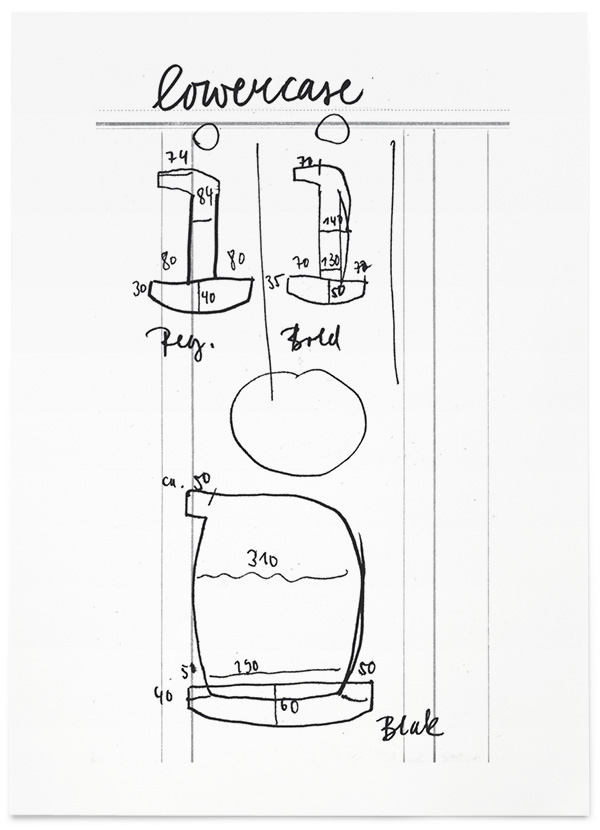
“As soon as the concept was defined, I decided to work on my project with a more thorough approach. I produced many more calligraphy sheets, focusing on similarities and differences encountered in the tools. In a second step, I scanned the sheets to print enlarged copies of them, which I manually traced on transparency paper.
As every weight was treated individually, it happened to be a quite time-consuming process. Nevertheless, I felt that this step was the most essential in the evolution of my project so far.”
Analogue / digital progression of Italic and Bold Italic.
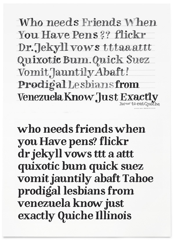
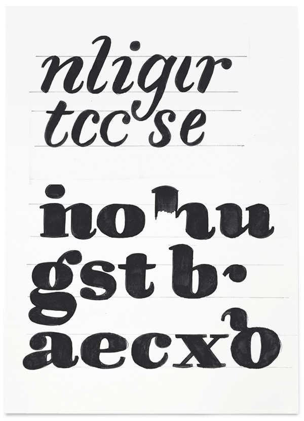
“As soon as the basic shapes were defined, I could get into the cycle of endless iterations through the various styles, in order to refine and expand them. The typefaces slowly moved away from the original drawings, and started to get a life of their own.”
The interpolation process elevated the project from a purely tool-based level to a more user-oriented (and useful) scale. The interpolation does not only represent a shape change from thin to thick – it changes the overall feeling of the typeface from being stiff (Regular) to loose (Black). Frank was also interested in thinking about what the imaginary interpolated tools would look like.
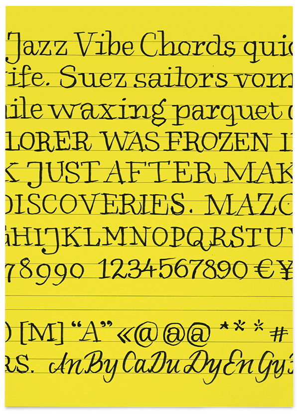
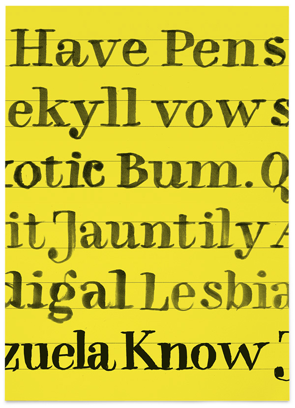
Specimens