The Southern Collection- Wine Packaging
Student Packaging Project
Student Packaging Project
Students were given a brief to produce packaging for a new wine that a major supermarket would then release.
The requirements were that given were to produce labels for 3 wines:
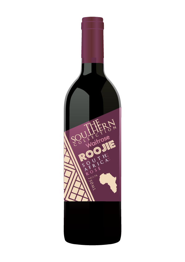
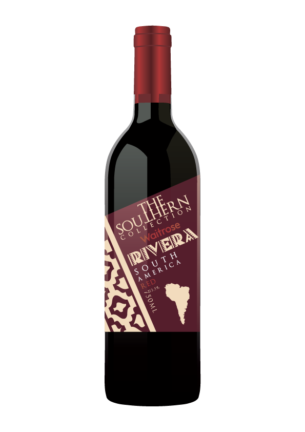
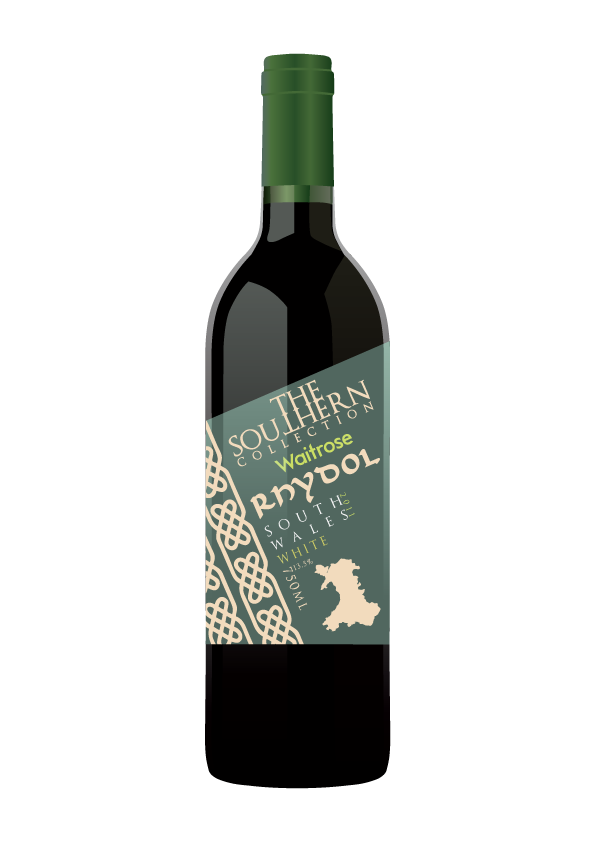
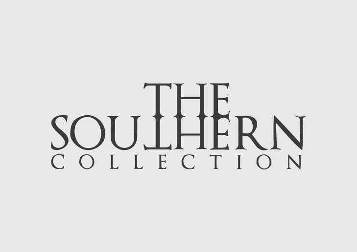
When I completed my research, I designed a logo for 'The Southern Collection' which would consistently appear on each wine label. I also decided to differentiate each wine not only by their colour, but by a cultural pattern and a typeface relating to their origin.
The finished label had a consistent layout throughout, and the top line of the label is tilted at an angle of 23.5 degrees, which is the axial tilt of the earth.
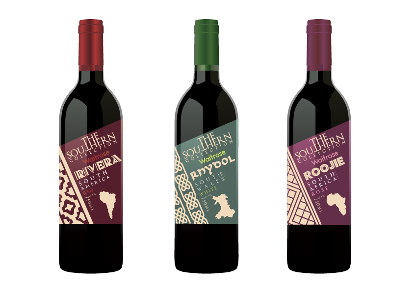

The logo that I created to include in each label plays on the word 'Southern'. The layout of the type allowed me to reflect the word 'the' and incorporate the reflection into the next word. The type I used also provides customers with a traditional feeling, but is combined with the modern style of the label.
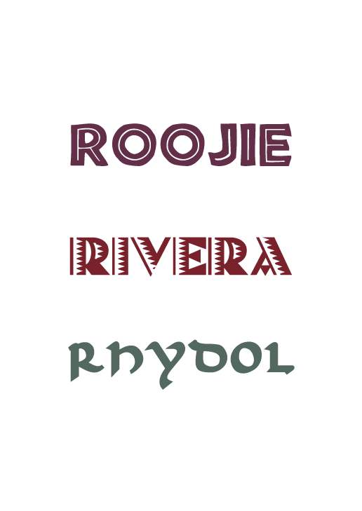
With 'Roojie', I used a typeface that reflects african culture, 'Rivera' was based upon Incan styles and 'Rhydol' was based on the Celtic heritage of the country.
The colours used were based on what type of wine each bottle held. Also the patterns were based on research into each culture.