FRONT END
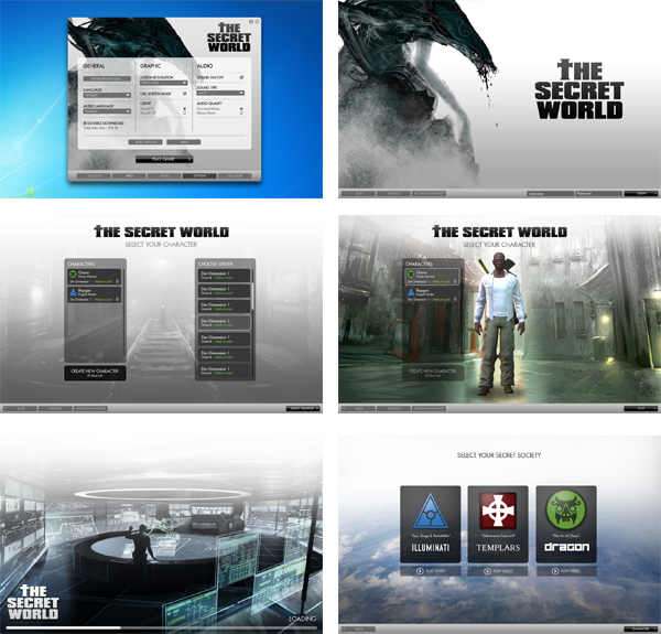
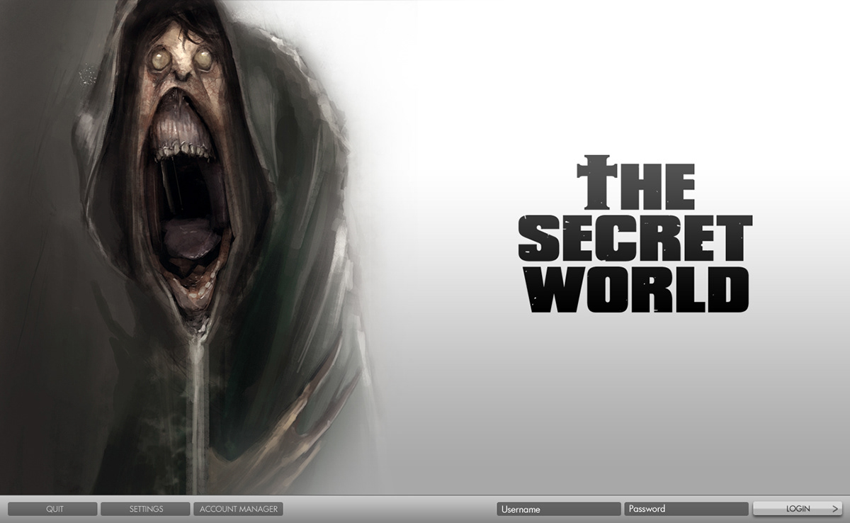
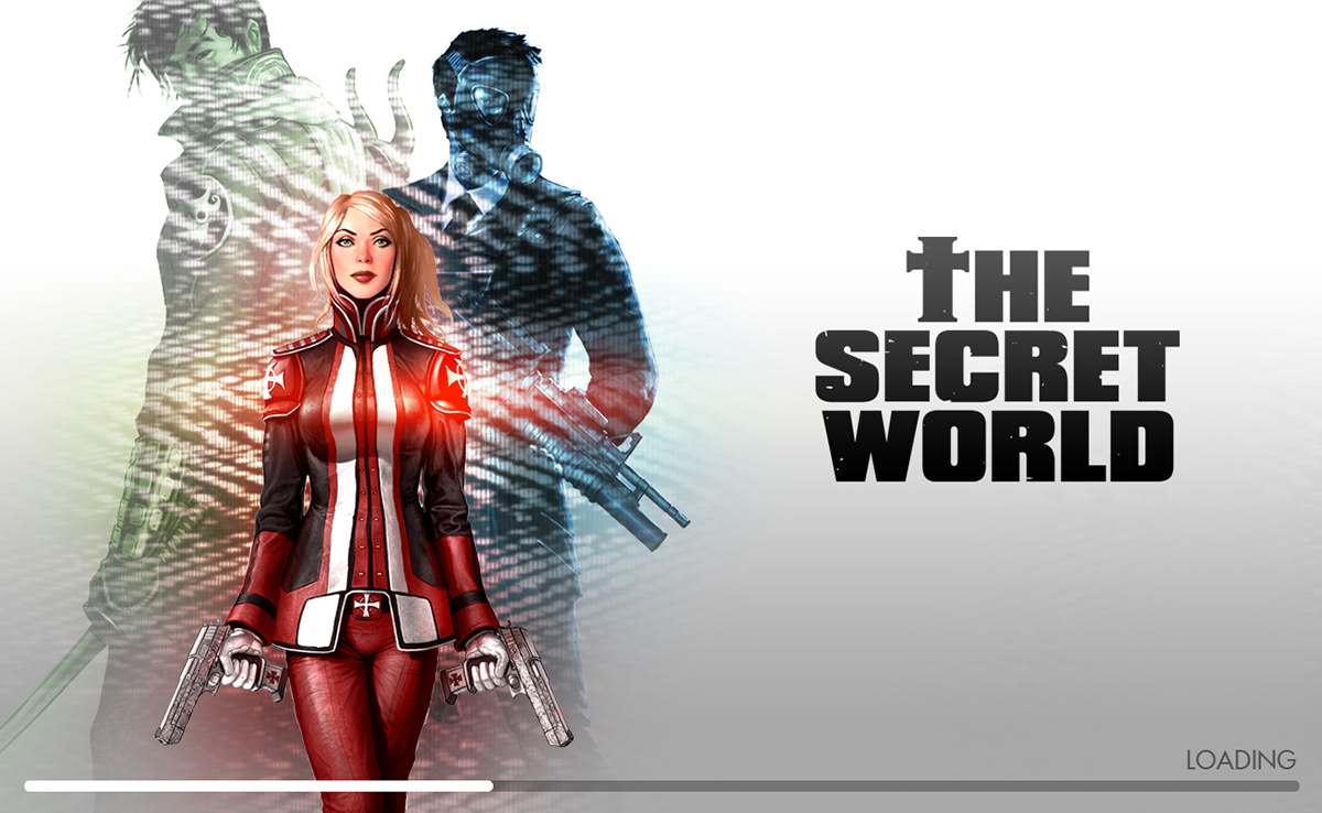
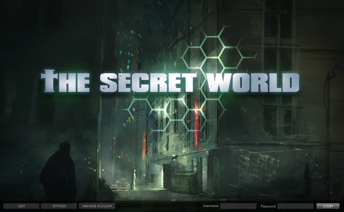
This was the latest flow that I did for the front end. The driving concept was simple, white, Apple-ish. Very different from the typical fantasy MMO.
ALTERNATE DESIGNS
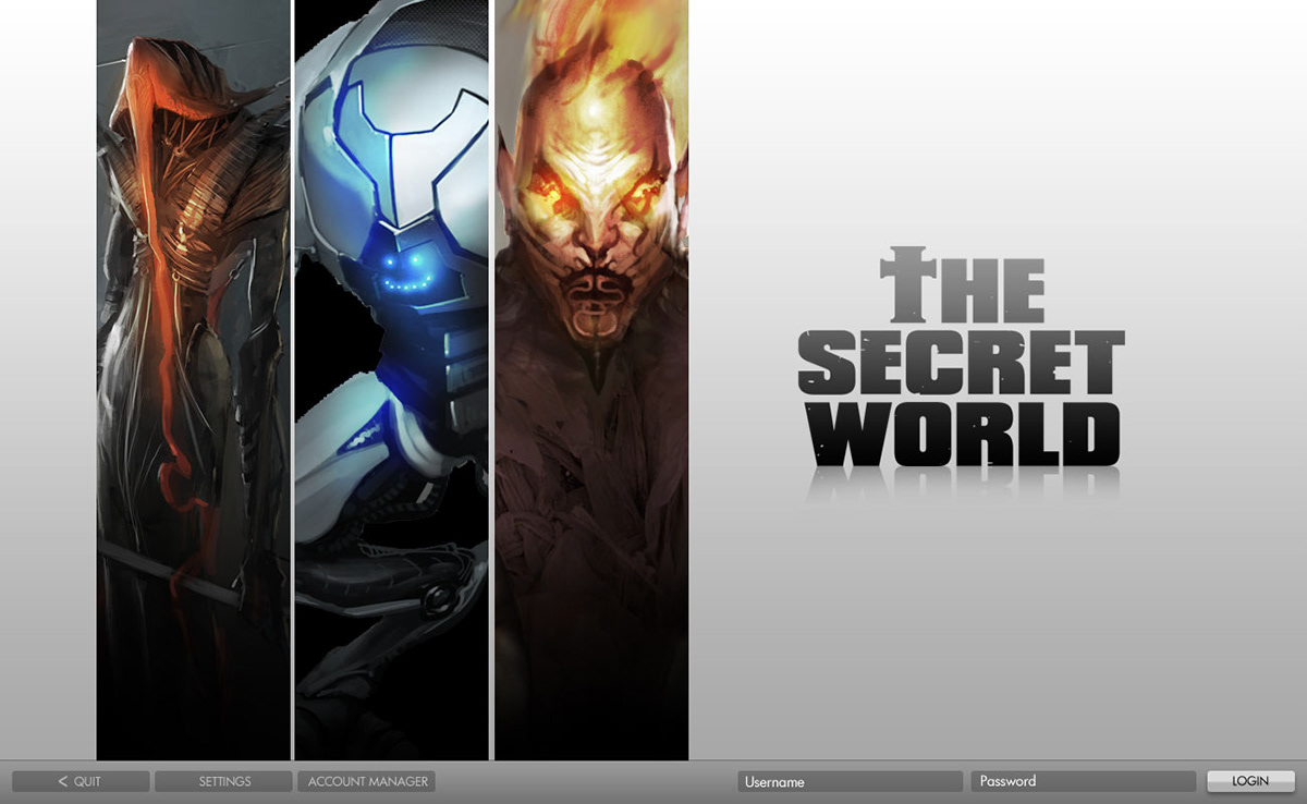
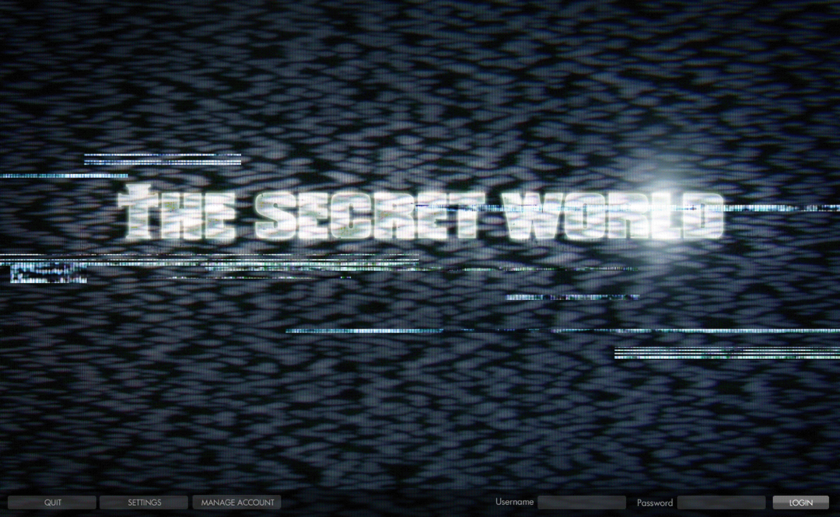
For me the fun part of every project is the mockup and experimental stage. This is where you can do pretty much what goes through your head. The project, having lots of Lovecraftian references, was great to visually explore.



ABILITY ICONS
Everybody know that MMO usually equal : an INSANE amount of icons. For The Secret World, the icons style that we used was clean and simple. This style would contrast to what typical MMOs use which are more illustrative and colorful, a bit like tiny concept art pieces. So it was chanlenging to have these stand out since they were basically all white on a colored backing.

ACHIEVEMENT ICONS
Since these needed to be more flashy and rewarding, design was adapted to have more textures and colors so that they poped out more.

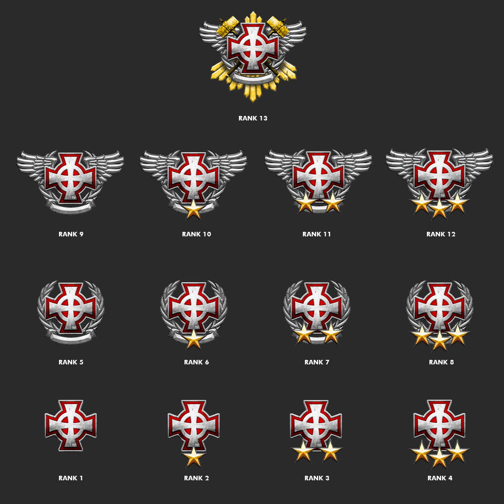
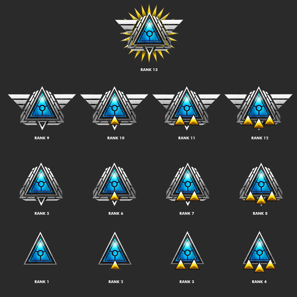
RANK MEDALS
These medals represent de different levels attained by the player. Each faction had it's own style, but shared the same logic as to how the medals would upgrade.
