The Roadhouse: Logo Redesign
Introduction
The Roadhouse Manchester is a self proclaimed sexy and gritty underground music venue that is known for it's regular hosting of live bands and artists from across the globe. Bands such as Muse, Blink 182, The Verve, Stereophonics and Kasabian have all performed at the venue, and it is this ability to draw some of the worlds finest musicians, that make it one of the most popular bars in the north west of England.
.
Project
Within our Advanced Communications Design module at the University of Salford, we were tasked with completing one of three briefs relating to different design based challenges. One of those briefs was to rebrand the logo for a Manchester based underground music venue by the name of The Roadhouse.
This redesign began with us heading to the bar in the city centre and asking the owner some questions regarding her personal opinions on the direction the rebrand should head in. After we collected this vital information, we went about generating a logo design that not only matched her own feelings, but one that also reflected the direction and emotion of the bar itself. We knew from the beginning that we wanted to create a design that was wild and free, while at the same time, we did not want to alienate a particular audience.
We knew that in order for our designs to be successful, we needed to attain a level of balance and strength that would both attract a wide audience, whilst also maintaining the roots of the business.
.
Original logo

.
American Longhorn Cattle Skull

This was our first design of a cattle skull, we felt it had a certain rock and roll aura about it, however, we also felt it was 'too' American for the brand that we were trying to create.
.
British Ram Skull

This was our second attempt at creating a skull based logo. We struggled to get this right as it was a little complicated due to the texture and shape of the horns. We definitely felt that this design was a failure and so we headed back to the drawing board to create something a little simpler and slightly more recognisable.
.

We decided that we would try and develop a new logo based on a silhouette rather than a skull, as the shape was beginning to veer away from the simplicity we wanted to achieve from the beginning. We created this silhouette of a stag, however, after discussing the shape with our peers and each other, we agreed that the design looked too much like a 'comedy moose' and it completely lacked an edgy personality.
.
Revised Stag head

Here is a revised version of our previous design. We have changed almost every aspect of the silhouette except the antlers. Firstly we altered the ears so that they were more proportionate of the head, then we added eyes to the design as we wanted it to have character and also have a somewhat menacing feel about it. After that we added rough fur the the neck and brought the lower neck to a point to give it a more gritty and edgy feel. These revisions, combined with the inclusion of a jawline, gave the Stag much more personality and we now feel it fits in with the rock and roll stlye a lot better.
.
Final Logo

We feel the type we have added to the design works well, although, on occasions we had some doubts as to whether the type made the logo design feel as though it was for an eatery or restaurant, however, the owner of The Roadhouse was extremely pleased with the outcome and so it remained the way it currently is.
.
Logo Beer Mats

.
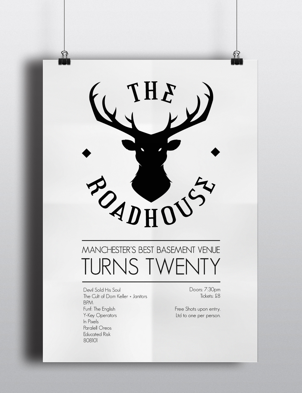
White/Black Poster Design

.
'The Roadhouse' Side Wall Branding

.
'The Roadhouse' Front Neon Signage


Thanks for Watching!


