The Narrows Book Design
Linoleum block etchings, screen printing, oh boy!
Linoleum block etchings, screen printing, oh boy!
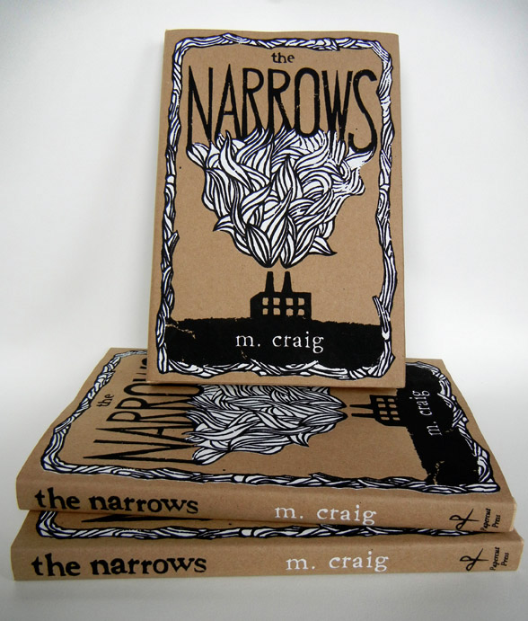
For this project, I tried to get my hands as dirty as possible from beginning to the end. The author (Maggie Craig) wanted a very DIY look for her novel, The Narrows, which is kind of a mix between Catcher in the Rye and Harry Potter - a dark coming of age fantasy filled with steampunk and brooklyn, NY imagery.
I decided to create a linoleum block illustration for the cover, keeping things super simple and cost effective as far as printing was concerned. We did a one color paperback cover on super recycled cover stock, and then we took it to the next level by screen printing 100 jackets for the limited edition hard cover.
I also got to design the interior layout of the book, bringing a classic elegance to the rough outer shell.
thanks for taking a look!
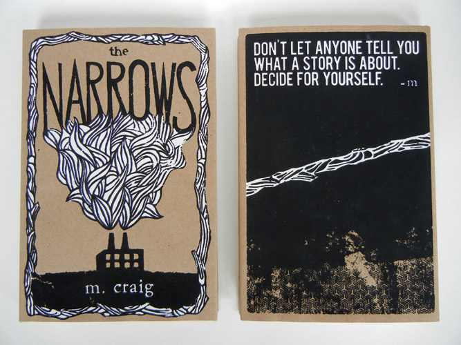
front and back of the limited edition, screen printed hard cover

the paperback version
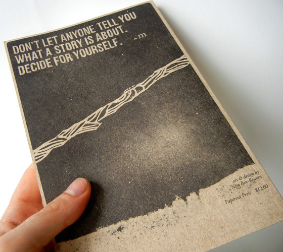
back cover, paperback version. is it just me, or is my thumb bizarrely straight?
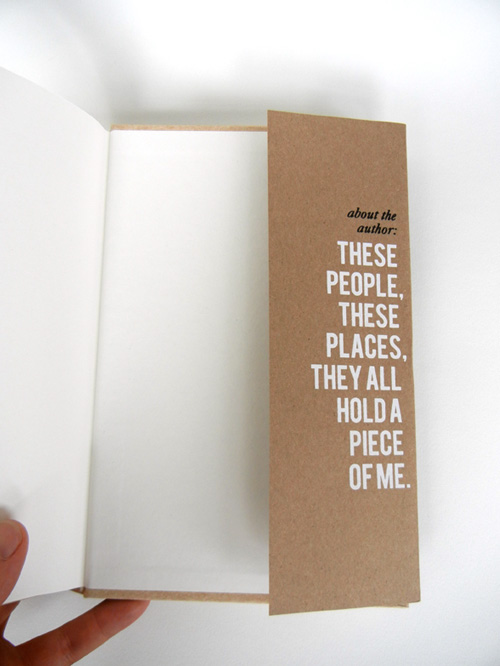
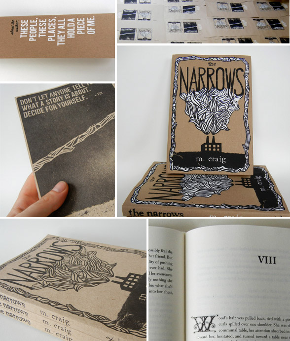
inner flap informations!
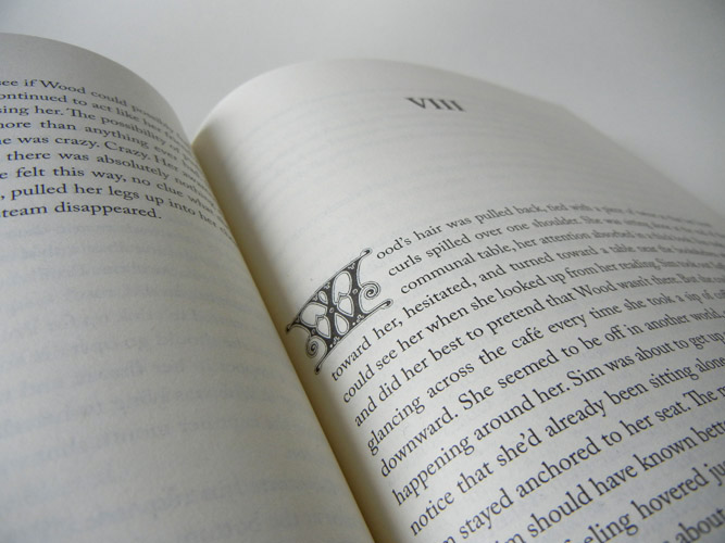
the insides... I got to play with crazy drop caps. yay fantasy novels! the book was set in Caslon, one of my favorite text typefaces.
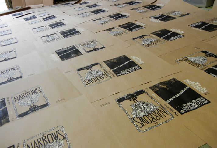
the hardcover jackets drying on the floor of my friend Dave Ulrich's impromptu studio in Philly.
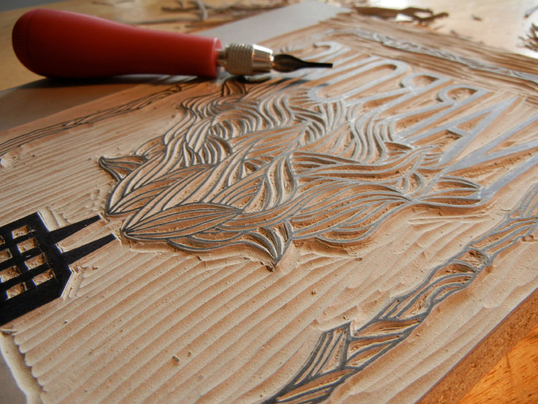
etching the linoleum.