The Menu Project
Creating a fine dining experience out of a hole-in-the-wall
Creating a fine dining experience out of a hole-in-the-wall
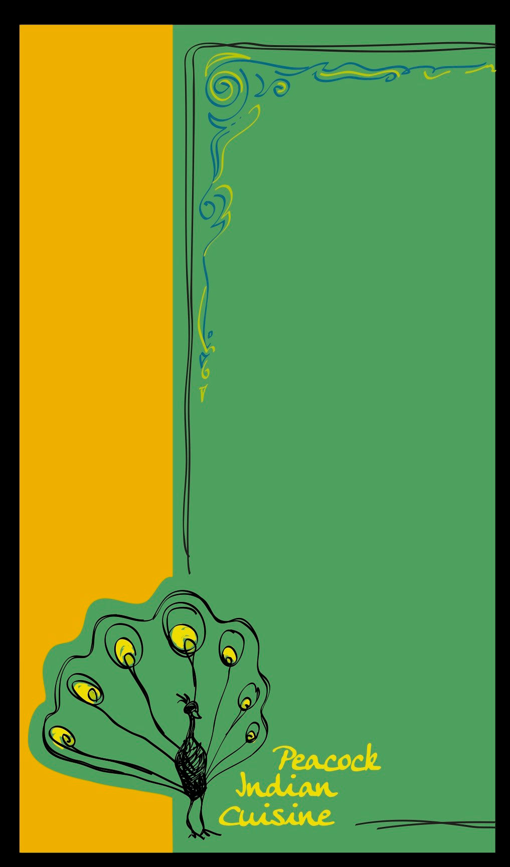
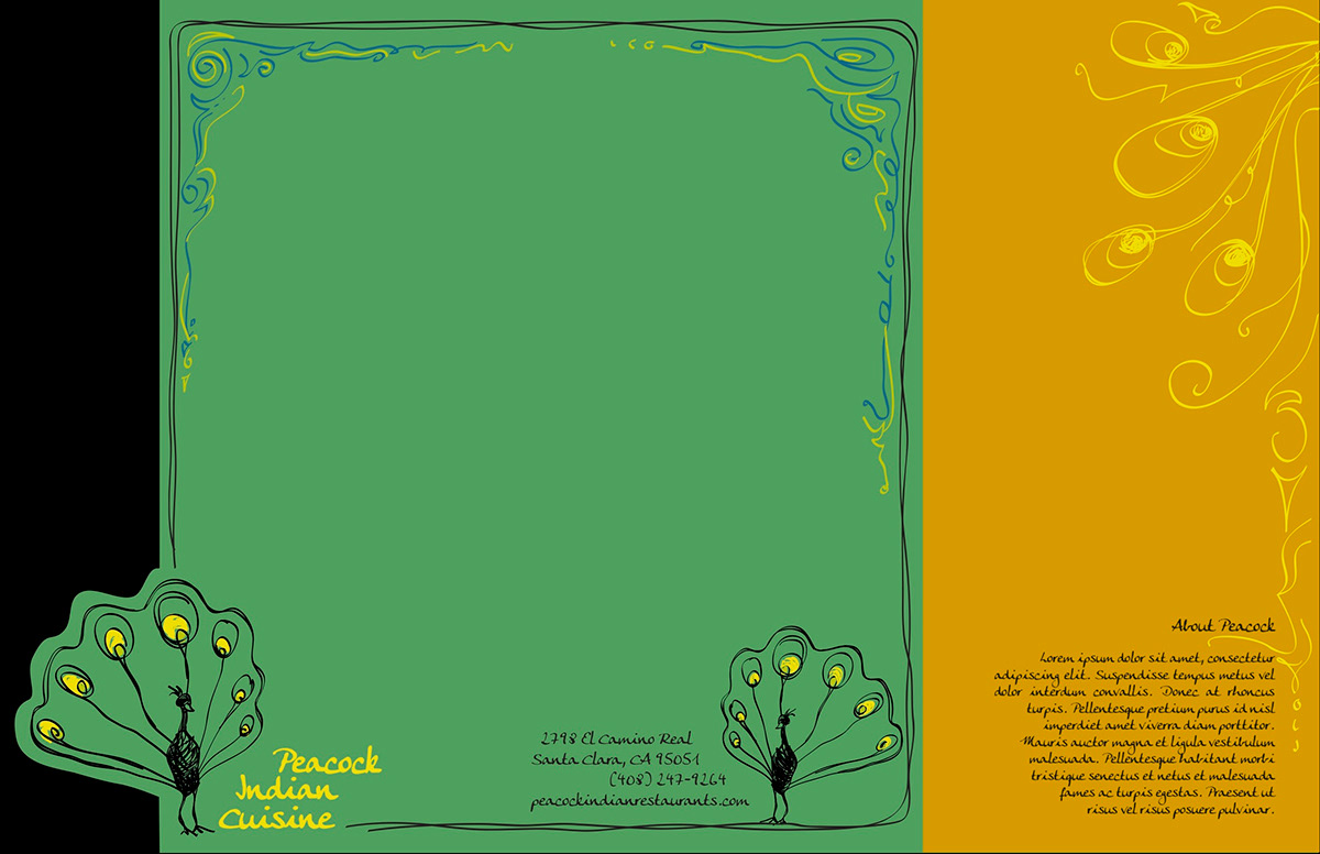
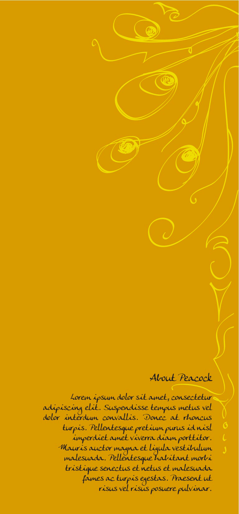
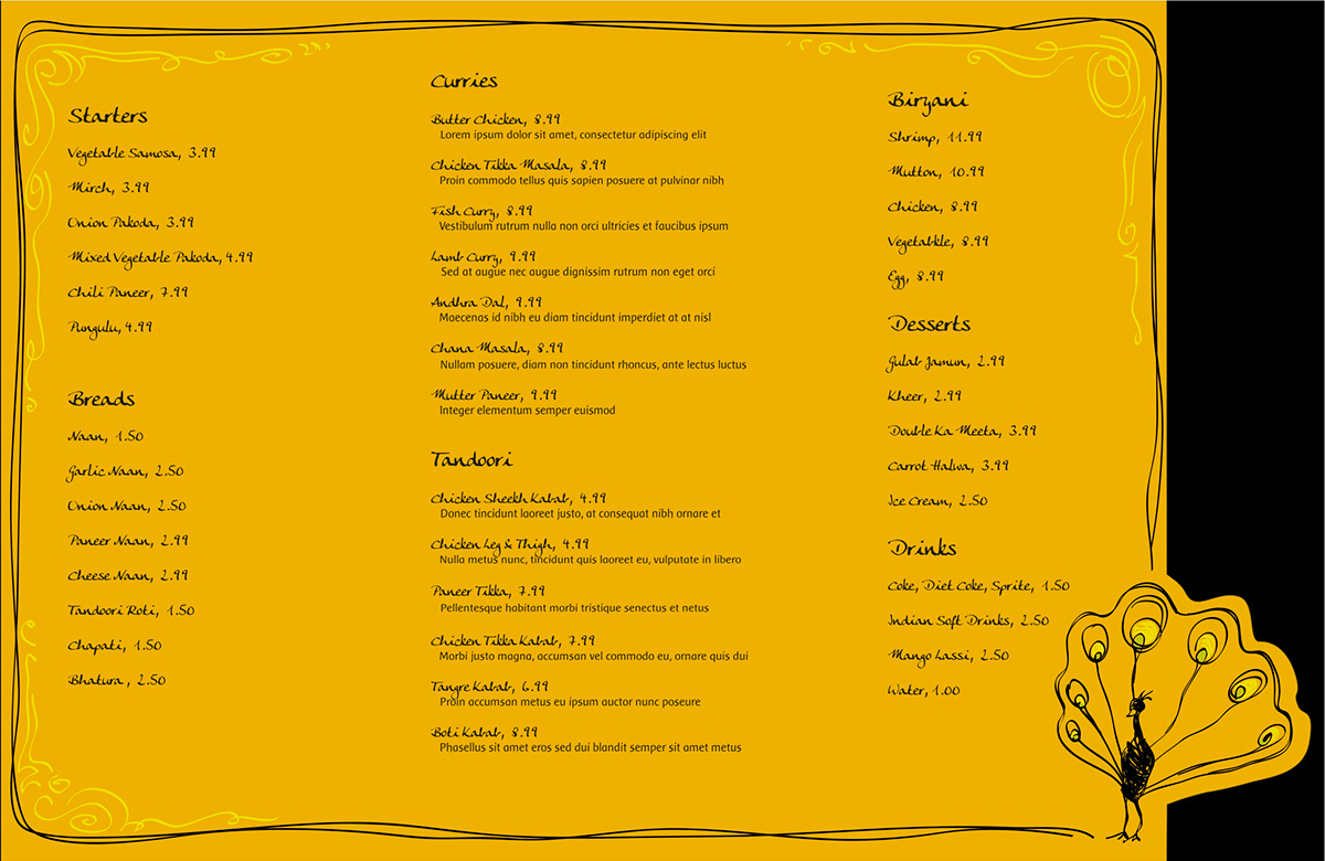
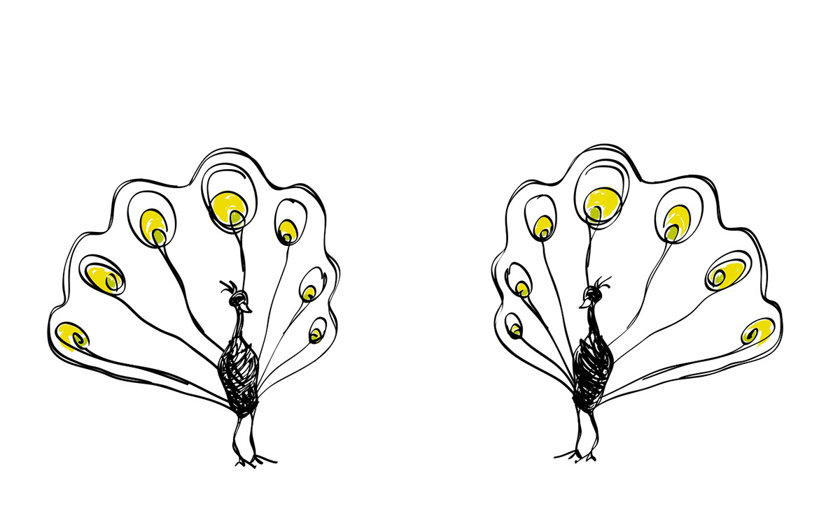
We were asked to choose a restaurant, preferably a not-so-fancy, not-so-flashy joint whose branding and menu we could re-create into one of a higher caliber. I chose my favorite Indian restaurant in the South Bay and decided to take an approach that combined traditional associations and modern simplicity. I used the warm yellow ocre color of curry and ornate Eastern details on the borders, while creating an organic, hand-drawn effect with the peacock logo and its surrounding accents. The illustrative details combined with the color palate tells the guest that the restaurant is nice, yet approachable. You will walk through the front door, smell the Tikka curry, and know that your meal is being assembled from the finest ingredients with love and care.