BREAKDOWN
From director Ridley Scott, based on the novel by Cormac McCarthy. A successful lawyer becomes
entangled in a complex drug plot, through nasty twists falling deeper and deeper in over his head.
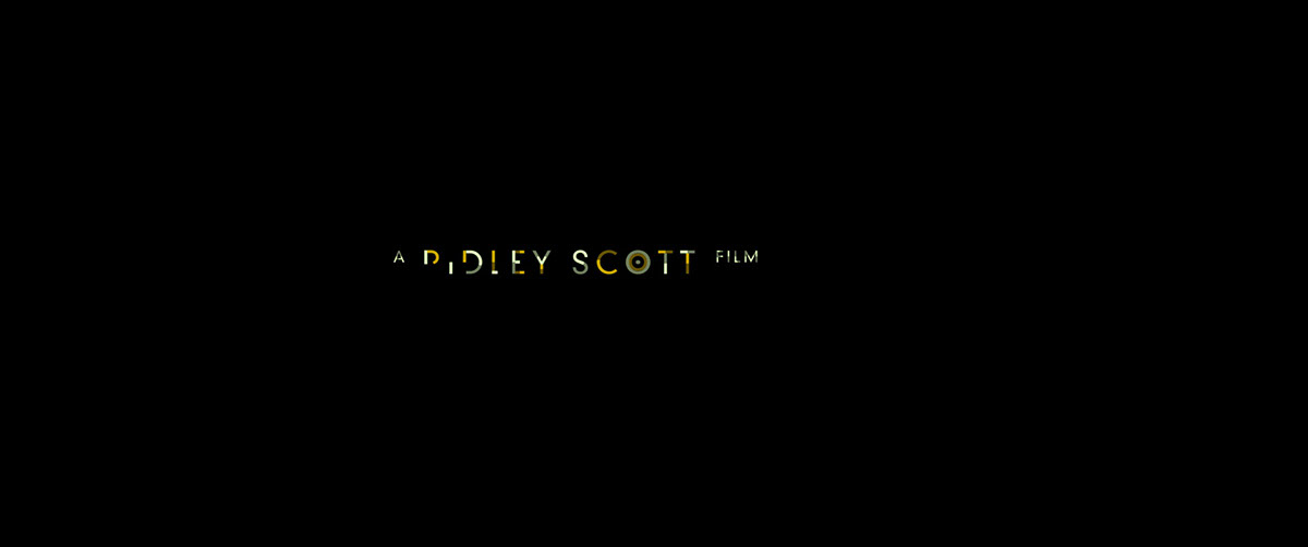
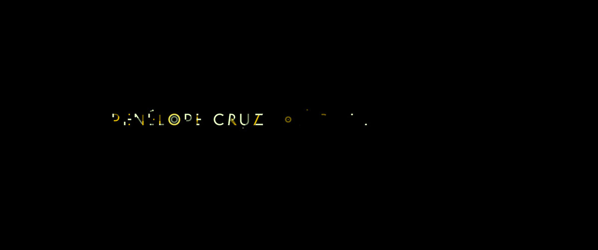
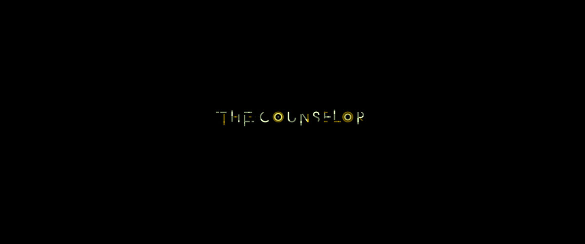
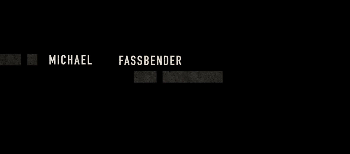
Working with Ridley Scott and editor Pietro Scalia I developed a simple but elegant sequence of typographic choreography which inter-cuts with vignettes introducing the main cast.
The typography reflects the interweaving characters and plot line, subtly transitioning from one credit to the next in unexpected and surprising ways.
The colour palette in turn echos the sunburnt landscape of New Mexico in which the plot is set and the
pet Cheetah of one of the main characters played by Cameron Diaz.
Director: Andrew Popplestone
Producer: Tom Bromwich
Produced at Momoco
INITIAL EXPLORATION
The initial intent was to use a typeface that was simple and clean yet human and gritty at the same time.

ALTERNATIVE ROUTES
Adding texture and taking inspiration from the sun-bleached landscape and gritty environment of New Mexico in which most of the story is set. Also hinting at unseen or as yet unrevealed information.


FURTHER DEVELOPMENT

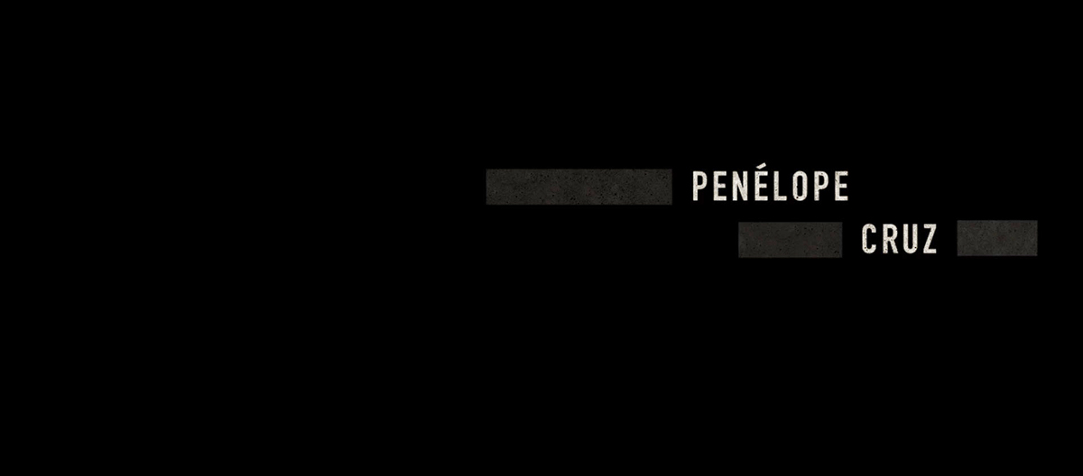
Final
The final result was a two-tone colour combination that echoed the sun-bleached landscape of New Mexico and also complimented the animation style. Like pieces of jigsaw coming together to form the credit and then breaking apart and transitioning into the next.

ANIMATION [See Top]
Like the ever evolving, twisting plot, the credits migrate slowly across screen towards its inevitable conclusion, interlinking and connecting the characters.