
This was a semester long research and branding project. I took the exisiting Cleveland Indians logo and redesigned it to make it not so controversial. I focused on the fans and their faith to their team. I also incorporated social media into my final application of the new logo.


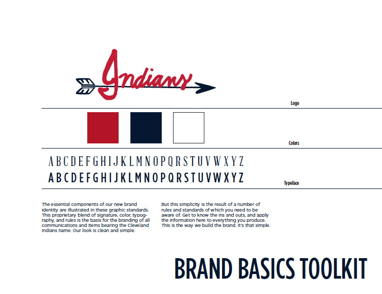
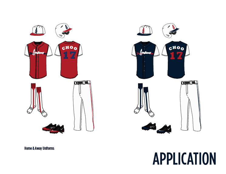
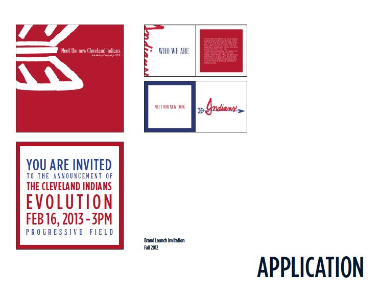
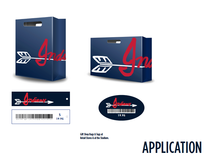
The essential components of our new brand identity are illustrated in these graphic standards. This proprietary blend of signature, color, typography, and rules is the basis for the branding of all communications and items bearing the Cleveland Indians name. Our look is clean and simple. But this simplicity is the result of a number of rules and standards of which you need to be aware of. Get to know the ins and outs, and apply the information here to everything you produce. This is the way we build the brand. It’s that simple.


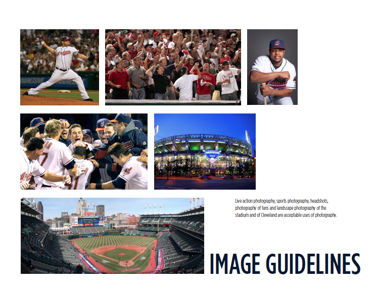
Live action photography, sports photography, headshots, photography of fans and
landscape photography of the statium and of Cleveland are acceptable uses of photography.

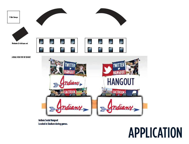
Located at all Home games - Pop up displays for a "Twitter & Facebook Hangout"
including iPads to 'check-in' and update status' and tweets. The first 250
people of each game who come to the Hangout would receive a shirt.


