Temple Tree Branding
Initial Concepts
Initial Concepts
Background
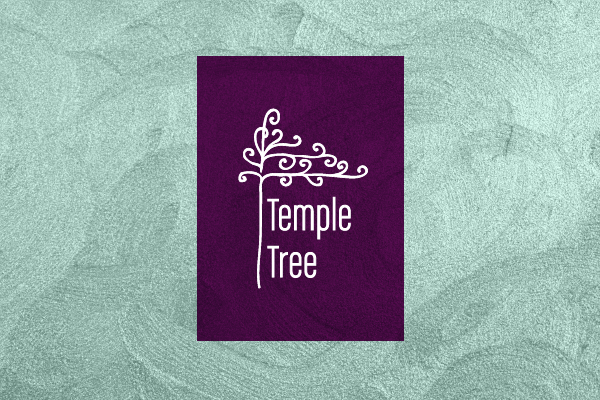
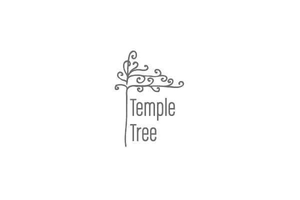
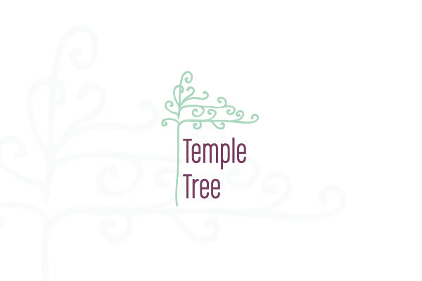
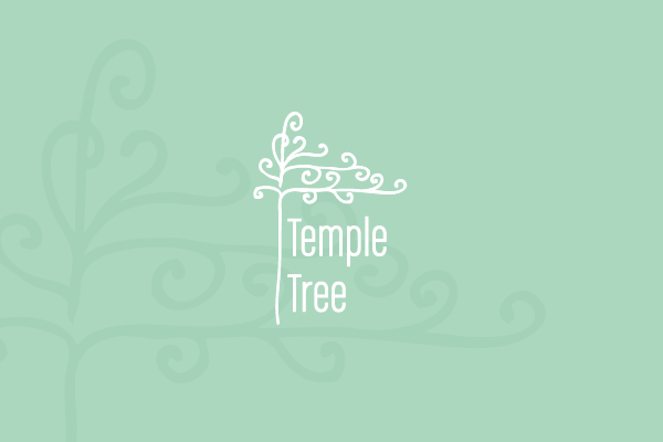
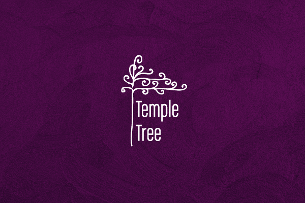
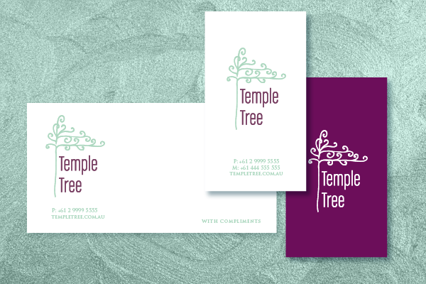
Temple Tree is a reiki & aromatherapy practice in Sydney, Australia that aims to offer an oasis of wellness and relaxation to its clients, a place where people can heal, find peace and get in touch with the sacred light within themselves.
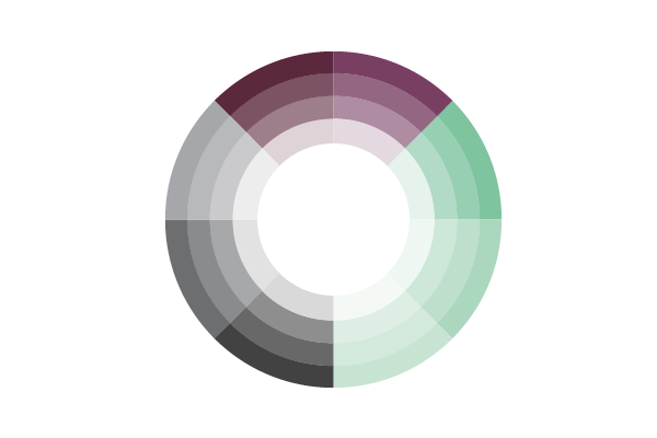
The brief called for organic, fluid lines, as well as a colour palette that contains tints specific to the Feng Shui elements water and metal: gold, white, blue, silver, violet.
For the purpose of keeping the designs soft and relaxing, colours inspired from nature have been used for these concepts: aqua blue, aubergine, gold and the soft green implicit to the "tree" aspect of the name.
Temple Tree is a reiki & aromatherapy practice in Sydney, Australia that aims to offer an oasis of wellness and relaxation to its clients, a place where people can heal, find peace and get in touch with the sacred light within themselves.
The brief called for organic, fluid lines, as well as a colour palette that contains tints specific to the Feng Shui elements water and metal: gold, white, blue, silver, violet.
For the purpose of keeping the designs soft and relaxing, colours inspired from nature have been used for these concepts: aqua blue, aubergine, gold and the soft green implicit to the "tree" aspect of the name.
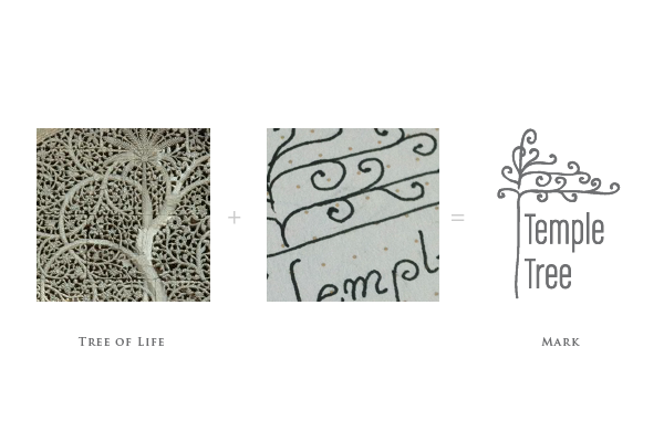
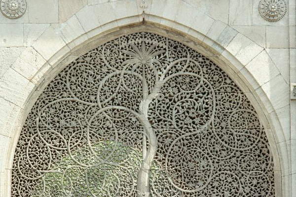
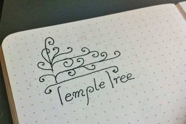
Concept One: Tree of Life
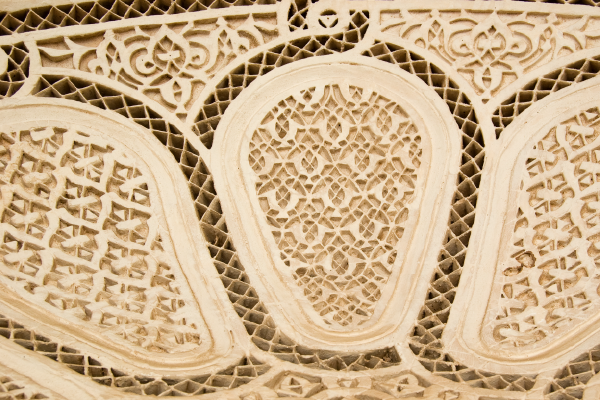
The second concept is loosely based on the Tree of Life depictions found in Moorish designs. However, as opposed to the precise lines used in Arabesque designs, this concept relies on a hand-drawn approach, with very organic linework.
The second concept is loosely based on the Tree of Life depictions found in Moorish designs. However, as opposed to the precise lines used in Arabesque designs, this concept relies on a hand-drawn approach, with very organic linework.


Concept Two - Arabesque Stamp
This is a concept based on floral arabesque patters and the heart-shaped leaf of the Bodhi Tree. The centre of the stamp features a double "T" for the Temple Tree initials.
This is a concept based on floral arabesque patters and the heart-shaped leaf of the Bodhi Tree. The centre of the stamp features a double "T" for the Temple Tree initials.


Concept Three: Flow / Wave
This concept is based on the pyramidal structure of temples across a wide range of cultures, as well as a water ripple pattern. It has been drawn in brush strokes that hint at the kanji calligraphy of reiki symbols.
This concept is based on the pyramidal structure of temples across a wide range of cultures, as well as a water ripple pattern. It has been drawn in brush strokes that hint at the kanji calligraphy of reiki symbols.


Concept Three -
