TALOS Packaging Systems
Brand Identity
Brand Identity
About Talos
While I was working at Definitive Creative I was requested to desing the new brand identity for Talos Packaging Systems.
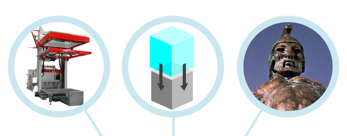
Talos is a pioneering end-of-line packaging service provider based in Leeds, UK. They operate as a turnkey business, offering bespoke packaging solutions from sourcing used shrink/stretch hood machinery and parts, to facilitating the installation of state of the art industrial packaging systems.
In Greek mythology, Talos (/ˈtɑːlɵs/; Greek: Τάλως, Talōs) or Talon (/ˈtɑːlɵn/; Greek: Τάλων, Talōn) was a giant man of bronze who protected Europa in Crete from pirates and invaders. He circled the island's shores three times daily.
There is a straight resemblance between the mechanical figure of Talos and the hooding machines that the organisation produce. These modern Taloses encircle the paletted products wrapping them with a protective film that ensures their safety during transportation, handling and storage.
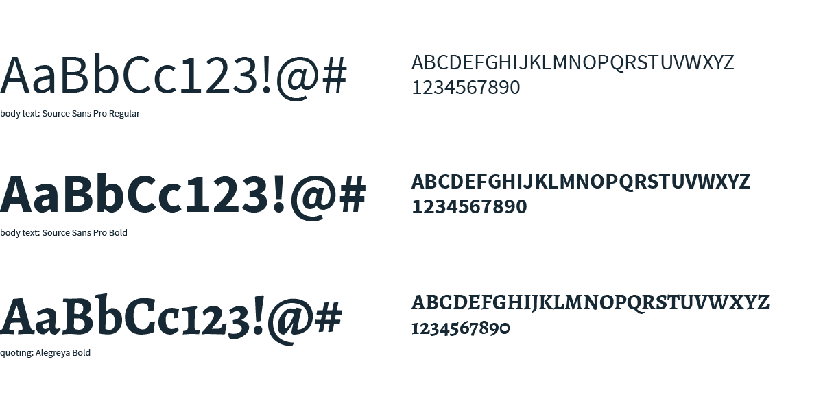
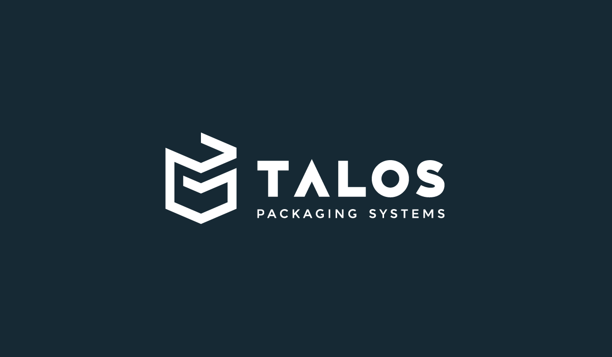
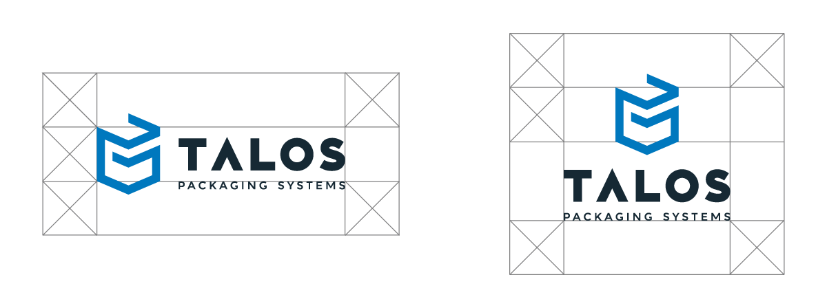
Talos' icon draws inspiration from the actual hooding machines and from the mythological Talos. It can be seen as either a two or a three dimensional shape and portrayes the dynamic and bold spirit of the company. The custom typography with the uppercase letters reflects the heavy machinery with it's bold lines and it's geometric and dynamic shapes.
Ideas

The icon

Typography

Typefaces
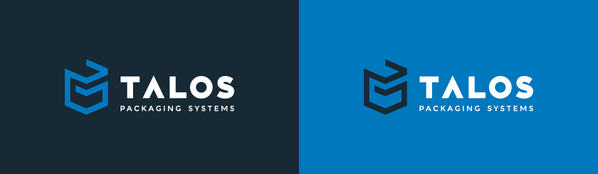
Colours

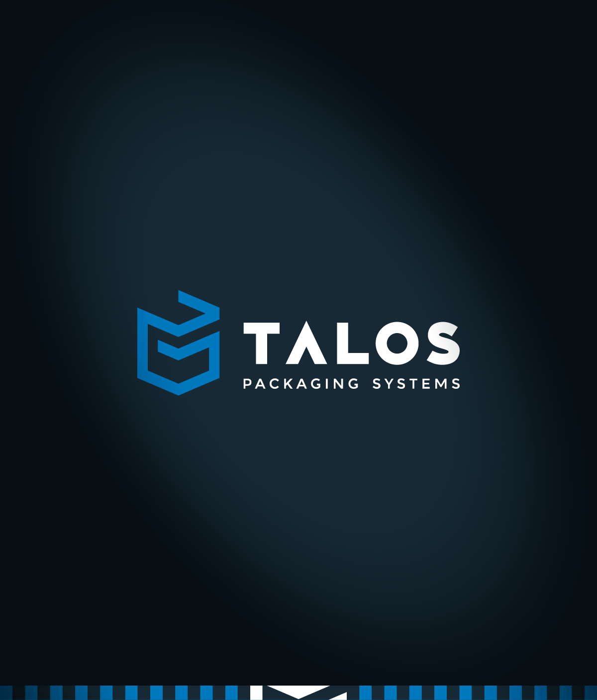
The logo

Staging
Element

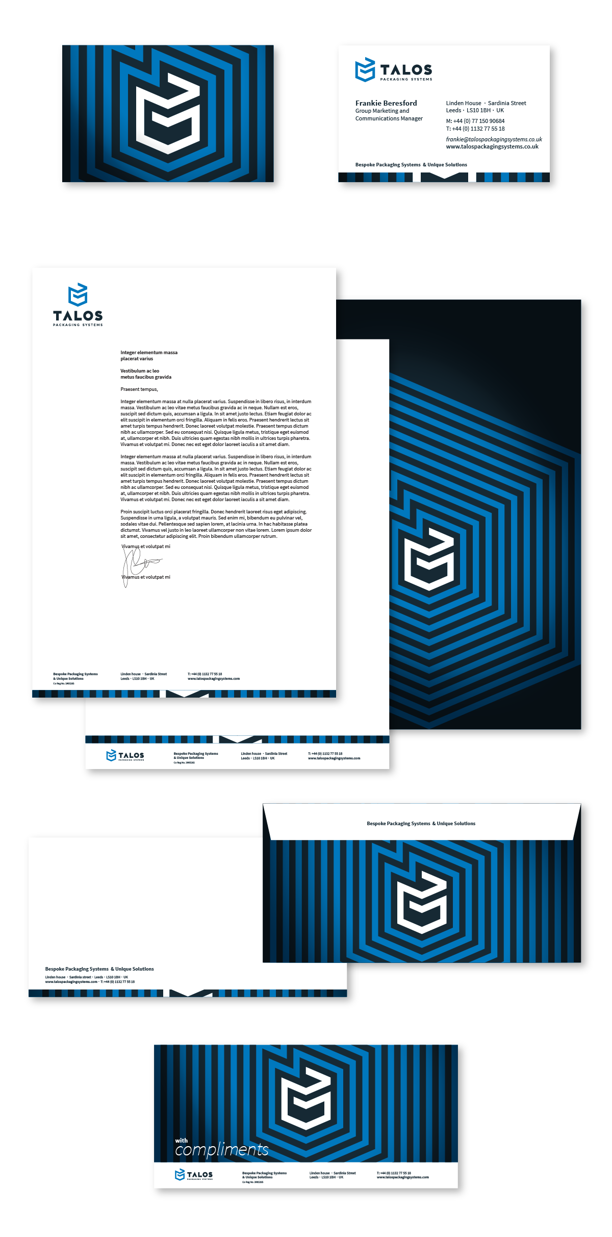
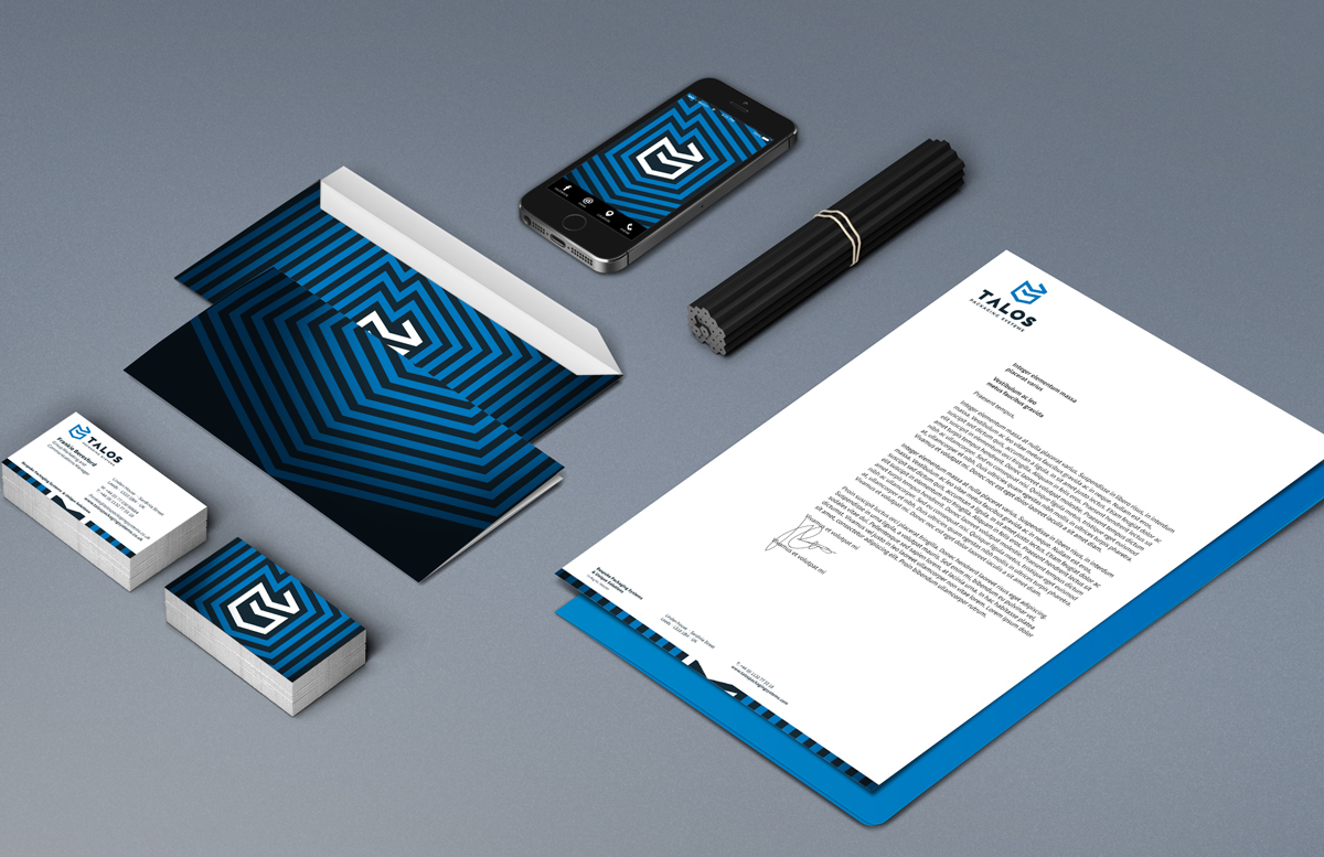
Stationery/Applications


Thanks for watching!
Kostas


