Corporate Design
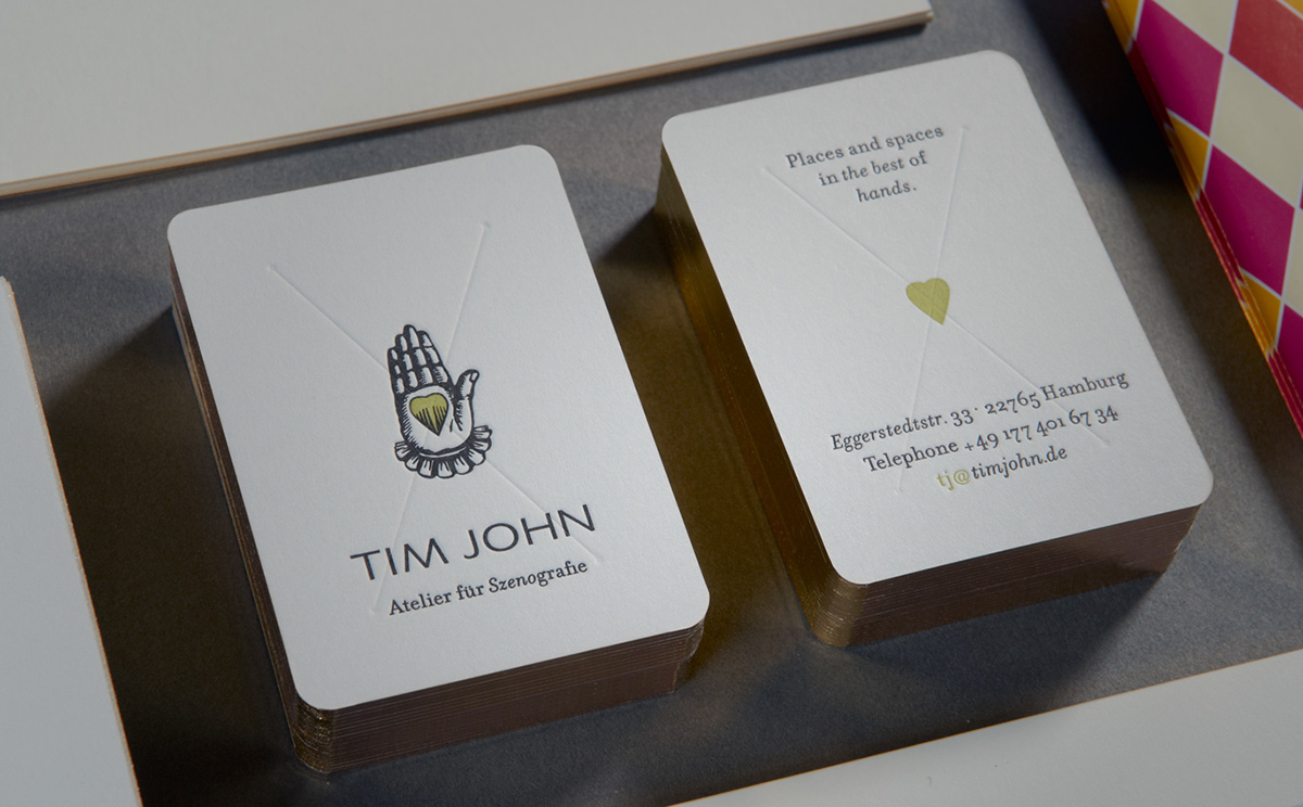
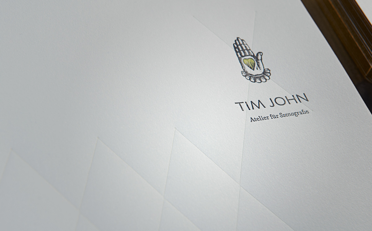
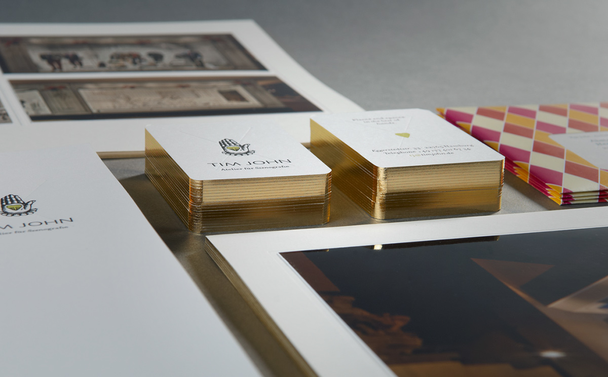
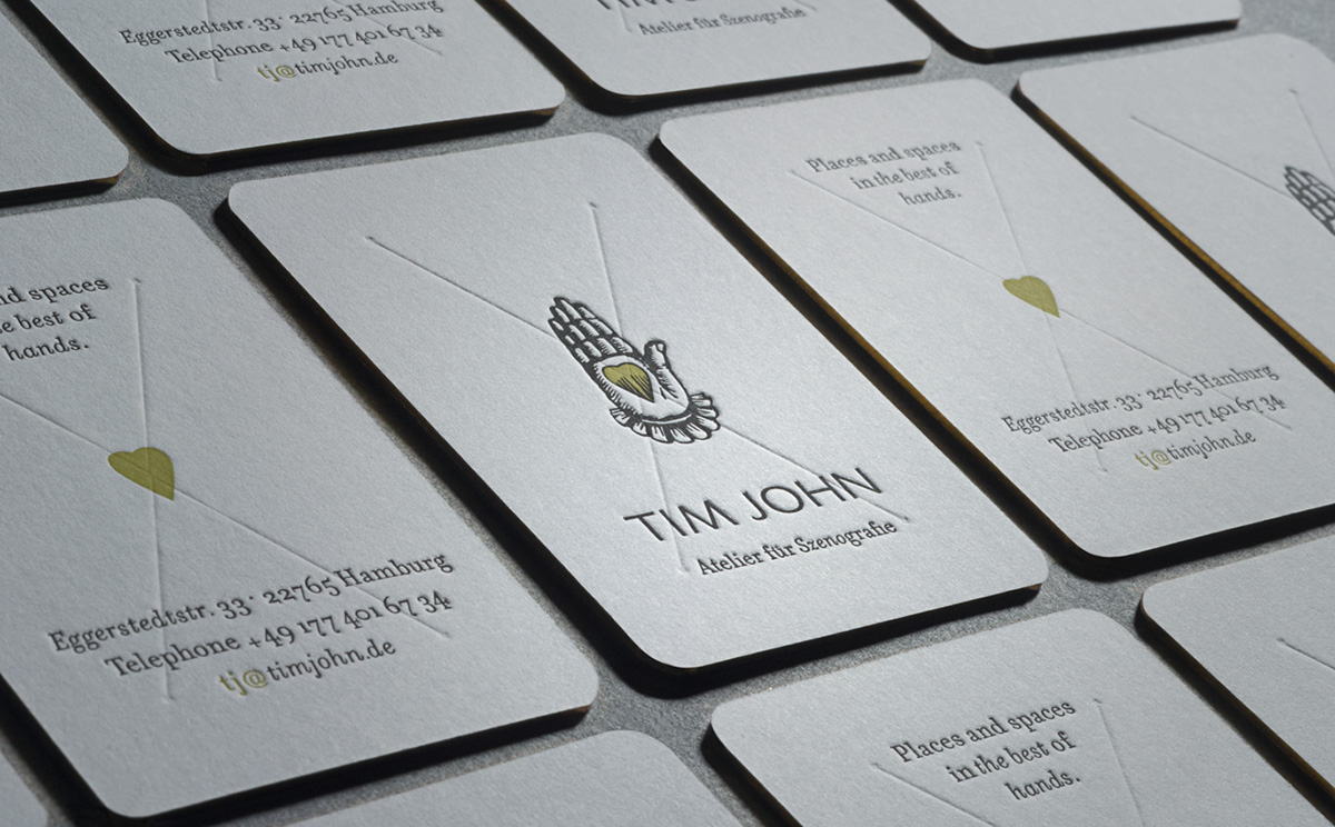
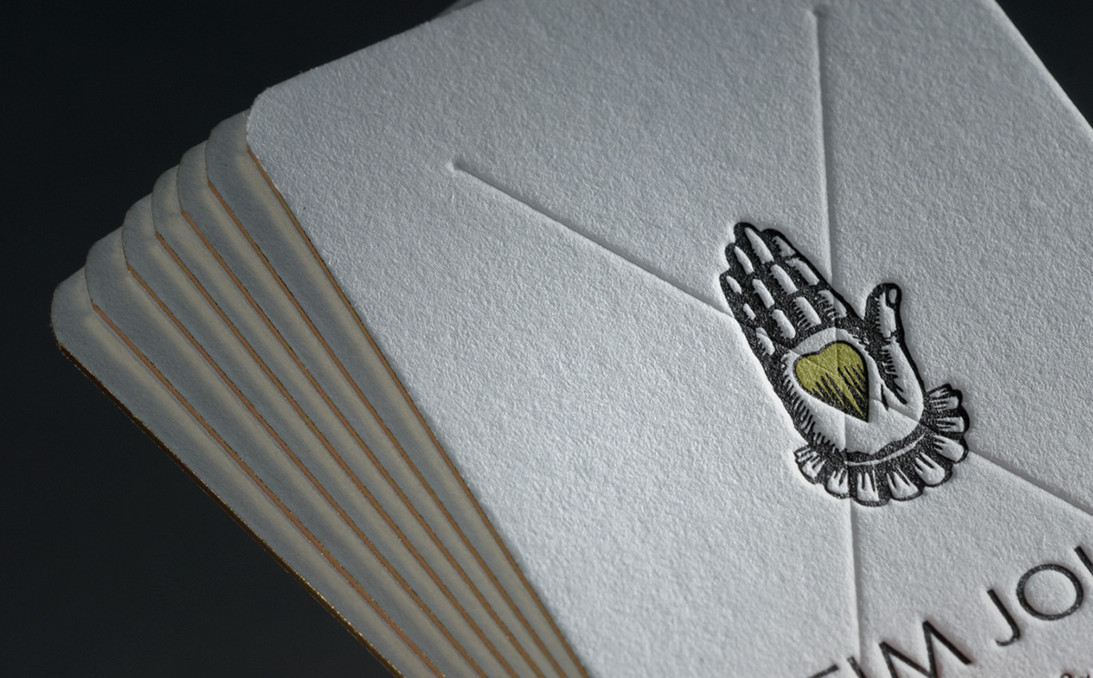
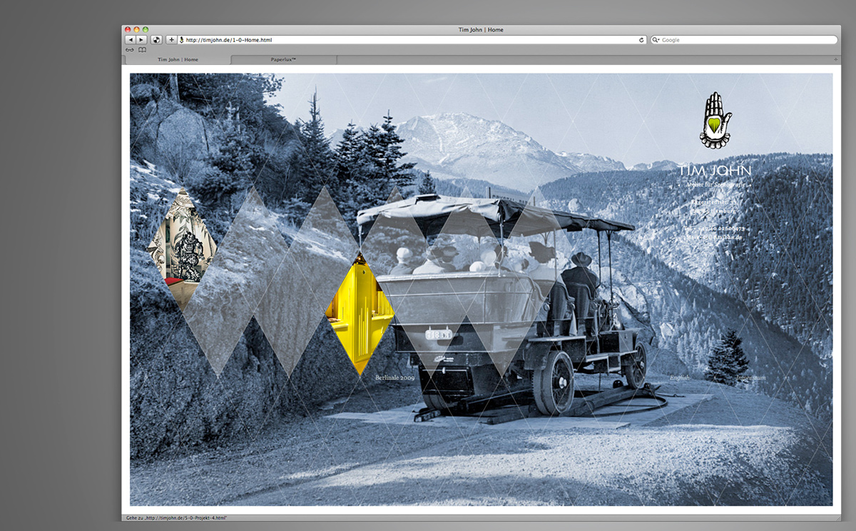
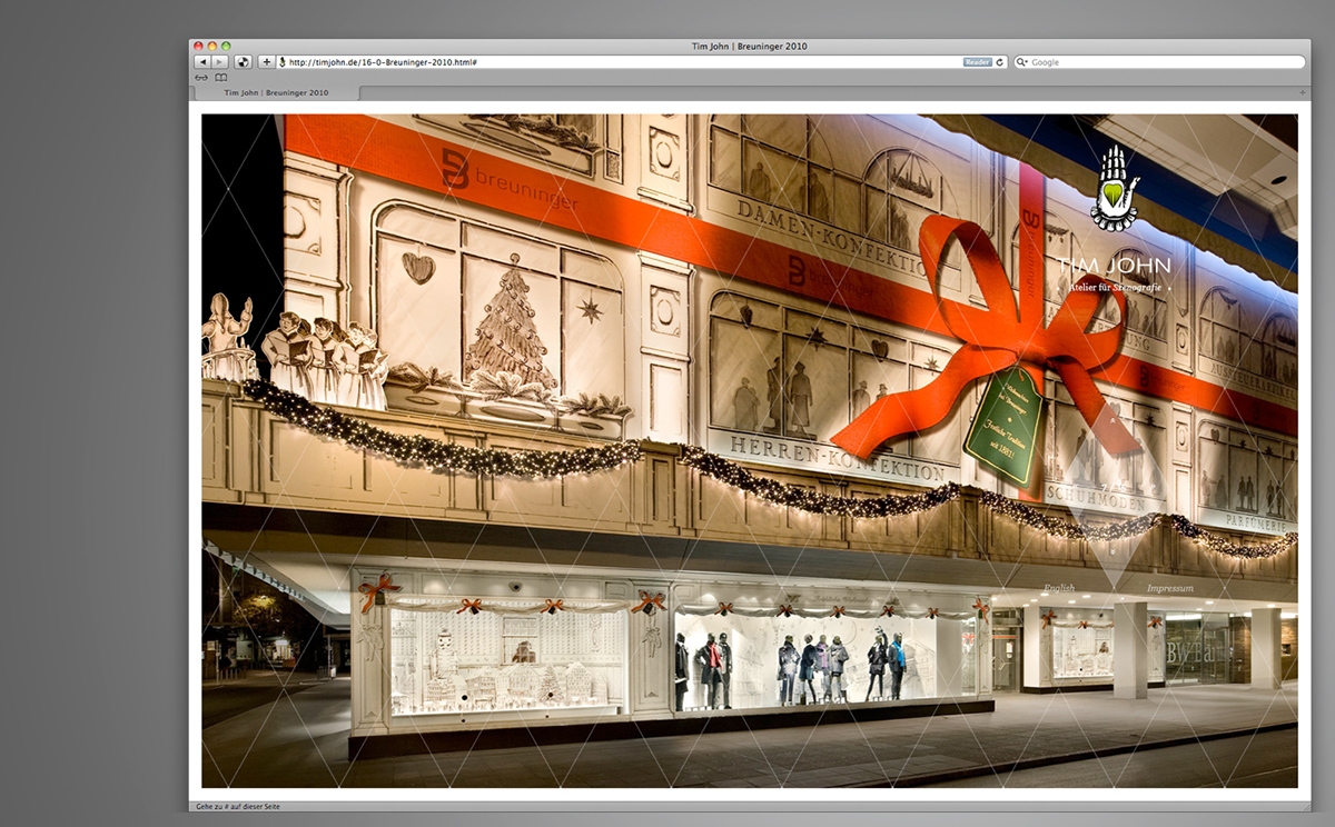
We designed the complete corporate design for our good friend, Tim John. It was essential to translate his work, which always conveys humor and sensitivity, into an elegant design system. The nostalgic heart on the palm of the hand is complemented by a modern serif font and forms the basis of the design system. A grid of diamond-shaped rhombuses spans across the entire site. By mousing over this grid pattern, visitors to the website are able to navigate and access images. All printed materials are done in letterpress, with a gilt edging. Here, the grid serves as a full cover in blind embossing.


