REBRANDING THE PUBLIC IMAGE
After a year the public image opened they reinvented themselves. They wanted a bigger store in a better neighborhood with a new identity to break free from there first business startup. I did the previous design for them as well, pleased by the design they noticed that some people thought they were a punk-metal band.
This said they were determimint to have a more corporate classy brand, with an edge...
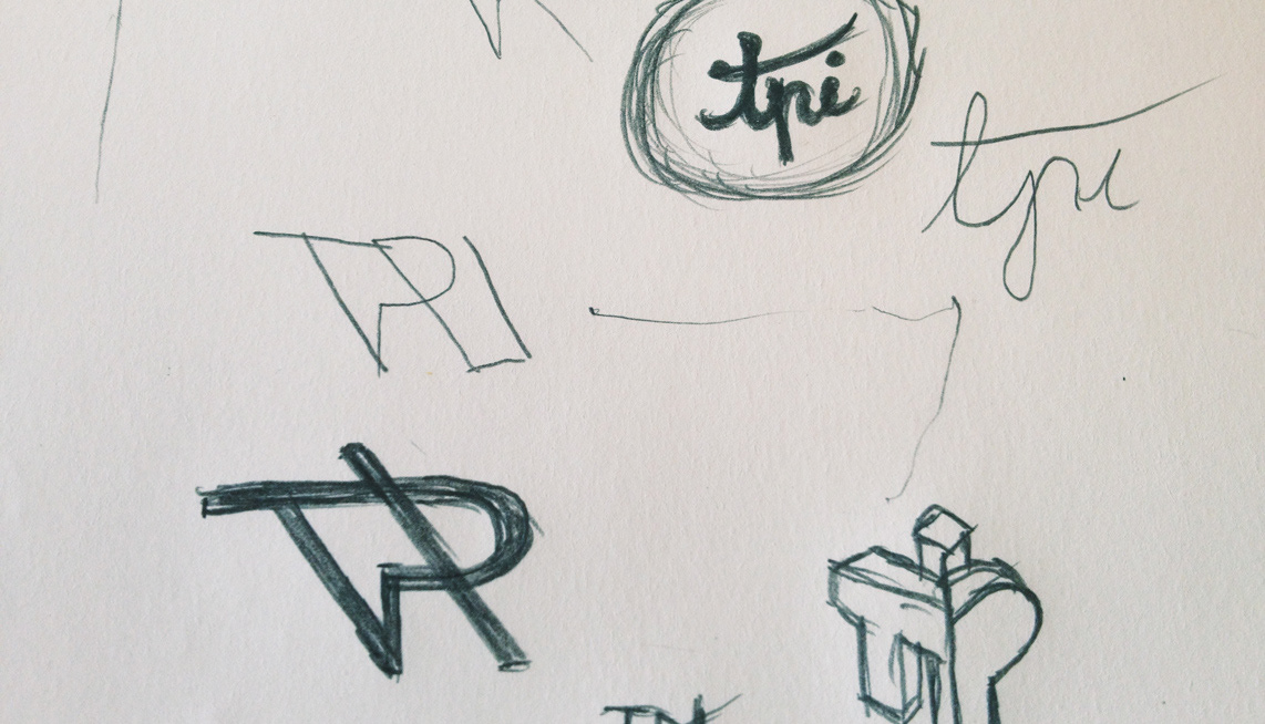
Some initial sketches
They had asked another graphic designer to design they're new logo but after just a few meeting the noticed it wasn't working out. The designer didn't grasp they're expectation, what they wanted the new brand to communicate to the people. So after that i was put on the project for them in within a week i had a proposal they didn't want to refuse. It had a classy touch with an corporate attitude still having an edge to it. Some small typographical accents like the trademark signage completed the whole look and feel.
Composition/arrangement Process

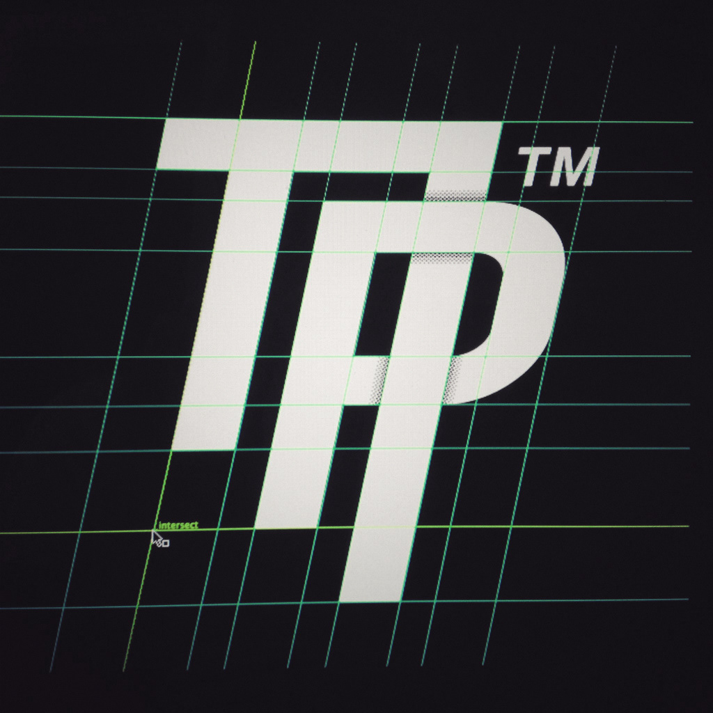
After sketching the overlapping type effect i wanted to try it in vectors to see how it would look with hard clean lines on a crisp screen. Also fitting it in a grid without distorting the letters to much within the proportions.
Business card and reception invitation closeup
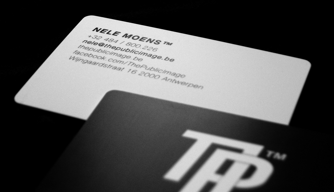

Business cards were printed on a heavy duty 450g - PVC surface that had a mat satin finish feel to it, very durable and the shape flexes back to the original shape when curved. invitation and other paper products were printed on 350g - paper mat finish, they didn't feel cheap :-)
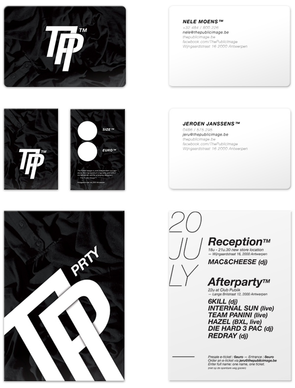
All went well in production, the prints came out fine, the interior design of the store was amazing (done by the same team that does the interior of urban outfitters) You don't get a lot of chances like this, the opportunity of rebrand something you did years before. Looking back i like the new branding better, its a better fit.
Instagram snapshot
I already got some mixed feedback of people liking the " old design " better, what do you think & why ?