THE BELLE ISLE
Since 2009 I have been lucky enough to work along side the folks at THE BELLE ISLE. During this time I have worked with them on a mixed bag of enjoyable projects, from the company's brand identity to concept artwork for their second restaurant, in Chichester. Below you will find examples of some of the projects which have been completed for THE BELLE ISLE.
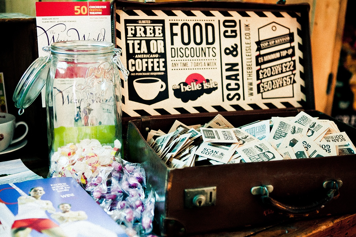
Artwork for the "SCAN&GO" discount card. This is a contender for my favourite project with THE BELLE ISLE.
Design work was developed in Adobe Illustrator and the printed digitally.
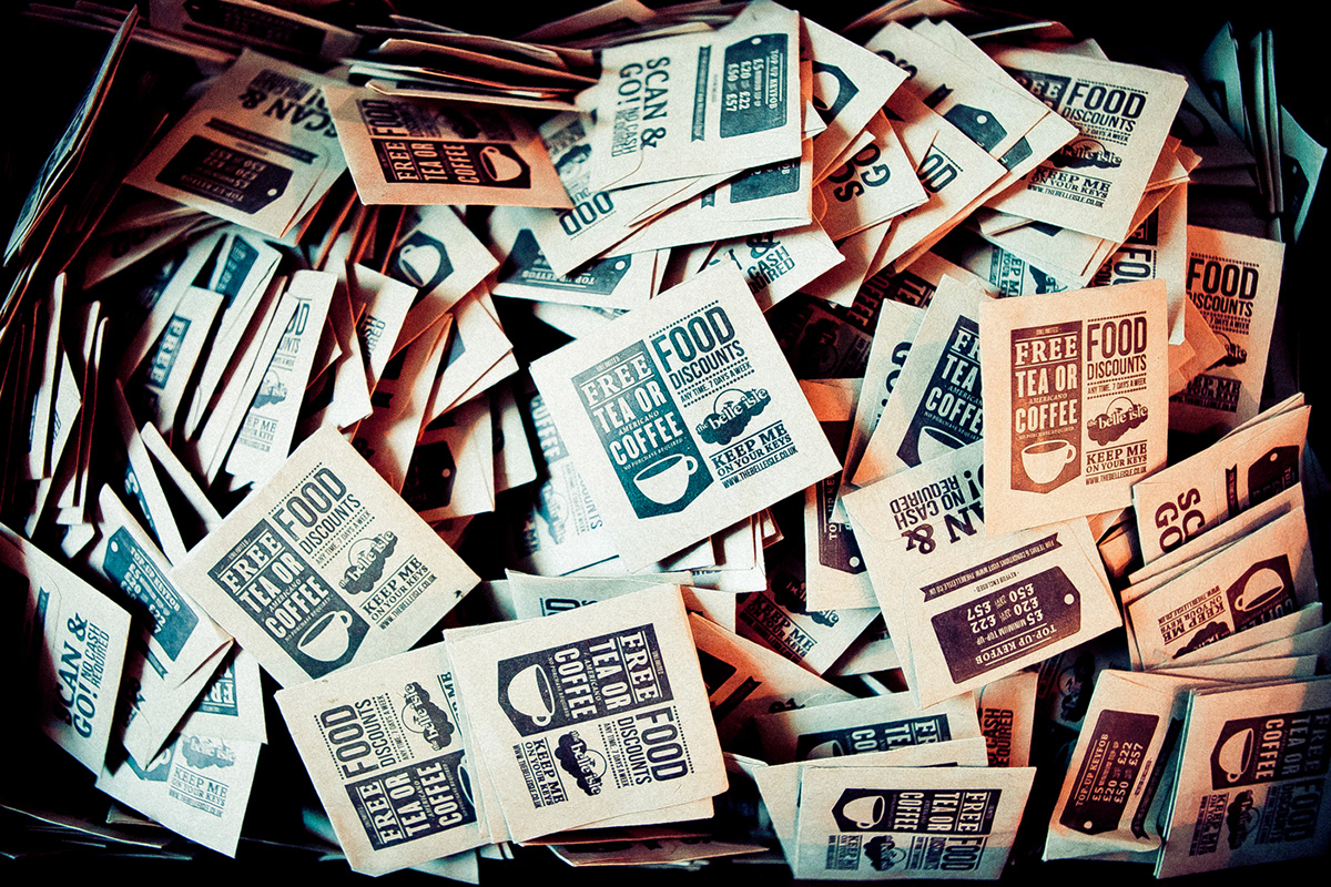
More from the "SCAN&GO" project. These 60x60mm Envelopes contain the "SCAN&GO" keyfob.
The artwork was produced in Illustrator and then, both sides, painstakingly screen printed (by somebody else).

Belle Isle logo design.
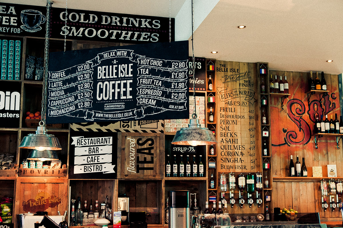
My favourite of the many blackboards I designed for THE BELLE ISLE in Chichester.
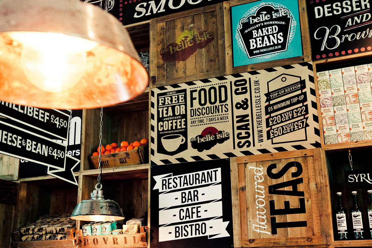
A few bits of print work on display in the restaurant. "SCAN&GO" has been featured on here a few times already, there's also a simple scroll vector I put together in Illustrator and the 'faux-heinz' logo developed for THE BELLE ISLE's very own brand of Baked beans.

simple black & white labels designed for flavoured syrup bottles. This is a theme we've been using alot in the belle isles print work recently. Inspired by modern airplane boarding passes.
Produced in Illustrator.
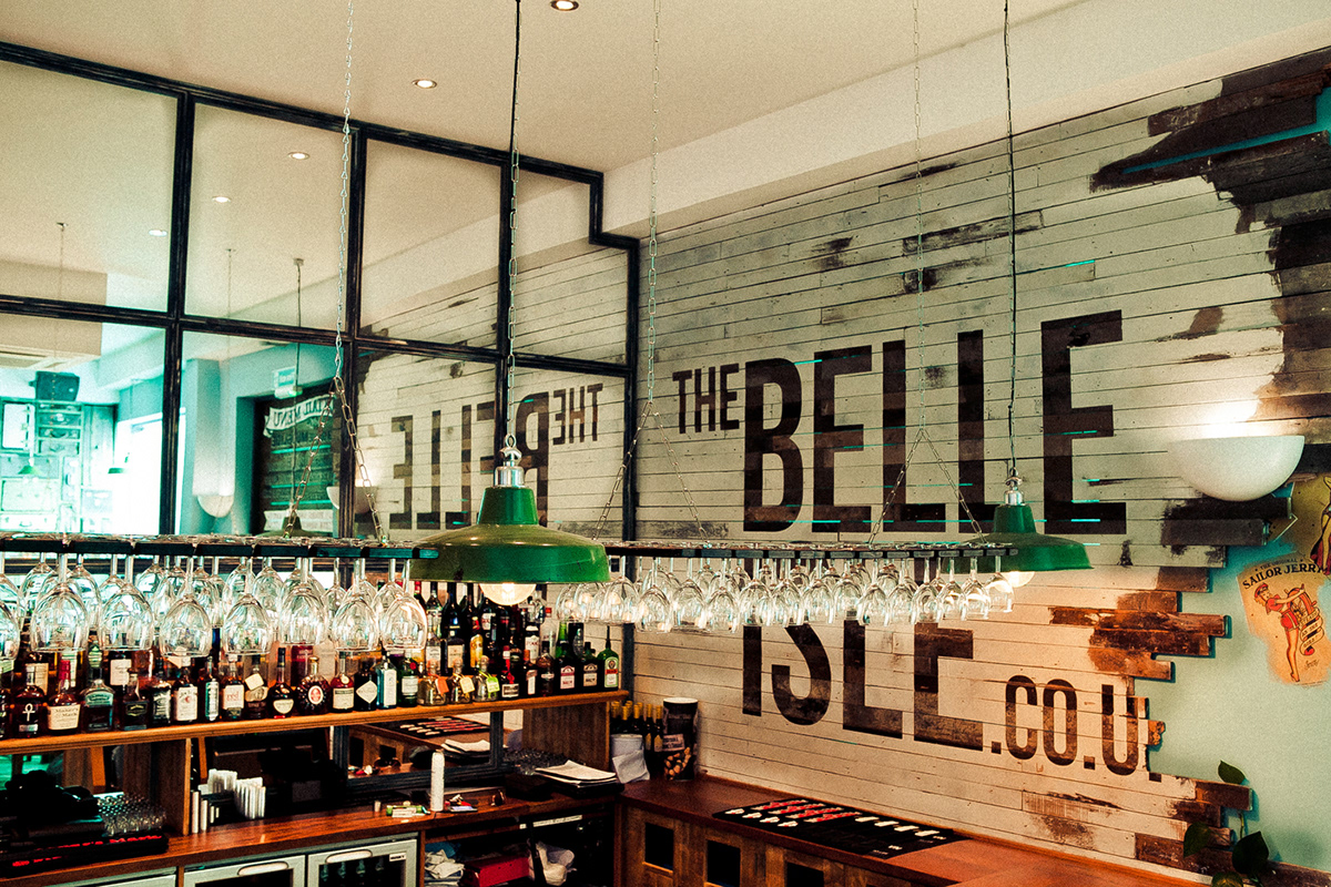
An example of the typography running throughout THE BELLE ISLE brand.
Strongly inspired by 1920s/1930s type.

Another blackboard design.
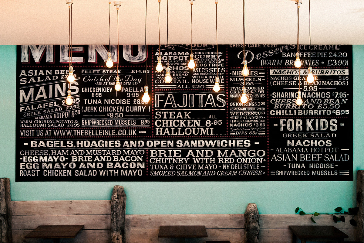
Huge typography piece and a focal point of the restaurant. THE BELLE ISLE wanted something a little different from the traditional list used when ordering your dinner. which left a lot of room to get creative with the type. Although, it's was very important to stick with typefaces which complemented the feel of the restaurant.
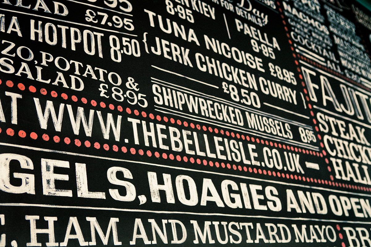
Close up of the hand painted menu.
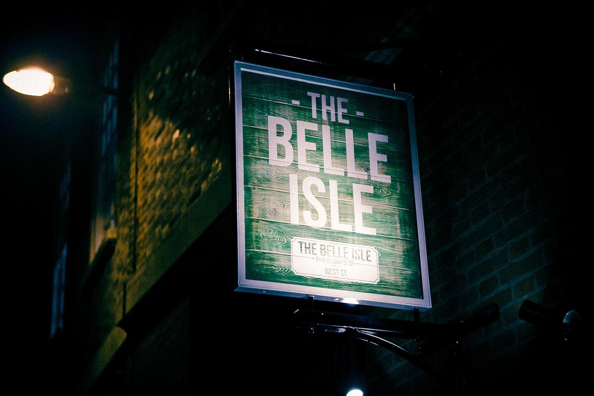
More 20s/30s type. This time for the hanging sign on the front of the restaurant.
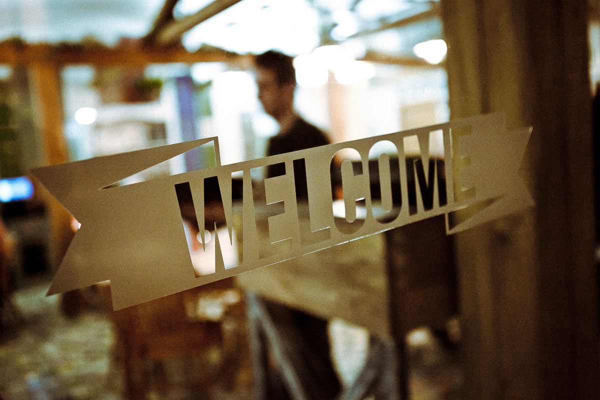
Simple vector scroll designed in Illustrator. More of this type of thing to be posted in the near future.
Large window vinyl design. Produced in a mixture of Illustrator and Photoshop.
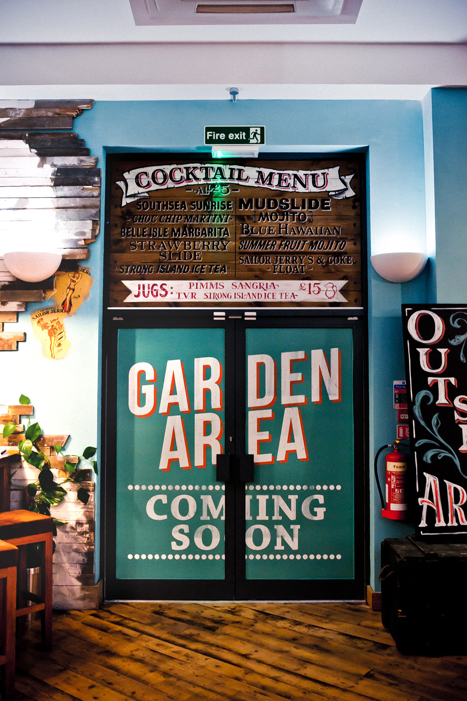
Another backboard design, of mine, featured above the door.
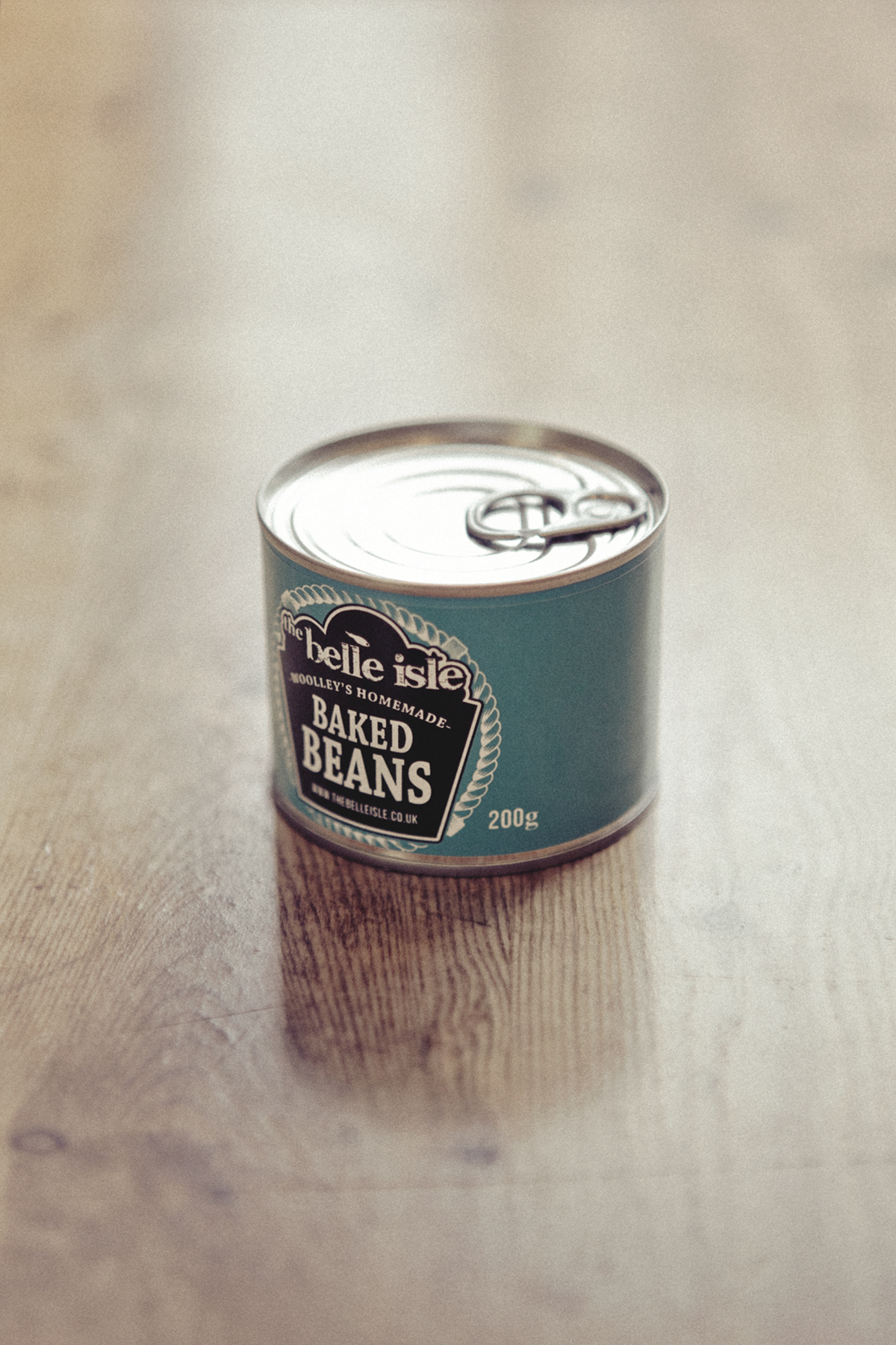
Label design for "woolley's homemade baked beans" THE BELLE ISLE's very own brand of beans!
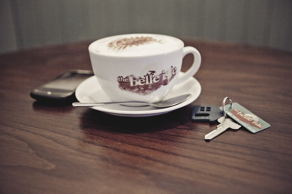
BELLE ISLE coffee mug with distressed logo design and THE BELLE ISLE "SCAN&GO" key-fob.
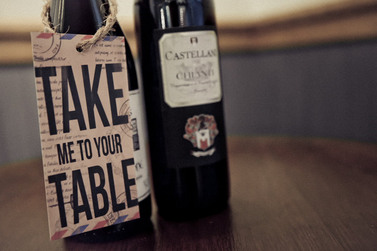
I design this wine bottle swing-ticket which will be attached to every bottle on THE BELLE ISLES wine rack.
Artwork produced in Photoshop.
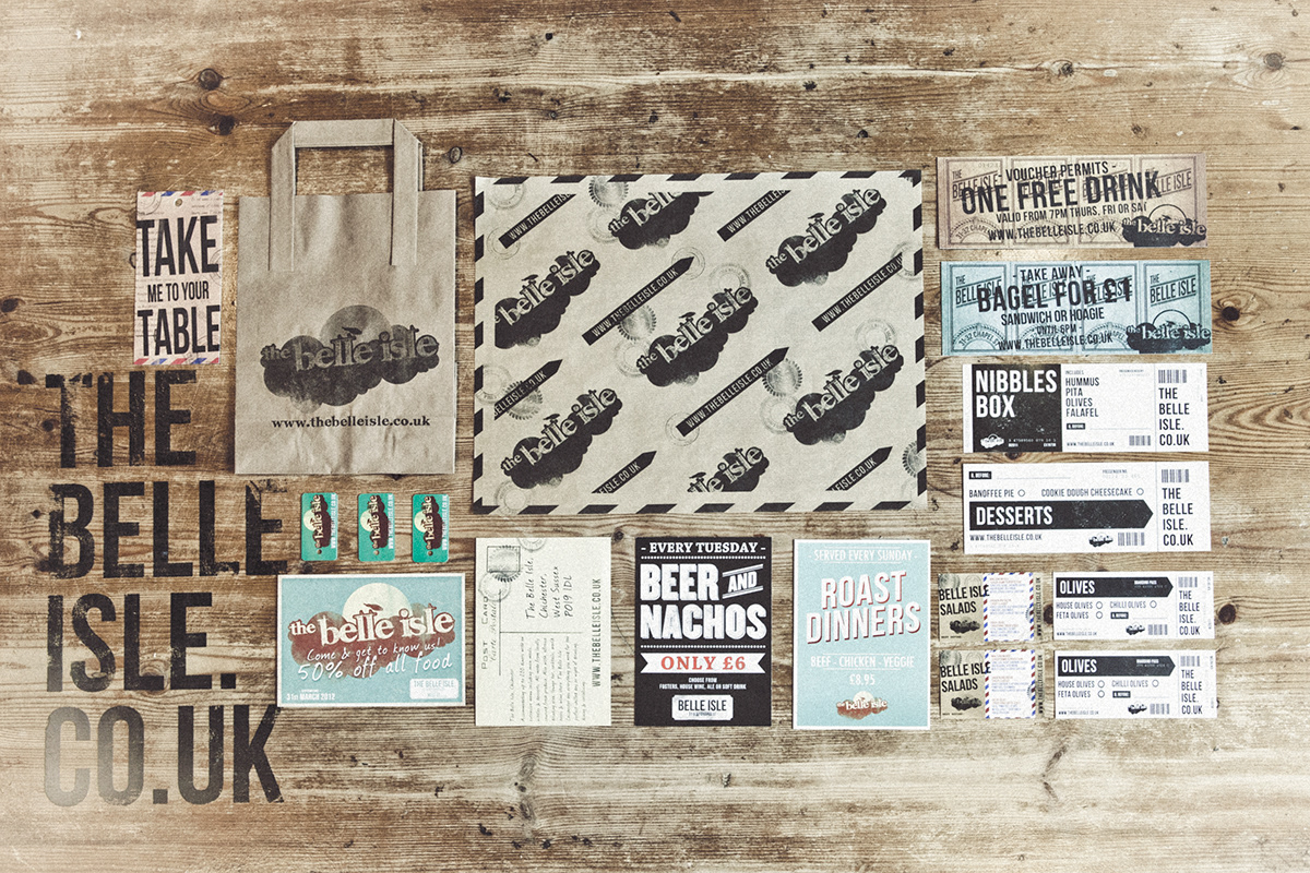
A collection of some of the print work I have designed for THE BELLE ISLE. I'm especially found of the the vouchers picture top/right. They were inspired by a collection of old circus tickets I fond online.
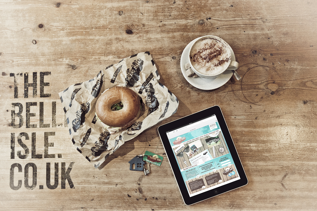
Here we have the Grease proof wrapping paper designed for takeaway food and a little look at THE BELLE ISLE website I had the plessure of designing last year.

This is an ongoing project I have been enjoying thoroughly. It's the concept work for THE BELLE ISLE Gourmet food truck.
I love it when I have the chance to do a bit of photo manipulation! This is made up of various images and was put together in Photoshop.

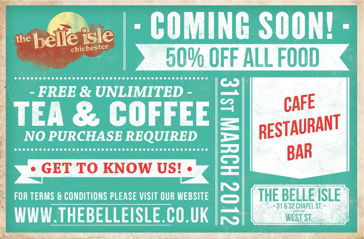
Part of THE BELLE ISLE print campaign in the lead up to the Chichester restaurant opening.
Featured in the CHICHESTER OBSERVER


