
We held a friends and buyer's poll last year to determine which shirt we would release next. Make the Logo Smaller was the hands down winner. I was quite pleased with that as I also run a political t-shirt company. This has become one of our best sellers. The thought that designers are wearing these to meetings with the account execs and clients pleases me to no end.
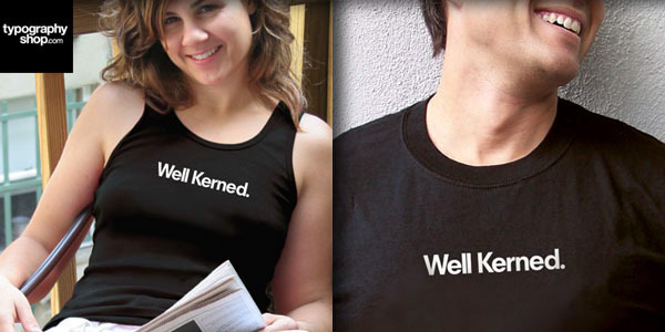
Well Kerned.
Chosen by our buyers from among a variety of themes exploring kerning, tracking and letterspacing, our Well Kerned tee is set in Neuzit S Book Heavy and printed in white on an American Apparel fine cotton black tee or tank.
Chosen by our buyers from among a variety of themes exploring kerning, tracking and letterspacing, our Well Kerned tee is set in Neuzit S Book Heavy and printed in white on an American Apparel fine cotton black tee or tank.
In 2008 I launched TypographyShop to great acclaim in the design community. 2 years later we've sold shirts to fellow practitioners in 23 countries. Many a famous designer and many more not so famous ones have purchased our wares. As a designer, nothing could be more flattering.
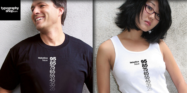
Helvetica Neue Descending a t-shirt was our first release. Helvetica Neue explained for the layman. In weights descending from Ultra Black 95 to Ultra Light 25, Max Miedinger's redesign of his own 1957 classic has never been so fashionable.
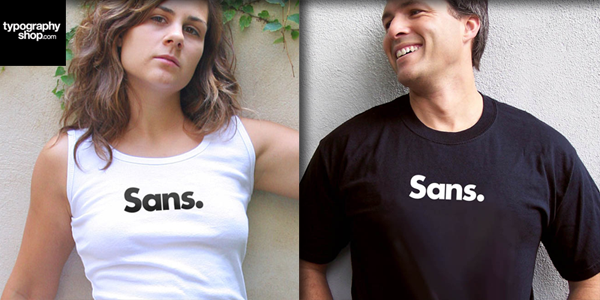
Sans.
Sans is a simple statement rife with meaning far beyond the world of typography. Set in Futura Bold.

Great ideas can't be tested. Only mediocre ideas can be tested.
TypographyShop is honored to present the first theme in our new line: The Ten Commandments of George Lois.

I love typography a-z
ilovetypography a-z was part of our recently released Valentine Trilogy. In uploading this I just realized that if you sing this, it rhymes. Set in News Gothic.

Letterspaced.
Letterspaced was another theme chosen by our friends and buyers. The shirt's theme is rife with meaning beyond the typographic term it delivers.
Declare your love of letters and your state of mind while under their spell with this simple statement set in one of our favorite faces and certainly one of the most ubiquitous of the last 20 years, Trade Gothic Bold Condensed 20.

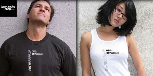
A companion shirt to Helvetica Neue Descending a t-shirt, Across the Univers was our second release. Set, obviously in Univers.

Love. Love. Love.
Love. Love. Love. Love, classified. Type classification that is.
Love, simply set in Futura, Simoncini Garamond and Akzidenz Grotesk, labeled with their respective classifications of Geometric Sans, Oldstyle and Grotesque Sans.

Helvetica Neue Descending a Long Sleeved t-shirt
Yours truly on the left, my neighbor on the right modeling Helvetica Neue Descending a Long Sleeved T-shirt, released by popular demand by our European customers.
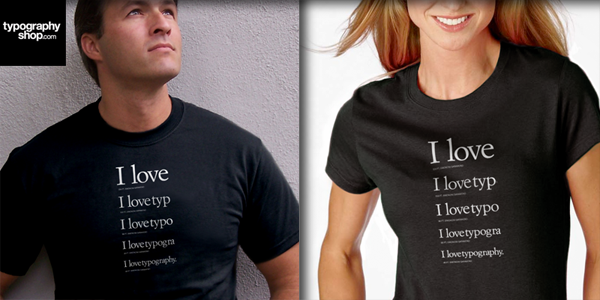
I love I love typography
The 3rd shirt in our Valentine Trilogy, I love I love typography is a five line specimen display of Simoncini Garamond
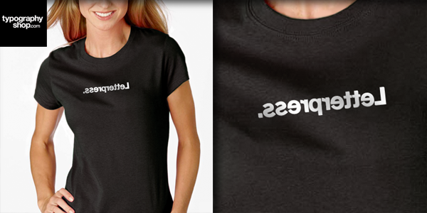
Letterpress
Letterpress has been a hit as this craft seems to be enjoying a massive resurgence.
Simply set in reverse in Berthold Akzidenz-Grotesk Bold, often referred to as the original sans. Released in 1896, its first life was in lead.


