Syrian Refugees in EU Infographic
an infographic about the increase in asylum request after the beginning of Syria's Civil War
English
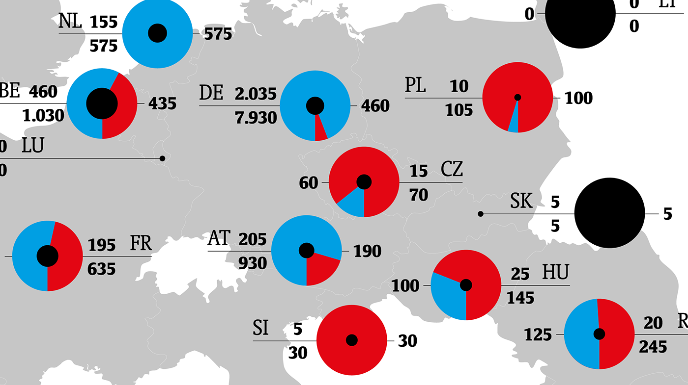
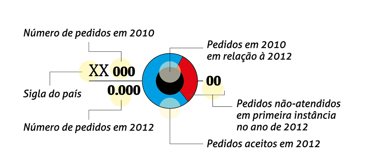
This infographic compares the amount of asylum requests provenient of syrian citizens before and after the beginning of the Civil War in Syria. It also show how many were accepted by the UE countries. The disposal of this information over the map shows that the countries which are closer to Syria are the ones who had rejected more requests (see the red portions of the circle), but they aren't necessarily the ones who had the biggest increase. The information is arranged into a circular system in which the blue portion represents the amount of accepted requests in 2012, the red represents the amount of rejected in first instance requests and the black represents the amount of request in 2010 comparing to 2012. This means that the biggest the black circle, the smaller the increase in asylum requests. The countries acronyms are placed on the side, along with the total number of requests in 2010 (top), the total number of requests in 2012 (bottom) and the total number or requests that were rejected in first instance in 2012 (on the other side).
Português
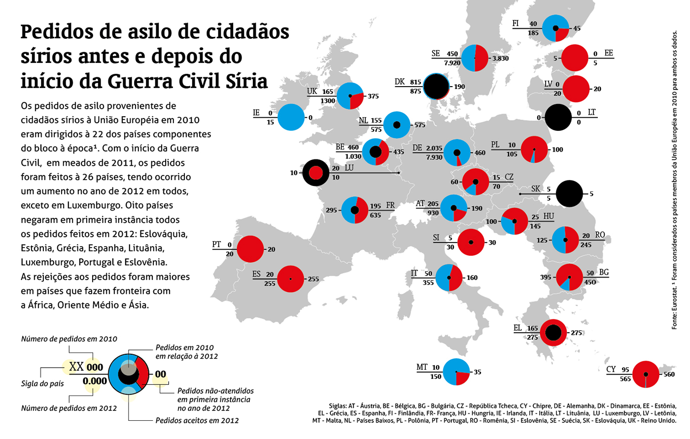
Esse infográfico compara a quantidade de pedidos de asilo provenientes de cidadãos sírios antes e depois do início da Guerra Civil na Síria. Ele também mostra quantos pedidos foram aceitos nos países da União Européia. A disposição dessa informação sobre o mapa mostra que os países que estão mais pertos da Síria são os que mais rejeitaram pedidos (veja a porção vermelha dos círculos), mas eles não foram os que registraram necessariamente o maior aumento. A informação é arranjada em um sistema circular no qual a porção azul representa a quantidade de pedidos aceitos em 2012, o vermelho representa a quantidade de pedidos rejeitados em primeira instância e o preto representa a diferença entre os pedidos de 2010 em relação à 2012. Isso significa que quanto maior o círculo preto, menor o aumento no pedido de asilos. As siglas dos países são dispostas ao lado, juntamente com o número total de pedidos em 2010 (topo), o número total de pedidos em 2012 (abaixo) e o número total de pedidos que foram rejeitados em primeira instância em 2012 (ao lado).
Created as a Project in Infography for the Master in Graphic Design
and Editorial Projects at Universidade do Porto, October 2013.
and Editorial Projects at Universidade do Porto, October 2013.