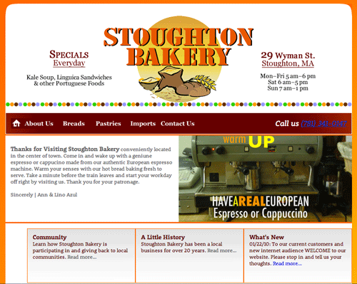
This is the current look of the website done approximately three years ago. My my.
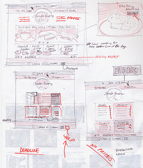
This is one of three sketches that were used in the presentation to the Client during the design phase.
Revisiting the goal of the website, it was decided that contact via email, and forms needed to be discarded.This also inspired a quicker user interaction by getting back to the basics.
This is the a high fidelity sketch of the new homepage. You might notice where I am going with it - shrink the sitemap and simplify for possible responsive UI.
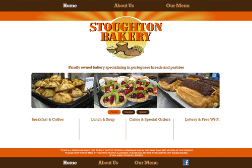
As I was adding the rest of the details (phone#, address, hours), it dawned upon me that a bakery can be representational OF the breaking dawn.
Falling under the essence of how a bakery functions, I decided to build upon that concept. First, I introduced a morning glow around the bakery emblem, and second, I placed images of the main attractions on a suggested orange table.
Feels like I'm really pushing the color scheme in all different directions, but it is working out splendidly.
Woops! Gotta add the Yelp!
This is the 'About Us' page. Looked through my stock photography for this client and found some gems that made everything come together.
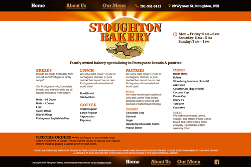
The menu page proved to be the most difficult in arranging towards simplicity.
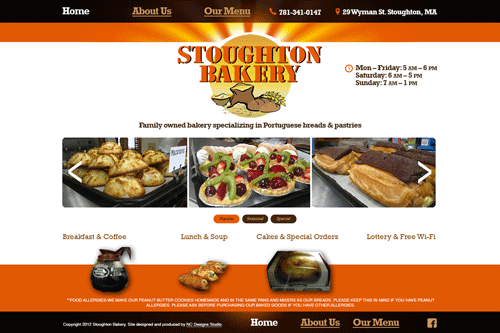
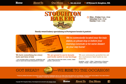
Well, this is the finished homepage in its last few hours in beta. In the next few days I will be revisiting the appearance of the site in older versions of IE, but for now it is mostly presentable in all new browsers (IE9, Chrome, Safari, Firefox).

This the Stoughton Bakery website mobile layout:
Portrait
Minimum width 320px
Tested using Chrome Web Developer Tools and Firefox Nightly responsive view.
Minimum width 320px
Tested using Chrome Web Developer Tools and Firefox Nightly responsive view.
This is the Stoughton Bakery website tablet layout:
Portrait
Minimum width 768px
Tested using the iPad retina display.
This is the Stoughton Bakery website mobile layout:
Portrait
Minimum width 320px
Tested using Chrome Web Developer Tools and Firefox Nightly responsive view.


