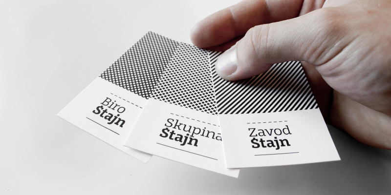
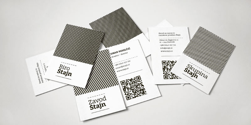
The identity is based on a custom designed slab serif type family Štajn. In the logotypes of the institute and its organizational units the word "Štajn" visually interprets the principle of the architectural layout of load. Identity's only color is black with the aim of achieving maximum contrast and reducing printing costs. Secondary visual elements are architectural hatchings. Steel used for Institute articulates stability, sand, the diversity of skills and experiences gathered within the Group, and reinforced concrete with its frequent use in modern times, the Bureau.
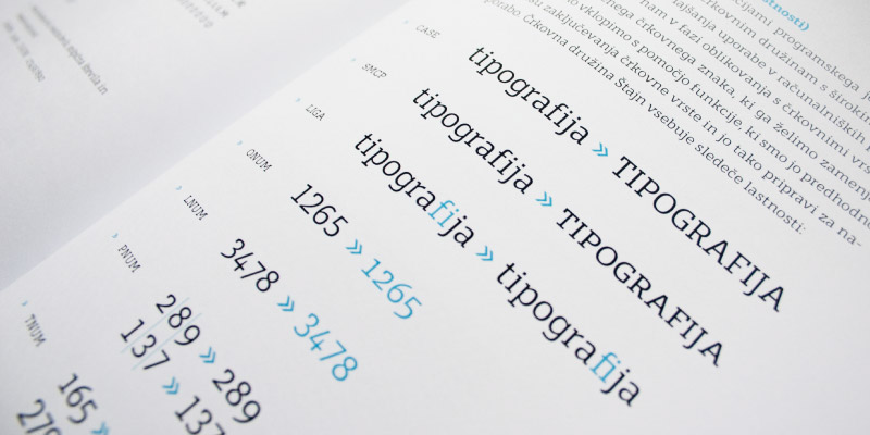
Custom made Type Family Stajn Pro - you can read more about type family here (Stajn Pro ob Behance)

Group Stajn logotype - positive and negative

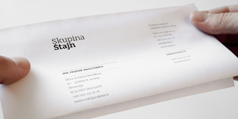
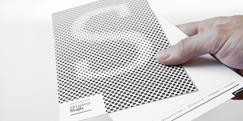
Letterhead
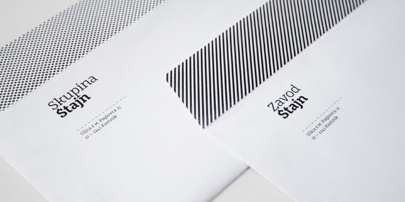
Envelopes


Promotional badges

Event Raumštajn
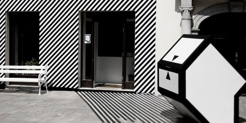
A custom facade and postbox were designed based on the visual identity of the House of Arhitecture. The main goal of this event, was to collect many diverse proposals and ideas about problems within the city of Kamnik from its residents. The achievement of the event is that one of the submitted proposals is going to be financed and implemented by the Kamnik municipality.
A custom facade and postbox were designed based on the visual identity of the House of Arhitecture. The main goal of this event, was to collect many diverse proposals and ideas about problems within the city of Kamnik from its residents. The achievement of the event is that one of the submitted proposals is going to be financed and implemented by the Kamnik municipality.


Website www.stajn.si