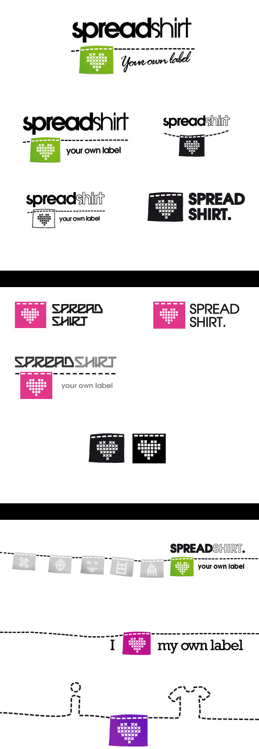
In 2007, I got involved with a logo competition. It started out pretty small but resulted in 2500 participating designers from 43 countries. For several weeks designers were improving their own concepts and was showing it off to the judges (who picked out 4 weekly finalists from which 1 later proceeded to the big final) making it 15 grand finalists in the end.
THE BRIEF IN SHORT Spreadshirt.com is an online service that lets you design your own apparel & accessories. Create a logo that emphasizes our new tagline "your own label". Need for standalone icon. Easy to read.
THE BRIEF IN SHORT Spreadshirt.com is an online service that lets you design your own apparel & accessories. Create a logo that emphasizes our new tagline "your own label". Need for standalone icon. Easy to read.

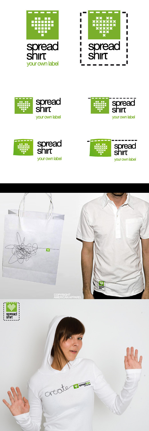
I refined the tab using more basic shapes in order to get a more recognizable look that also could be more dynamic when it comes to printing techniques. The typographic revision lead to a more sharp easy-to-read face with less disturbing visual objects. In this stage I tried out the logo on physical objects to get a feeling of the final result.

The final version became, more or less, a simplified version of the first versions, making it easier to handle but still using the physical reference with stitches and the heart. I played around with the heart, trying to find other similar shapes which led to a distinct, more unique shape.
Taking the symbol out of it's natural surroundings helped me gain more substance, not just being a symbol but something that invites you to remix and play around with.
Taking the symbol out of it's natural surroundings helped me gain more substance, not just being a symbol but something that invites you to remix and play around with.

I made it through the weekly races and got to the grand final, where I got to visit Leipzig and received first price. Happy Kim!
Read more: http://olp.spreadshirt.net/wordpress/
Read more: http://olp.spreadshirt.net/wordpress/
