


Specialist Fitness
Business Branding
Business Branding
I was initially approached by Personal Trainer and company Director, Marcus Tolley in 2008 to develop a branding solution and visual identity for promotional purposes. There was a clear need to create a strong presence in the market in order to attract new client interest. With many years experience in the fitness industry, and a high loyalty rate with current clients, Marcus was focussed on expanding his business.
The final design solution needed to be flexible enough and dynamic, in order to be carried across a broad range of promotional materials and used for future advertising. It was important that the design reflected Marcus’ professional approach to his business and client dealings. He wished to represent himself as a friendly, intelligent Personal Trainer who takes great pride in his flexible one on one training methods.
Right from the beginning there was a strong emphasis on avoiding predictable or bland colour palettes, like red or black, often used to represent many other trainers or companies in the industry.
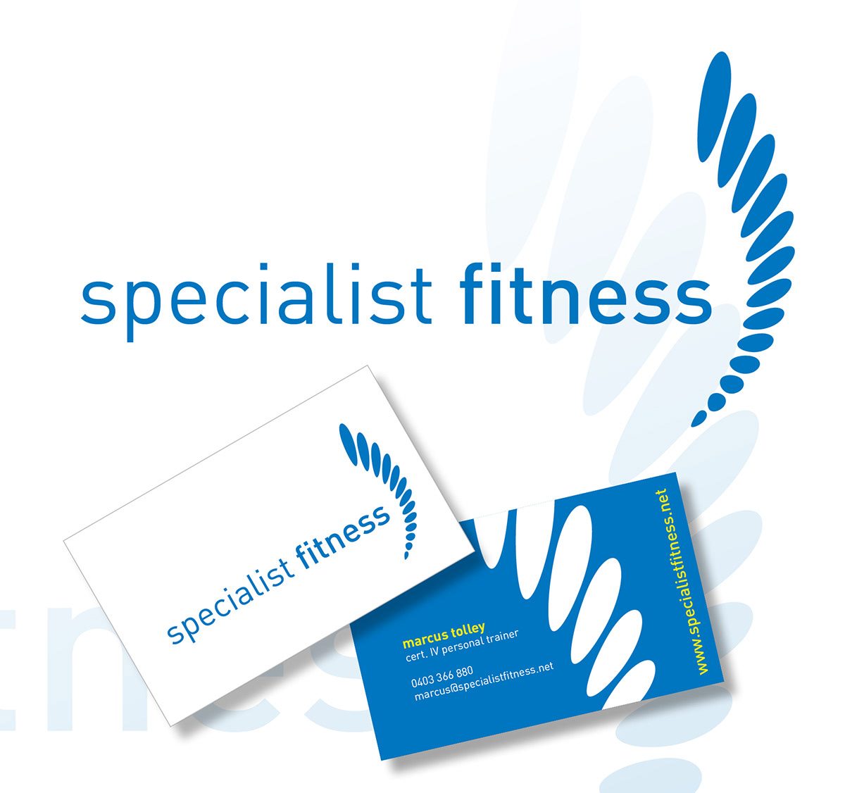
The oval elements ultimately meant to represent a spine, became an important design feature that could be adapted into of different designs in fresh and vibrant ways. To compliment the blue yellow was introduced to creating contrast against the blue background when applied to the text, also contributing towards the hierarchy of information on the business card.

Logo Design
Business Cards
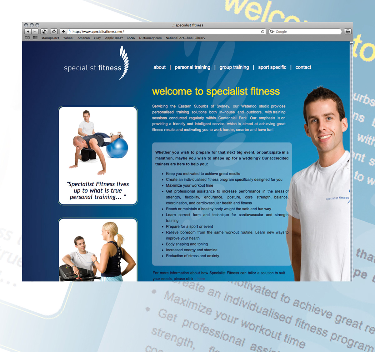
Website Design & Development
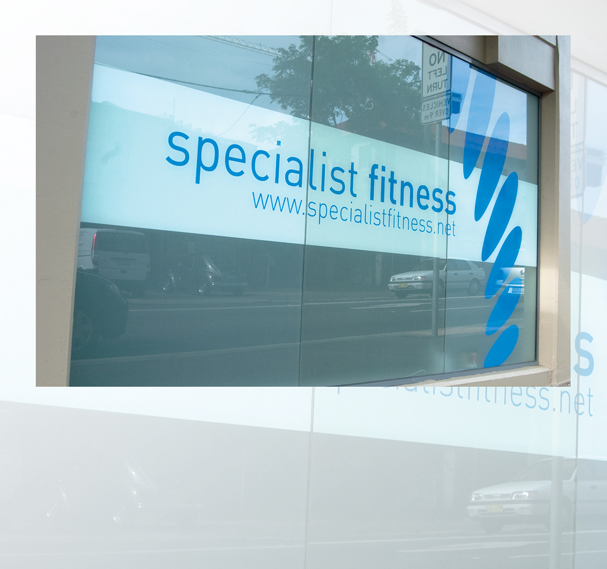
Window Signage/Decal Design

Company uniform


