
The landing page of the application.
This page somewhat deviates from the standard Windows 8 applications in a way that this page is scrollable vertically rather than horizontally.
I was thinking about this page as a stream/wall of the latest activities that have happened recently (nothing new here) and since soundcloud.com differentiates themselves by actually showing how the track's waveform looks like - I thought it should be re-plicated here in this concept as well, therefore it did not quite make sense to make it scrollable horizontally.
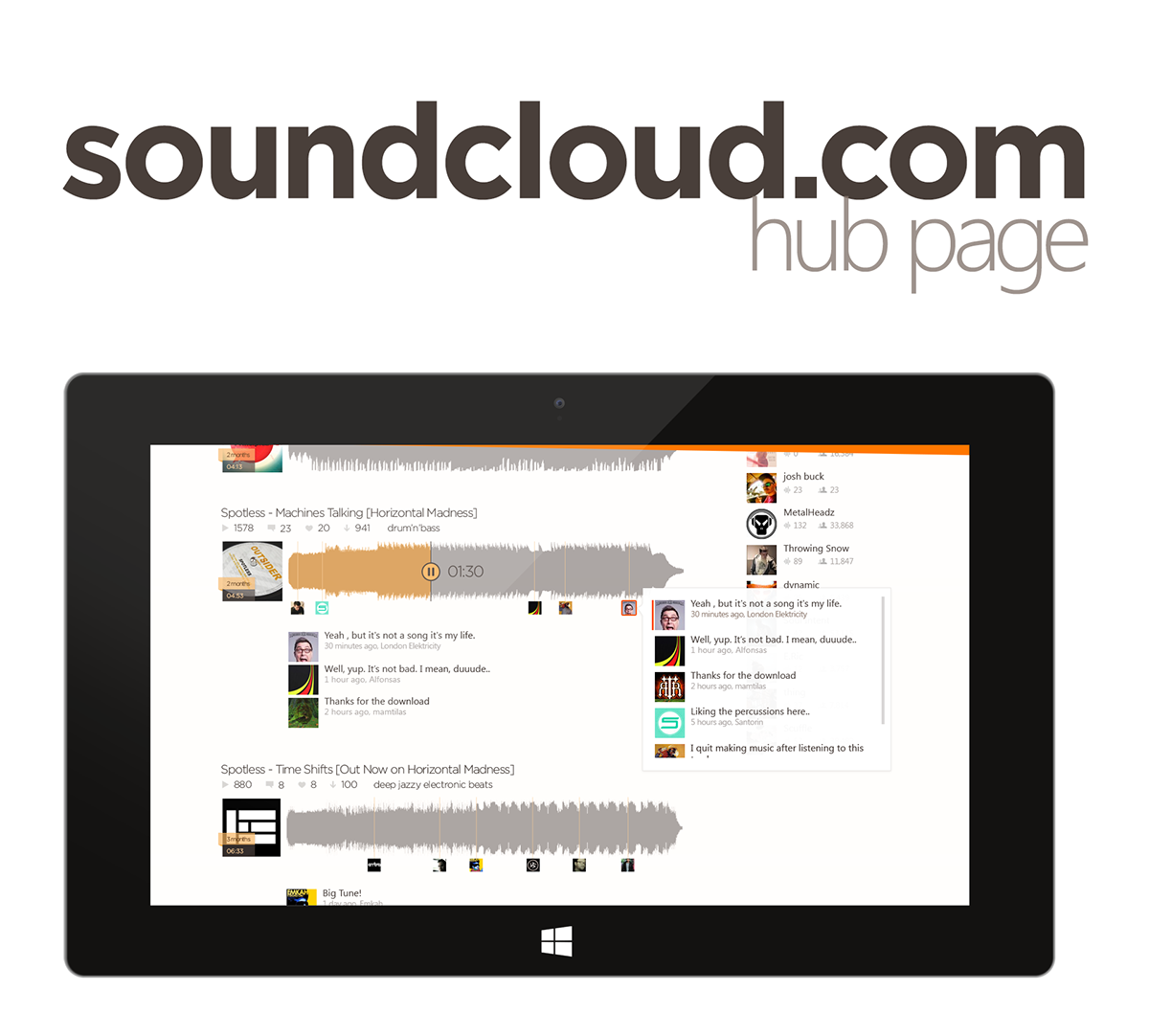
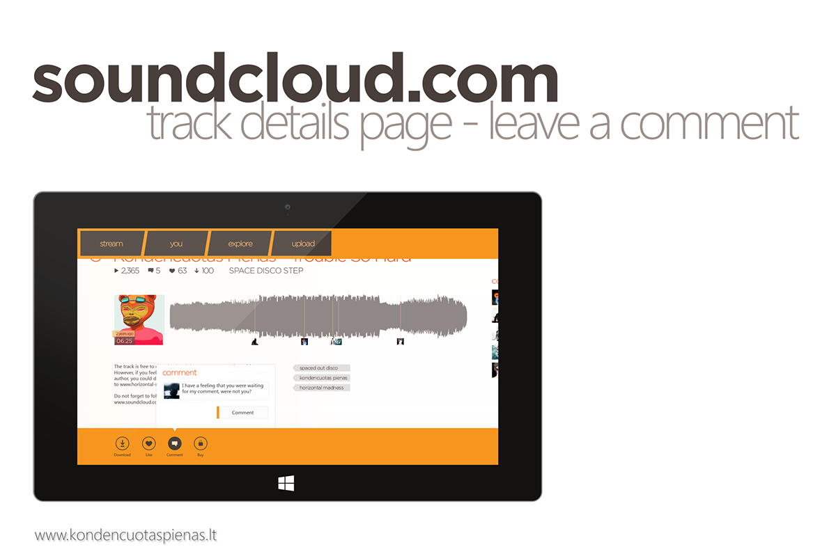
This screen illustrates that the user can tap any timed comment below the track to invoke a flyout which highlights (subtly, with a vertical orange stripe in front of the users picture) the selected comment. Also, the user is able to see all other comments about this track by scrolling up/down. Tapping on the comment in the flyout highlights the small picture under the track's waveform at the time where in the track the comment was posted.

Bigger version of the previous screen.
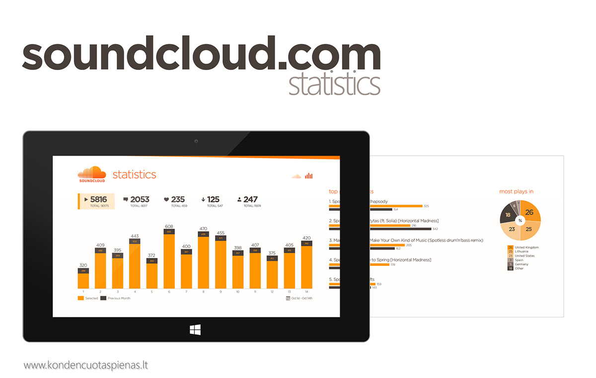
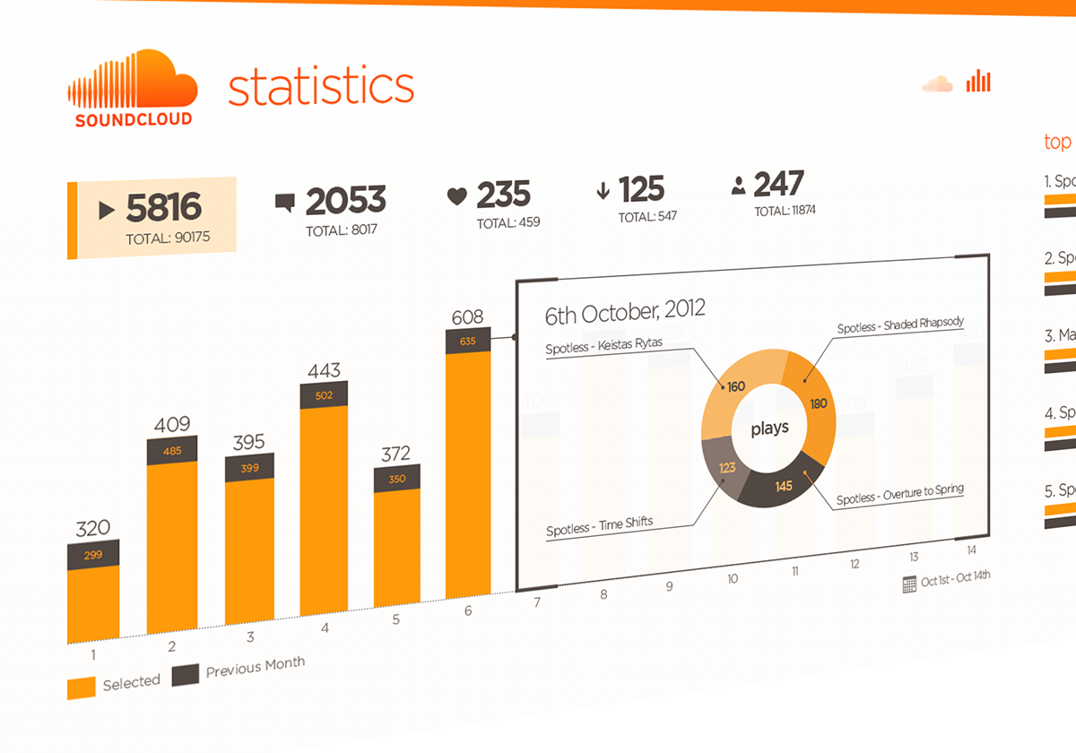
Profile statistics page.
The user can get to this page by tapping a small "graphs" icon at the top in the rightmost corner (you can see that it's highlighted now. The other icon is for getting back to the hub page - stream of the recent events.)
This is the page where users can see different kinds of stats, i.e. how many plays each track received, download & favourited tracks, etc.
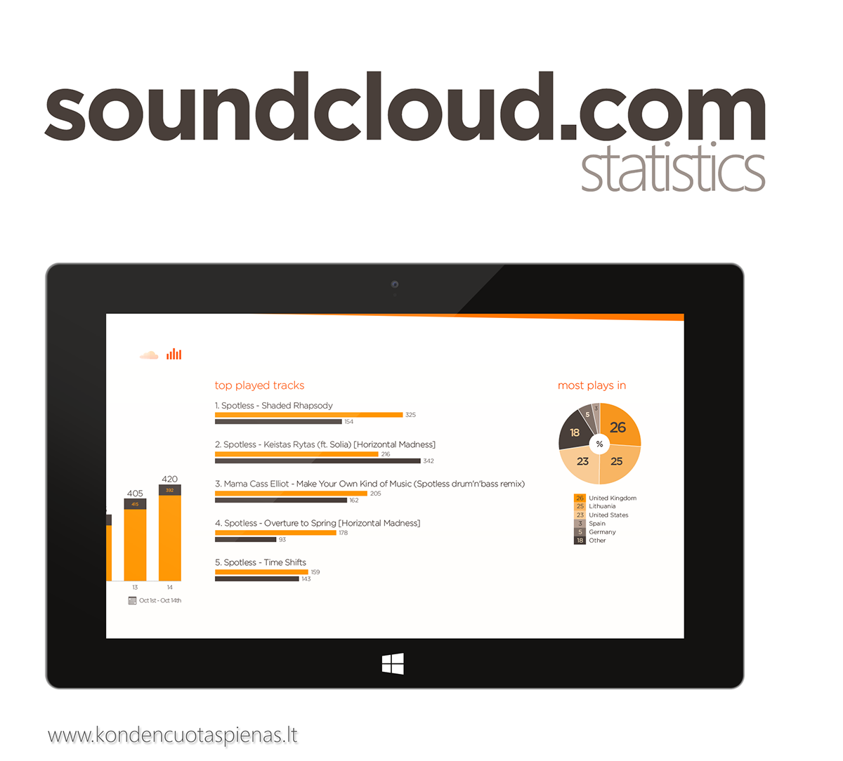

This screen shows that tapping on a bar within the histogram (x - date, y - plays count) presents user with a flyout (popup) which breaks down the day into a piechart which signifies what tracks were played and how many times.
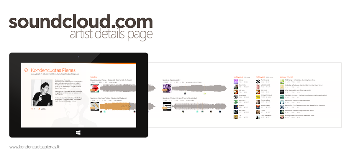
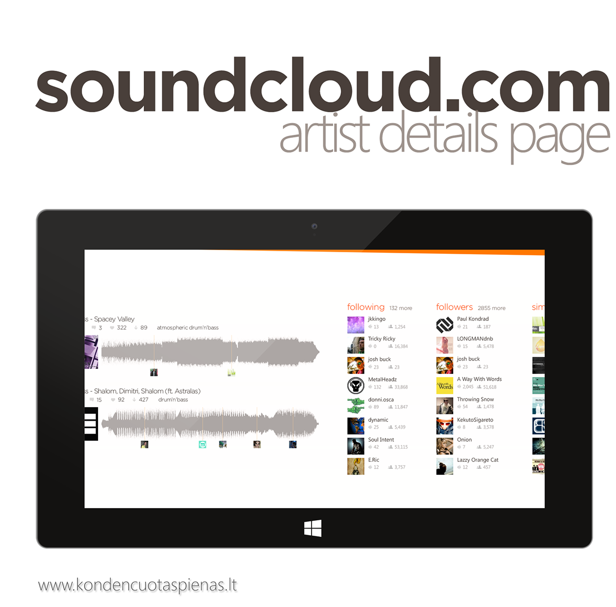
I know, you might say - so if the hub page had verticall scrolling - why isn't this page sticking to the same principle - and this is a very good question.
To me, doing this page this way just felt like the right decision as it has different types of content (artist biography, a list of tracks, a list of followers, list of people the artist follows and a list of similart tracks) and putting everything into one big vertical sheet did not seem the right thing to do.
I think, Windows 8 were not publically released at that time when I was working on this project, therefore, you could not find a lot of material internet in regards to UI/UX best practices for Windows 8 apps. If you have any comments - feel free to share!


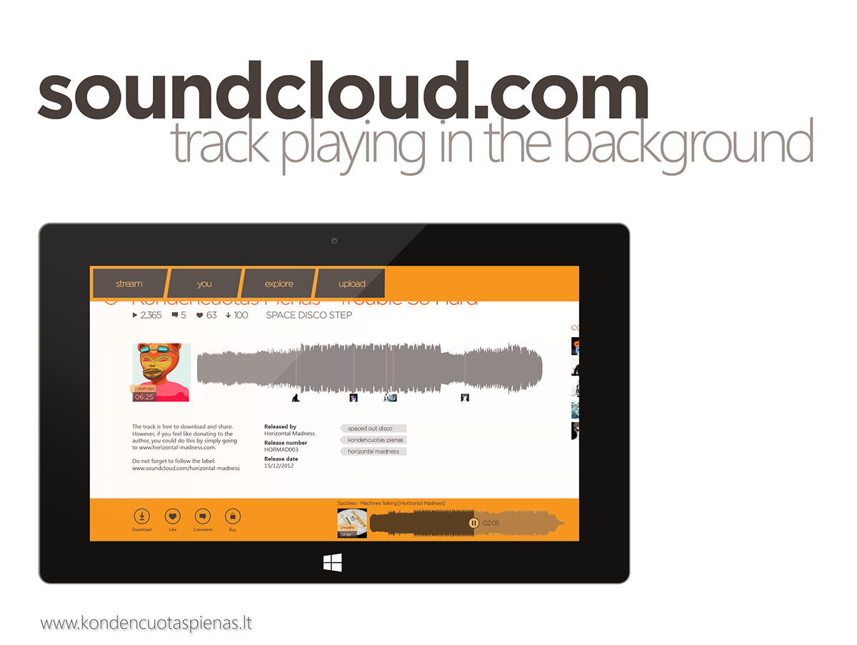
Tapping anywhere on a track's waveform would start playing the track.
A vertical stripe with a play/pause button in the center starts moving towards the end of the track and leaves the played area coloured in yellow. There is also a timer supporting that information. Whilst the track is playing, user could tap anywhere on the waveform to skip/rewind the track respectively. Tapping on the track title would take user to the track details page.


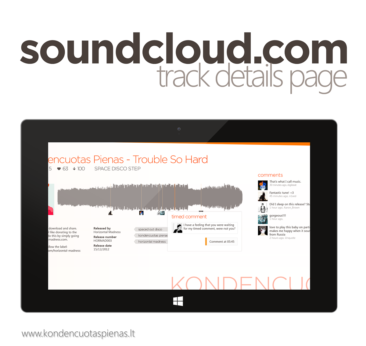

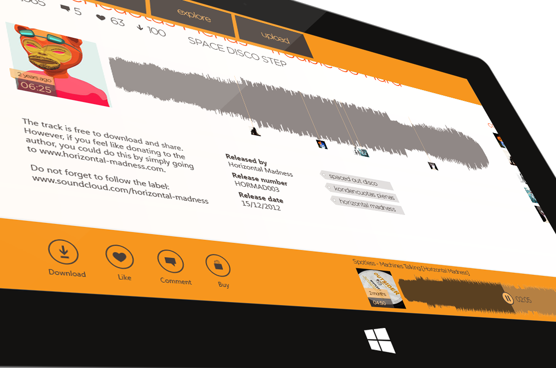
Tapping anywhere on the invisible timed comments area (where all the small pictures below the track's waveform are put, would invoke the time comment flyout allowing the user to leave a timed comment (comment for specific area of the track) for the track.
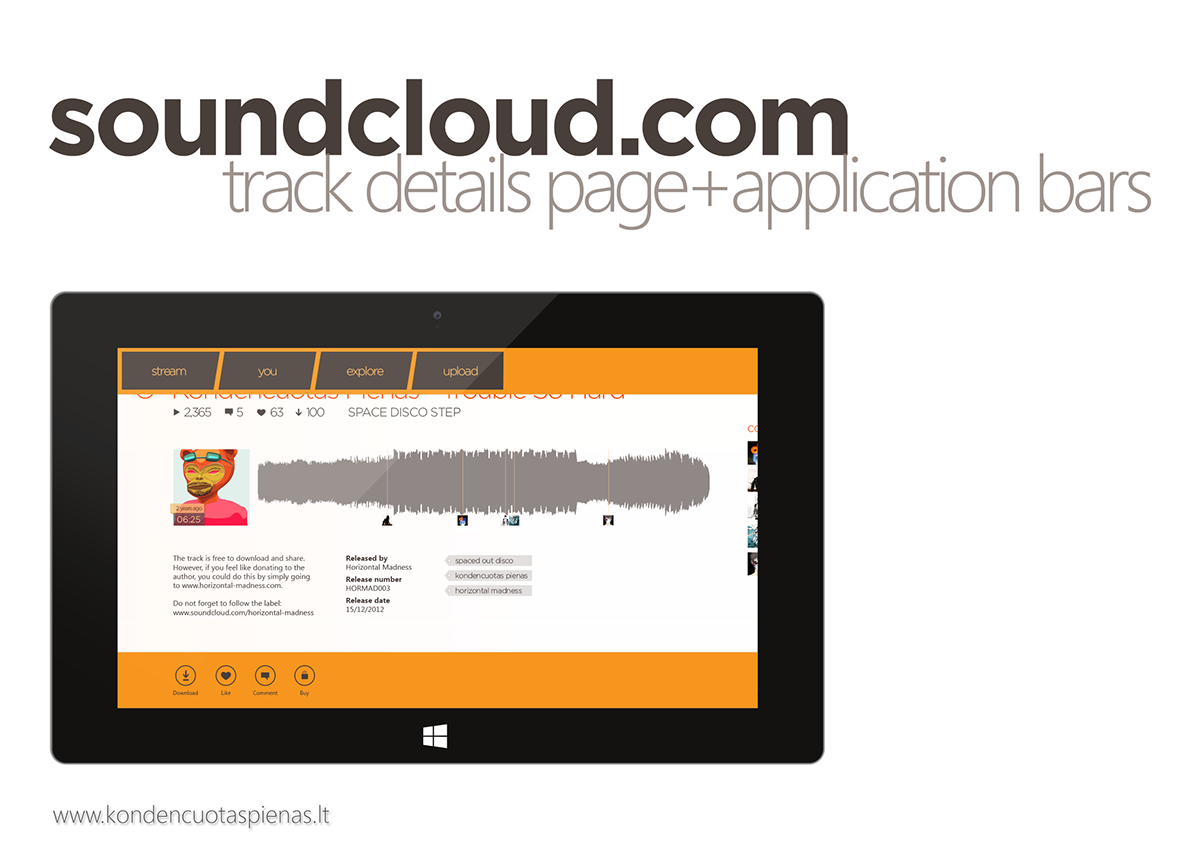
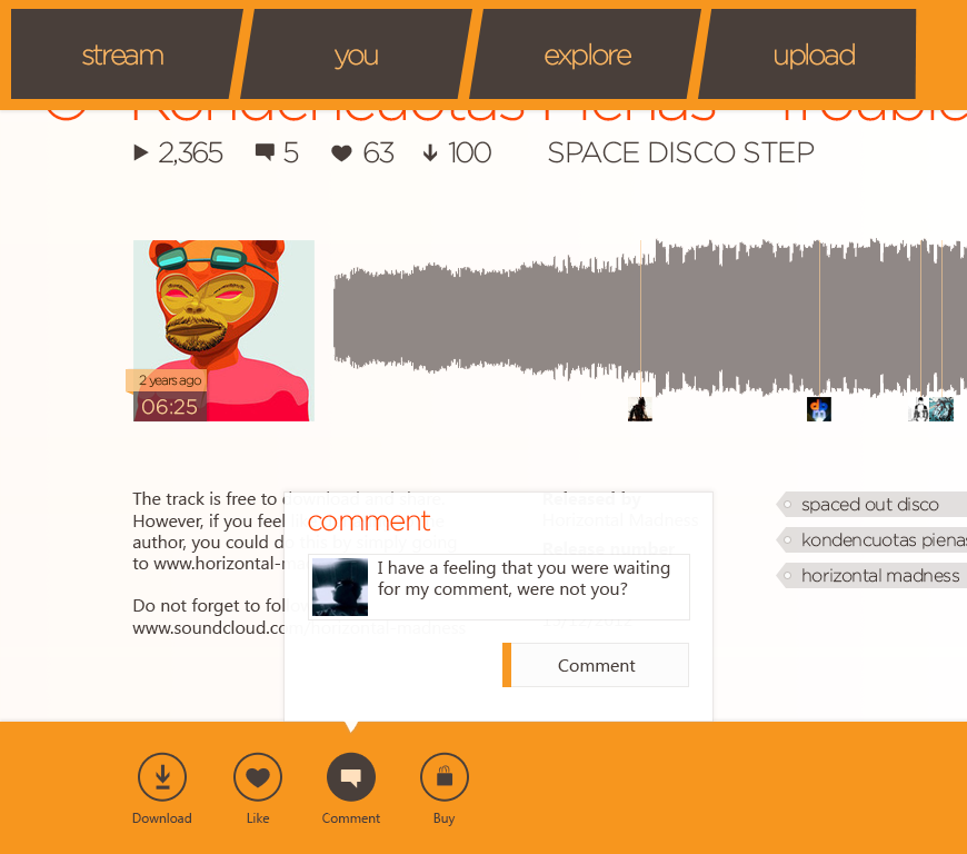
Swiping the device from either top or bottom will invoke the top & bottom application bars.
Top one is called navigation bar - allows the user to jump around the section of this app.
Bottom one is used for placing actions & commands specific to this page. It includes "Download" (download the track), Like (like/favourite the track), "Comment" (invokes the flyout which lets users leave comments about the tune), "Buy" - links out to the webpage where users can buy this track.
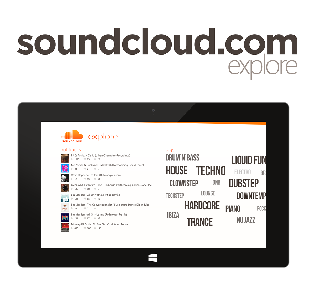
Explore section is for the users who want to listen to some music, they do not know exactly what they want.
Here they can see a list of hot tracks (tracks which get a lot of other users attention) and a tag cloud with the most popular musical genres.
Tapping on a tagcloud item would take the user to a collection view of the tracks that fall under that genre/tag.

This is where the page which allows you to upload your music to your soundcloud account. You have to swipe from the top (to invoke the top application bar and tap "Upload" in order to get here).
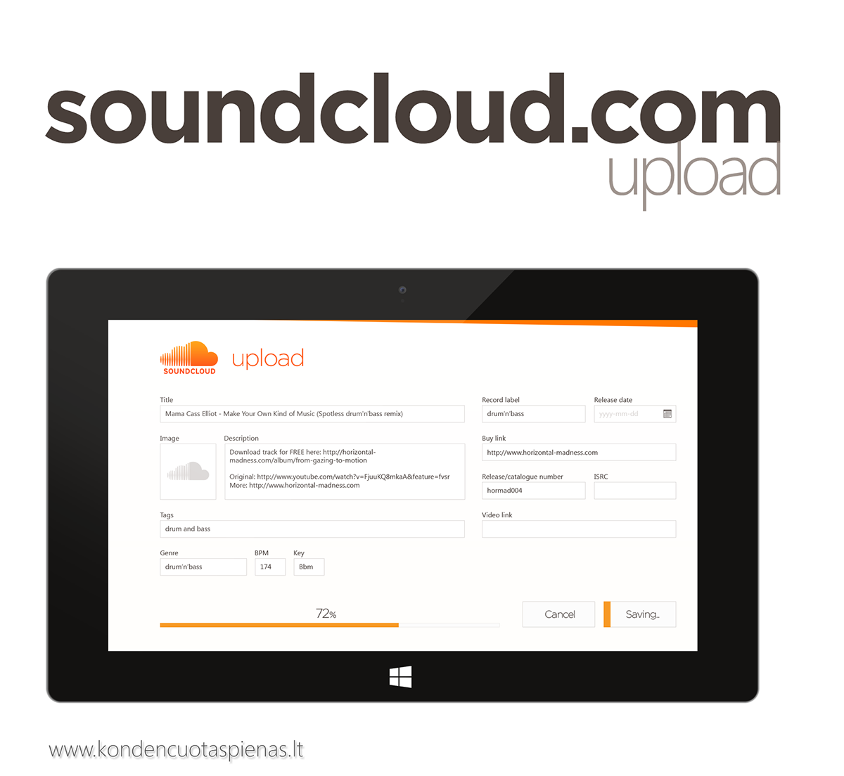
After filling the necessary information, you would have to tap "Save".
It's cruicial that your users get the immediate feedback from your application, so they know that no matter what they are doing with your application, your application does understand that and reacts accordingly. In this case, we're showing that the uploading is underway.. Soon, other will be able to listen to the material you've just uploaded :)


