Since transitioning to tech from advertising, I've had the great fortune (and fun) of working with UX/UI designers to create some pretty cool mobile experiences.
Mogo is a fintech company that positions itself as an alternative to the stodgy big banks in Canada. Our task: to create a mobile app for Mogo, which allowed users to sign up for an account, take out a loan, make payments, apply for a prepaid Visa card, and more.
I was the Lead Copywriter, and worked with the Lead Product Designer on the app — our CEO, who was very engaged in the project, was the final approver for design and copy:

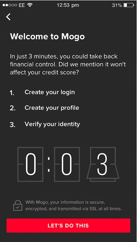
Before, the headline on this signup page was “Sign up for a Mogo account,” with the signup fields below it.
What we wanted: To set expectations of how long it would take to open an account, and to alleviate worries that this would impact people’s credit scores.
Mogo has a very fun brand voice + tone, so I added a small reference to a line in The Lord of the Rings in a relevant step of the signup process:
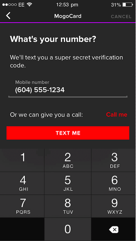
In hindsight, I would have suggested to the Design team that the “Text me” button be moved above the option to call. I think this makes more sense as opposed to breaking those up:
After the mobile app launched, we continued testing and iterating, to see where users were dropping off in the initial signup flow, to continue increasing those numbers. At the time of my leaving the company, we'd crossed the 250,000 signups mark — and the CEO was so confident in the app's experience that he soon announced a goal of signing up one million members to Mogo. (Which they would hit in the next few years!)


