Visual identity | Stationery design
Skills Alliance is an international staffing company specialised in recruiting skilled life science professionals in drug development, medical technology, biotechnology and biomedicine. Founded in 2005, they are headquartered in London and have further offices in Switzerland, Germany, Czech Republic, the Netherlands and the United States of America.
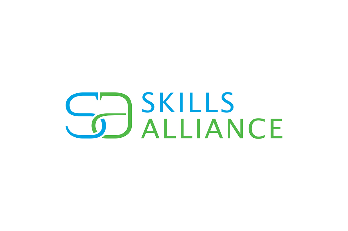
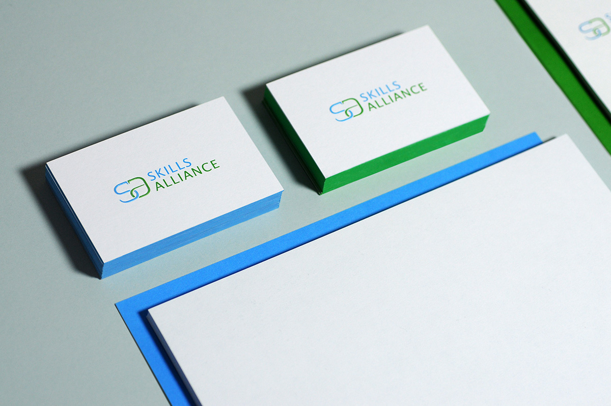
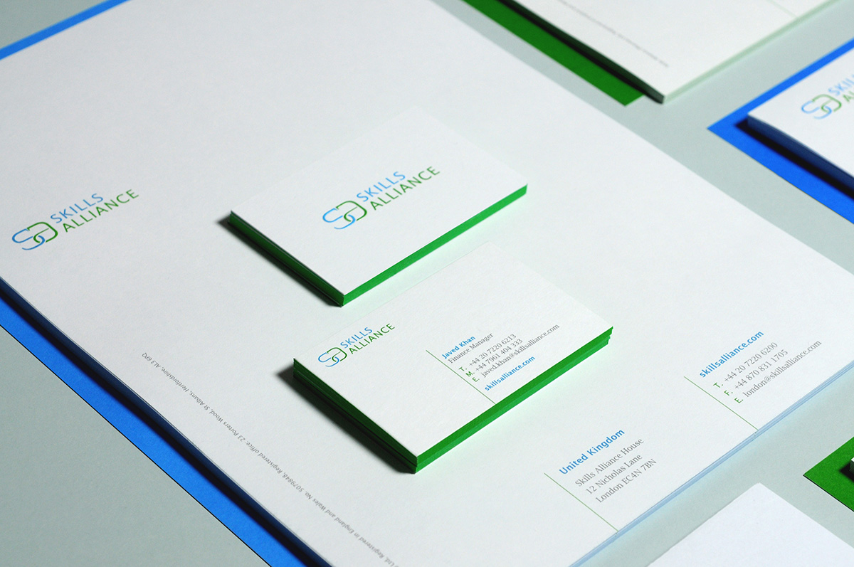
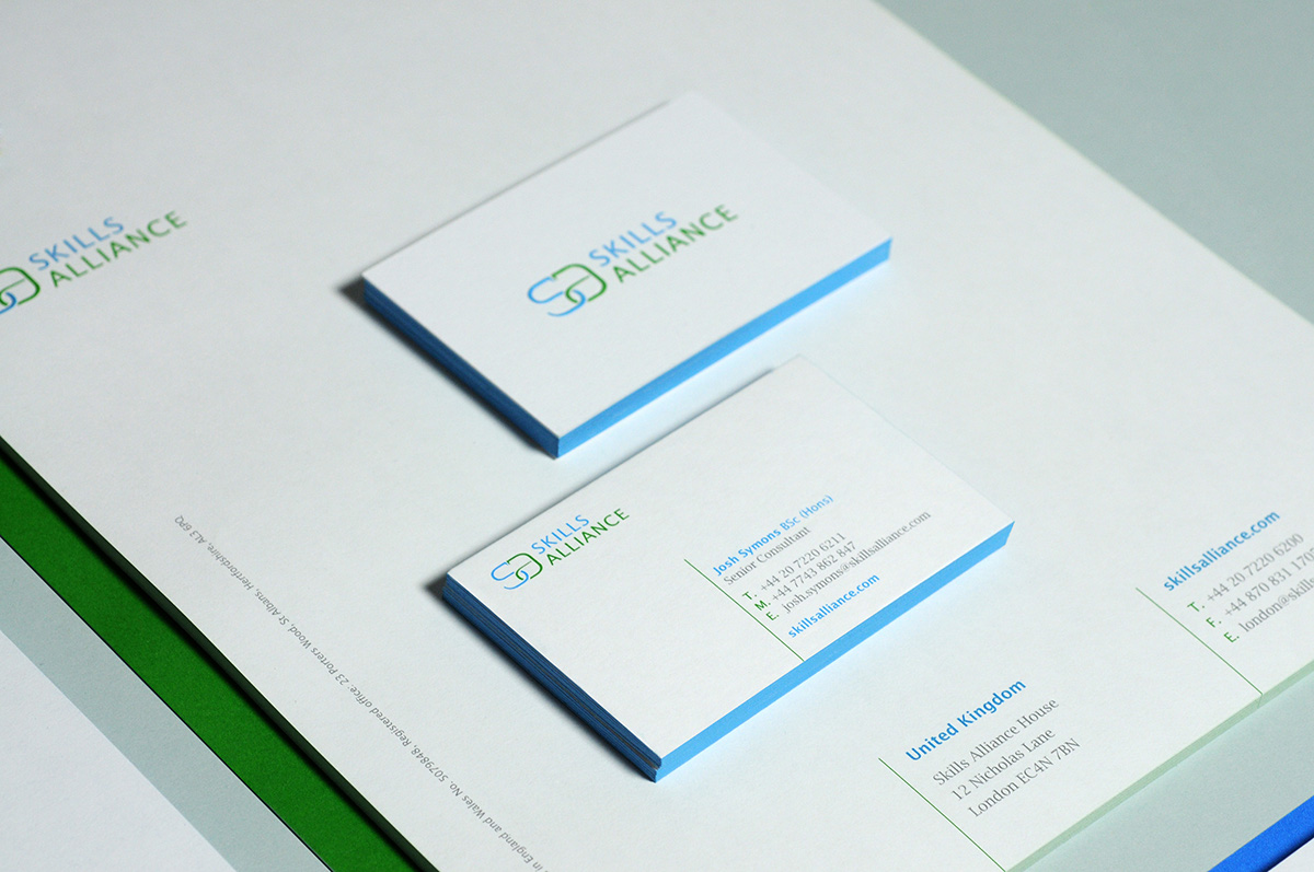
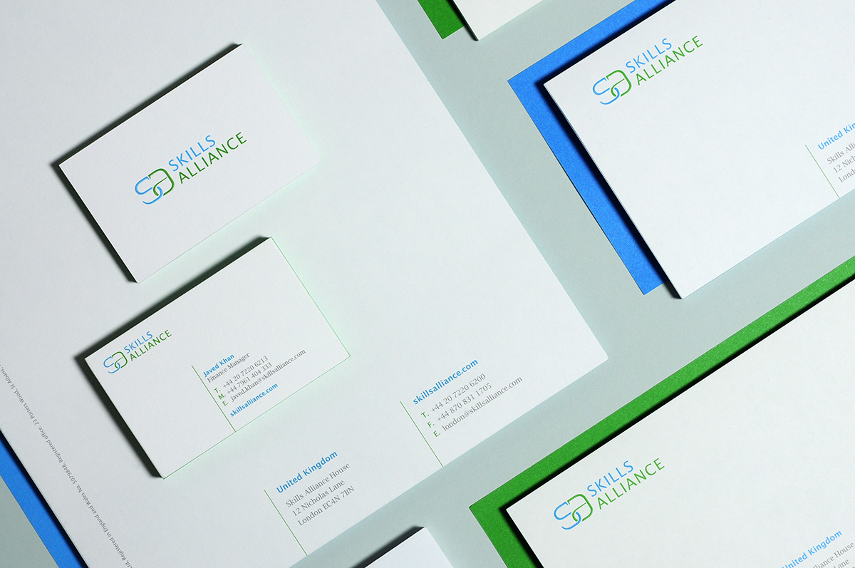
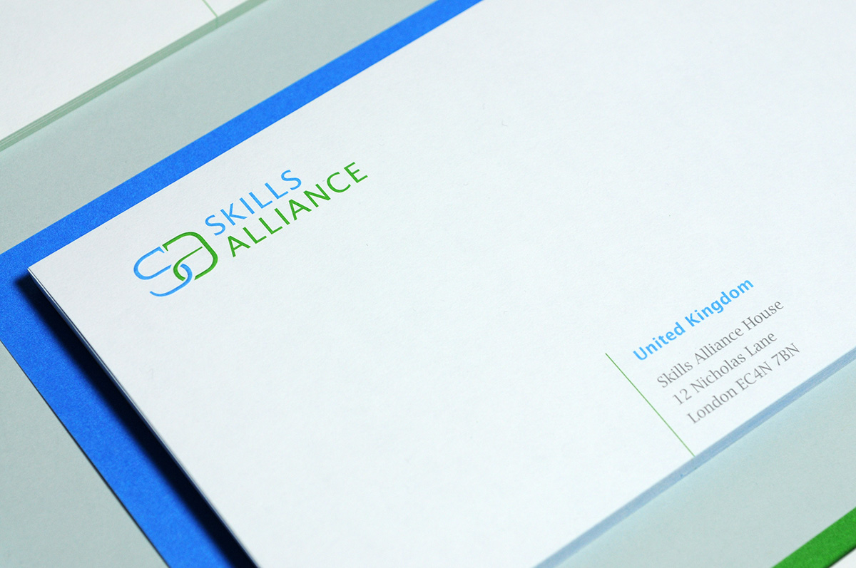
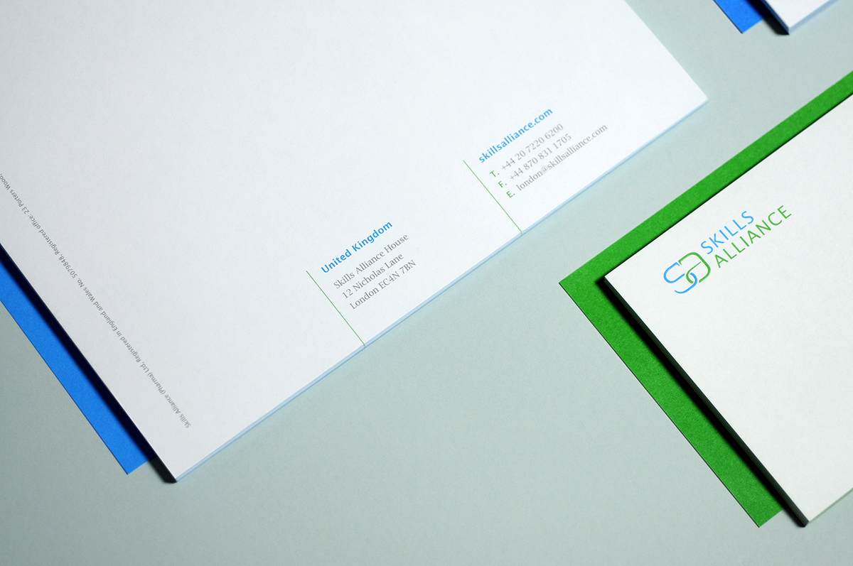
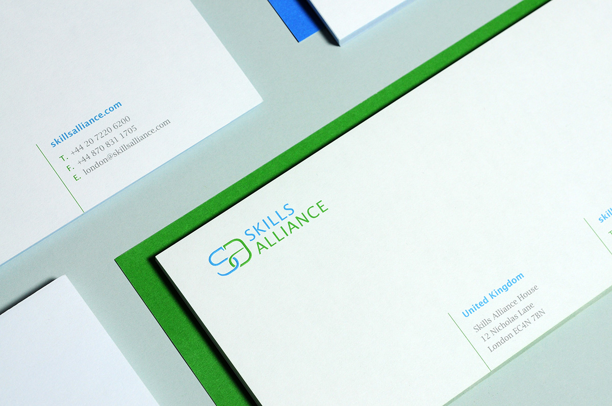
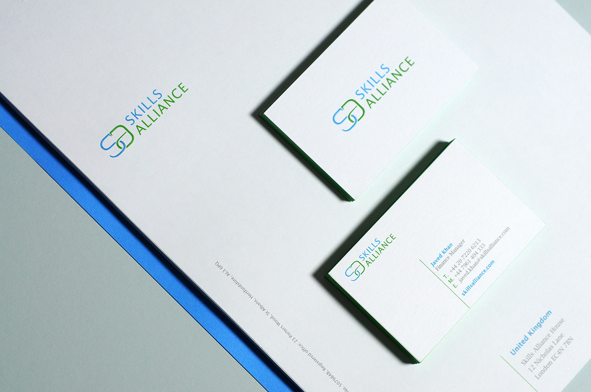
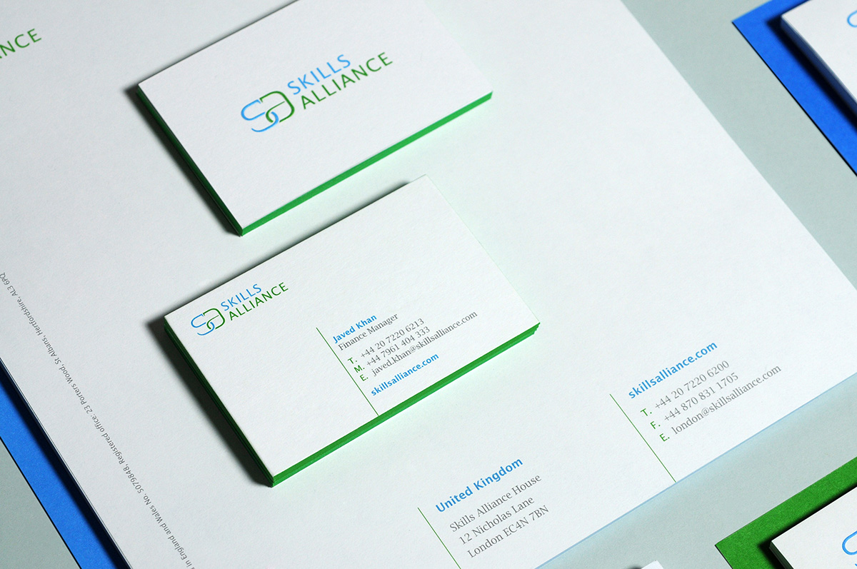
Skills Alliance approached me to help them create a new visual identity that will support their international expansion. They wanted something a little more bright, neat and professional looking that would be timeless and iconic, yet offer a link to the life science industry. As the main constitutive logo element, I created a monogram from the initial letters of the company name - S and A. I linked them both together to reinforce the idea of the ‘alliance’ and at the same time subtly suggest the iconic two entwined snakes emblem – caduceus - symbol of modern commercial medicine.
Regarding the typography, I decided to use the Lucida Sans and Lucida Bright fonts family, designed by Charles Bigelow and Kris Holmes in 1985. I find it important to use a serif font to enhance the body text legibility and to keep the sans-serif type for the logo, headlines, titles, subtitles and abstract text. A consistent font family is the best tool to generate harmony as much as distinction and contrast.
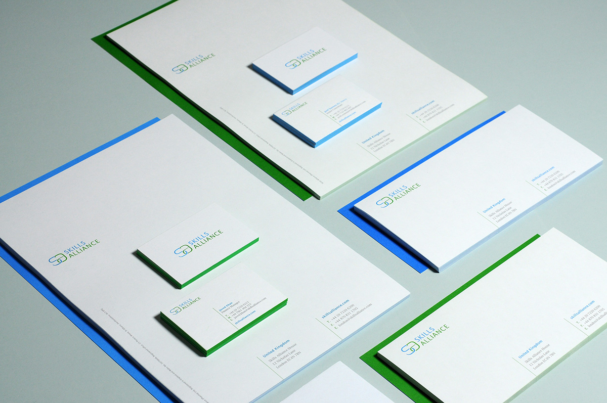
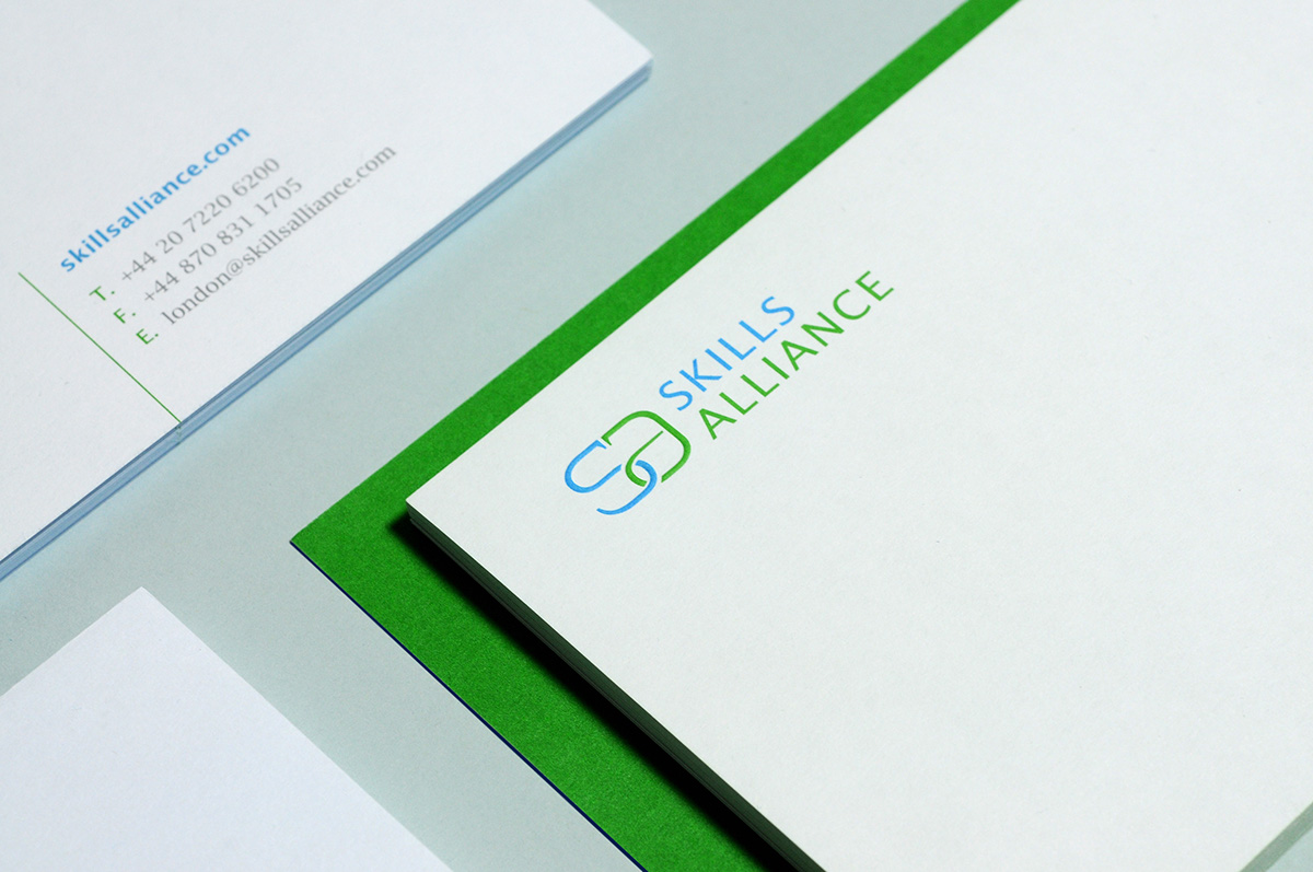
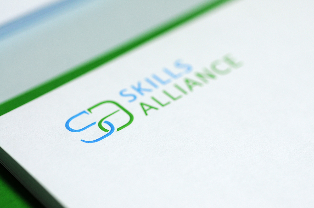
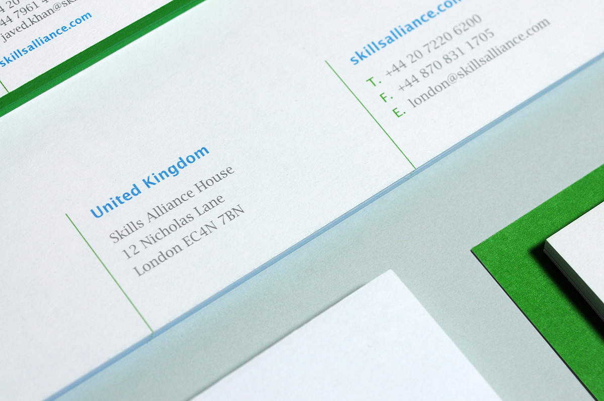
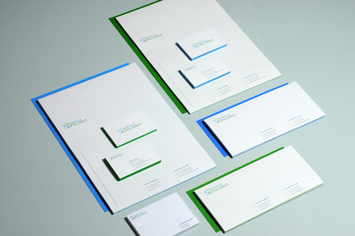
Business cards, compliment slip and letterhead are printed on the Fedrigoni Sirio paper range using three solid Pantone inks to make sure that all the graphic elements and text remain extremely sharp even if printed in a small size. A special embossing finish was applied on the SA monogram to give it a raised profile, offering a tactile experience when touching it. The business cards are printed on a duplexed board to attain a weight of 480 gsm, making sure the embossing on the SA symbol is not visible at the back side of the cards and therefore not affecting the contact details design. To hide the lamination connection between both boards, I have chosen to add a fore-edge printing process and to spray the two principal Pantone inks on the cut outside edges of the business cards.
Art Direction: Denis Mallet
Designer: Simona Cellar, Denis Mallet