
Sjoa Rafting
Commercial work, April 2011
Commercial work, April 2011
A friend of mine asked me if I could do a job for his father's company, Sjoa Rafting AS, a company that gives people experiences related to nature, wildlife and extreme sports. Sjoa is one of the worlds most famous rivers for rafting and kayak, and this company is the one that has been there the longest and offers great experiences. As I also have tried rafting with them, and know the company quite well, I thought it was a cool job to do.
Sjoa Rafting AS have many guests that comes back each year, and this is because they deliver a good service, not only with a focus on the product, but on the whole experience - from the arrival to leaving the camp. They have created a great camp by the river, with old traditional wooden buildings and wildlife accommodation in lavvo's.
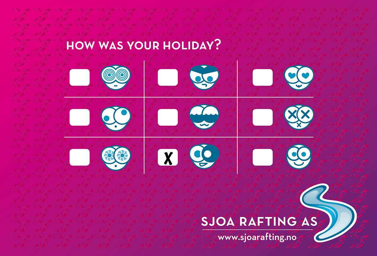
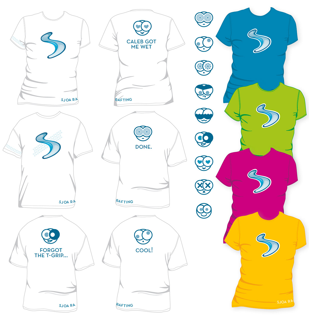
Everybody loves to feel cool after a trip on the river :) ... And the most common injury from rafting is a blue eye from a paddle...

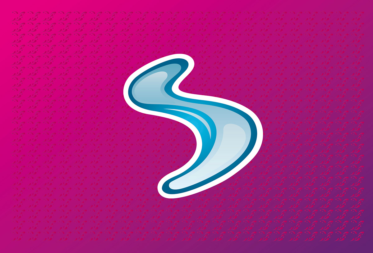
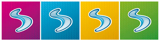
One of the things that Sjoa Rafting loved about the logo, was the way the gradient colour assembles the river and it's dark and white spots and nuances, in it's unpredictable ways. In addition the gradient of the background makes the drop-pattern seem like it is also something that changes, just like the colours of the river.
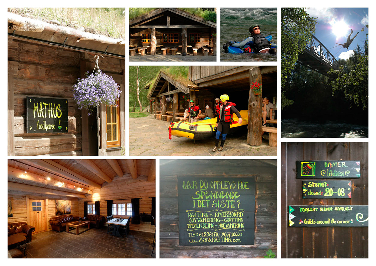
Above: Pictures from the camp at Sjoa Rafting ASBelow: Pictures from the activities.

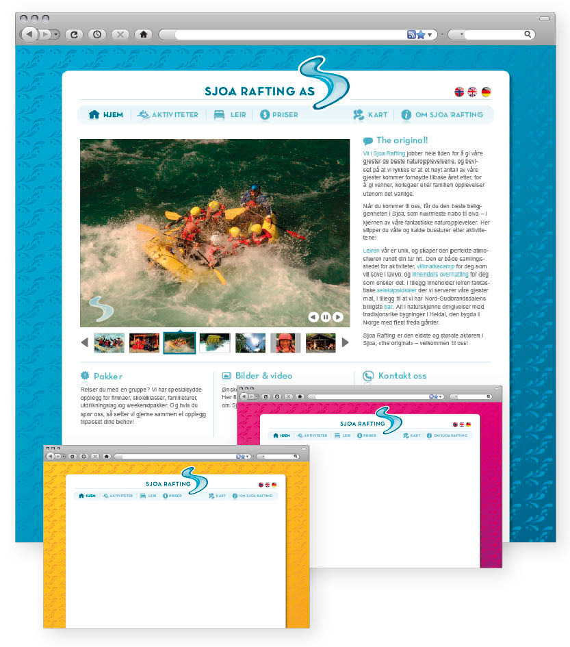
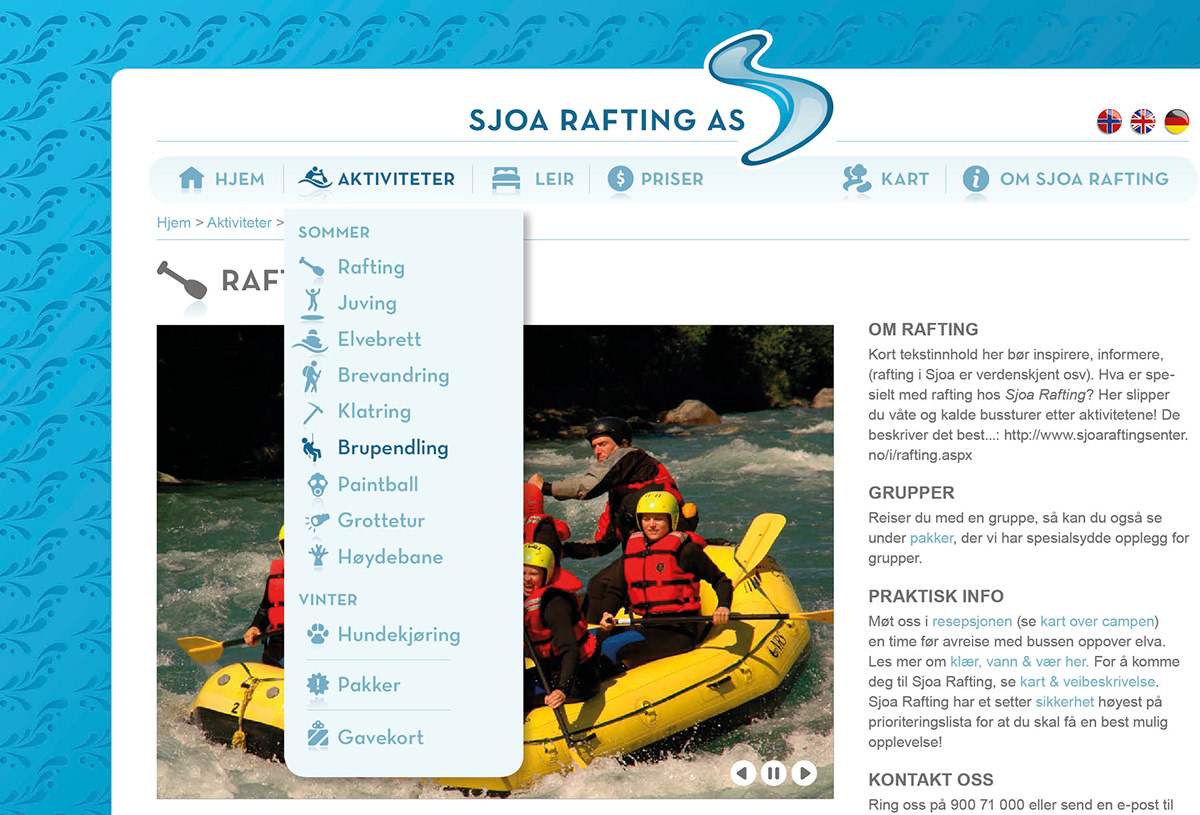
The previous website (that still exists per august 2011, as they launch the profile gradually) was a chaos of information. As for the structuring of the website, I therefore found it very important to show more of the activities that Sjoa Rafting offer - at the old website it seemed like they only did rafting. In addition it was crucial to show the fantastic camp that they have, because the camp located right by the river, is one of their best advantages to competitors.
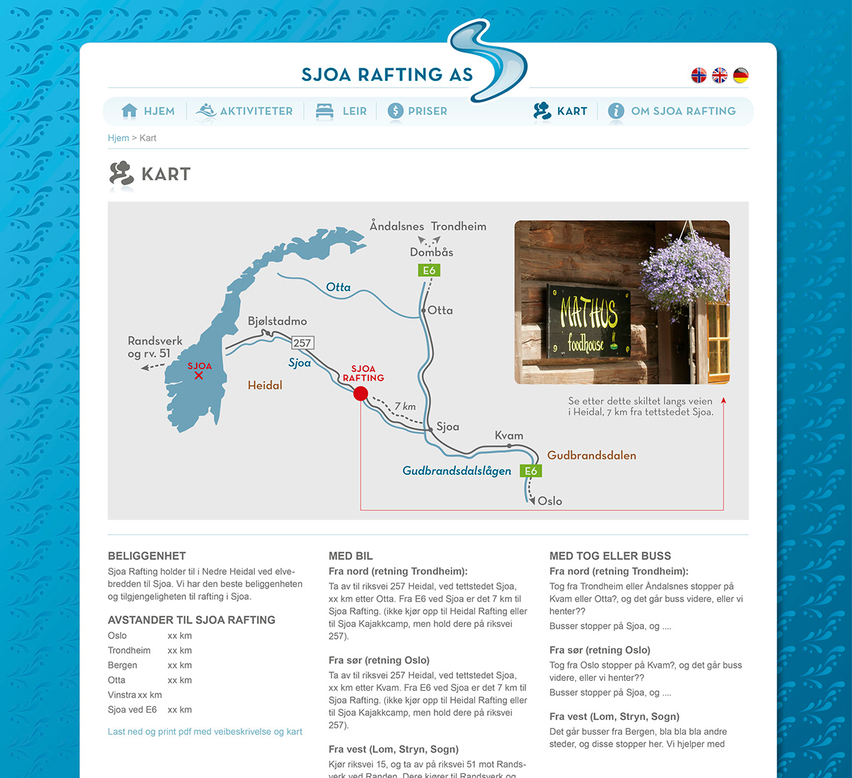
This is just a map of the website to show the organization of information:
This is just a map of the website to show the organization of information:

Inspiration & process
The first picture shows "work in progress": When I was sketching on the logo, I tried to find out how water and materials from nature works as typography. These water-experiments are the fundaments of the logo-S. The second picture shows some of the inspirational sources to the communicational aspects of the visual profile, and the third picture shows visual inspiration to the logo and the typography. 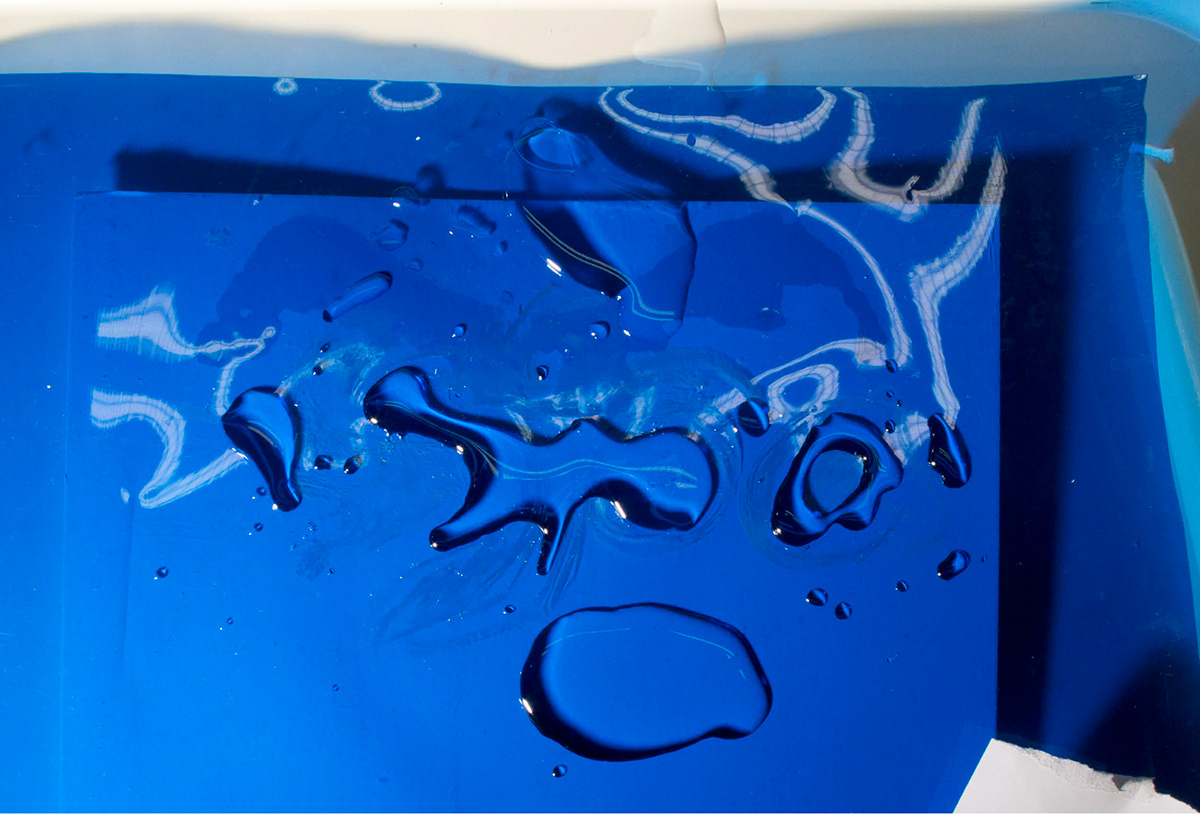

I wanted to create an expression that communicates something in-between these different sources of inspiration: the "cool" from Sweet, the entertainment/uniqueness of Voss, the handcraft/tradional aspect from Skafferiet, the nature experience from Ascent and the simplicity from the picture with the blue wave.
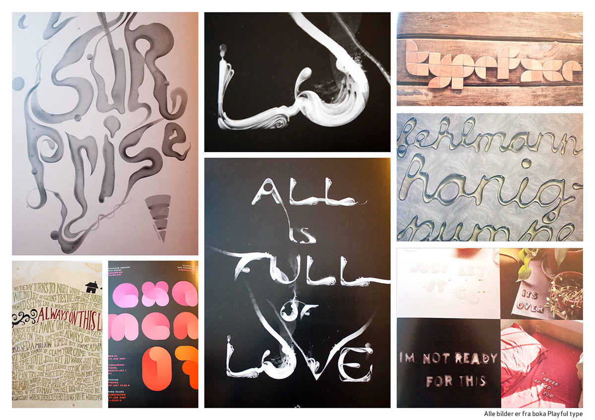
All these pictures are from the inspirational book on typography in nature/materials: "Playful type"