
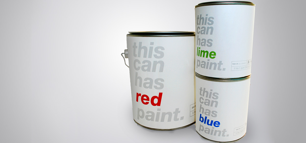
This can has red paint
Simplifying interior painting
Simplifying interior painting
The prompt for this project was to create the packaging for a line of paint that would be produced by a fashion designer gone interior designer. The paints would be sold beside the furniture created by the designer in the store. I imaged that the designer would be creating Ikea-like pieces and designed a line of paint that would match the simple and clean style we see there.
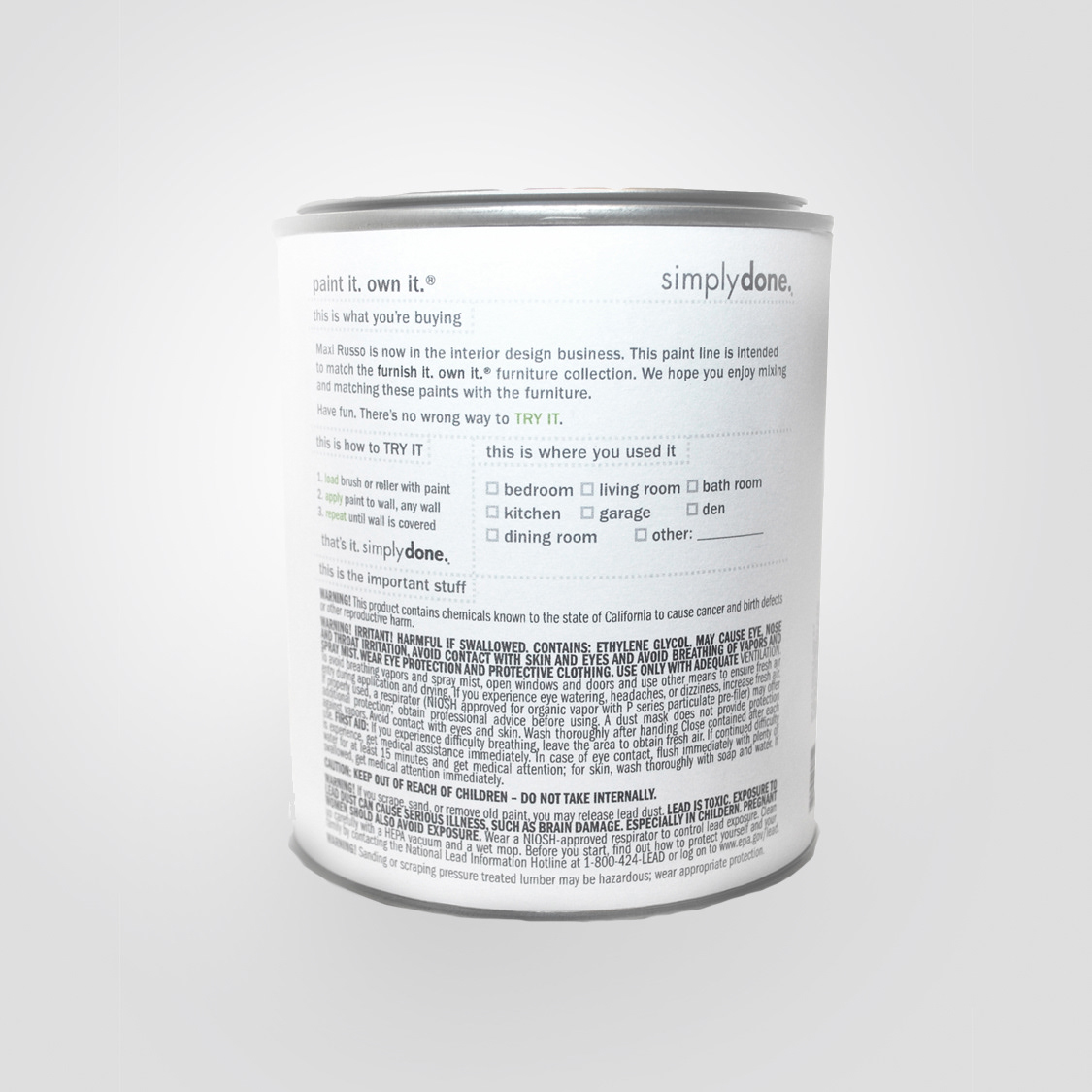
The back of the can was also meant to be clean and easy to read. I included a chart that the customer could use to check off what room he or she used the paints in. This would help them keep their colors organized and clean.

The name would not only show what color was inside of the can but also demonstrated if the paint was matte, semi-glossy, or glossy.


