
"A Century of Connecticut Storms" is a timeline mapping 100 years of storms. To achieve a sense of order with so much text, each storm has a dimensional plaque which was then mounted on top of the vinyl background. To the right is a map direct-printed on Homasote into which visitors can stick a pin to note where they were during Superstorm Sandy.
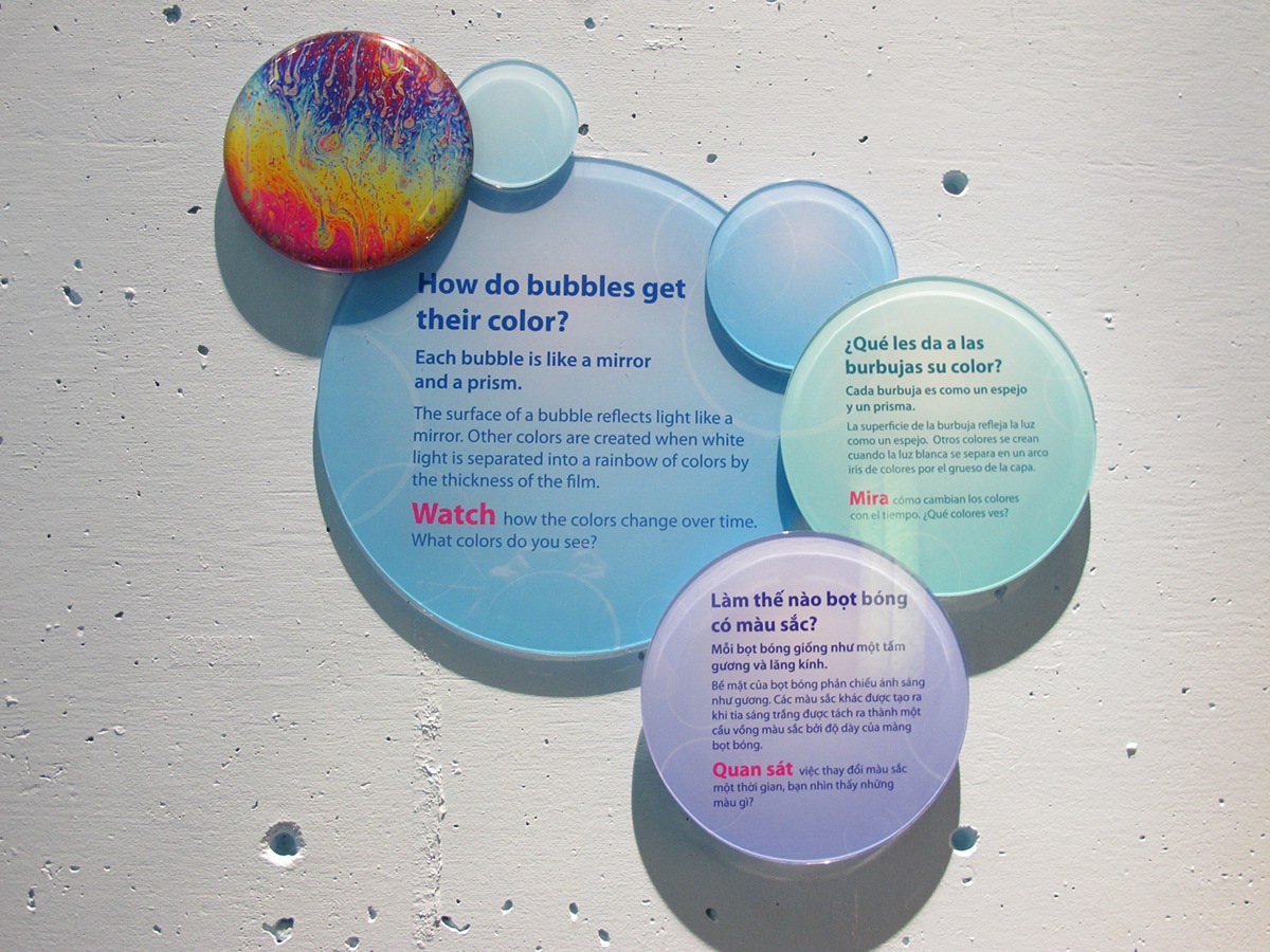
The signage in the Bubbles exhibit at Children's Discovery Museum of San Jose is made from reverse-printed clear acrylic that has been cut and mounted in a dimensional array, inspired by the way bubbles move.


The signage for Mammoth Discovery! is printed directly on Dibond, an aluminum composite substrate. Since we use three languages in all our interpretation, signage with just one sentence can start to feel text-heavy, especially in a content-rich exhibit like Mammoth. The way the panels relate visually to the wall keeps the signage from dominating the space but the exposed aluminum border and shiny accents catch the eye. I used the silhouette motif to illustrate the panels in a subtle way that leaves plenty of room for the imagination. The rolling hills differentiate each language.

Waterproof Sintra graphic panels hang from the ceiling in Waterways at Providence Children's Museum. Each sign is printed on both sides and follows the graphic program of the rest of the museum, differentiating English from Spanish with sans-serif and serif typefaces. I created unique graphic elements for the five signs, each inspired by its content and location.

