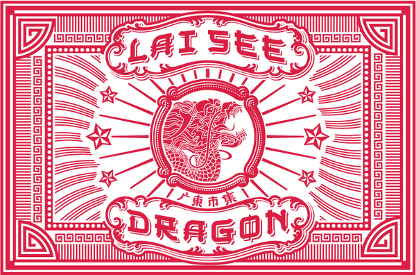
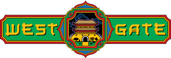
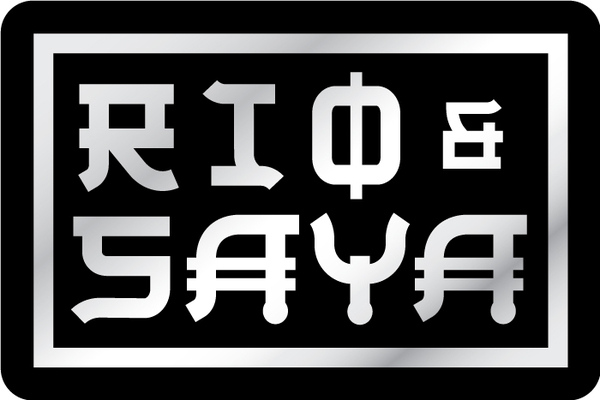
Originally designed to brand and package products celebrating the charm and mystery of the Ancient East, the characters in Setsuko were meant to express admiration and respect, not the stereotyping and parody sometimes evident in fonts with a particular "foreign" flavor. Rather than trying to twist pictograms into Roman letterforms or effecting a recognizable but trite idiom, I chose a more ambiguous stylization, hoping to leave room for a designer's creativity and interpretation.


