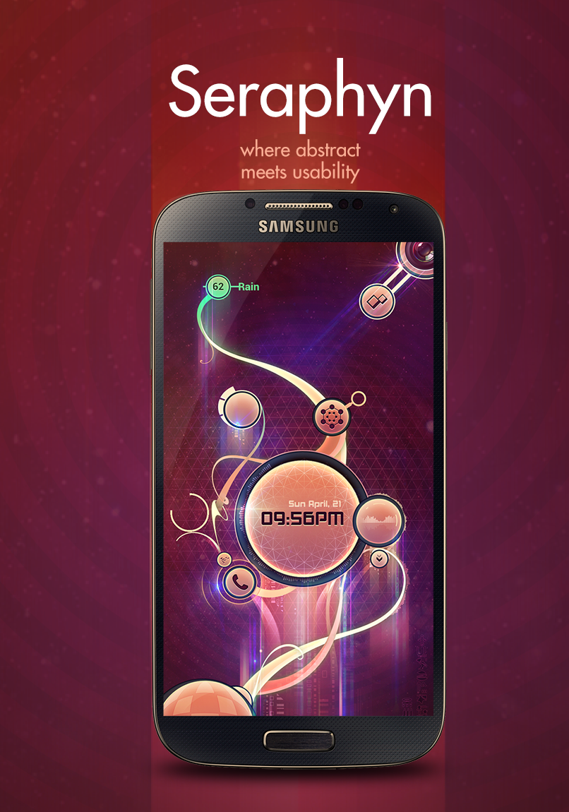
Truth be told, I was tired of the themes I was seeing; rigid, monochromatic, minimal.
We have these incredible devices with unbelievable quality and color reproduction,
and we arent taking advantage of them! I want to show off my display. its a work of art in itself.
I wanted to make something that wasnt flat, clean and grid based.
I wanted messy.
Something organic which flows with the user.
I decided to try something new: using my right thumb and a drawing app,
I explored which regions of the screen are easy to acess:
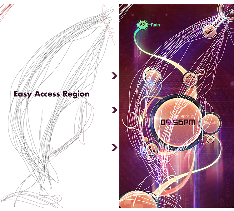
Everything in the black can be reached with minimal effort.
I tried to organize all my most needed shorcuts in this region.
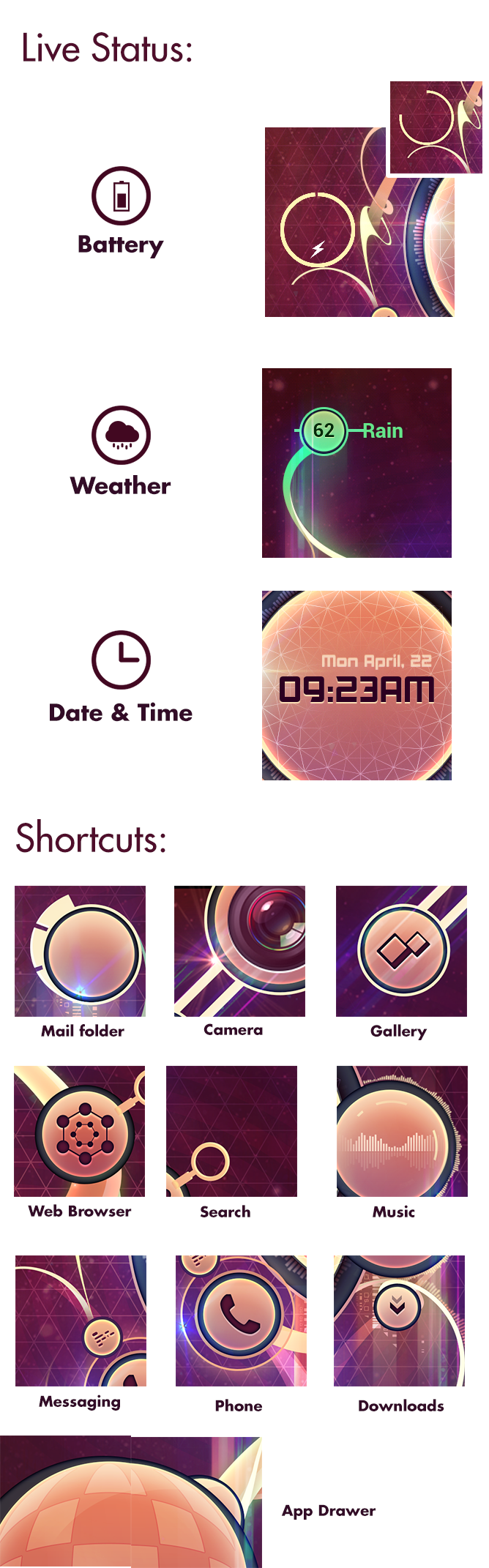
A Swype gesture from the bottom reveals the notification tray,
latest messages and updates are displayed here.
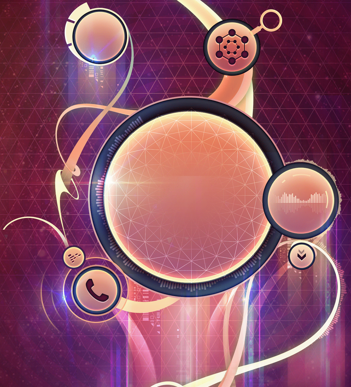
Closeup view of the background (made in photoshop).
I tried to incorporate metaphors for each shortcut into its icon:
Radio waves for the messaging section,
the music launcher has recognizable bar visualizer elements ,
everything flows from the bottom left (the app drawer) , representing all the potential of the phone,
and all other elements (individual apps) growing out of it.
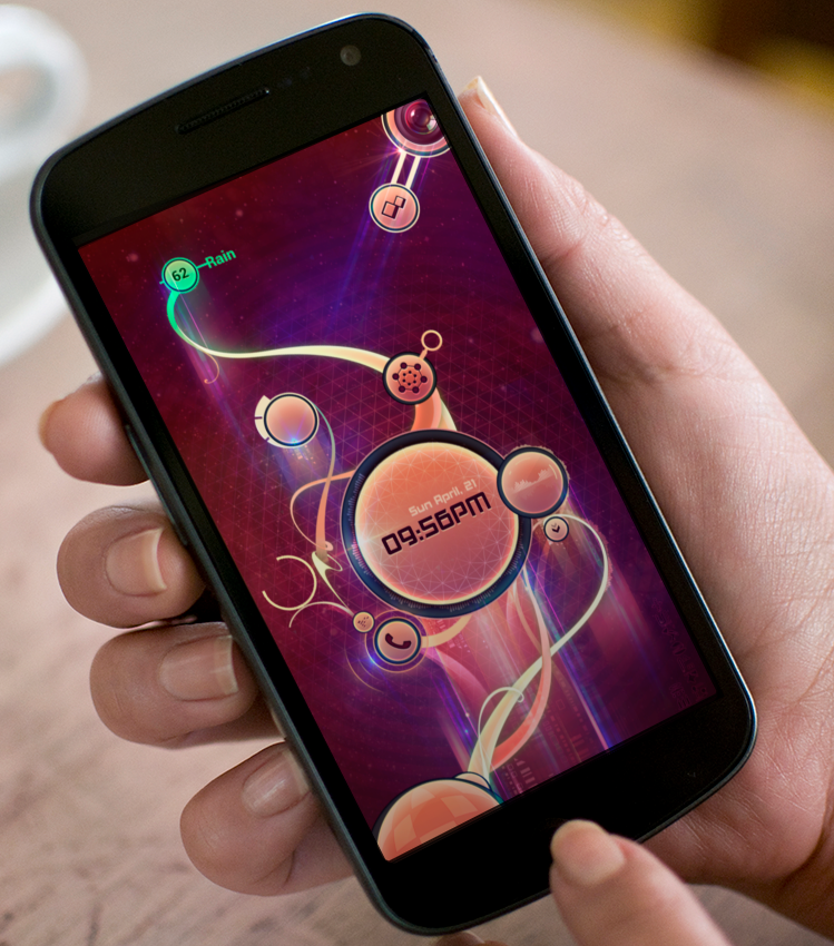
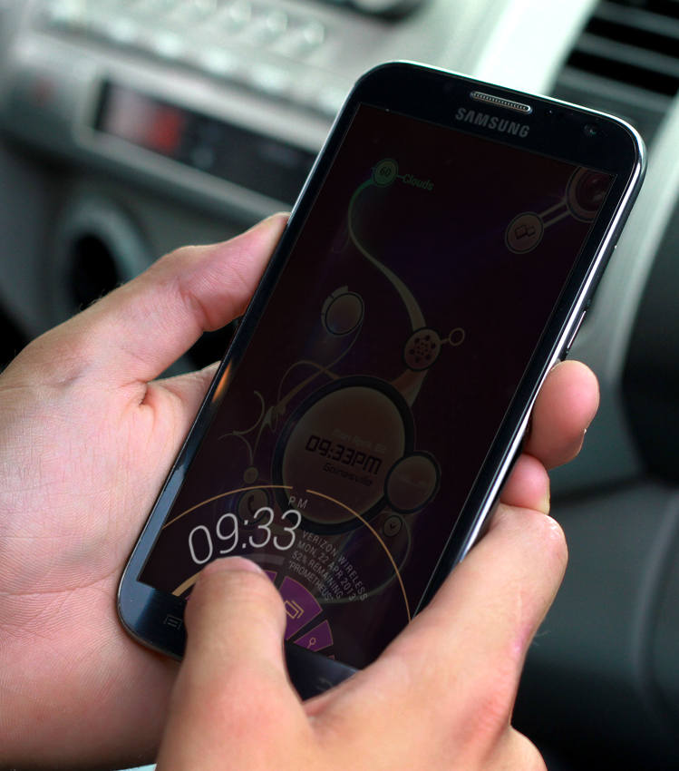
Screenshot from the implemented interface.
Feedback welcome.


