


In 2011 and 2012 I participated on the corporate typeface for germans daily "Süddeutsche Zeitung" at the office "Bureau ErlerSkibbeToensmann". Hand in hand with type designer Henning Skibbe and Art Director Christian Tönsmann the different styles and weights were carefully designed. The technical part was edited by fontshop.com.
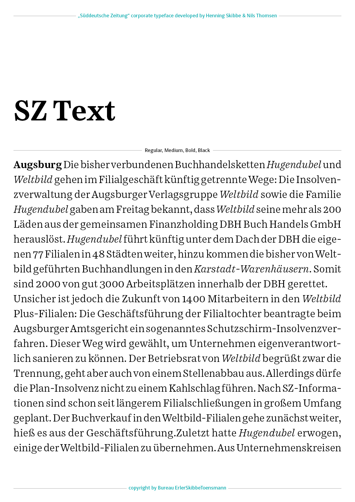
SZ Text is based on the previews typeface "Excelsior" (Chauncey H. Griffith, 1931). The new typefce got narrower and the capitals smaler and lighter. To this we added lots of new details, which worked better and made it overall more efficient in tight columns and line spacing.
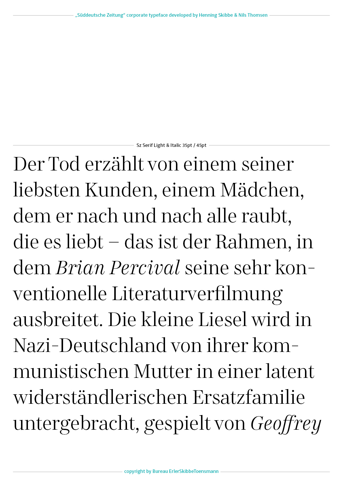
SZ Serif is based on SZ Text and replaced the "Times" (Stanley Morison, 1931). Higher contrast and slightly narrower letter shapes makes it more useful for headline typography.
SZ Sans is designed for strong headlines and replaces "Helvetica" (Max Miedinger, 1957). Simple and silent shapes gives the right touch to the neutral character of "Süddeutsche Zeitung"
SZ Sans Condensed is made for tables in the sport or economy segment. It replaces “FF Unit” (Erik Spiekermann & Christian Schwartz 2003-2011).

