WORK IN PROGRESS.
The emblem of Union of instructors SNOWPRO was very recognizable and my clients weren't ready to change it for a long time. In spite of brand awareness they realized their emblem was lost in a line of competitors and partners. It was time for renovation.
Important condition: the emblem must be the same, but new. It have to be classic and serious, not fashionable, not trendy.


There are main symbols, that have to be preserved in the emblem: SUN, MOUNTAINS, SNOW.

Snowflakes always have a hexagonal form

2 basic modules to build the logo


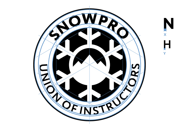
All elements are subject to the basic modules


Main color scale


Equipment for instructors

Additional color palette


T-shirt for students
