


Revert Design is my recently founded graphic design studio. The name originates from a graffiti name I used as a teenager, it derives from my real name Trevor when written backwards reads Revert. (kind of!)
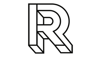
I have always been fascinated by the works of M.C. Escher, Reutersvärd and others. I came across a newly designed font called Macula by Dutch type designer Jacques Le Bailly a.k.a. Baron von Fonthausen.
The font is an Esher-inspired forray in optical illusion, which is really beautiful. The idea of the letter R as an optical illusion really intrigued me as there could be endless possibilites with it as a brand mark. So I alterd the R from the Macula font a little and decided to use this for my logo.
I was also experimenting with patterns while screen printing and decided to use these in my new logo design.
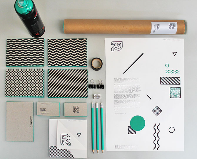
The 4 patterns used are to represent the main areas of design I work in - Branding, Print, Interactive and Interiors. While the green colour comes from the word 'vert' which is green in French.
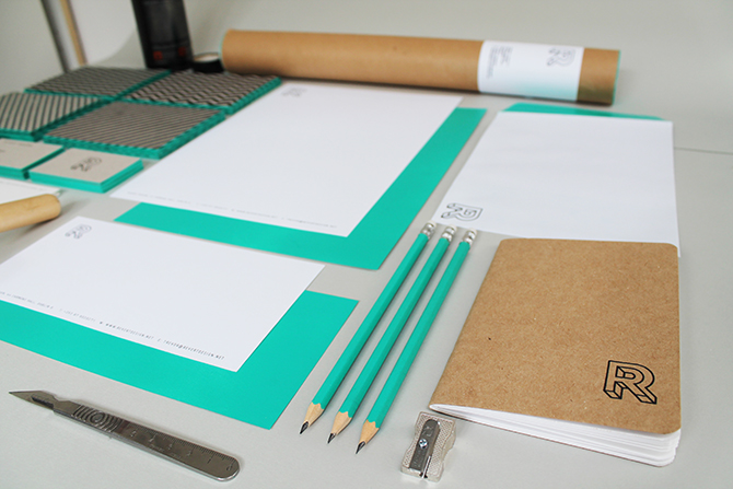
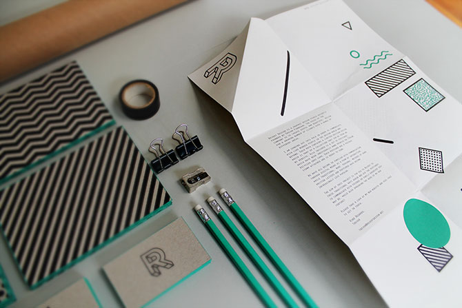
With my budget pretty low for this project I wanted to do the printing myself, so I got rubber stamps made which I could use throughout. The business cards were all hand crafted using 100% recycled 750gsm grey card and spray painted around the edges. All the printed info was stamped from a self inking stamp. The process used for the pattern postcards is similar except these cards were individually hand printed front and back with rubber stamps that I made.


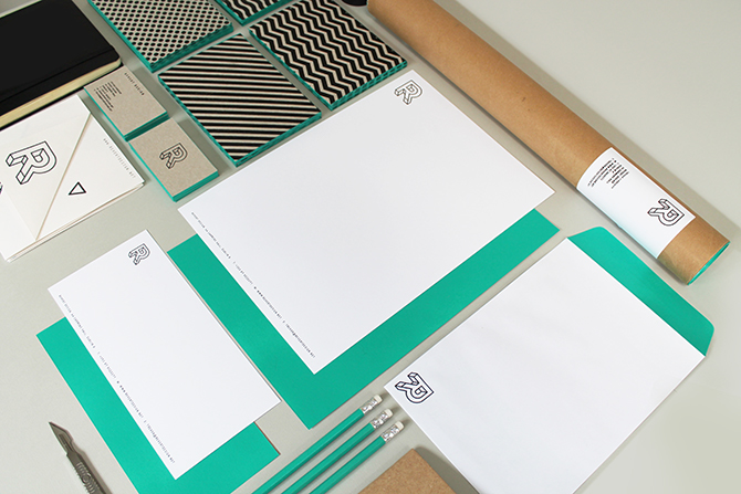

Postcard and business card are individually hand crafted and printed on 100% recyceld card with rubber stamps.
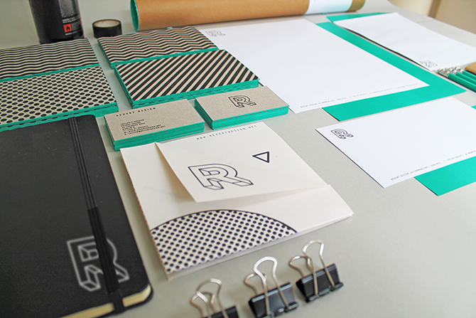
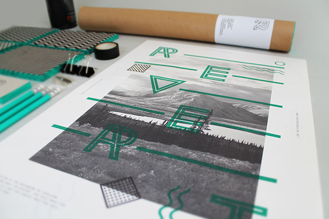
The collection is part of a promotional pack which I am sending out to clients and other design professionals. The pack includes 4 postcards a folded poster (above) and a set of business cards. If you would like a pack please get in contact

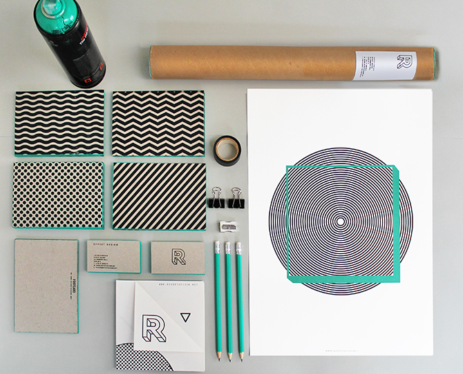
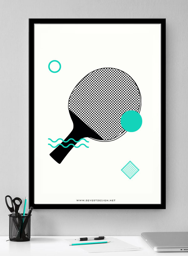
Posters are available to buy in my shop at www.revertdesign.net

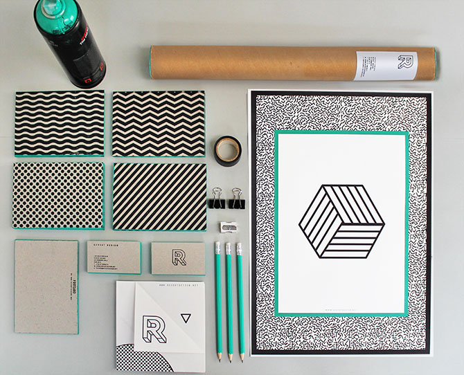
Posters are available to buy in my shop at www.revertdesign.net

Posters are available to buy in my shop at www.revertdesign.net

Posters are available to buy in my shop at www.revertdesign.net
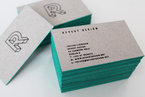
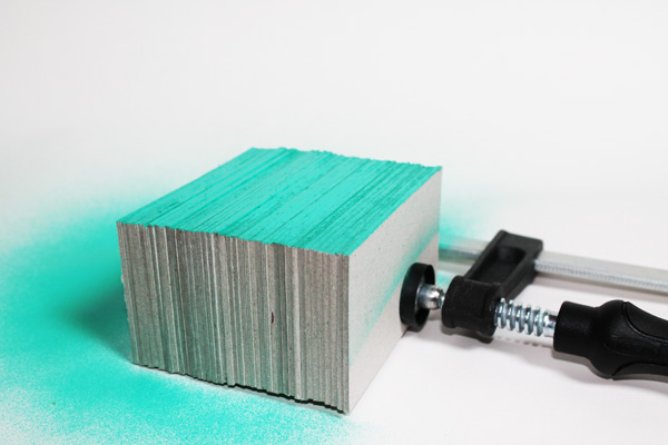
Business cards were cut to size then spray painted.
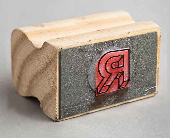
Rubber stamp of my logo is used on all the printed material as seen above.

These are the rubber stamps that were made to print each of the postcard designs.


