Even Linkedin Can Be Beautiful
One of my favorite things to do as a designer is to conceptualize and make it happen. I really love a personal challenge where I can dive deep and examine every design element presented. With those observations, I am able to theorize and reverse engineer design decisions.
LinkedIn is the world's largest professional network boasting 200 million members in over 200 coutries around the globe. Their mission is to connect the world's professionals to make them more productive and successful. With access to people, jobs, and insight, LinkedIn has proven to be a powerful tool for professionals.
In my attempt to create a better LinkedIn user experience, I took 3-5 hours to create the concept below. There are many other aspects and features that I did not get a chance to present but with more iterations and revisions of these concepts, I believe I can create a better LinkedIn experience.
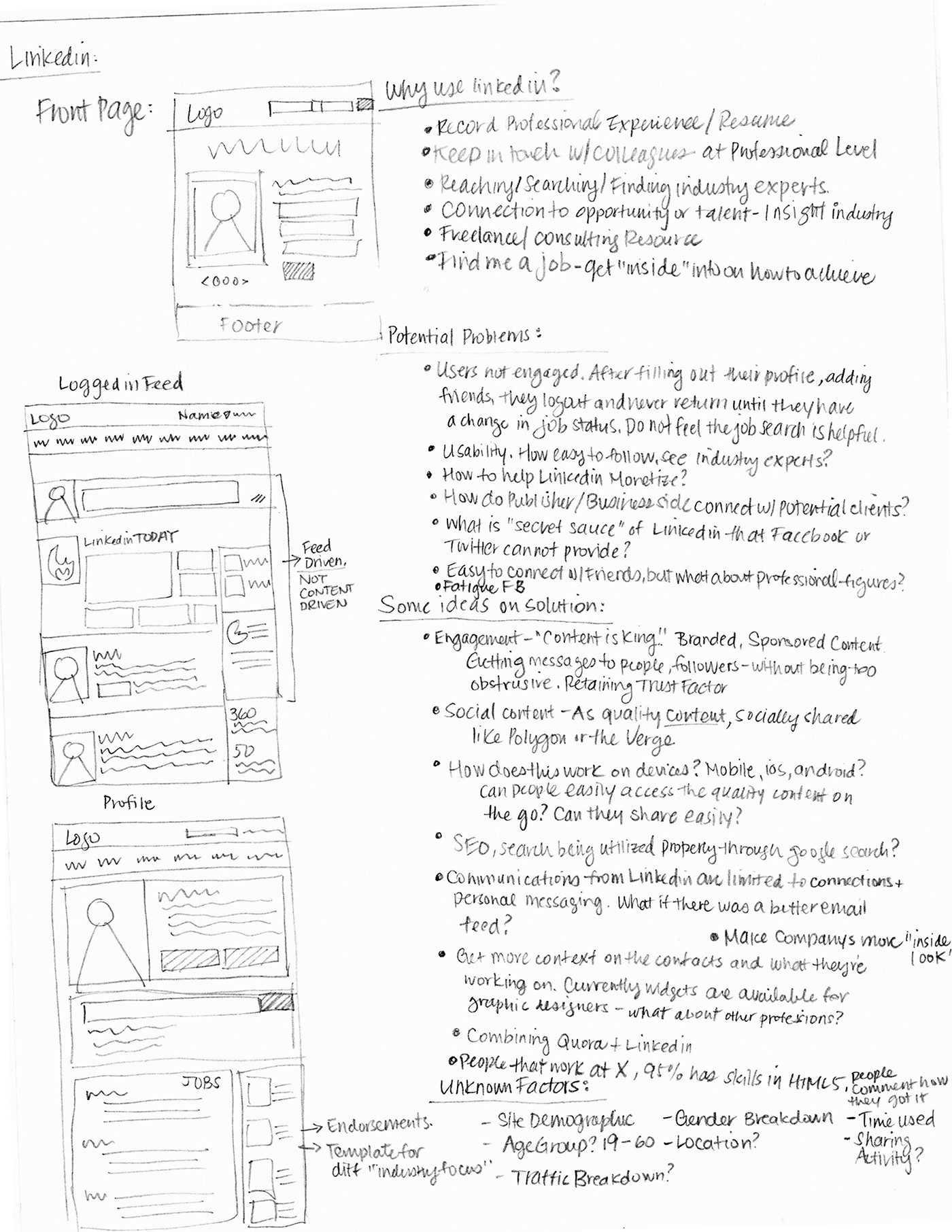
I wanted to touch upon the following: (1) Why do we use Linkedin (2) Potential Flaws (3) Ideas on solution (4) Unknown Factors.
(1) Why do we use Linkedin?
(1) Why do we use Linkedin?
- Record our professional experience and resume
- Keep in touch with our past friends at a Professional Level
- Reaching / Searching / Finding industry experts
- Connection to opportunity in a field that you like, finding talent, getting insight
- Freelance / Consulting Resource
- Get inside info on Job Opportunities
(2) Potential Flaws
- Users are not engaged with Linkedin after completing their profile. Due to the nature of business profiles, people rarely need to make frequent updates. Seems like people only login to Linkedin to accept a friend request, or received an InMail.
- Some people feel that the job search on Linkedin is not too helpful
- How easily is it to access Industry Experts? Public Figures?
- How do Publisher/Business side connect to potential clients?
- What is Linkedin's "Secret Sauce" that Twitter or Facebook cannot provide?
- How to be different, relieve the "Facebook Fatigue"?
(3) Some ideas on possible solutions:
- Engagement. "Content is King". Having branded, sponsored content, getting messages out to people without being obtrusive. How to retain that trust factor? How can we make this more personalized?
- Social Content - How can we make the content, QUALITY content?-How do people use it on the go? Mobile Devices? Is it easy to access?
- SEO, Search being utilized properly through Linkedin? What abut Keywords
- Communications are limited through connections. What if there was a better content driven feed?
- Get more context on the person's projects and updates. Be able to ask questions like Quora.
(4) Unknown Factors
- Site Demographic
- Age Group
- Traffic Breakdown
- Location?
- Time people mostly share and active?
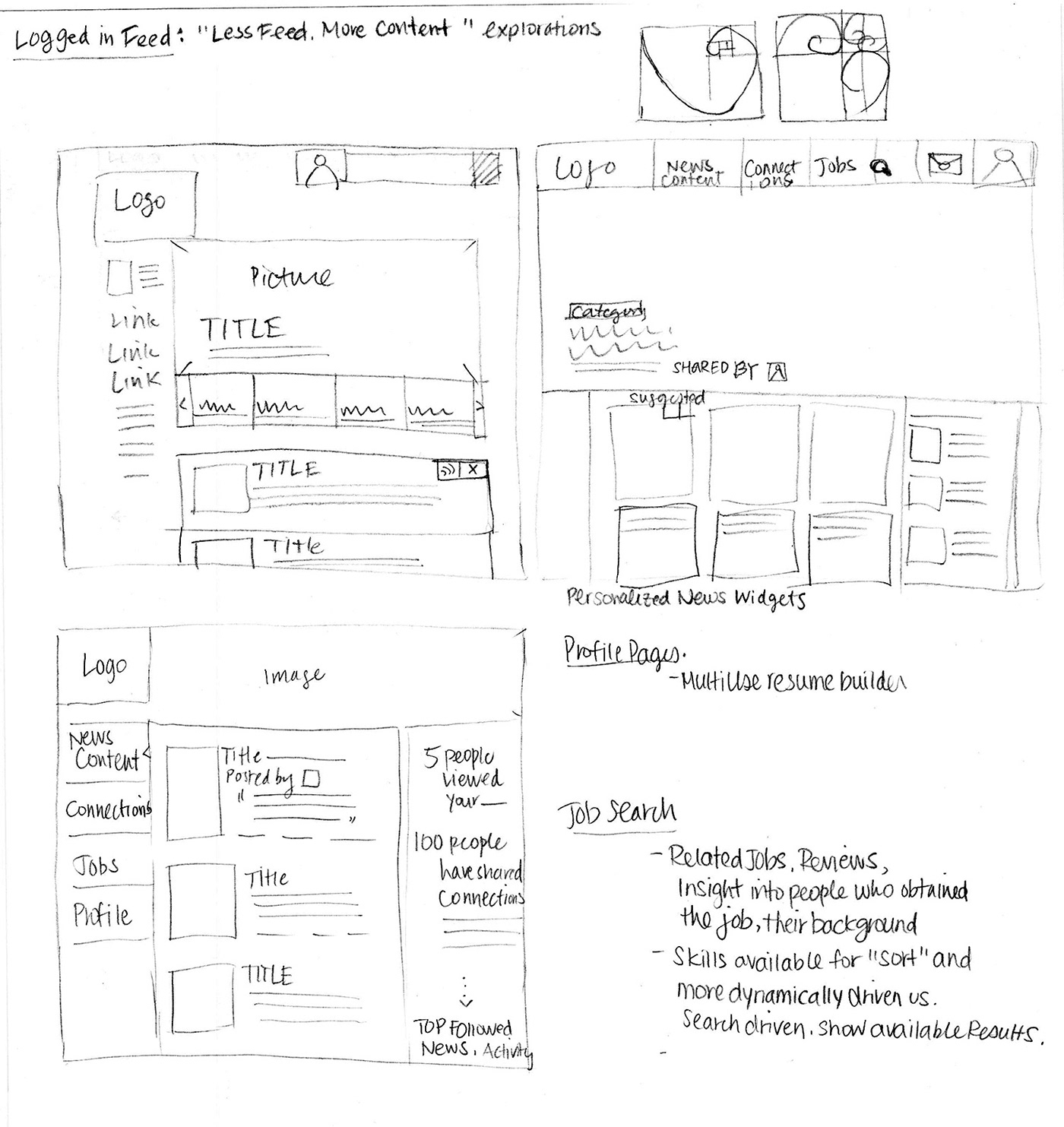
The above are just some of the thoughts I had for Linkedin. I believe that what makes Linkedin more special is the actual CONTENT. I would like to propose a more "content driven" Linkedin, where users will feel that it's more engaging and relevant towards their own interests. Business sites do not need to be "stale", it could be a layout that is both professional and attractive.
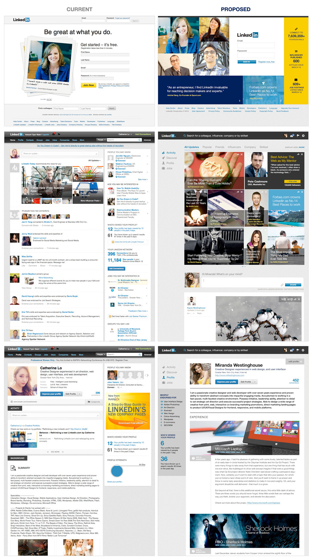
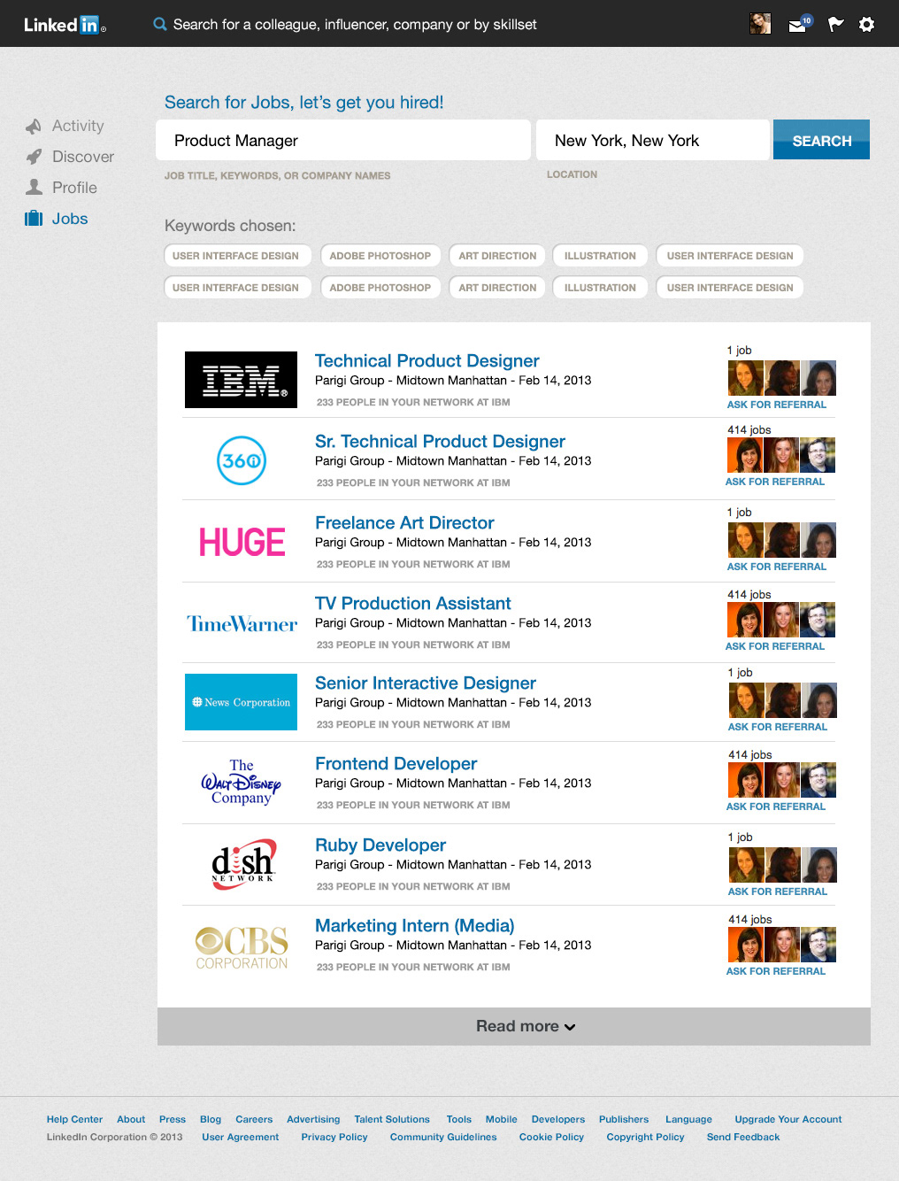
(below) A Wireframe on how to create a less cluttered Linkedin. I believe right now, it takes a lot of extra clicks for users to get to content that they want to see. I want to simplify all of that. Only leave what is important and allow content itself to shine.
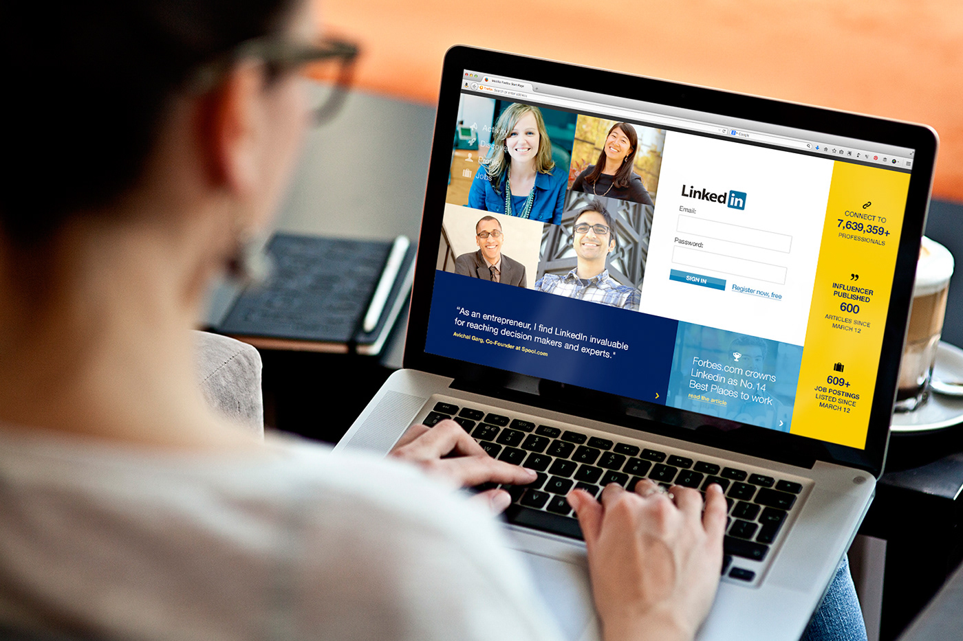
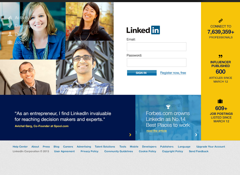
(below) A wireframe for the login page could also use a nicer facelift. There are so many options to explore, from Traditional, to Gridbox, to Interactive styles.
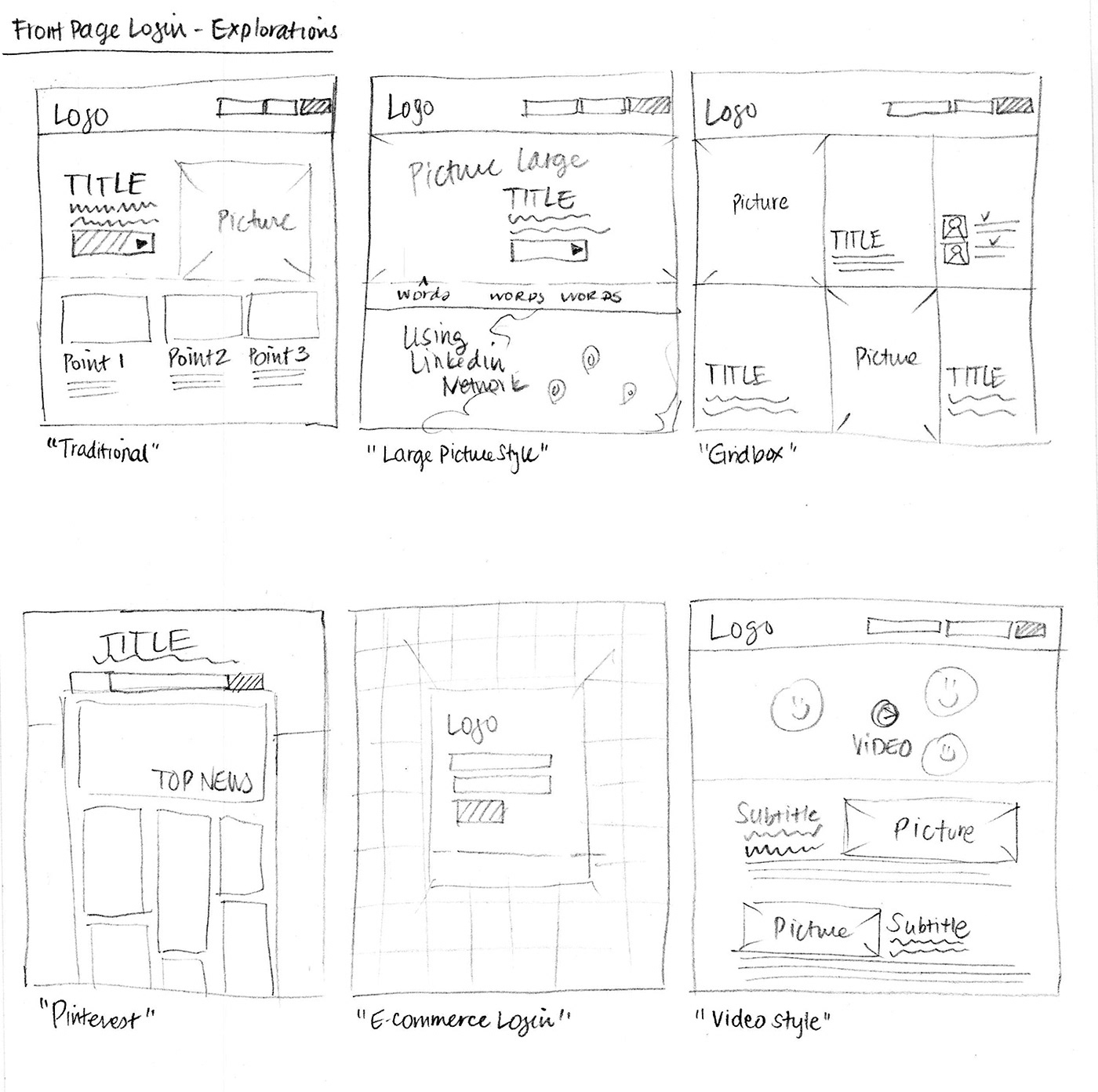
Visual Concepts
Linkedin's branding colors are very similar to Facebook and Twitter, using mostly pleasing blues and oasis lagoon shades. Blue is very traditionally used with Tech companies, as it presents a very calming and pleasing effect. I've noticed that Linkedin also uses a lot of light and darks with few points in highlight yellow. I want to keep their branding the same, but explore a bit more. I incorporated more yellow into the page because it can be the color to really make Linkedin stand out apart from Facebook and Twitter. It gives a more "hip" and "edgy" feel.
I decided to go with a more gridlike style, because the "in" symbol in Linkedin is encased in a rounded square. It would be a natural progression.. also this page is full screen from top to bottom with different animations loading for the quote, and photo of influencers. The data on the right side should be live and active.
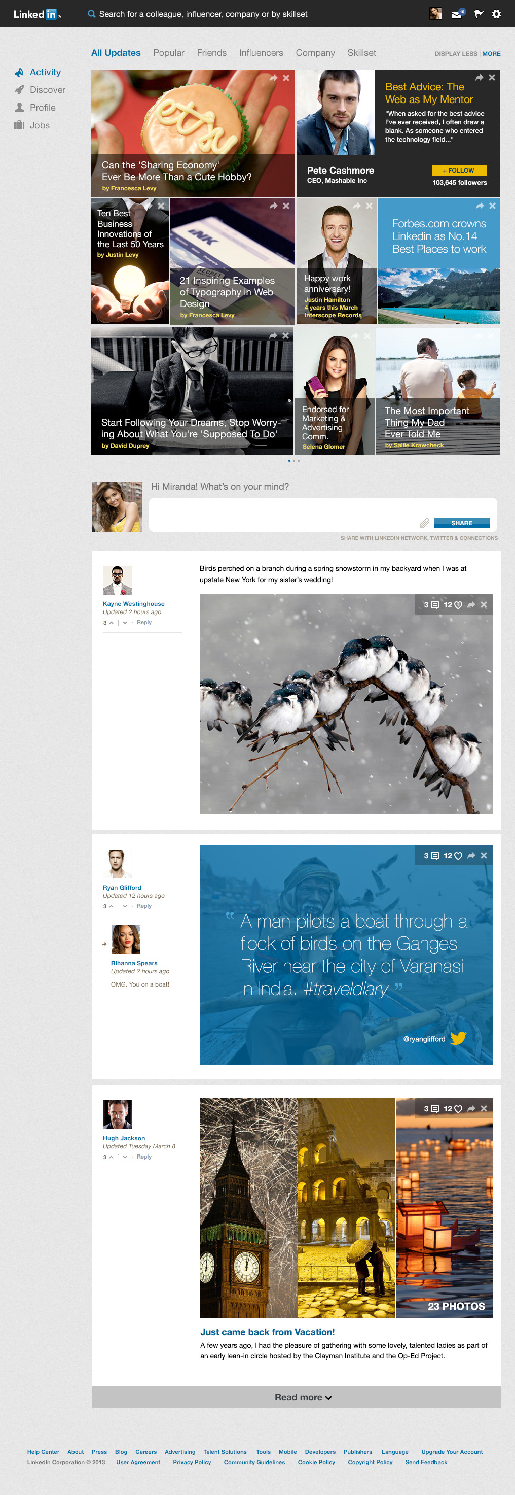
Let's start from the Top.
I was inspired by the ease of the Facebook Graph Search, why not implement it here on Linkedin? Users should be able to search for a colleague, influencer, company or simply by skillset. If I wanted to see all the "designers" in NYC, I should be able to search that very easily - like second nature.
I've boiled down 4 main objectives for the main page. ACTIVITY. DISCOVER. PROFILE. and JOBS. Activity is basically what you see here on the top, a personalized gridbased, responsive content viewer. I should be able to see relevant content and sort very easily, between Popular Industry News, to Featured Influencer to Follow. Each "widget" should be easily removed if you decide it's not relevant to you.
I've placed the "status update" and friends updates more below the fold because I believe that people don't come to Linkedin to update their friends on the best dinner they ever had last night, or announce they are engaged. Strictly more professional, business oriented, quality shares of content, articles, or insights.
With larger images and smaller focus on your friend's comments and posts, it allows users to spend more time on the actual content and not the distractions. Upper right corner of the posts show number of comments, likes, and share. Of course, any widget item could be deleted or hidden. That will help the clutter and sorting of your daily news.

I am showing an example of how it would look with a bit less "in-your-face" content. It should probably scroll the right when you mouse over to get more news. This is also more traditional because it brings you the "status update" bar above the fold, making it easier to share throughout your network.
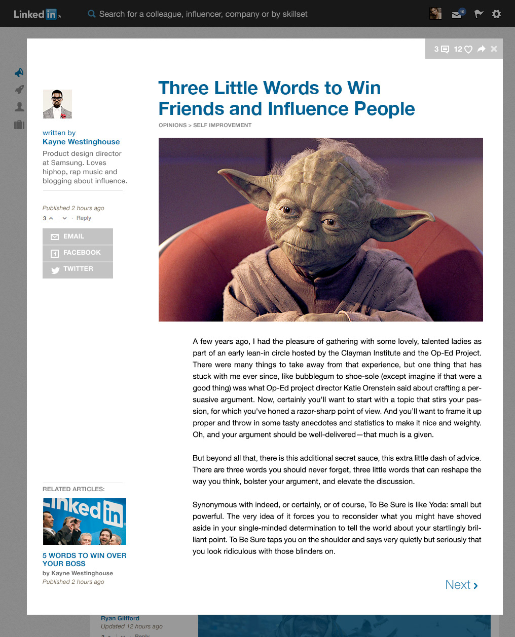
Upon clicking any content, I want to bring a better reading experience for all the articles. Something that is clean, easy to read, and enjoyable.
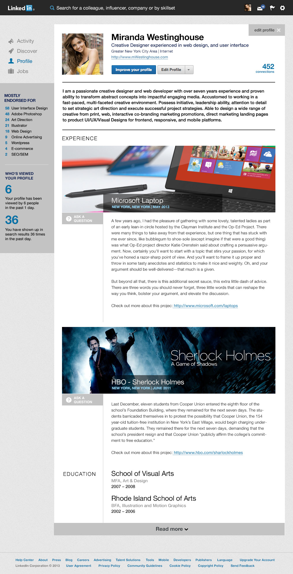
Lastly, I want to present one concept for the profile page. I wanted to mix the traditional resume look with a more content driven, modern feel. I want to allow bigger images that can ultimately showcase your work, projects, or anything you want for that particular job you had. Instead of the stale bullet points in resume building, what if we can write it in a storytelling way? Some jobs cannot be simplified into bullet points, and would be more engaging for users to read a good review on your experience, than to typical points to sell your worth.
Along with that point, I think it's would be a nice feature to include "Ask a Question", which a potential candidate could ask for advice. They should also be able to see if they've written any blog posts/articles in the past regarding their experience. I think some examples of great insights could be the range of salary offered, interview process and how the company operates.
I think this could be an excellent selling point for people to log into Linkedin and check out their content on a daily or weekly basis.
Let's talk about endorsements.
I don't know why they're so buried on the bottom of your profile. I think skillset list is one of the most important key telling points for job search. It should be above the fold, close to the top for people to see. I also believe that each section of the page should be widget-ed and could be customized to display anything you want. There should also be templates that you can revert back to, if you wish.
I would like people to envision their Linkedin Profile as a location for their own self-branding and professional page for their careers. There are so many more options to explore, but sadly I have ran out of time.
I would like people to envision their Linkedin Profile as a location for their own self-branding and professional page for their careers. There are so many more options to explore, but sadly I have ran out of time.
Here's the final side by side comparison: