Client: Aenorm Magazine / VSAE
Agency: United Creations
Assignment: Redesign of the Aenorm Magazine, creative concept, creation of template pages / masterpages
Agency: United Creations
Assignment: Redesign of the Aenorm Magazine, creative concept, creation of template pages / masterpages
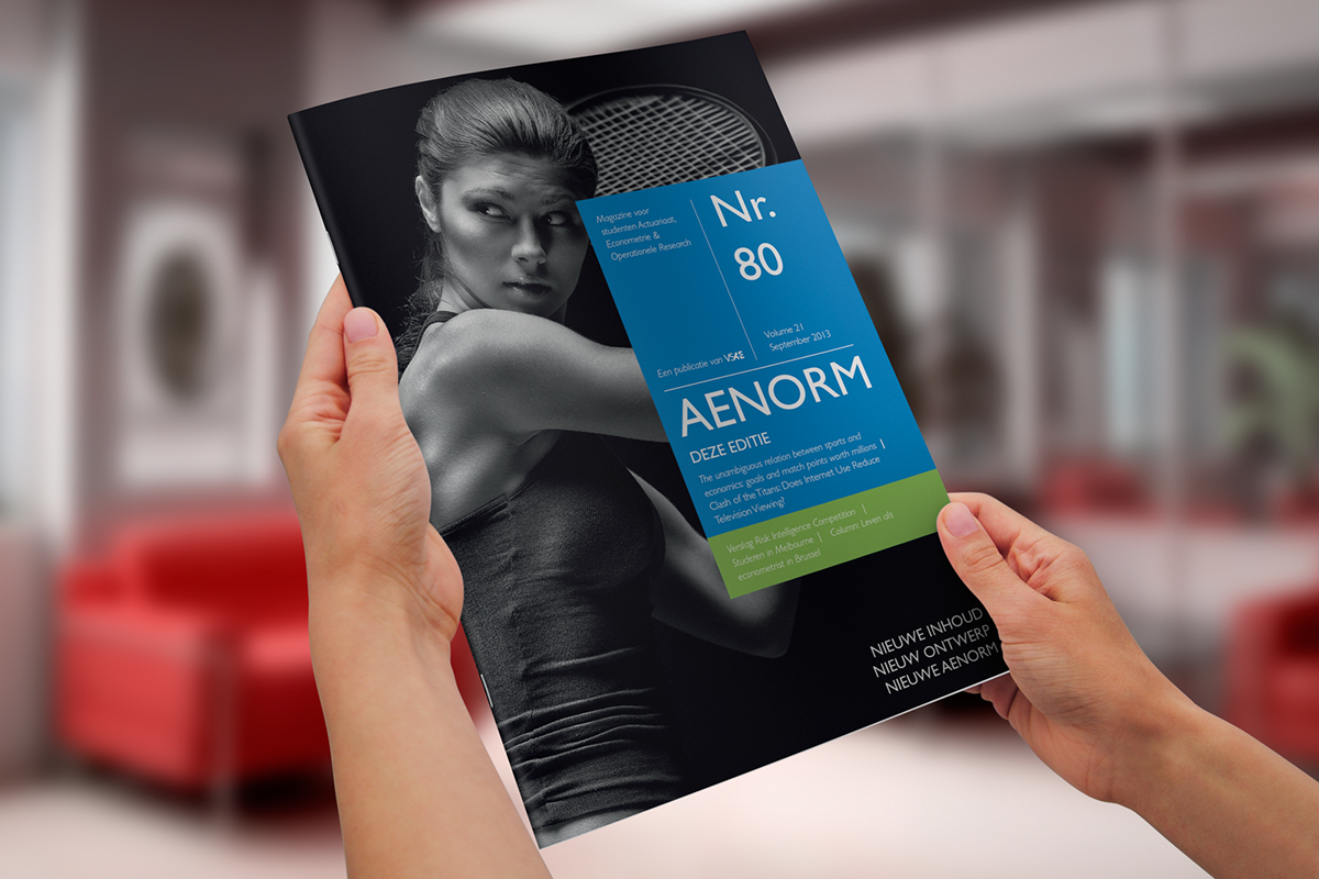
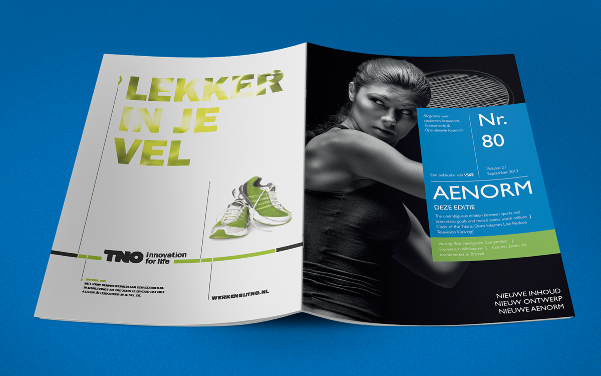
Early 2008 we were asked for the restyling for the student magazine Aenorm, a publication of VSAE, association for students Econometrics, Acutarial Science and Operations Research at the University of Amsterdam. The magazine contained scientific articles, interviews and research papers and aimed to provide the newest insights about the economic sector to students and professionals. After 5 years of classic magazine style we did a complete redesign of the mag.
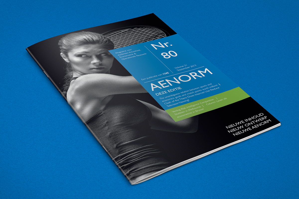
The editorial board decided to combine two existing publications in one new magazine. The title Aenorm remained the same, but the design got a complete makeover. A fresh and open style with a lot of room for visual elements and images. The pleasant look and feel enhances readability wich is important to easily spread new scientific insights among the readers.
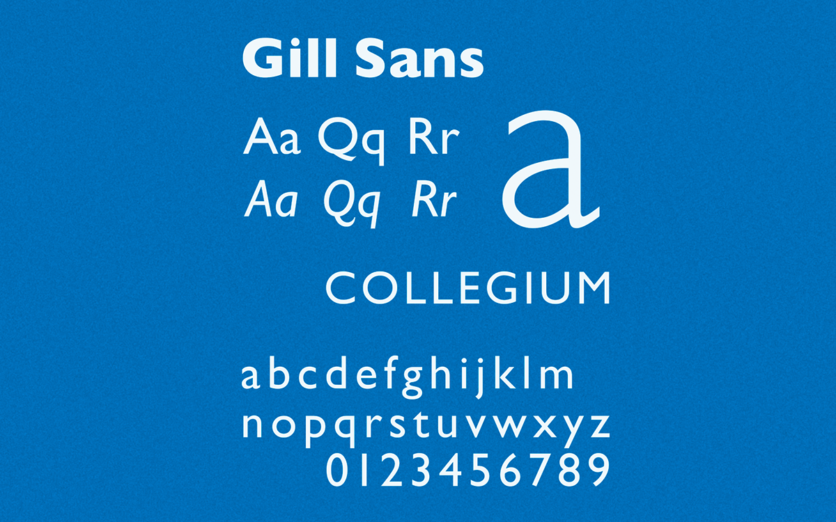
When searching for the most suitable font for the magazine Gill Sans got selected as winner. The corporate yet stylish typeface nicely fits the new magazine and the contents of articles about both science and upcoming or past events. The typeface was once used by the British Railways, for signage of all kinds. Gill Sans continues to be common welth, often being used to bring a touch of “artistic or cultural sensibility to a corporate style.”