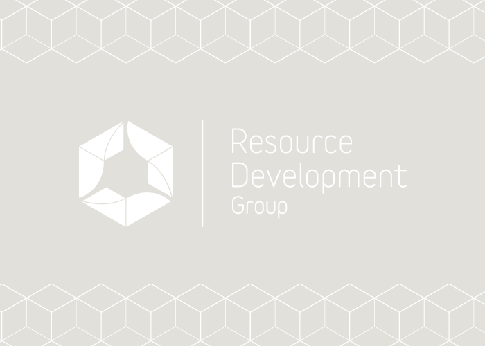
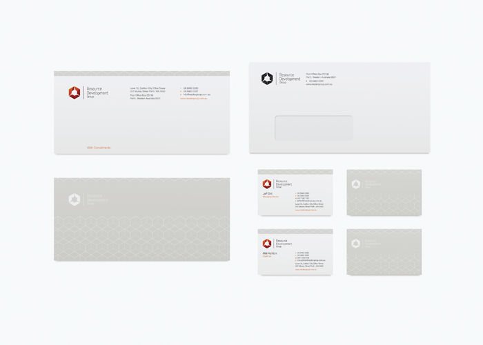
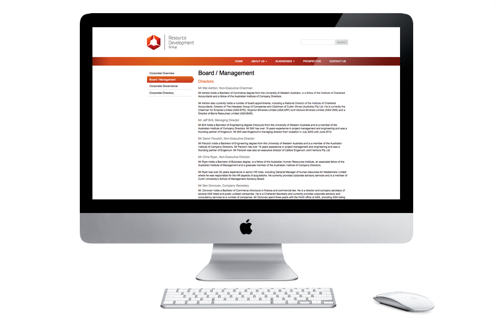
Brand Identity for a new mining and resources company Resource Development Group that listed on the Australian Stock Exchange.


The identity takes some inspiration from the rotational symmetry of an ore reclaimer and also symbolises the circular nature of the project development life-cycle. The symbol, whilst composed of individual parts, when viewed holistically creates the form of an isometric cube which can be seen to be representative of the individual companies that form the Resource Development Group.
The three-dimensional form of the logo is emphasised by strong earthy colours; pindan red, sun-burnt orange and a deep oxide maroon represent the harsh Australian environment which is rich in minerals and natural resources.