
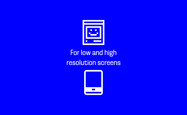
The icon adventure began with the internship at id:D. To draw these icons for various types of screens, I needed to understand how curves, and pixels worked on the screen. With the help of rendering type tecnologies available, I was able to design icons that work in every screen. These were the result of an essay about the evolution of rendering type tecnologies, and the definition of a process (or, at least, an attempt of) to design icons that works on desktops, or mobile phones.
The icons were designed in a 16, by 16 pixels grid. The area haves a total of 256. It is a real challenge to draw an idea, or an action, in such a small space. It means that we must keep a good relationship between the whites, and the blacks. With this in mind, I tried to use as few curves as possible to keep the white space. When they are needed, small ones are better: we keep the space clean.

Since the beginning, and doing research on rendering type tecnologies, I was very influenced with the work of Zuzanne Licko, and Susan Kare. I had the oportunity to draw some alternatives from the past. For example, the dot matrix printer, the Happy Mac, and the polaroid photographs. Then came the idea: icons with a retro feel. Render ended to be a package of icons prepared for various types of screens, with a retro feel in them. You can choose from contemporary, or retro ones.

The icons are in SVG format, but they are getting prepared to be a font. I am also designing missing ones for interfaces (such as arrows, and actions).
As for the font, I'm learning some technical details, and also a supporting alphabet.
Below the is a selection of the icons done:


