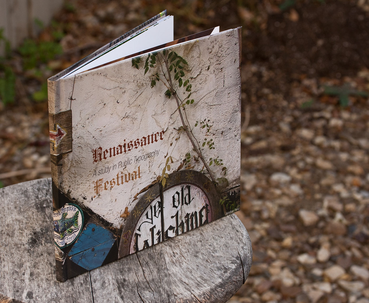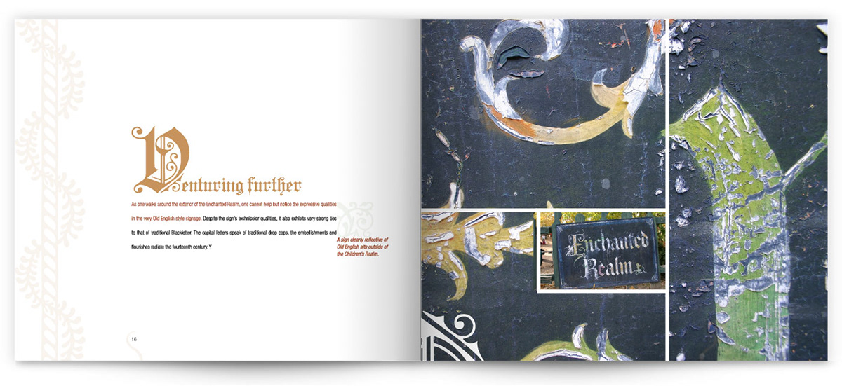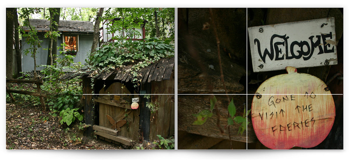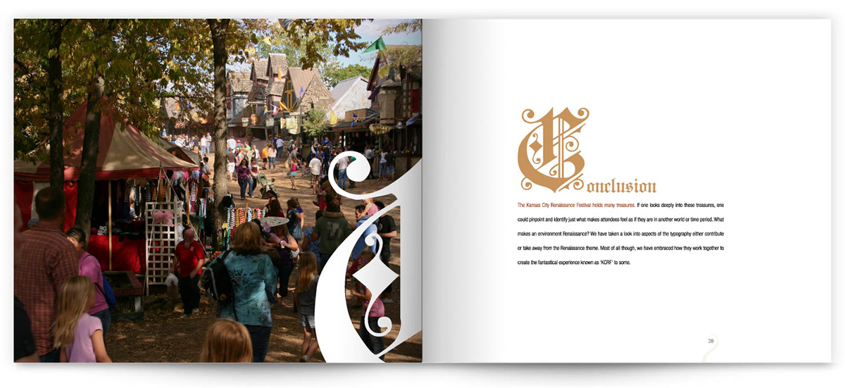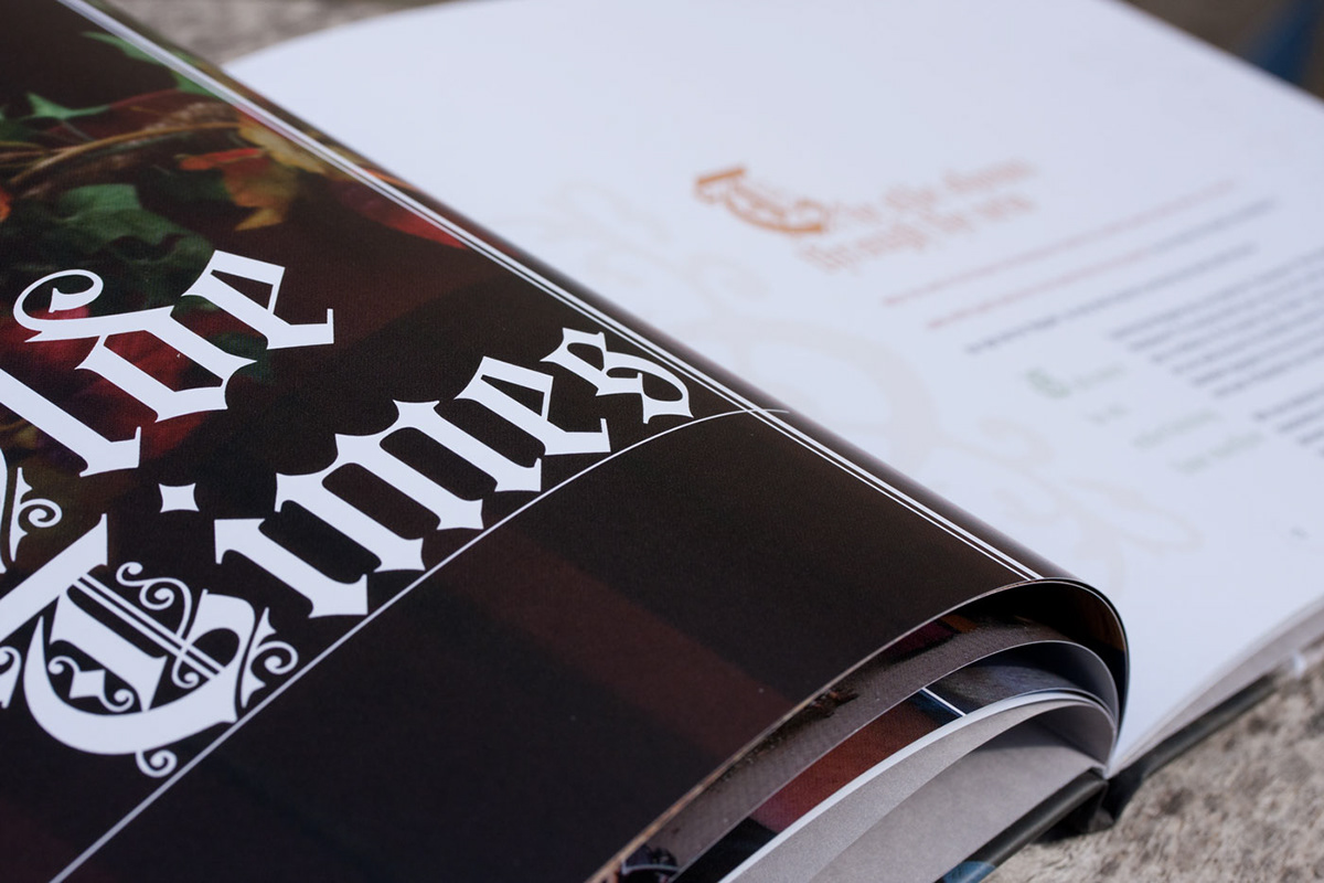
Honing in on a specific sector of our public environment, The Kansas City Renaissance Festival served as an excellent example of typographic diversity. The key differences between period-specific accuracy in typography and creative typography loosely based on history are explored in this photo essay.