Log In
Discover
Assets
Jobs
Behance
Pro
Hire Freelancers
Download on the App Store
Get it on Google Play
English
Čeština
Dansk
Deutsch
Español
Français
Italiano
Nederlands
Norsk
Polski
Português
Pусский
Suomi
Svenska
Türkçe
日本語
한국어
中文(简体)
中文(繁體)
About
Blog
TOU
Privacy
Community
Help
Do not sell or share my personal information
Sign Up
Skip to Main Content
Skip to Footer
Behance
Behance
Navigate to behance.net
Explore
Assets
Jobs
Behance
Pro
Hire Freelancers
search
magnifying glass
Sort & filter all:
Projects
Images
People
Assets
People to Hire
Cancel
search
magnifying glass
View your notifications within Behance.
View your notifications within Behance.
Log In
Sign Up
search
magnifying glass
Adobe, Inc.
Adobe, Inc.
Navigate to adobe.com
Follow
Unfollow
Follow
Following
Message
Tools
Adobe Photoshop CS4
Wacom Intuos 4
Ink
Tools
Add to Moodboard
Save
Share & Embed This Project
Share
Appreciate
Appreciate
Follow
Following
Unfollow
Follow
Unfollow
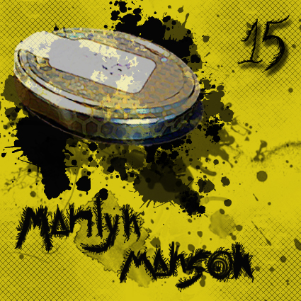
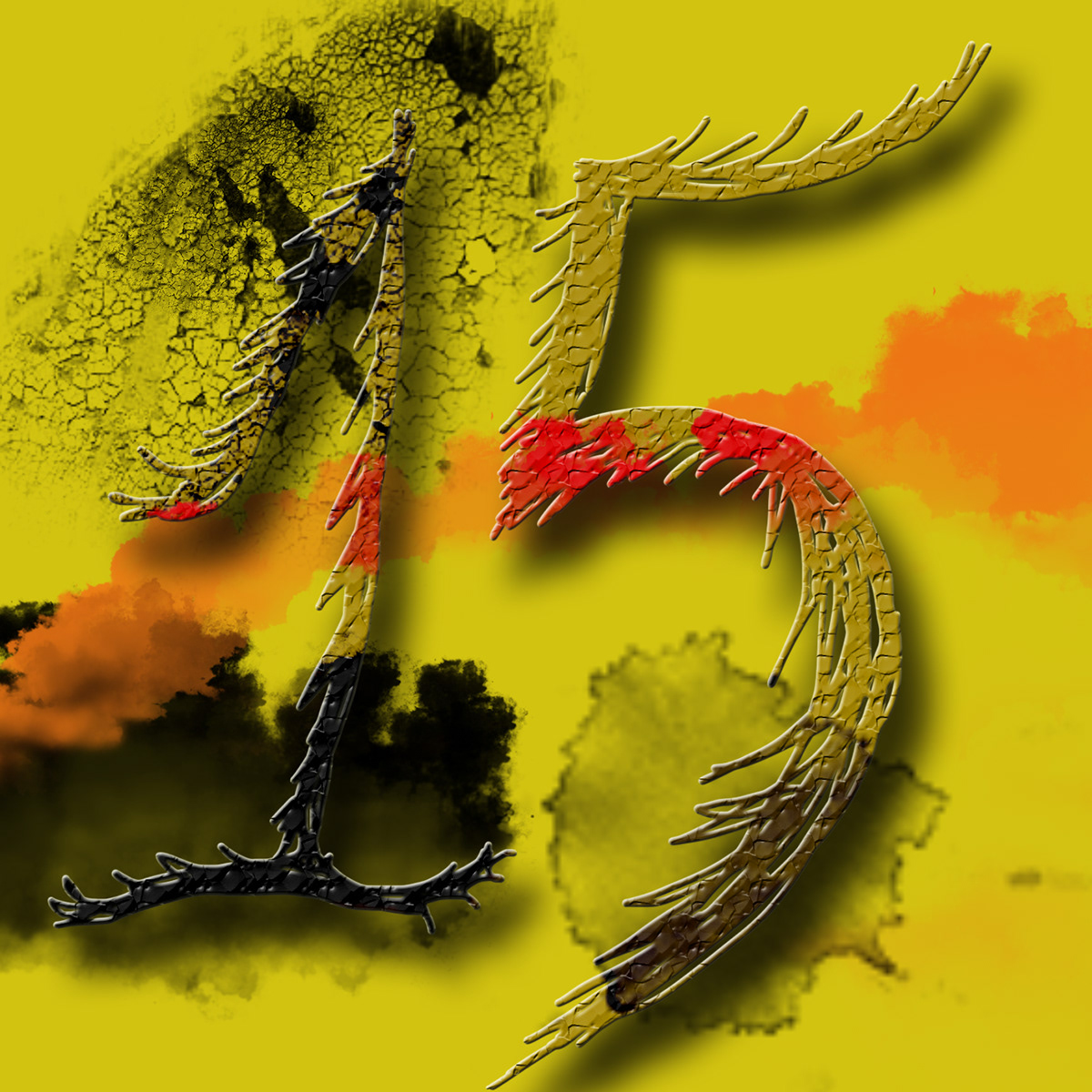
Rebranding Marilyn Manson
Margherita Biondi
•
Follow
Following
Unfollow
From concept to artwork
This project has been developed during the course : "Music Artwork, Packaging and Branding" at Central Saint Martins.
Front Sleeve
Back cover
Booklet
Front Cover - single
Special Edition Album
Join Behance
Sign up
or
Sign in
to view personalized recommendations, follow creatives, and more.
Sign Up With Email
Sign Up
or
Join Behance
Sign up
or
Sign in
to view personalized recommendations, follow creatives, and more.
Sign Up With Email
Sign Up
or
Rebranding Marilyn Manson
13
206
0
Published:
June 26th 2012
Margherita Biondi
Follow
Following
Unfollow
Owner
Margherita Biondi
London, United Kingdom
Follow
Following
Unfollow
Message
Rebranding Marilyn Manson
This is a rebranding project developed during the "Music Graphics, Branding and Packaging" course. It is meant to be a blending of the standard M
Read More
13
206
0
Published:
June 26th 2012
Tools
Adobe Photoshop CS4
Wacom Intuos 4
Ink
Creative Fields
Branding
Calligraphy
Music
marilyn manson
record sleeve
Album
music graphics
rebranding
handwriting
yellow
honey
Loo
black
sweet
© All Rights Reserved
Copyright Info
No use is allowed without explicit permission from owner
Report