Re-brand
for The Star Cinema
for The Star Cinema
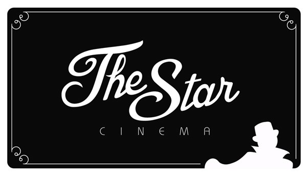
Atthe moment The Star Cinema is in the trouble. There is no identity inside thebuilding as well as there is no logo and no branding solutions to provide anyassociations with retro or rare movie, which the cinema is specialized on.
Itried to make sense about the rare movies, giving some feeling of rarity anduniqueness of the quite limited and specific audience. The main font mimics the“The End” credit at the end of most older movies. That with the old fashioned clothing of the silhouette work welltogether. Add to that -that it is black and white - keeping with the oldfashioned theme.
Itried to make sense about the rare movies, giving some feeling of rarity anduniqueness of the quite limited and specific audience. The main font mimics the“The End” credit at the end of most older movies. That with the old fashioned clothing of the silhouette work welltogether. Add to that -that it is black and white - keeping with the oldfashioned theme.

Doingthe packaging I focused on the design for the popcorn packaging, ticket designand packaging for 2 drinks. All of them are made in the same colors andpatterns which can be found in the logo.


