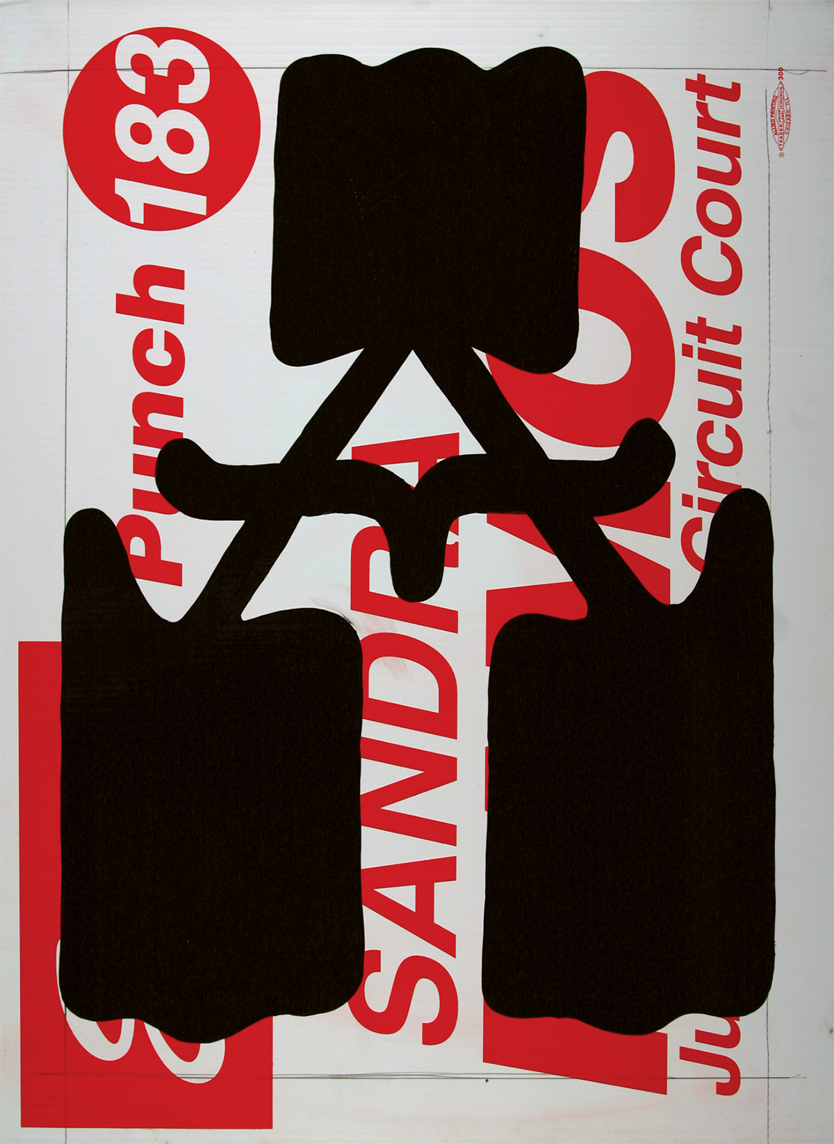
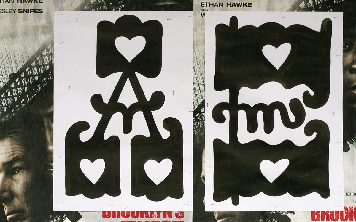
A Capital A.
Human history began with the innovation of writing. Applying symbols to surface provides the infrastructure towards lasting accurately transmitted thoughts, messages, and memories. While the recorded past of our forefathers has allowed culture to develop and evolve, it is with this success that contemporary life has become congested with informational messages.
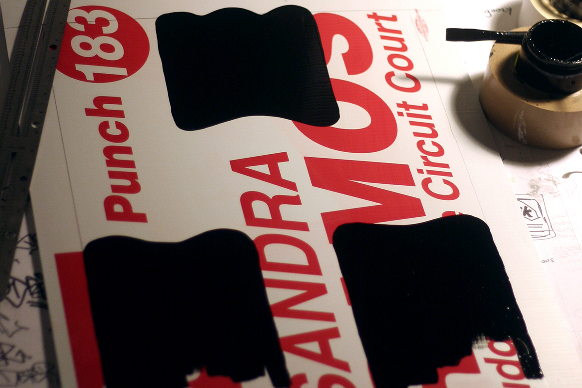
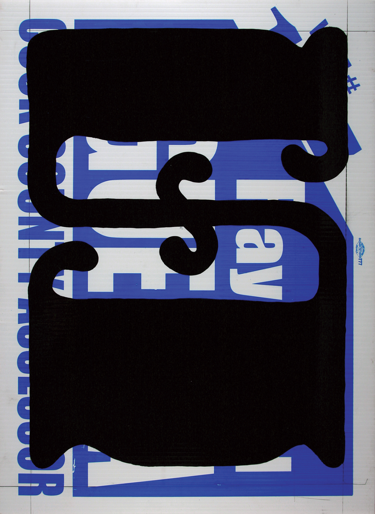
A penciled in margin was created with measured tick-marks to guide the placement of serifs.
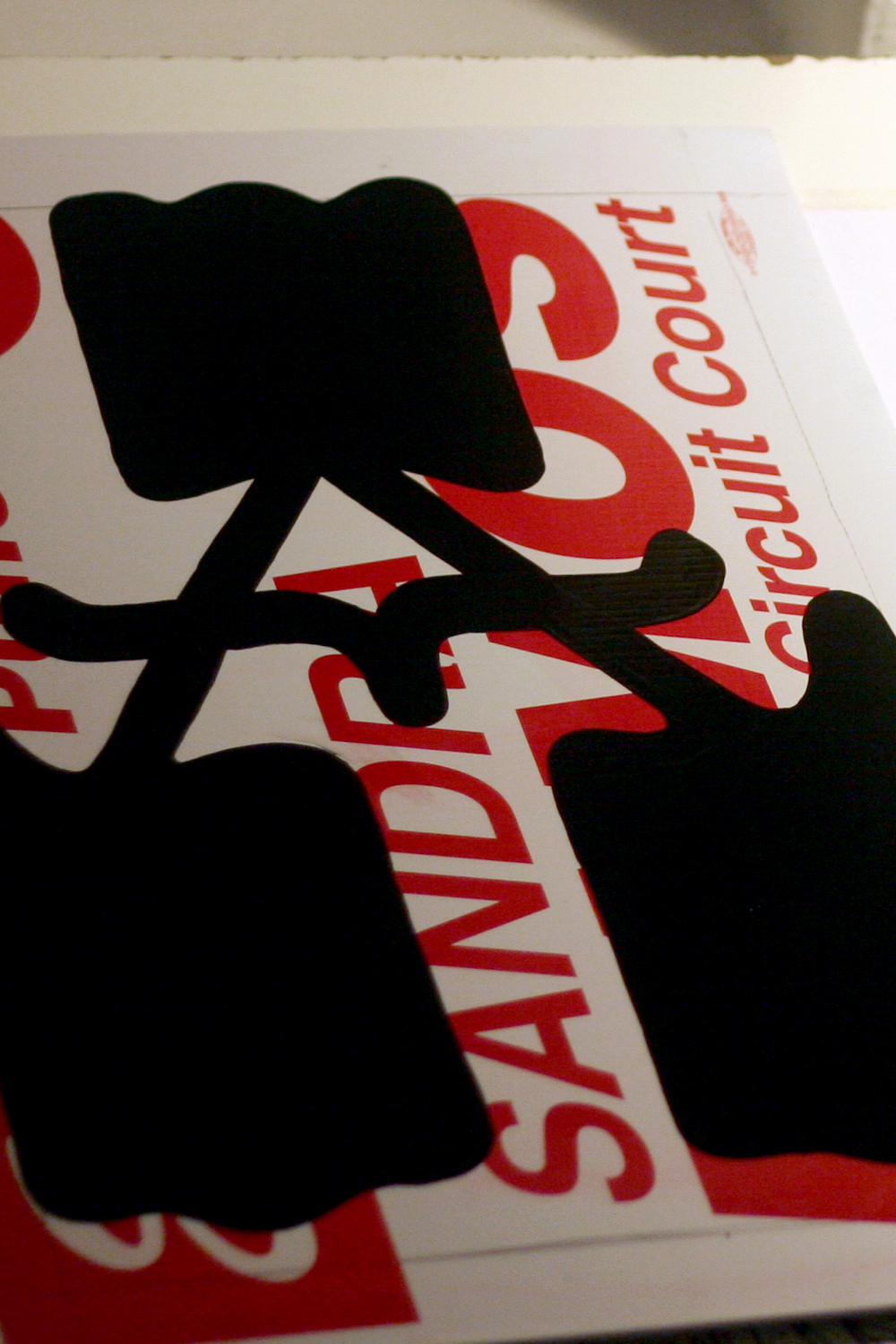
After the serifs and terminals are painted, stems and bars are added to complete each character.
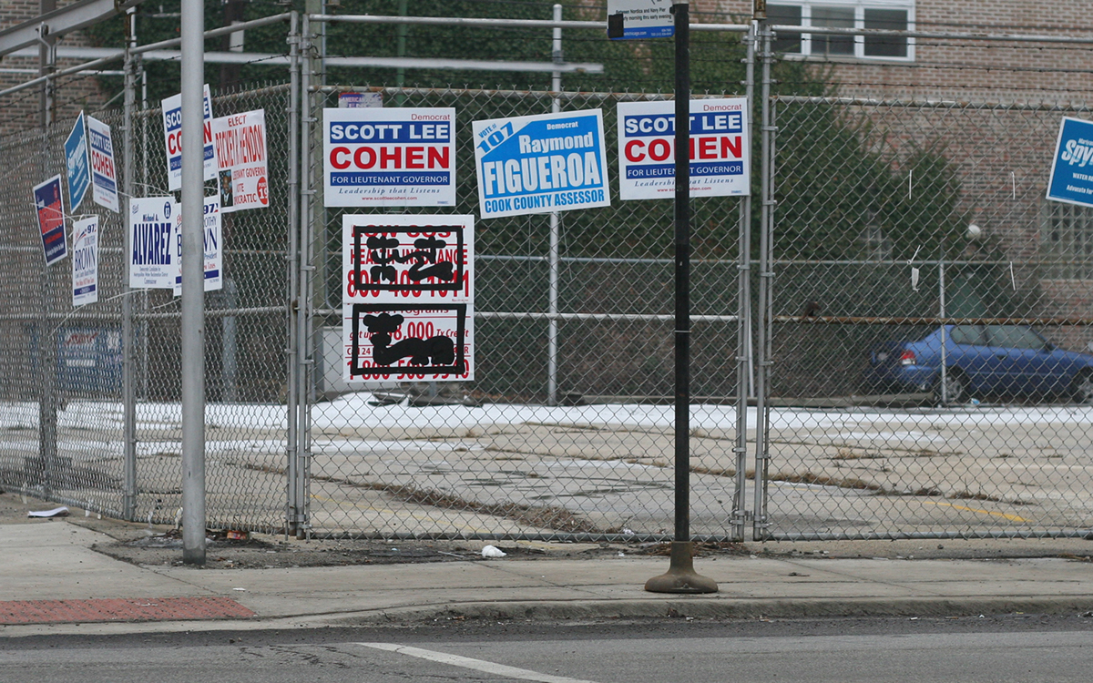
Encountering 5,000–20,000 informational messages per day average Americans live in a perpetual state of sensory overload, ill-effecting their space and time. These two elements are the foremost important factors we base our experience on. Each sadly has limited quantities for which an over abundance is inappropriately utilized, thus negatively impacting the human condition.
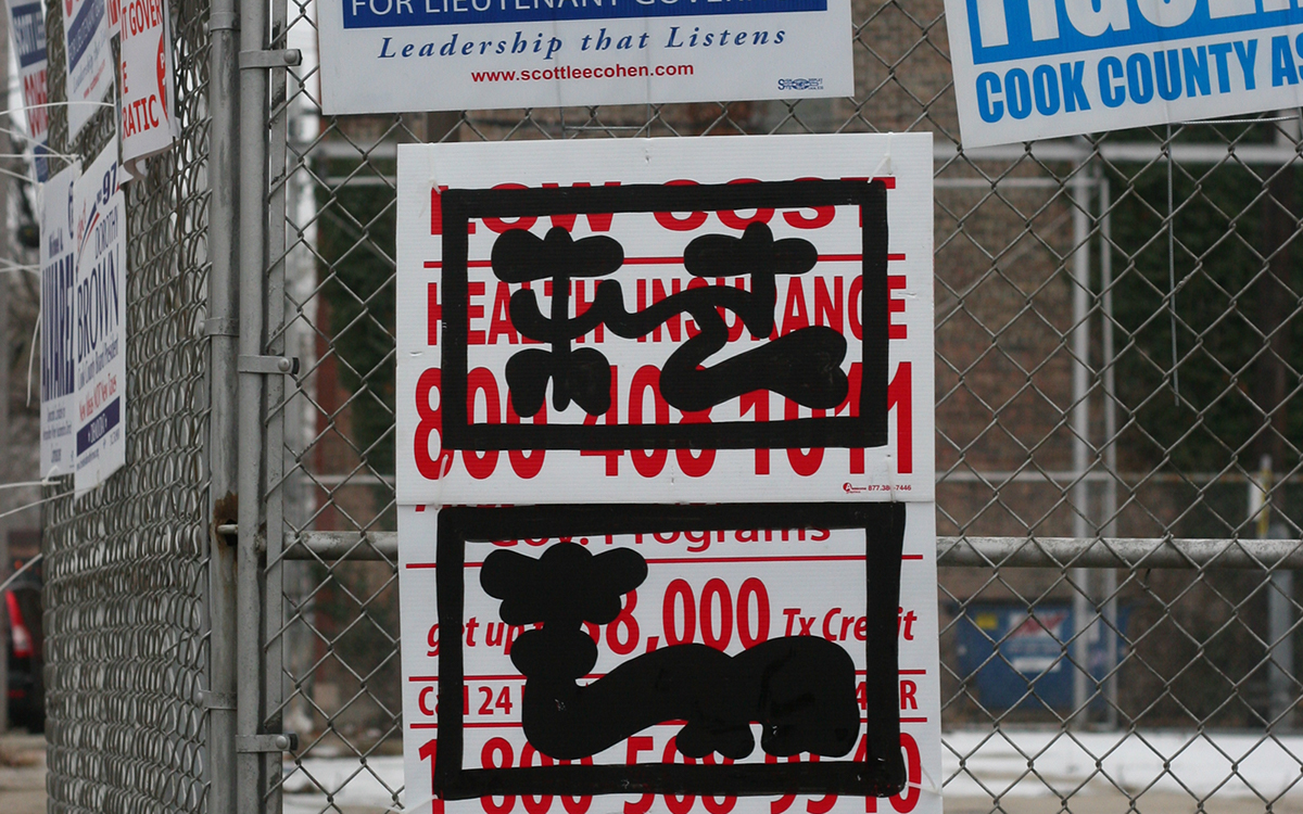
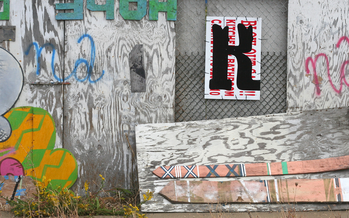
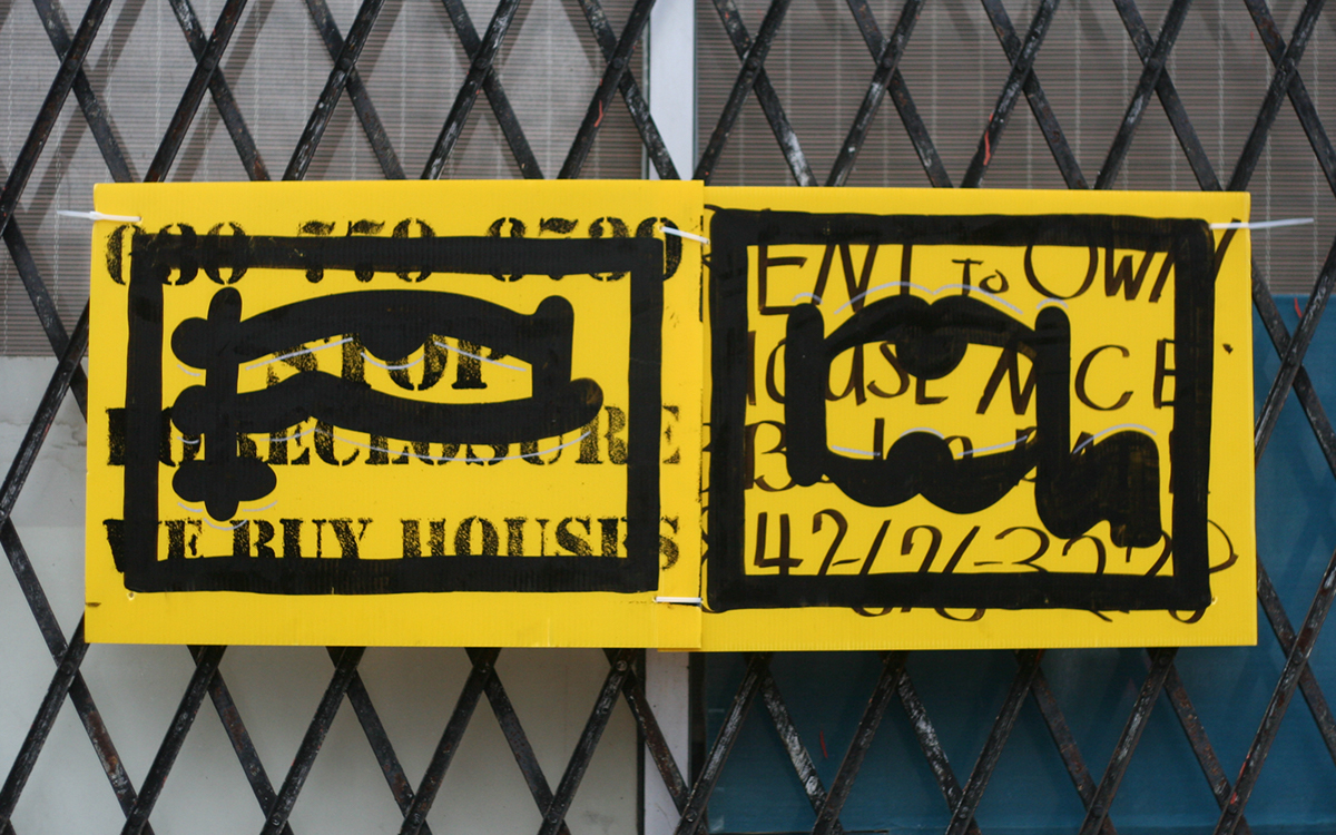
This project sereved as a moment to deliver and celebrate somthing simple while reducing complex messages and the congested visual landscape.
The full alphabet hanging in the Typeforce Exhibit. Photo from I Shoot Rockstars.
The slab-serif letters are a custom alphabet created for this project. Each was freestyled with brush in one-shot enamel.
This work was created for and shown at the first Typeforce Exhibition which included installations from:
Damian Abraham, Billy Baumann, Greg Calvert, Jeremiah Chiu, Chris Eichenseer, Lora Fosberg, Renata Graw, Margot Harrington, Matthew Hoffman, Chad Kouri, Andy Luce, Duncan MacKenzie, Darren McPherson, Will Miller, Aaron Pedersen,John Pobojewski, Ryan Thurwell, Tnop, David Weik and Luke Williams.
Typeforce is about to be in it's sixth year and is brought to you by Public Media Institute and Dawn Hancock.
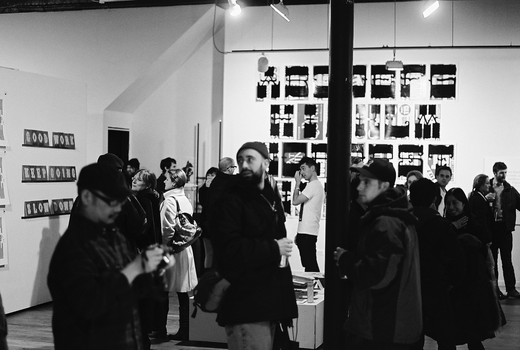
Friday, February 26, 2010 was the Typeforce opening. on the left of this image is some really good work by Chad Kouri. Photo from Luke Williams.

Photo from Luke Williams.
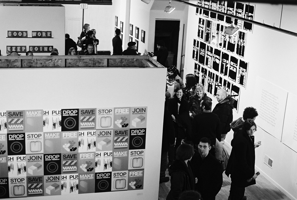
The piece in the foreground is Tnop's propaganda series. Photo from Luke Williams.
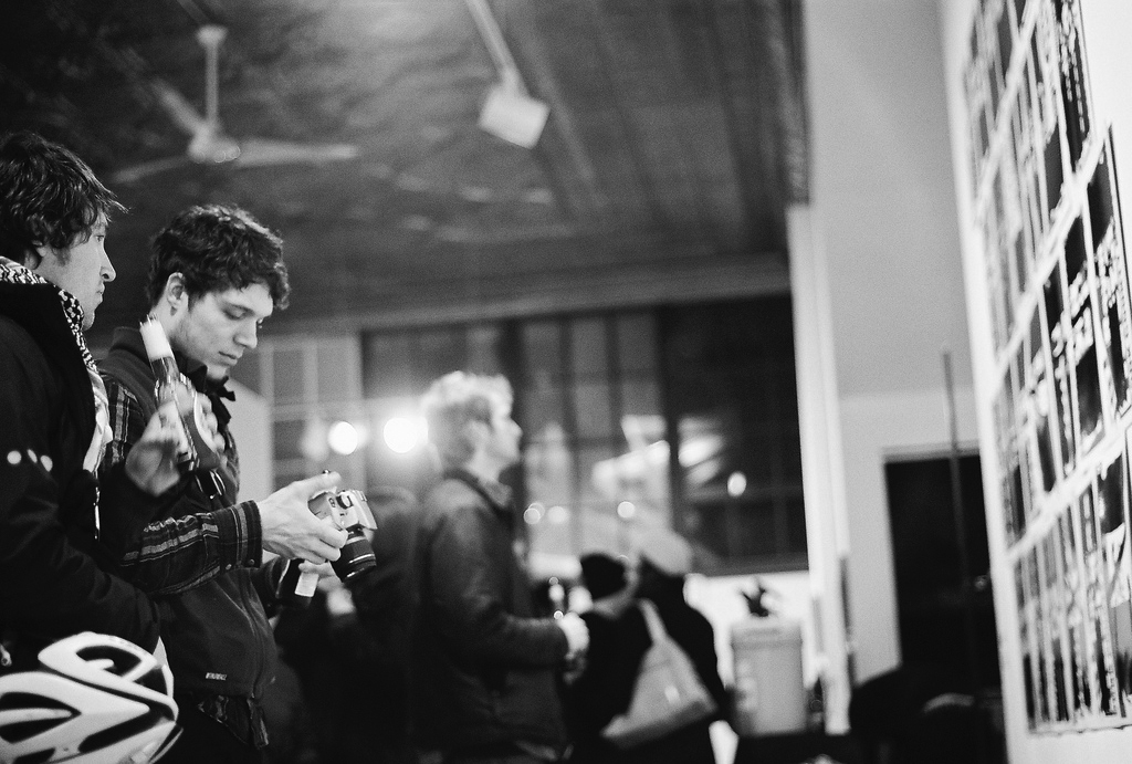
Photo from Luke Williams.
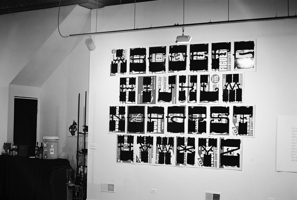
Photo from Luke Williams.
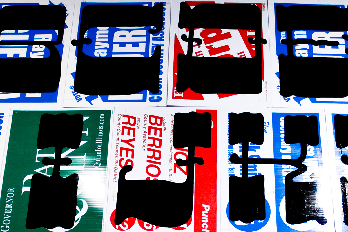
Photo by Kyle LaMere.

Photo by Kyle LaMere.
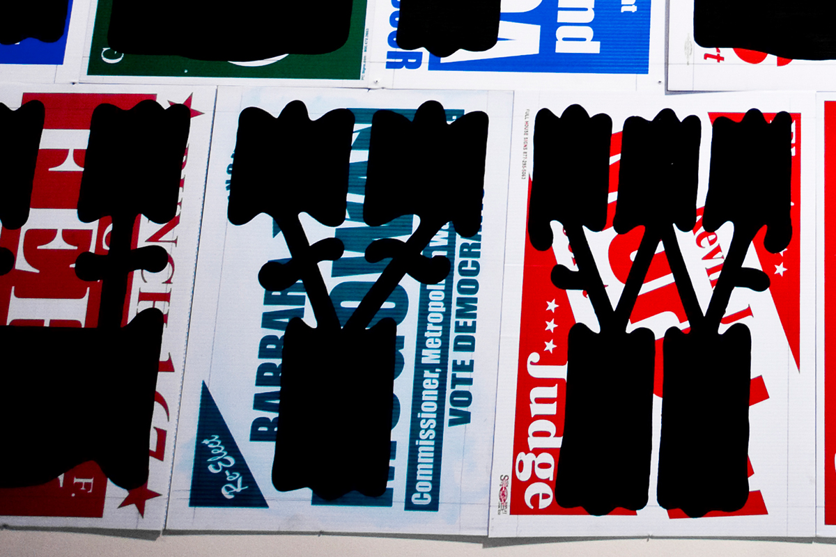
Photo by Kyle LaMere.
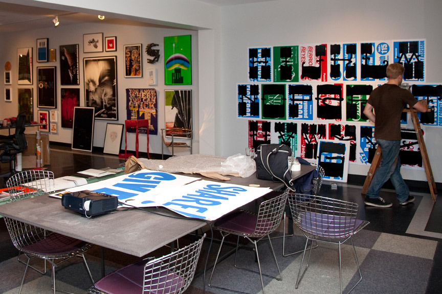
Photo by Christopher Hiltz.
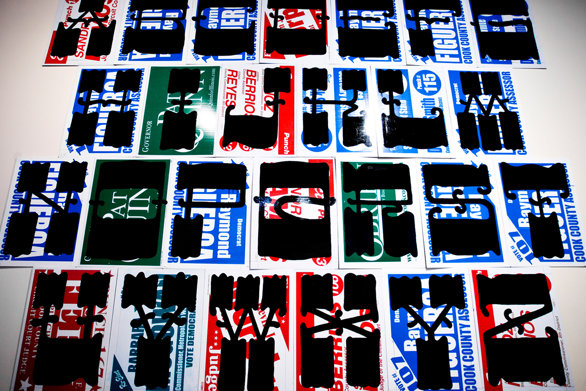
After the Typeforce exhibition, Rare Form was acquired and permanently installed in 3st Studio. Also on display inside Thirst are rare and unique work by Ed Fella, Paul Rand, Paul Sahre, Frank Gehry, April Greiman, Mike Perry, Dennis Ichiyama, Jason Pickleman, Marian Bantjes, Sonnenzimer, to name but a few.
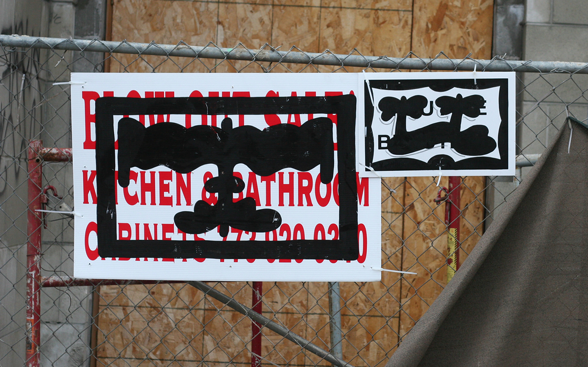
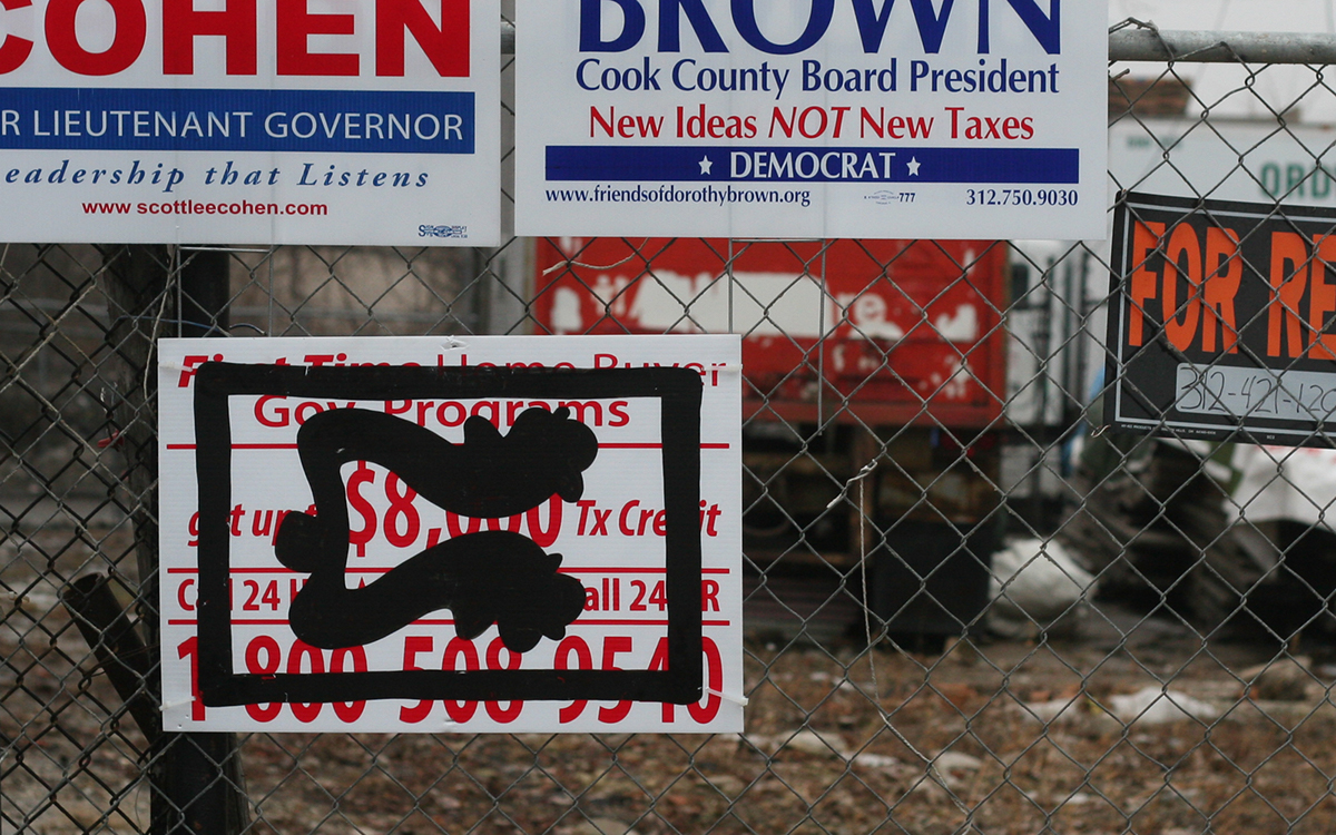
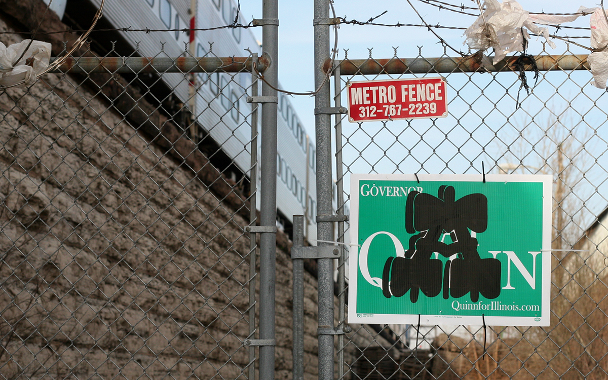
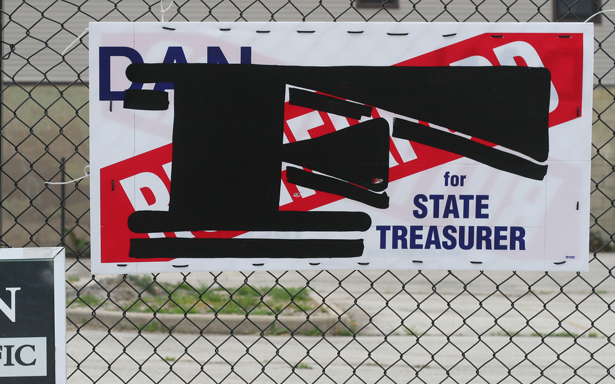
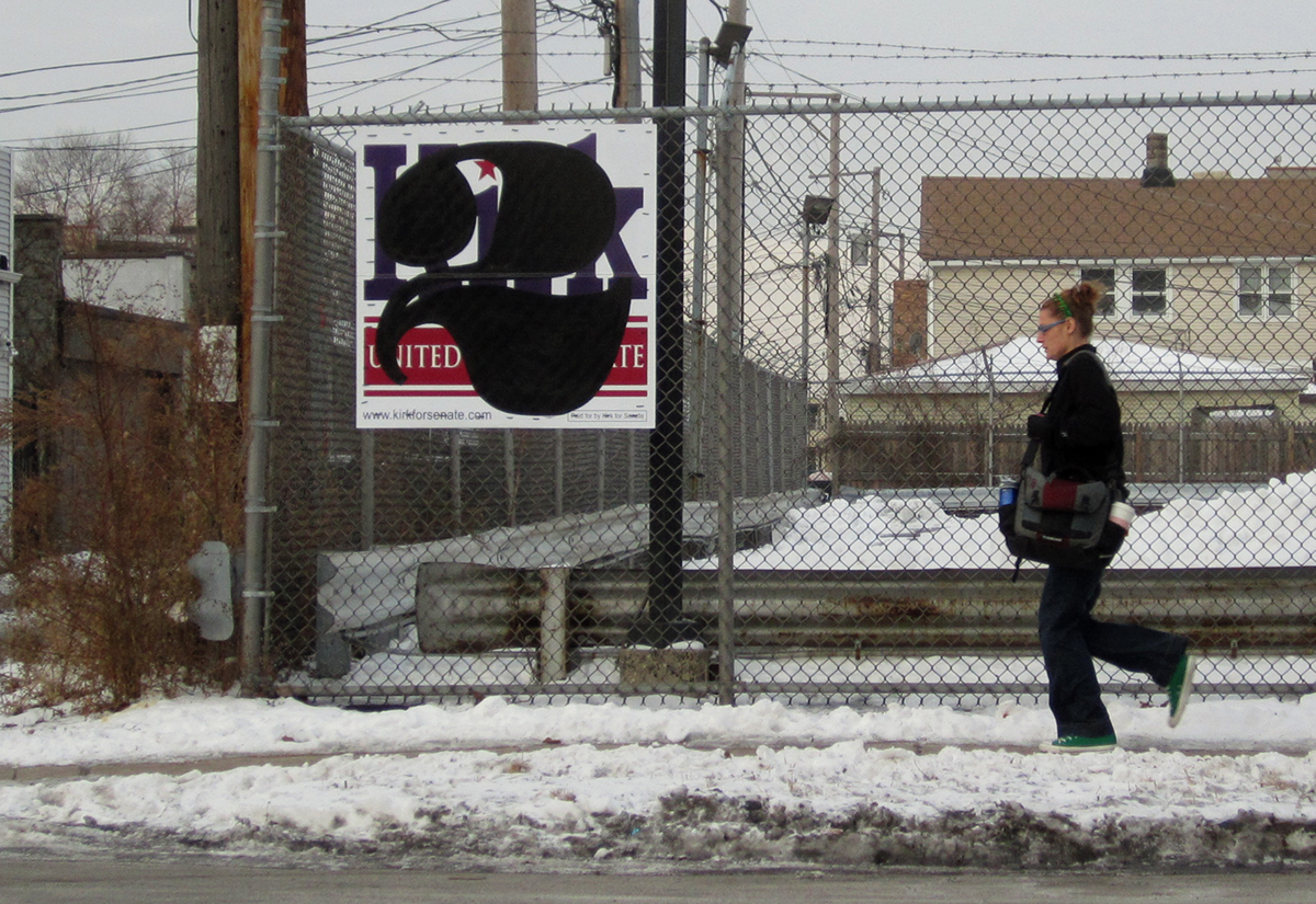
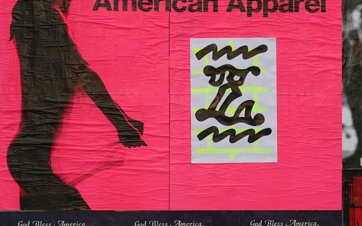
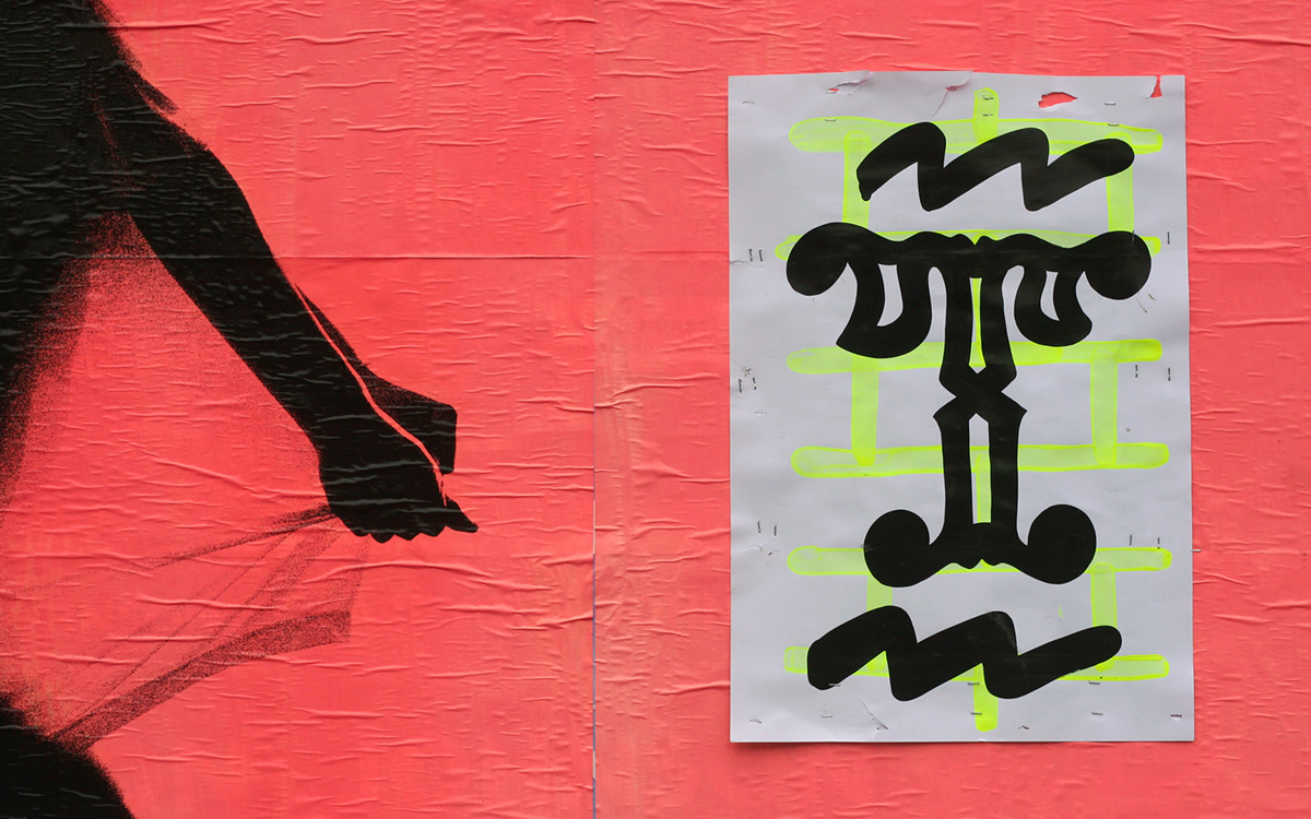
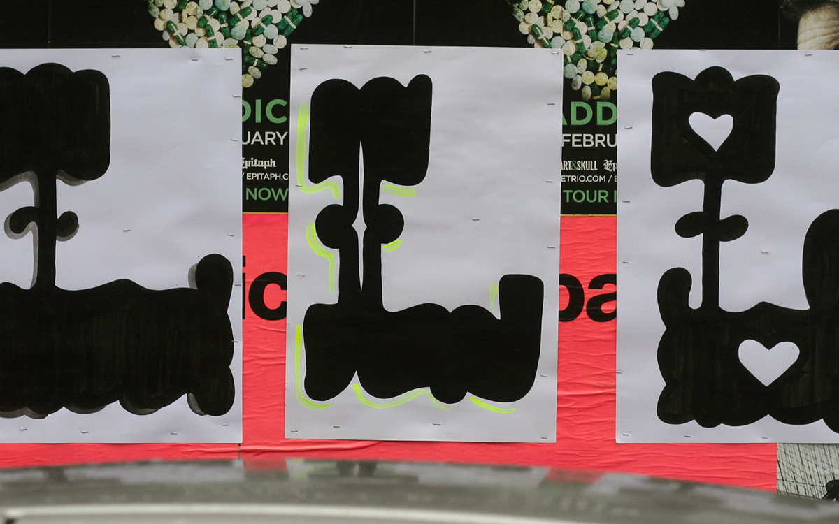
Displayed individually as well in groupings, we are privy to observe each character outside of its common codependent context of conveying a message. Sans-statement, these letters will not judge your lifestyle, ask you for help, nor will they tell you where to be. Simply these symbols exemplify the power and capabilities of our human kind.
This project began as an experiment in form and placement, yielding hundreds of variations city-wide public installations.
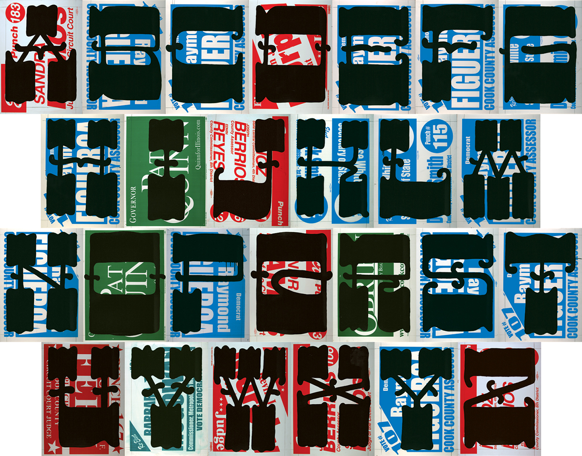
The full alphabet of Rare Form.
CURATORS: Edward Marszewski and Dawn Hancock | EXHIBITION: Typeforce | GALLERY: Co-Prosperity Sphere | MATERIALS: Sign-painter's Enamel on Found Coroplast Signage


