The Thorolf Rafto Foundation - Visual identity
This was a challenging project, due to the over used nature of the aesthetics surrounding the peace and human rights movement.
In the end I decided to embrace the stereotypes for the sake of clear communication and upon using the existing stereotypical visual language within this segment, to hammer in the message.
Mr. Thorolf Rafto, the man witch the foundation is named after had a favorite saying: "Birds in cages sing of freedom, free birds they fly". I liked that, so I aligned my earlier findings with this to make the starting point for the identity.
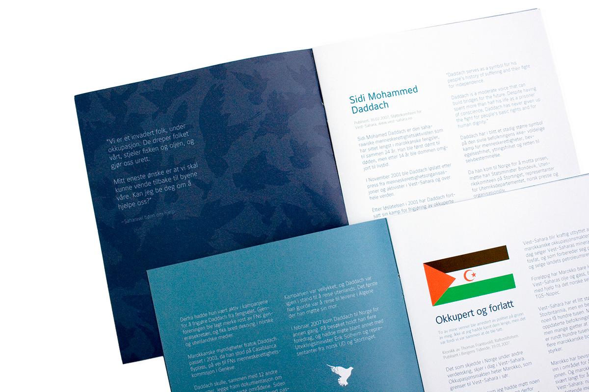
I designed a sort of mosaic pattern of birds flying, just as Mr Rafto had said so many times. The bird I chose to fly was the pigeon, witch is often used to symbolize peace.
This pattern was to be used in ALL of the foundations communications, as a back drop graphical (fifth element).
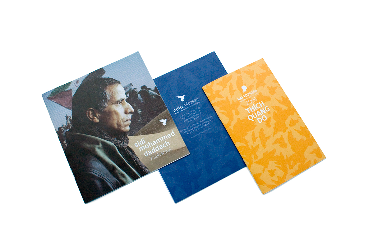
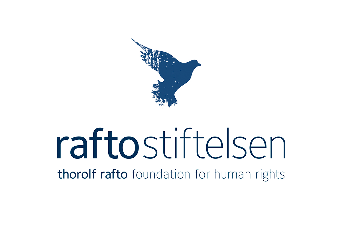
I made two separate logotypes, one for the foundation and one for the award. This was to differentiate between the two entities (foundation/award). The two entities each has their own color palettes to be used according to the design manuals.
Below is the flying birds mosaic pattern

Below is the logotype for the award. The profile likeness of Mr. Rafto is very accurate, witch had not been the case on their old profile.

Below is the logotype for the foundation.
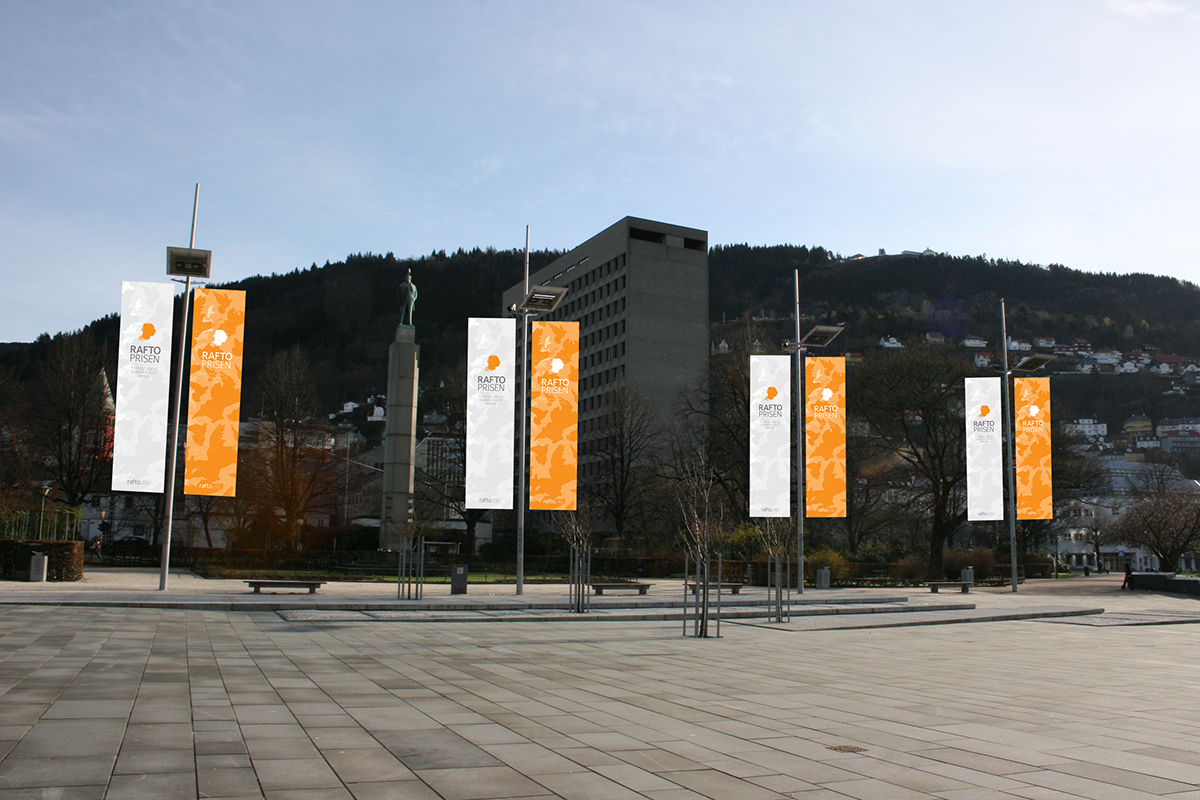
Below are examples of the visual elements in the identity program in use. On the main photograph the signature "gritty" filter is overlaid the image, the easily identifiable flying birds mosaic is used on the two pamphlets, and the colors from each of the two profiles are used respectively.