RESTAURANT BERG
Client
BRANDING
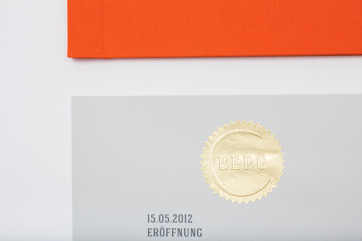
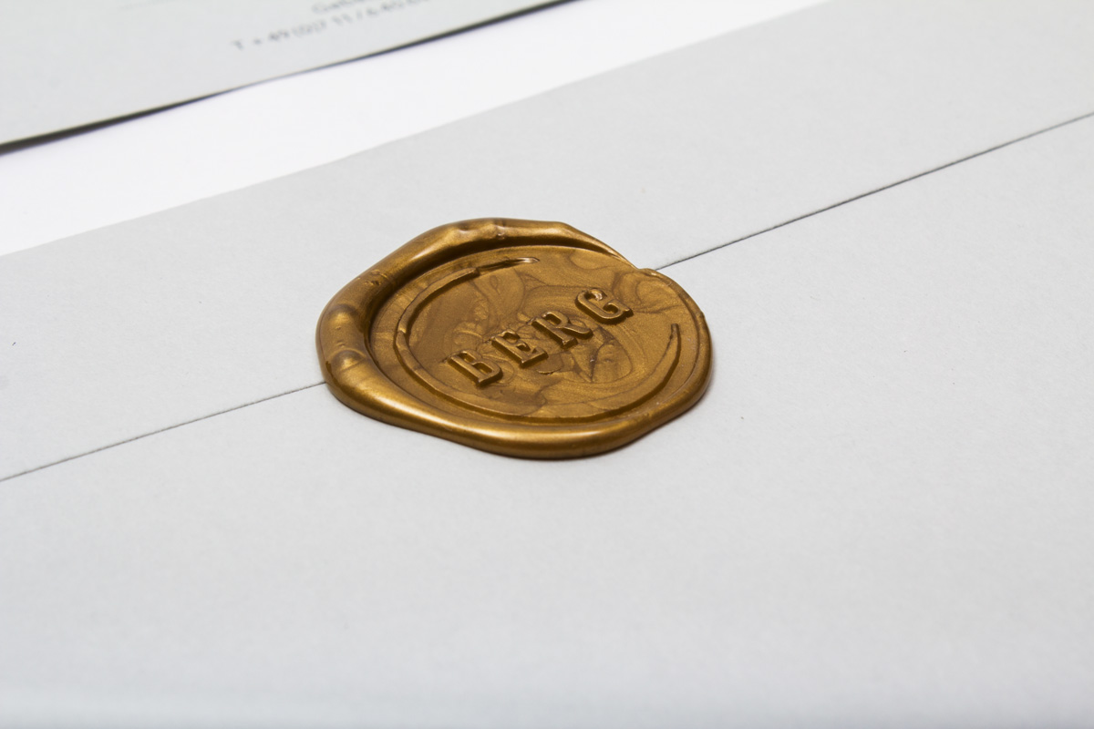
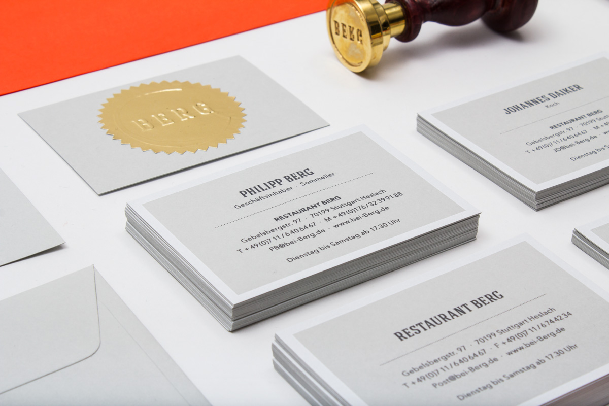
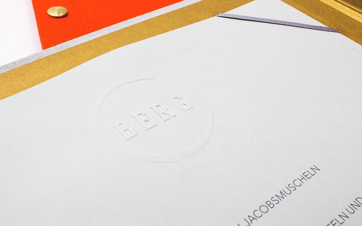
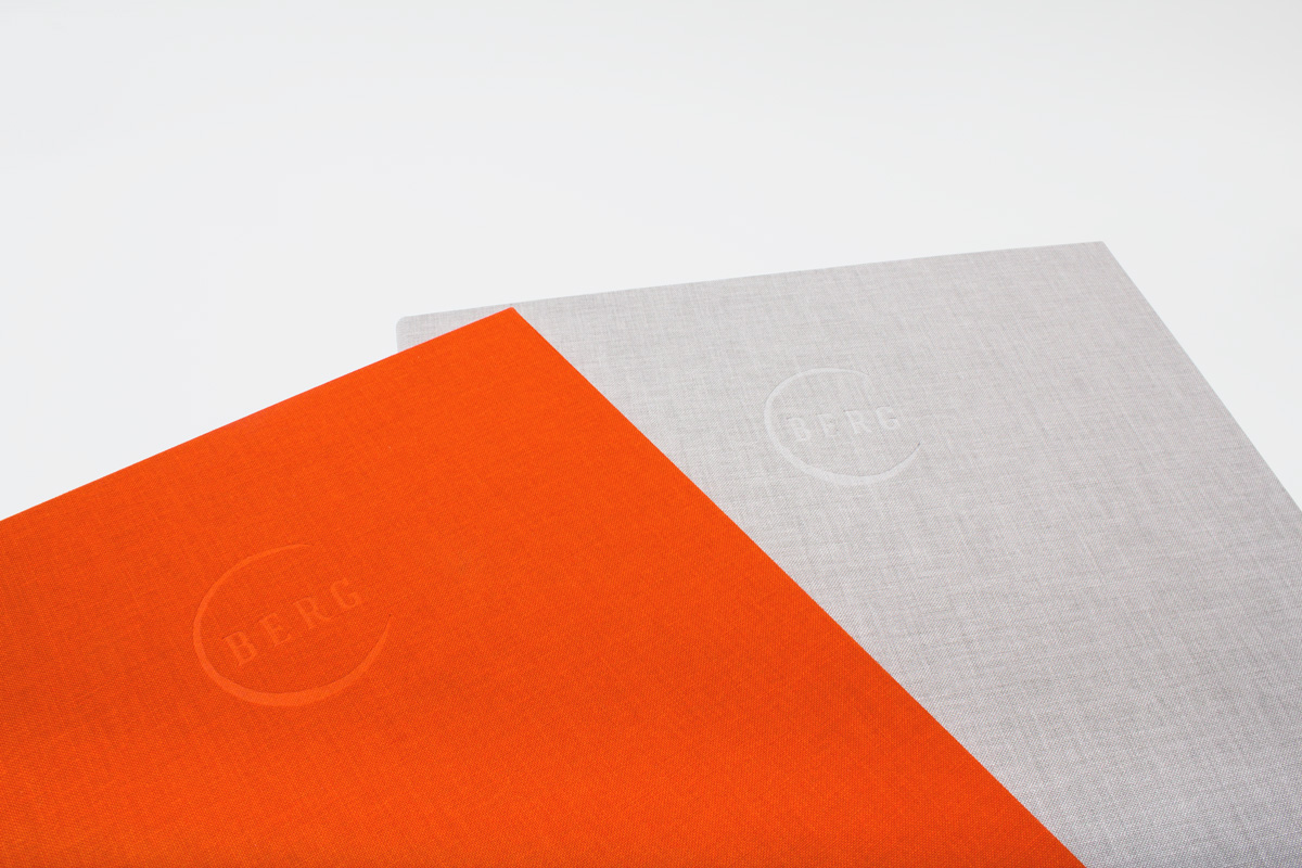
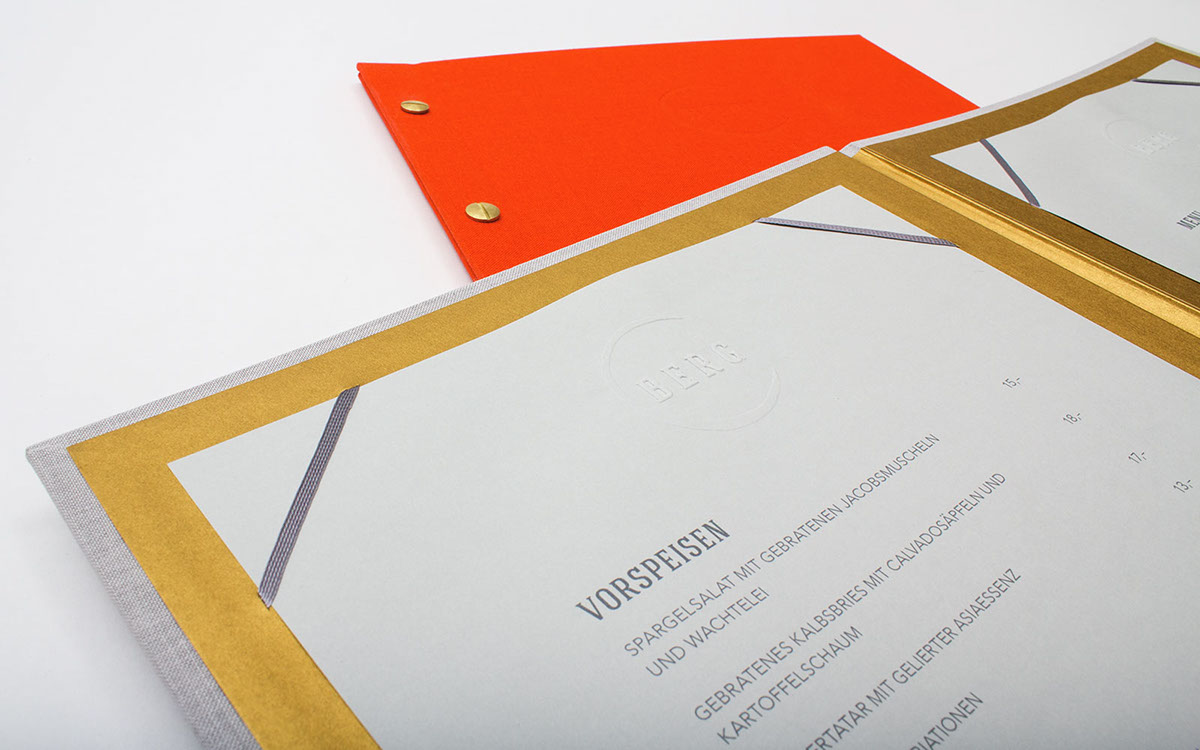
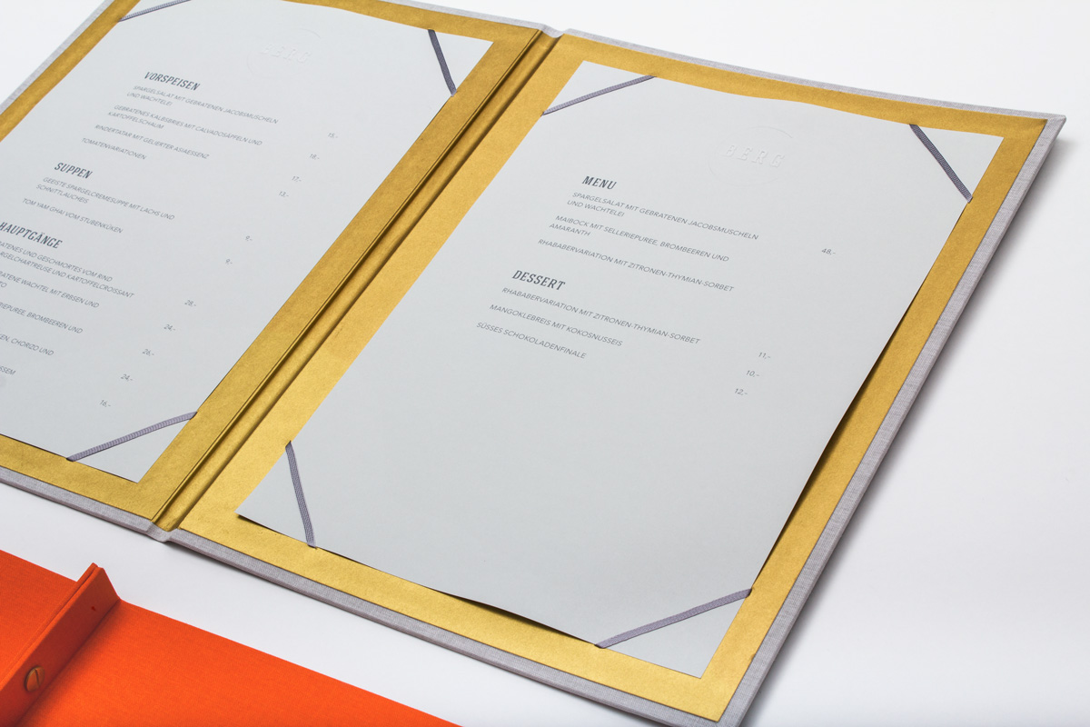
The stylized imprint of a wine glass enfoldes the geometrical majuscule Letters of the Restaurants Name „BERG“, a reference to the owners reputation as a sommelier aswell as to the focus of the Restaurant. Main colours are a bright, vivid orange and a distinguished cool gray. Business cards and 500 invitations are refined with hand embossed gold foil stickers. Their envelopes are sealed with the emblem on a golden sealing wax. Menu and the list of beverages have a blind embossing on their wrapping which is made of Toile-du-Marais-Linen.
WEB DESIGN
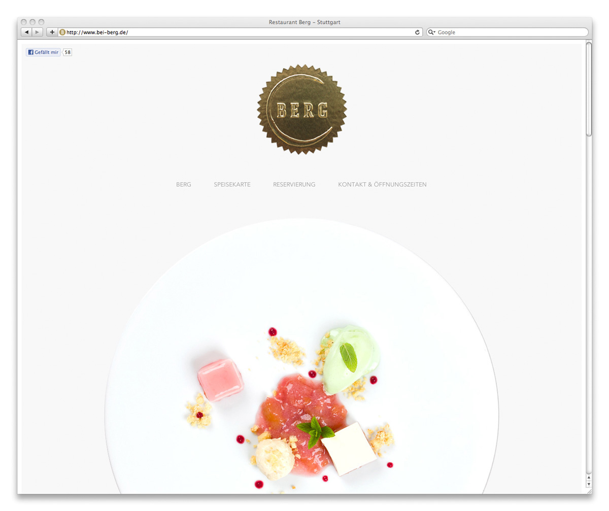
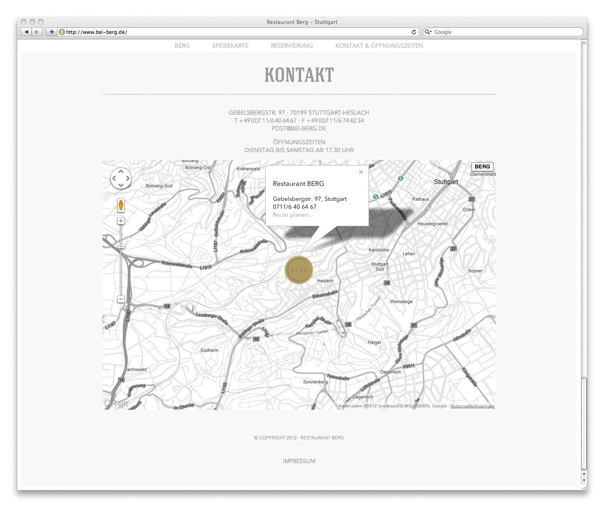
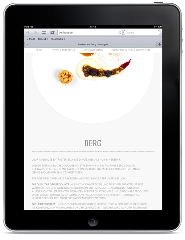
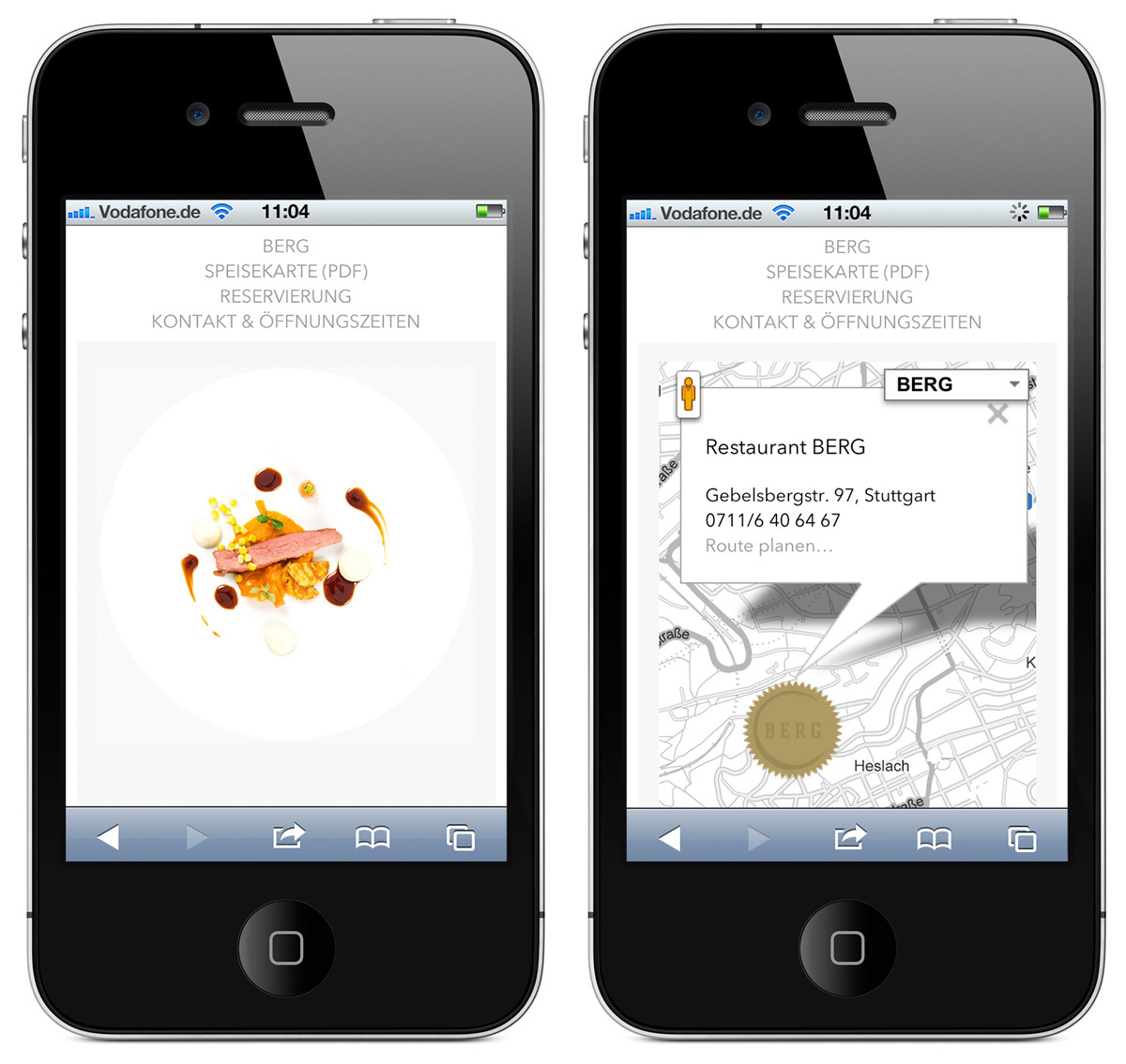
The reduced usage of Colours emphasizes the delicate food. The reservation system is optimized for a smartphone usage, the Google-Maps API had been designed harmoniously to the whole Page Design.
www.bei-berg.de
ART & CREATIVE DIRECTION
Christian Vögtlin (ADDA Studio) & Mark A. Milic (modularlab)
COPYWRITING
Sergej Grusdew
PROGRAMMING
Mario Kober
FONT HAGIN
by fontbaric