RANE
The new cultural section of the italian magazine IL
During the redesign of the magazine IL I was asked to develop, under the creative direction of Francesco Franchi, the visual project of the new cultural section: RANE.
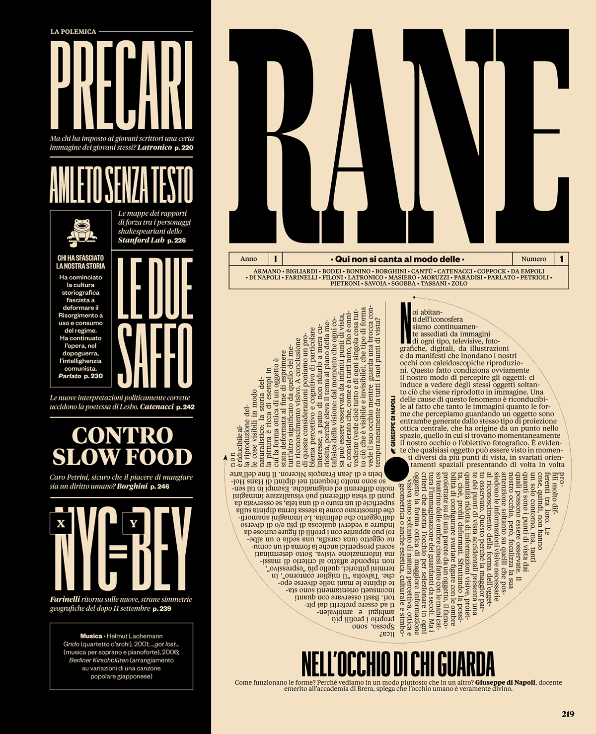
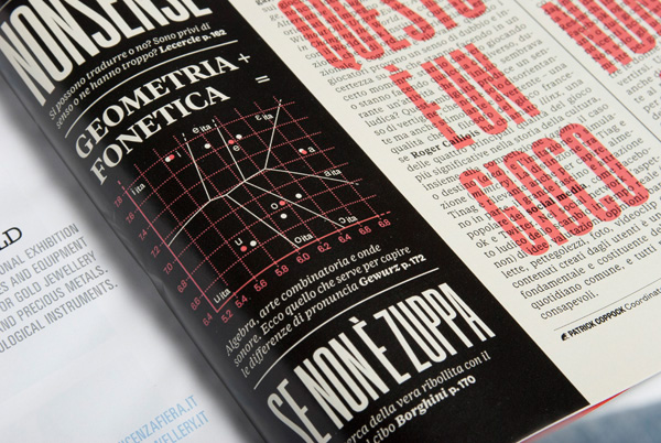
The first and foremost inspirations for the project were some futurist magazines like Lacerba and Dinamo Futurista: the name RANE comes from a quote of a medieval poetry work (called L'acerba) from Cecco d'ascoli, which was used by the magazine Lacerba as a sort of payoff (the whole line goes as "Qui non si canta al modo delle rane"). Starting from there, we tried to elaborate a more modern language, incorporating infographics and visual storytelling to accompany the articles content or to build a parallel-yet-related story along them.
After the project was done, I kept working on the section for the first six issues, designing it and also making the illustrations and infographics. I then left the project in the good hands of Micaela Bonetti, who already helped me finishing this first 6 issues.
-
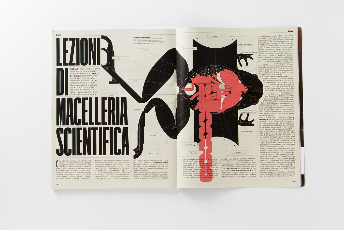
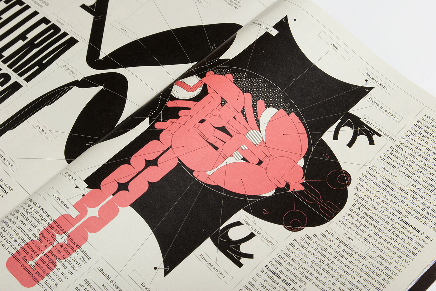
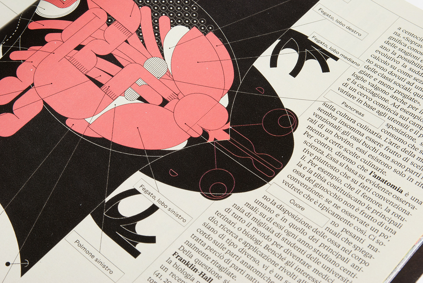
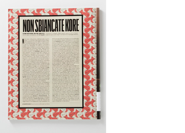
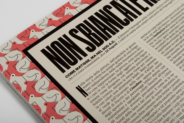
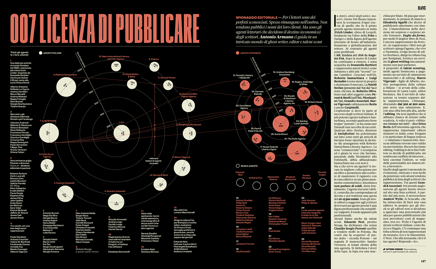
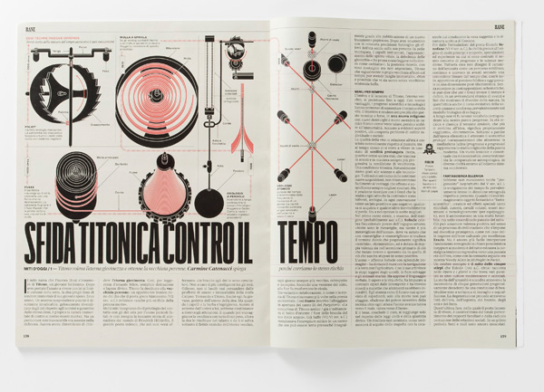
The brief was to create a sort of magazine inside the magazine, with its own bold language: the tone of the articles was provocative and challenging and the visuals had to reflect this attitude.
The first and foremost inspirations for the project were some futurist magazines like Lacerba and Dinamo Futurista: the name RANE comes from a quote of a medieval poetry work (called L'acerba) from Cecco d'ascoli, which was used by the magazine Lacerba as a sort of payoff (the whole line goes as "Qui non si canta al modo delle rane"). Starting from there, we tried to elaborate a more modern language, incorporating infographics and visual storytelling to accompany the articles content or to build a parallel-yet-related story along them.
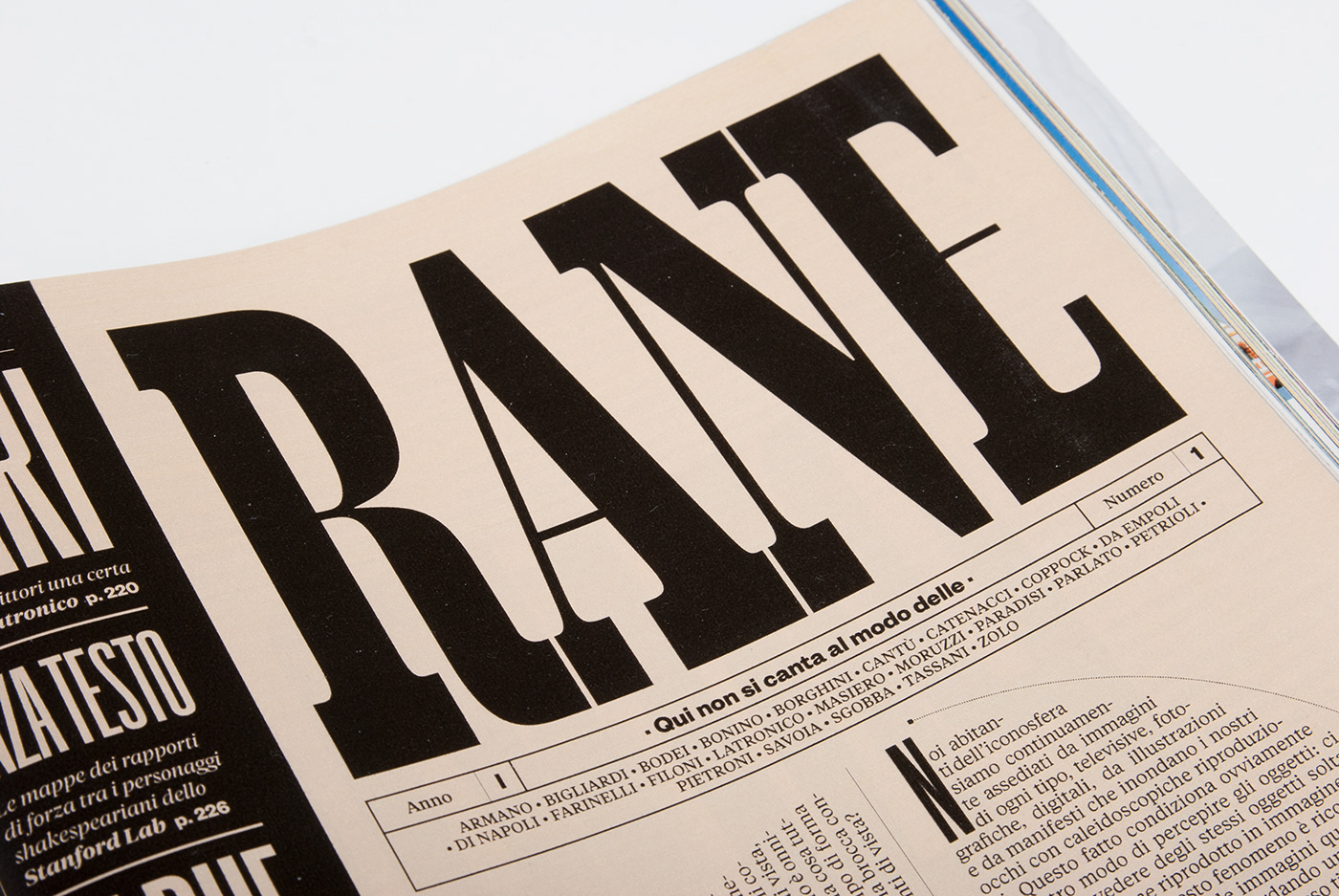
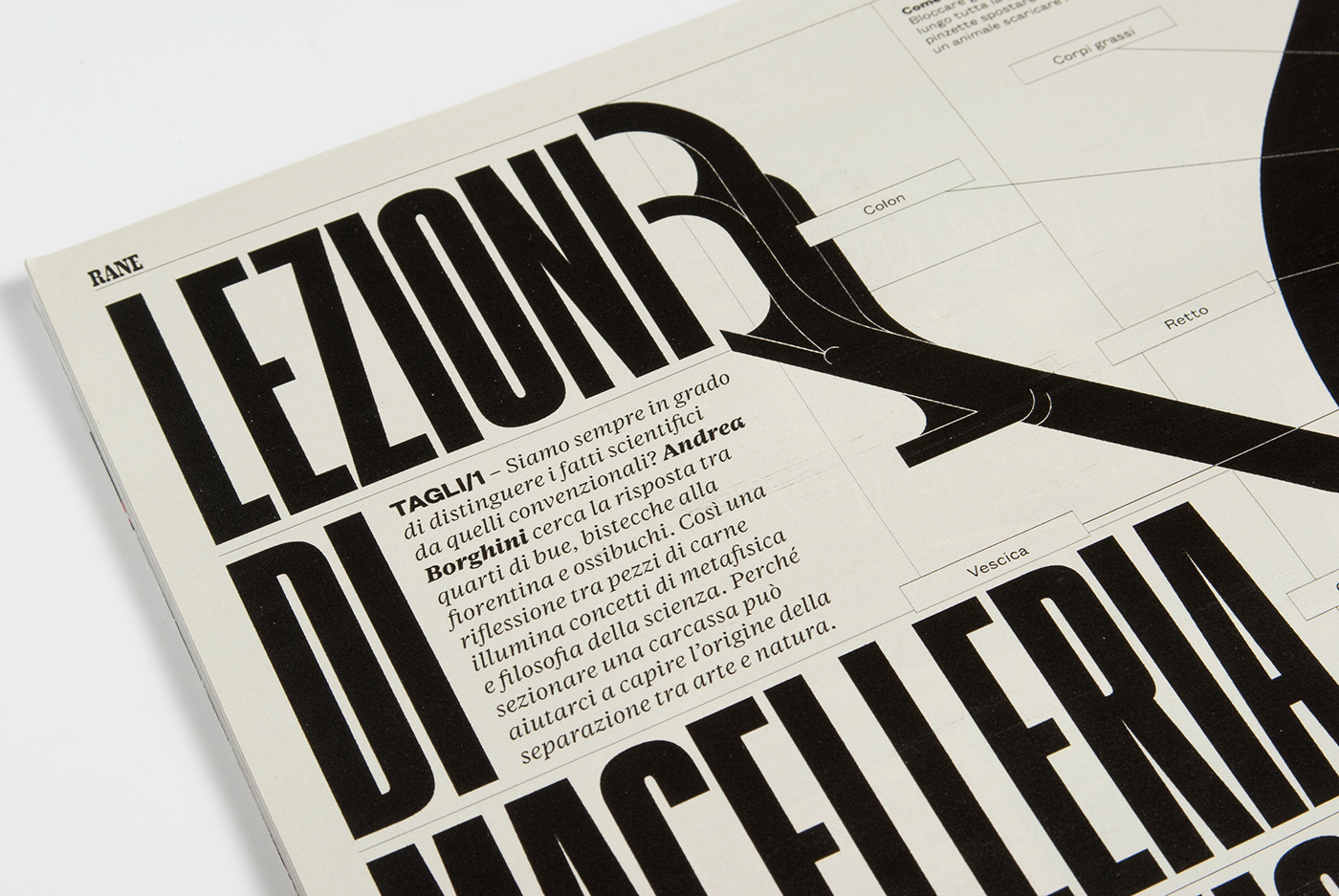
While the basic text font is the same used on the rest of the magazine, the titles are set in Graphik, designed by Christian Schwartz, who also custom-drew the letter masthead RANE
After the project was done, I kept working on the section for the first six issues, designing it and also making the illustrations and infographics. I then left the project in the good hands of Micaela Bonetti, who already helped me finishing this first 6 issues.
-

RANE has been awarded a Nomination at D&AD 2012 into the Magazine & Newspaper design / Magazine section Category.

RANE issue #2 won a Silver Award at SPD 47 as best section from a single issue.
-
Photos by Malvina Monteggia
If you want to see some higher resolution images, just go here
-
-
Photos by Malvina Monteggia
If you want to see some higher resolution images, just go here
-
RANE #1
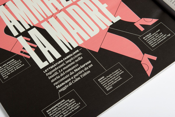
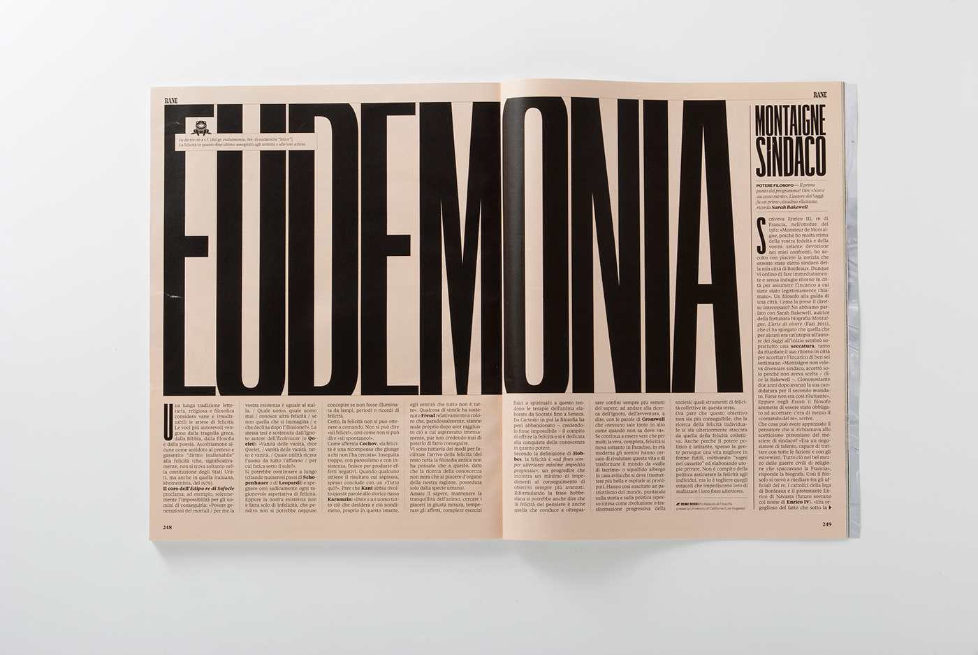
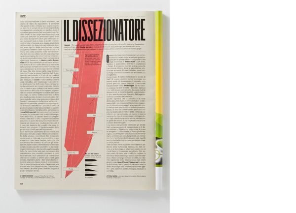
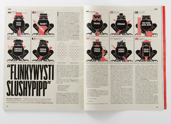
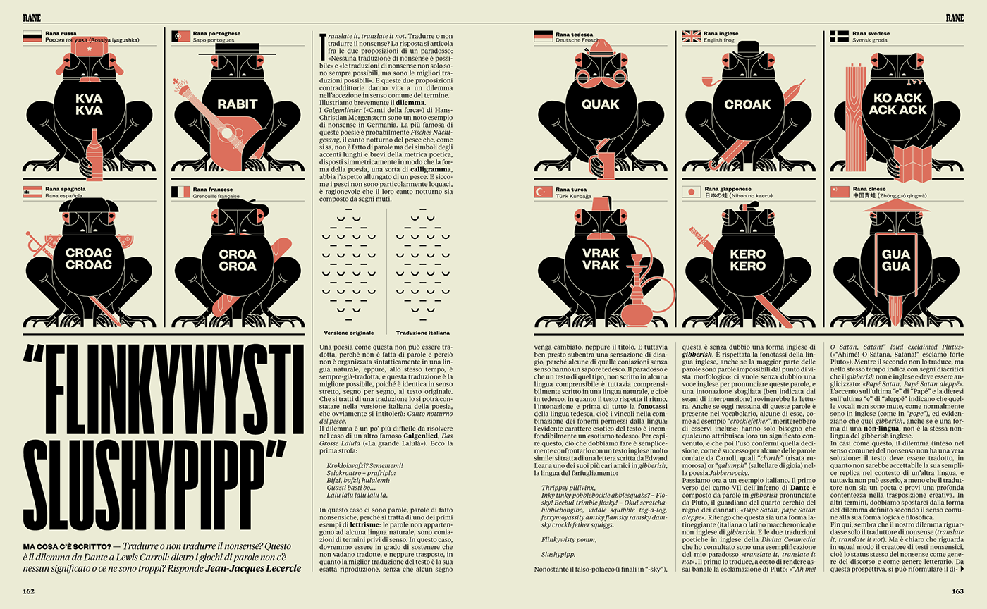
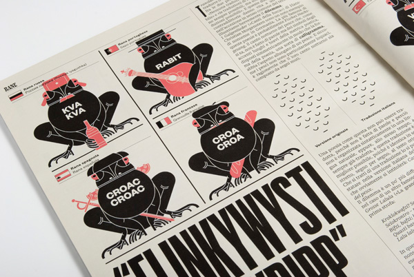
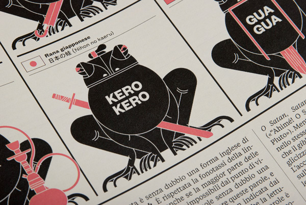
The first issue was still in an experimenting phase. It was heavily based on typography, illustration was almost absent and it used just black as foreground color, while the background color was still the yellow-pink used in the opening section of the magazine.


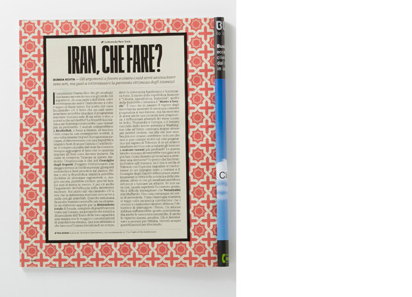
RANE #2
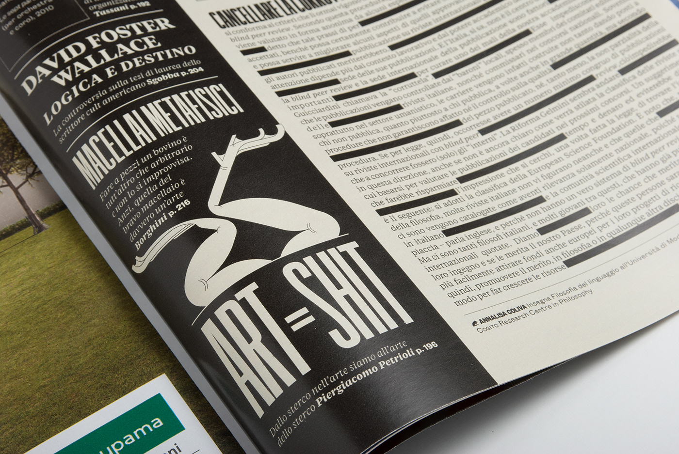
From the second issue on, the background color was set in a light green, while red was added as a foreground color. Also, a set of small frogs (RANE means frogs) was developed to "jump" from page to page in order to lighten the heavy content a bit. Here are some of them:


RANE #3


RANE #4


RANE #5


RANE #6