- Quintessenz Gin -
Student project by Annika Neubauer & Mike Leithner
–––––––––––––––
–––––––––––––––
In our semester project “packaging design as series” we got a predetermined font
(Masala, by Xavier Dupré) and had to find a product that matches this font.
In further steps, the task was to create a line of products which should include:
name, logo, packaging series and an advertising campaign. The work took place
in teams of two. I worked with my colleague Annika Neubauer on this project.
We decided to make gin to our product.
In further steps, the task was to create a line of products which should include:
name, logo, packaging series and an advertising campaign. The work took place
in teams of two. I worked with my colleague Annika Neubauer on this project.
We decided to make gin to our product.
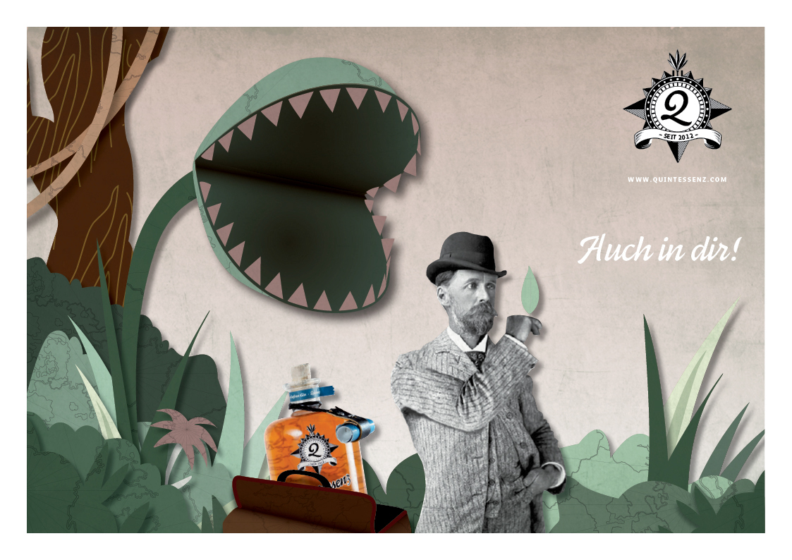
During the research, three archetypes of gin varieties emerged,
which we wanted to revitalize through our brand. So we came to the three
varieties London Dry Gin, French Saffron Gin and Holland Spice Gin.
which we wanted to revitalize through our brand. So we came to the three
varieties London Dry Gin, French Saffron Gin and Holland Spice Gin.
After intensive research, competition and consumer analysis, we began with the
naming and the first logo designs. The idea was to incorporate the spirit
of the colonial time to the design.
naming and the first logo designs. The idea was to incorporate the spirit
of the colonial time to the design.
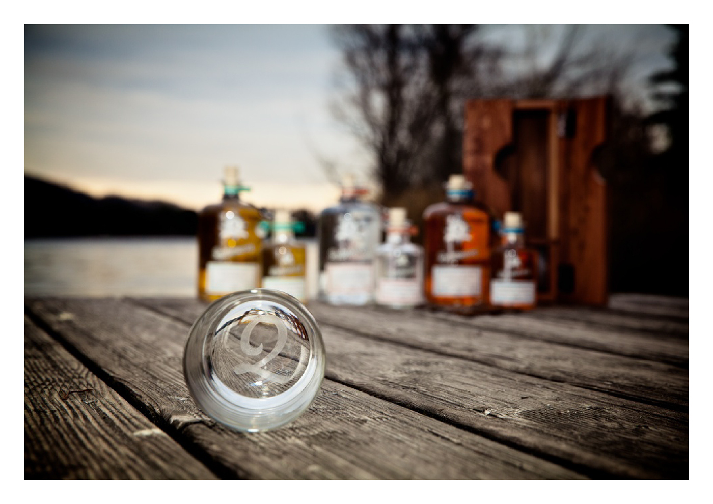
We designed three 700 ml, three 200 ml bottles and a wooden box with an
engraved glass as special edition. Through each bottle a shaded
map of the country of origin can be seen. The box and its closure are also engraved.
A small role on each bottle provides information of the philosophy of
Quintessenz and the particular flavor.
engraved glass as special edition. Through each bottle a shaded
map of the country of origin can be seen. The box and its closure are also engraved.
A small role on each bottle provides information of the philosophy of
Quintessenz and the particular flavor.
Photos by: redisgreen.tumblr.com