INTERIOR COVER PAGES - This was an interesting challenge to create. I used all of the Quiksilver logos and created this pattern. It would have been easier if there had been an even number, but of course, no such luck. However, I believe the work was definitely worth it and made for an impressive start to the rest of my project.
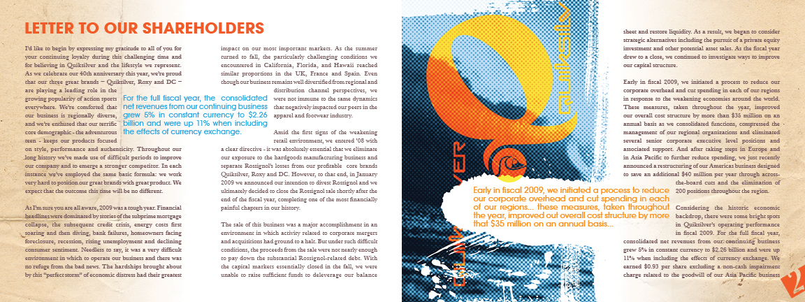
LETTER TO SHAREHOLDERS - The image on the left page was created by converting an image to halfton and laying it over a tinted version of itself. The addition of the distressing and logos helped me bridge the beginning pattern into the rest of the images with in the annual report project.
I created this illustration to start showcasing the color palette of the entire annual while establishing some of the shapes and graphics that I would repeat later. The hand drawn elements and illustration were well worth the effort if I say so myself.
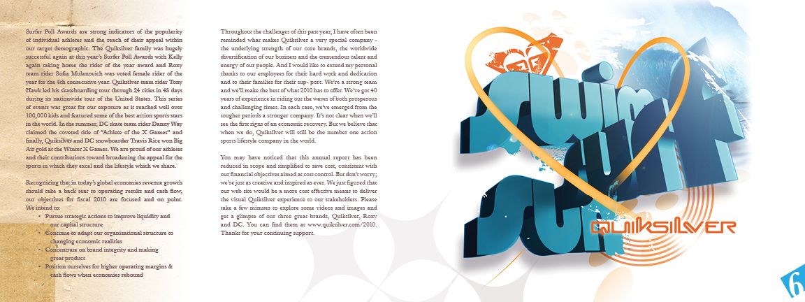
Quiksilver though consistent in their marketing, they still try to apply a range to their approach. In this image I created the text and the supporting shapes in illustrator then pulling them into photoshop to give them the edge they needed to really pop.

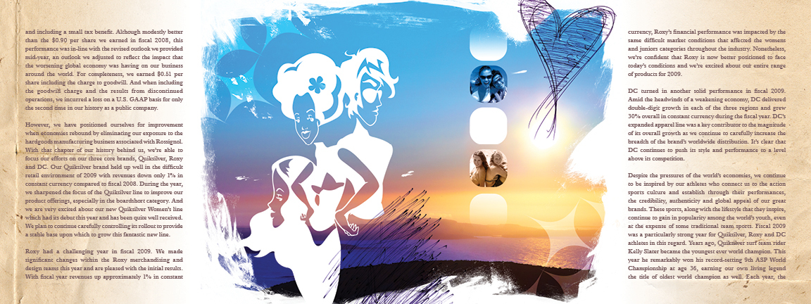
Image consideration was key through out this annual project. I actually compiled almost 80 stock images and went through them to find those that would be perfect in capturing Quiksilver's target audience. I also wanted to try to play into the throw-back and vintage vibes that are popular in both surf and skate culture.

One of the very first illustrations that I created for this annual, I really tried to play with the "every girl" mentality that Roxy encompasses. I feel that I achieved this by the two distinctly featured faces sharing the same headspace... a nod to the similar thoughts and styles of the Roxy girl. I then continued to play up the tropical and femenine qualityies by addind the photographic flowers. This small detail also helped connect this illustration to the more collage like images in the rest of the project.

DC is definitely a skate brand but is incerdibly similar to the surf side of Quiksilver. Here I wanted to play off a stronger sense of angularity and graffiti. Again, I used similar shapes to carry the same theme and feeling throughout each of my graphics.

Though this is supposed to be an annual report, it was important to make sure that there was some variation in the copy to make sure that it didn't begin to resemble a set of stereo instructions. I made sure that my grid allowed for accurate and appropriate spacing. Something that could really be great for including a lot of information, yet still provide areas for breath, and areas that could really open up for significant spacing.
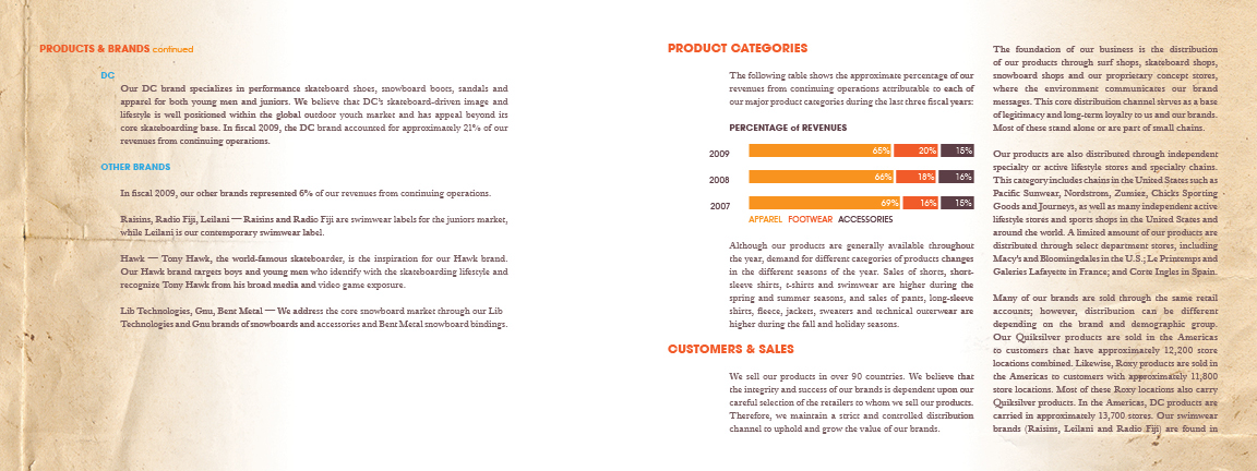
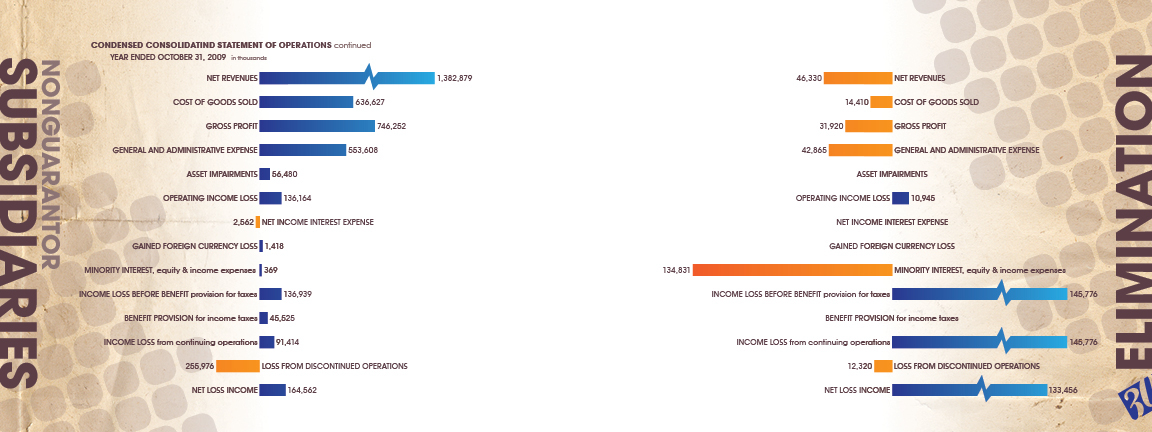
This form of graphing was an almost no-brainer. It just seemed not only fit well with the layout but the style of the annual as well. The perdetermined space also helped me to accurately figure out the mathmatical percentage based on the numerical values in Quiksilver's real annual report.
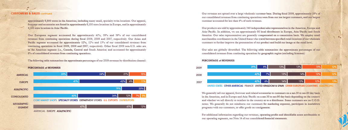
Another stroke of luck while designing — Quiksilver's market regions just happened to match the number of colors that I had established as a palette in preproduction.

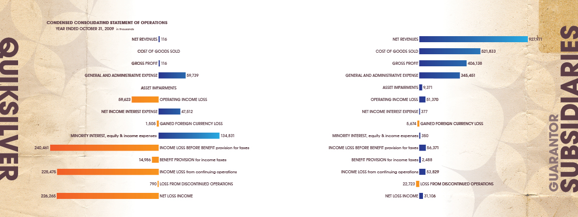
Following the design direction from my early graphs, I was able to take the remainder of the numerical data and graphically plot it out while maintaining consistency.